THE CLIENT
Fluxus is a new coffee project that belongs to one of the biggest coffee roasters in Turkey. They represent their products for coffee lovers in Turkey and Europe. Historically, Fluxus was an international community of artists, composers, and designers, but most of us reckon the coffee as a part of the art too. That is why the founders decided to use it as a coffee brand.
THE KEYWORDS
Vibrant / Bold / Plain / Clean / Comprehensible / Meaningful
THE SOLUTION
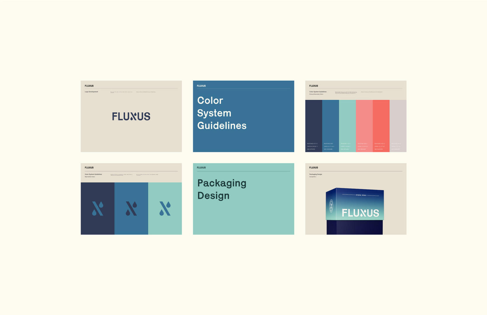
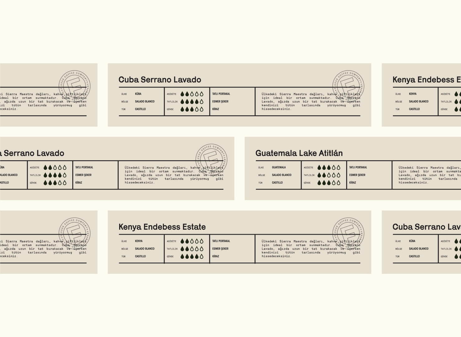
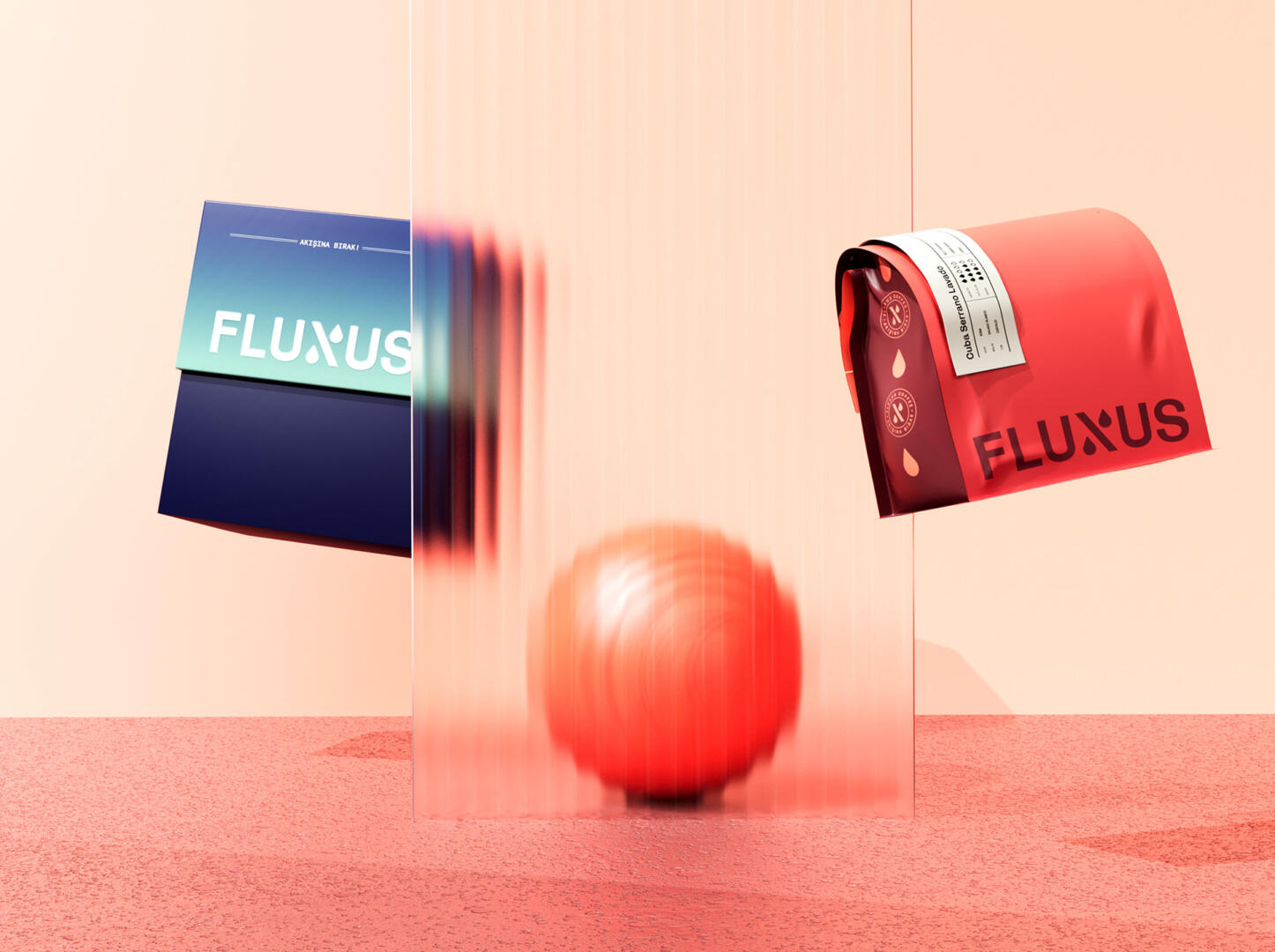
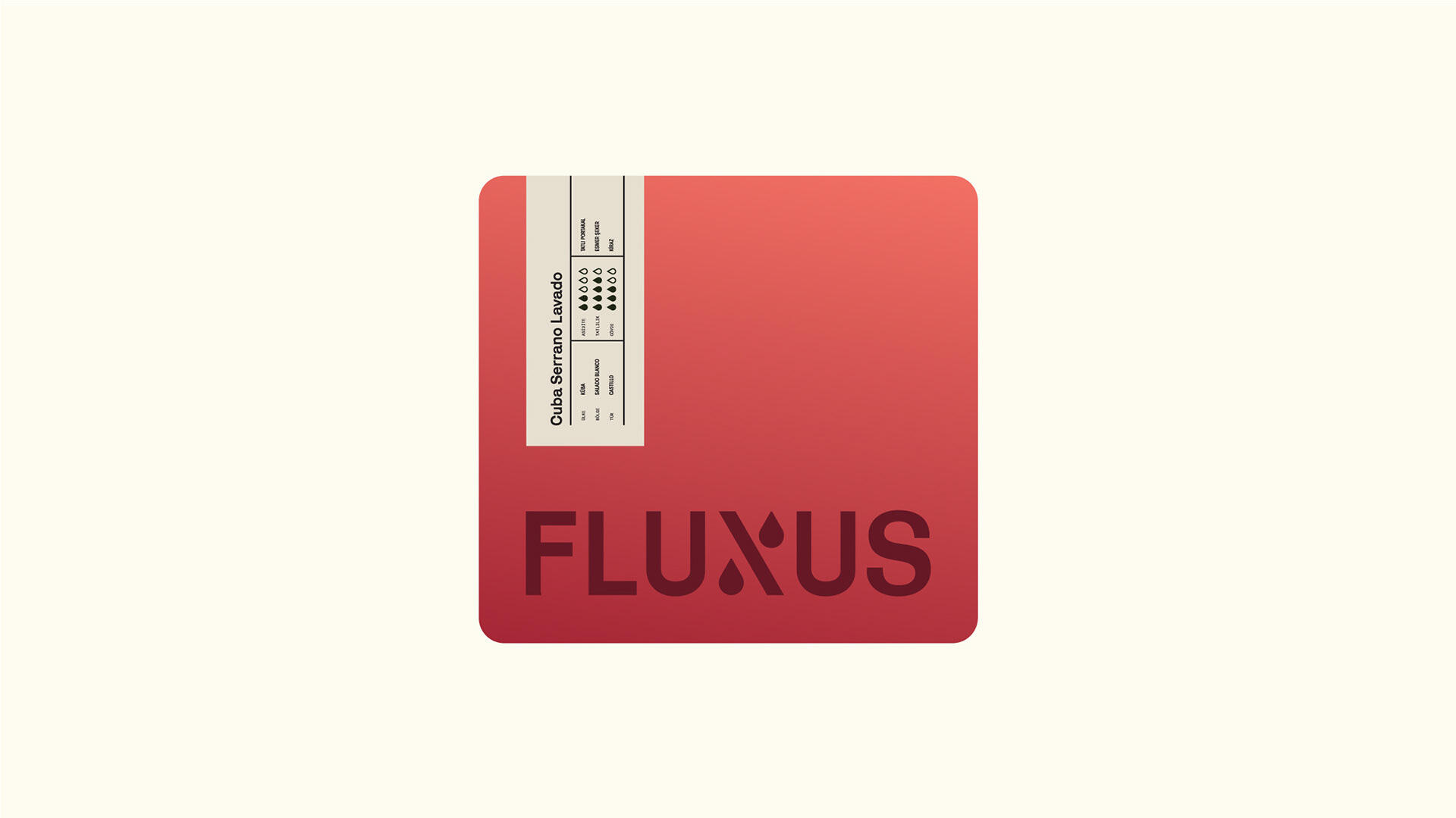
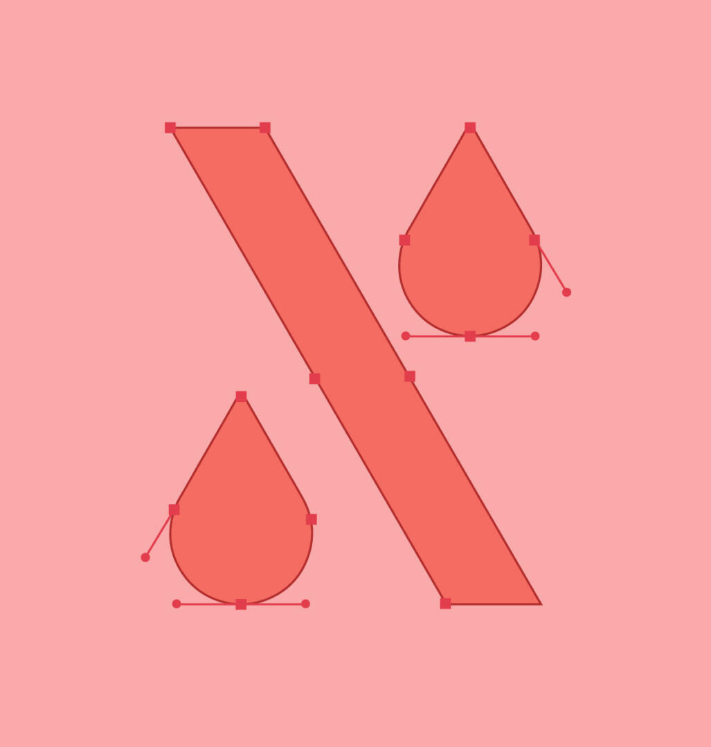
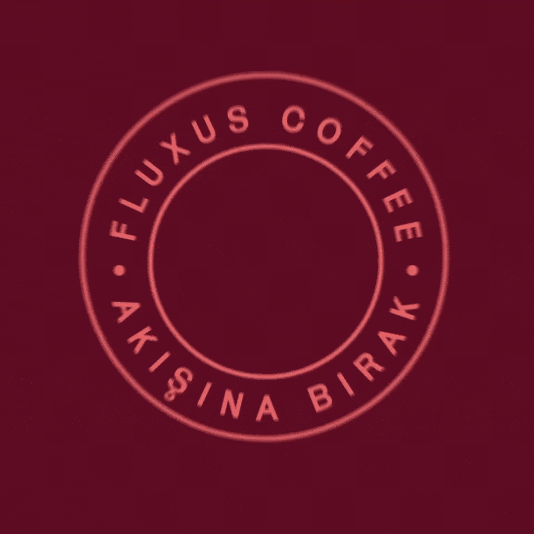
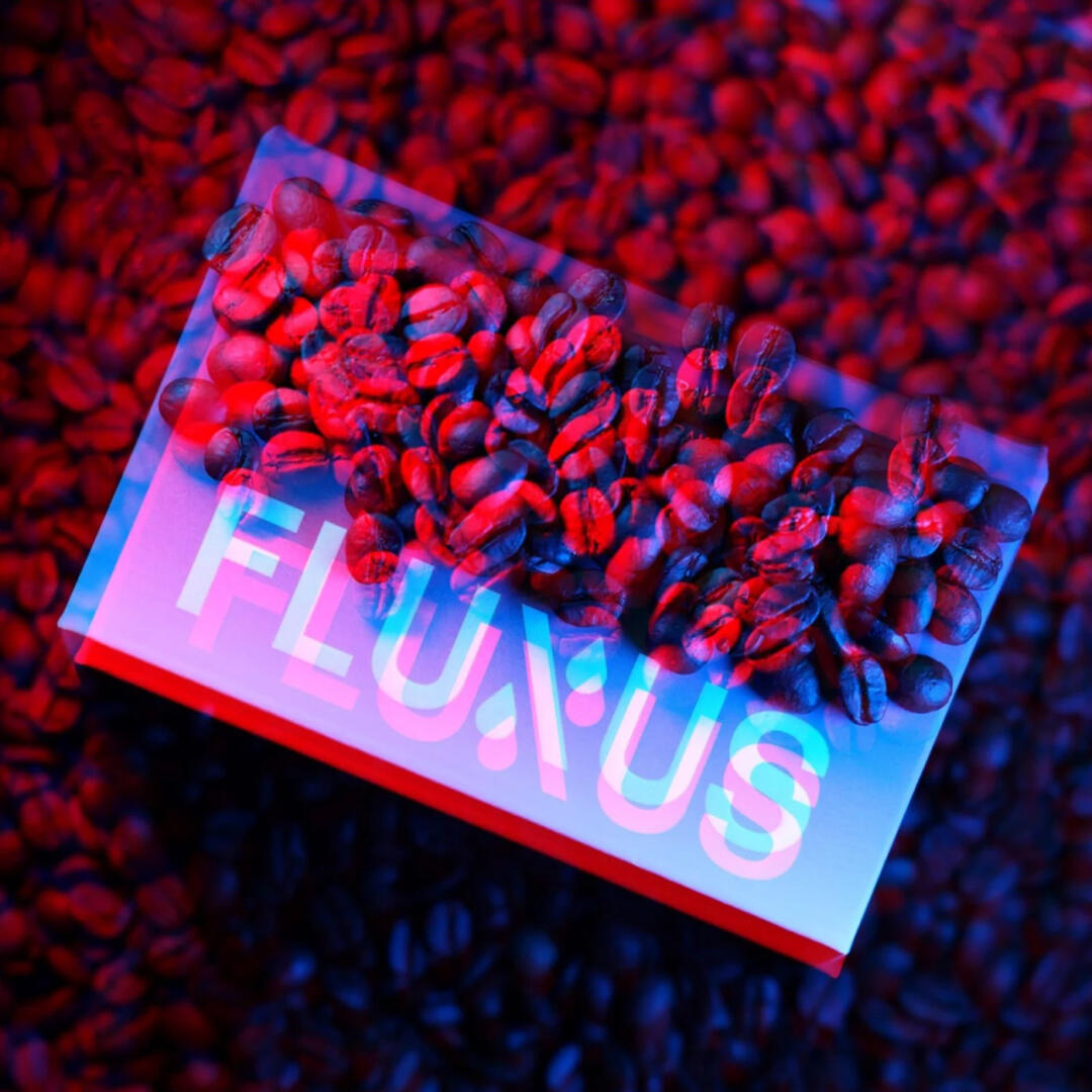
Considering the comprehensible nature of the brand, we decided to create the logo as a bold yet simple logotype. We have also created a monogram using the “X” letter and used it in the logotype as well. The decision to choose the “X” letter came to us due to its shape similarity with V60. In addition, we used the drops, which represent brewing coffee from the monogram, and created different varieties of emblems for the multiple purposes of use. As for the colour solution, it was decided to go with vibrant colour combinations such as red and blue. The contrast of these colours draws attention to the packaging and logo as well. For the box’s top half, we used a soft gradient between light blue and mint colour, and for the bottom, we used a dark navy colour. The biggest surprise awaits inside the box, as the coffee packaging’s colour is plain red. The label containing the coffee’s information is placed as a sticker and contains a description of the coffee’s origin and flavour.