CLIENT
The Vero Gelato’s founder is Veronica and she is from Italy. The naming of the brand means “Real ice-cream” from Italian. Veronica makes this ice-cream by her own self, that’s why it is so delicious and famous in the most prestigious areas of Istanbul. They make ice cream out of natural ingredients such as fruits, milk, and the Turkish milk drink Salep.
KEYWORDS
Soft / Timeless / Cute / Attractive / Natural / Elegant
THE SOLUTION
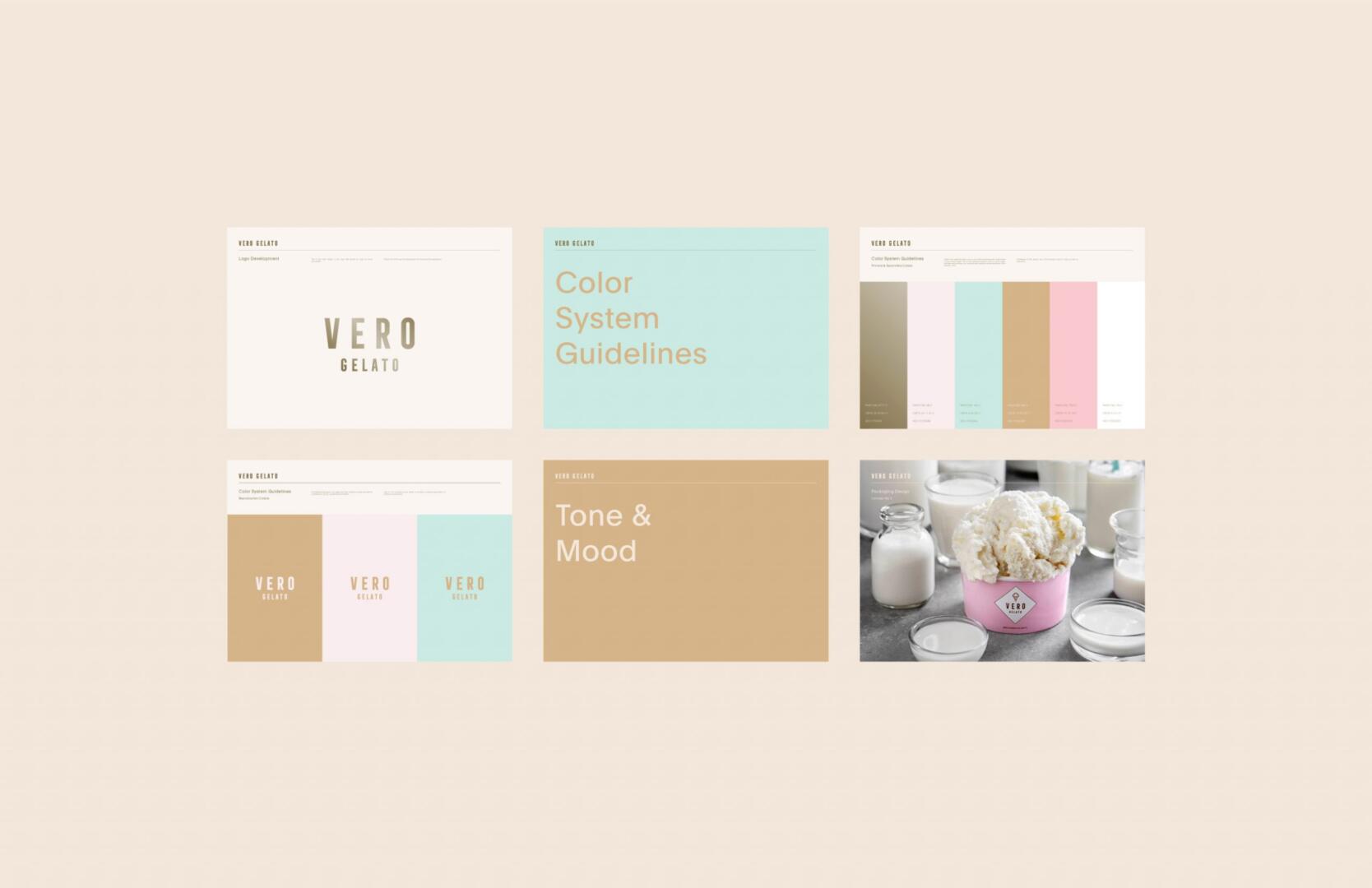
For a timeless and prestigious feel, we decided to create a minimal and bold logo with a representative logo symbol of melting ice cream.
To create a sweet candy-like association, me and my team decided to select a soft pastel color palette. For the highlight of the logo, we picked gold, because this way the logo looks more luxurious and prestigious, even on a pastel background.
As for the packaging, we came up with a simple and eye-catching design with a plain background color and the logo in front separated with a colored box or simply pasted on. This way, the design looks bold and elegant, attracting the eyes of ice cream lovers with its soft colors and simple design.