In the oversaturated post-covid market of single-use gloves, Shield Pro needed a new brand and packaging that could convey their products’ unique qualities and value.
The approach
1. Analysis
The analysis required in-depth product knowledge and careful attention to identify what makes Shield Pro valuable in such an overflowing market. It came to light that their logistics system and technologies integrated into the gloves stood out compared to their competition however this wasn’t being communicated successfully.
2. Foundation
Following the strategy of B&C, we wanted to infuse the original value proposition with the modern and technical solutions Shield Pro products offer. This gave us a clear platform to build the identity that associated the parent company with their new brand and their innovative approach to single-use gloves.
3. Creation
The Logo
Beginning with the pinnacle of the Shield Pro brand, we developed a figurative logo which clearly depicts the product itself to help communicate with anyone seeking this kind of product. We used the form of a hand to imitate the shape of the shield to also help reinforce the brand sub amongst the clientele.
Naming
Next was the naming of the three types of gloves within the Shield Pro line. We developed names that echoed their customers and tie them with each of the gloves’ special attributes.
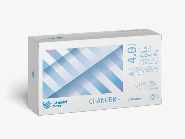
The Packaging
This design featured an abstract representation of the product names to further associate the key values and the figurative function of the products themselves. We also ensured the packaging design was highly functional in their specific work environments by placing the key information on each face of the box as well as highlighting it in a clear and readable manner. This was designed to help workers identify the vital details of the product and streamline their workflow.