BRANDING & IDENTITY, PACKAGING
What’s so special about Tea?
A fresh start to the day is often accompanied by a warm cup of tea. A venture by Reliance Retail, Aarambh Tea rebranded itself to catch more eyes and build sales, enabling us to take a fresh look at what the brand stands for.
The beginning of everything. ‘
Aarambh’ denotes the beginning of everything. The epitome of any perfect beginning is traditionally done with a perfect cup of chai.
Finding the perfect balance in a cup of tea.
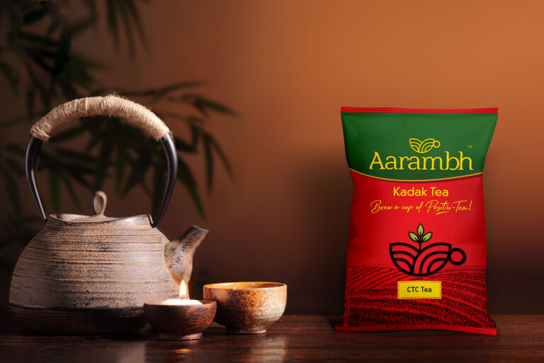
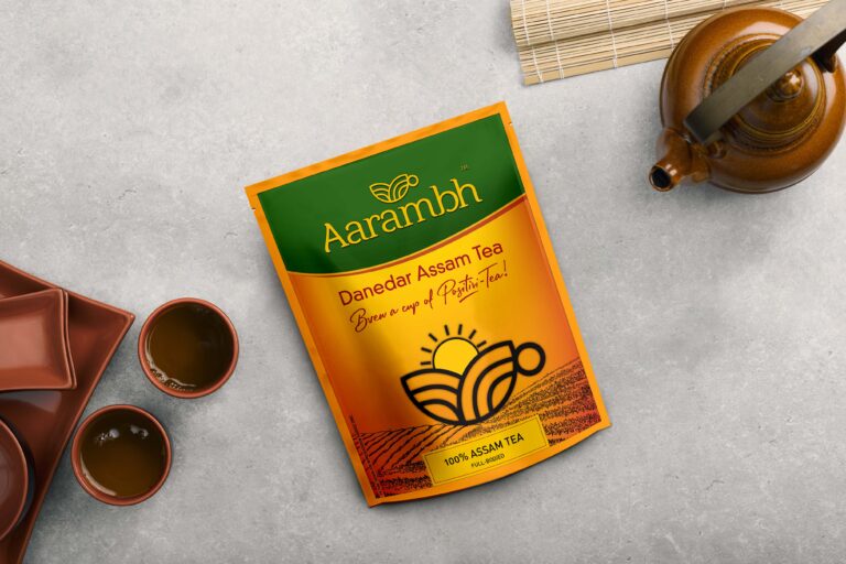
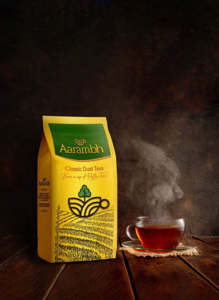
Bearing this in mind, we created a packaging design that resonated with the Brand. We reframed the Brand to align with its core belief – balance. The brand mark represents two leaves pouring into a cup of tea symbolising the subtlety of the ingredients. The packaging design was inspired by the Brand’s personality, simple yet significant, similar to a cup of tea – a simple concoction that holds great significance in each of our lives. The colours of the morning sky with the rising sun are resonant throughout the packaging. The idea behind this was to strike a balance. As yellow meets blue, we find green. We symbolised the balance between day and night with a fresh cup of tea by branding the product as a distinct and genuine representation of its category.


