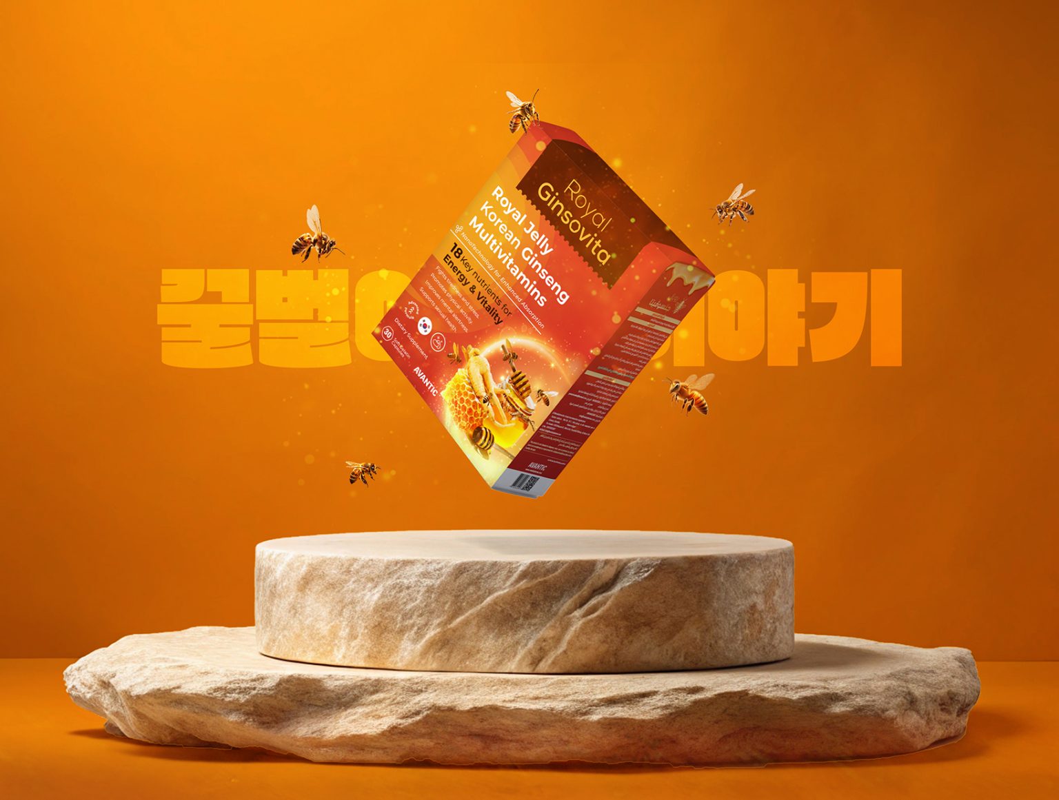
Marklinica teamed up with Avantic to create the striking branding and packaging for Royal Ginsovita, a premium dietary supplement designed to boost energy and vitality. With its powerful combination of Royal Jelly, Korean Ginseng, and multivitamins, the product deserved a design that matched its royal name and energizing benefits. The result? A vibrant and bold packaging that reflects both luxury and vitality.
Design Concept
The design revolves around warmth, energy, and the essence of royalty. Marklinica embraced a vibrant orange and red palette that symbolizes vitality, strength, and optimism, while the golden accents evoke a regal and premium feel. The packaging is not only visually stunning but also communicates the product’s benefits in a clear and engaging way.
Visual Identity
- Color Palette: Dominantly orange with gradients of red, accented with golden tones to convey energy and luxury.
- Typography: Clean and modern typography with bold headers ensures readability and emphasizes the key benefits of the product.
- Imagery: Highlighted natural elements such as honeycombs, bees, and ginseng roots reinforce the product’s organic ingredients and energizing properties.
Packaging Highlights
- Energetic Design: A dynamic gradient of orange and red with glowing accents gives the packaging a sense of movement and vitality.
- Ingredient Focus: Key visuals of honeycomb, bees, and ginseng celebrate the natural ingredients, building trust and excitement.
- Clean Layout: The information is strategically placed for clarity, making the benefits and features instantly noticeable.
Final Outcome
Marklinica’s design for Royal Ginsovita blends boldness with functionality, creating packaging that not only attracts attention but also reinforces the product’s energy-boosting promises. The vibrant design stands out on shelves, appealing to health-conscious consumers who value both aesthetics and quality.


