Art Of Delight makes some of the best handcrafted ice creams you have ever tasted and we can vouch for that!
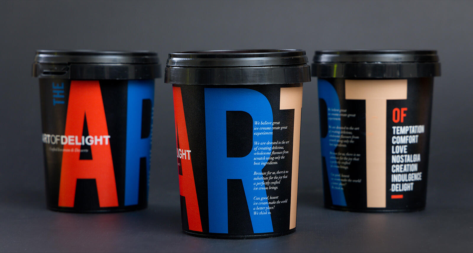
When looking at their packaging design, we felt it best to showcase their personality through a typographical exploration and bring out the spirit that they exude through their desserts- ‘The art of temptation, comfort, love, nostalgia, creation and indulgence.’ Nothing short of this does justice to what the brand brings out in you.
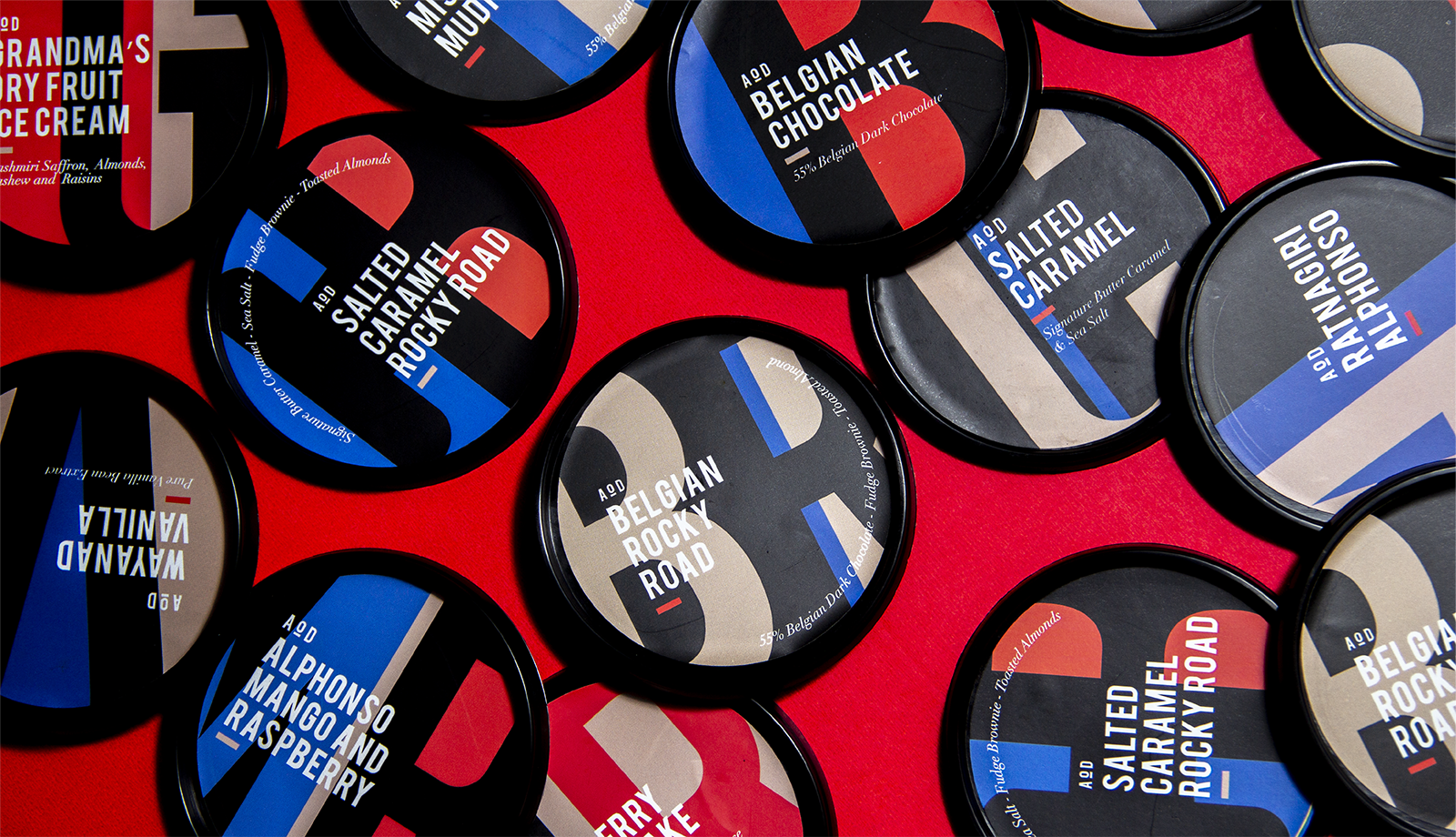
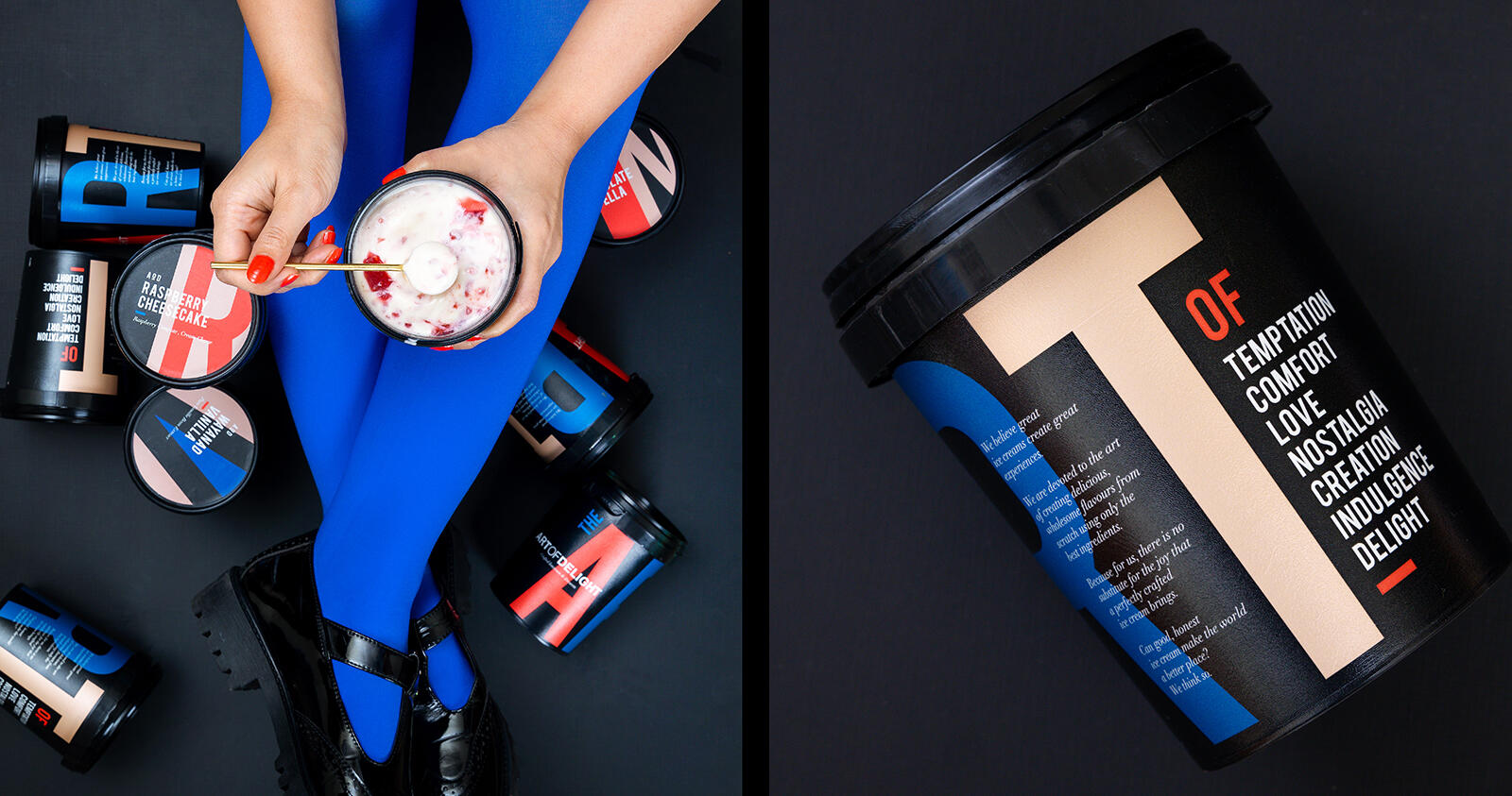
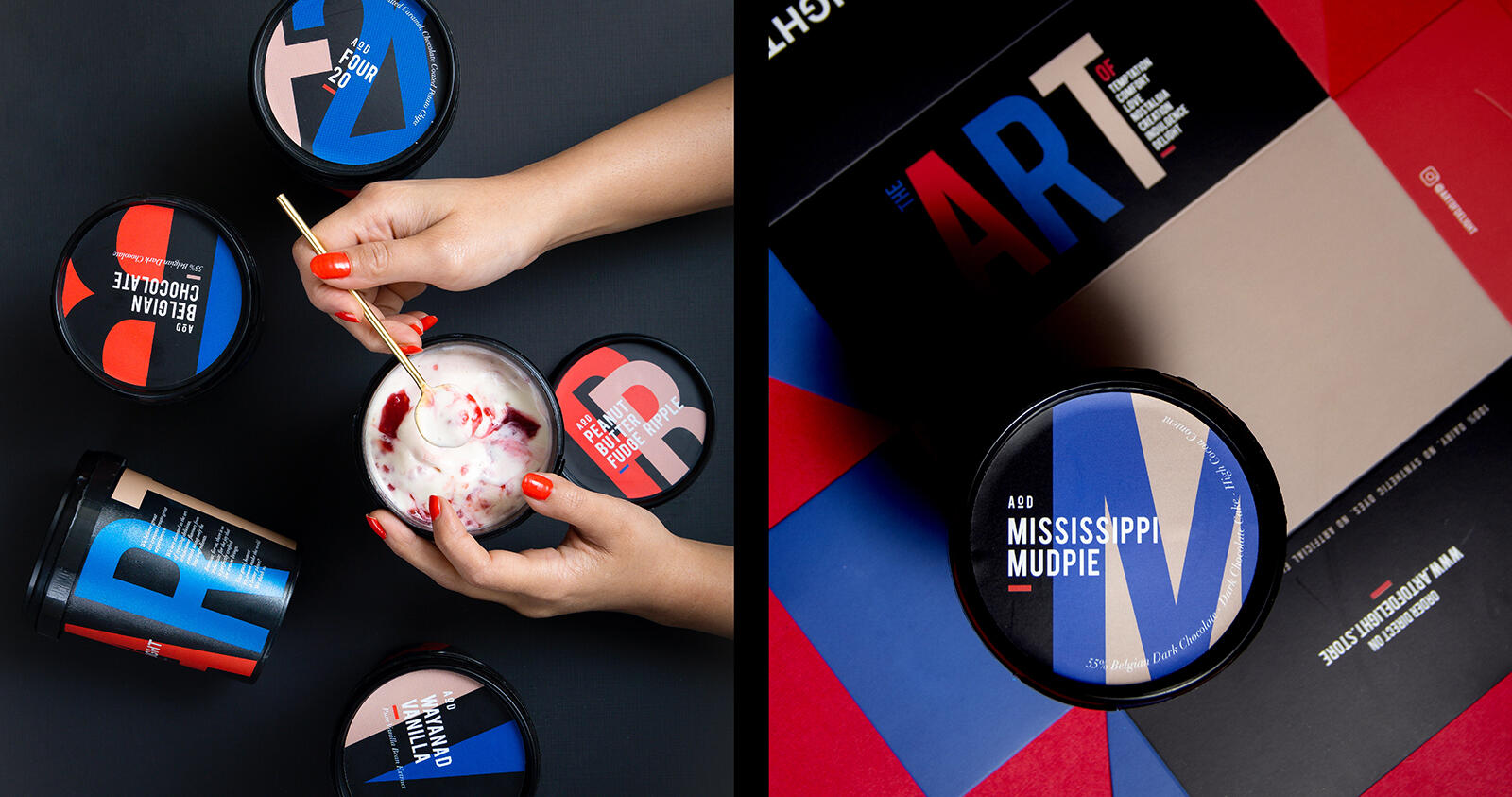
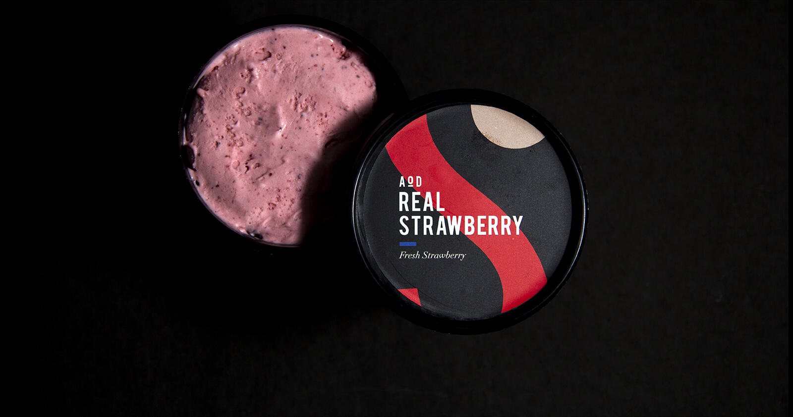
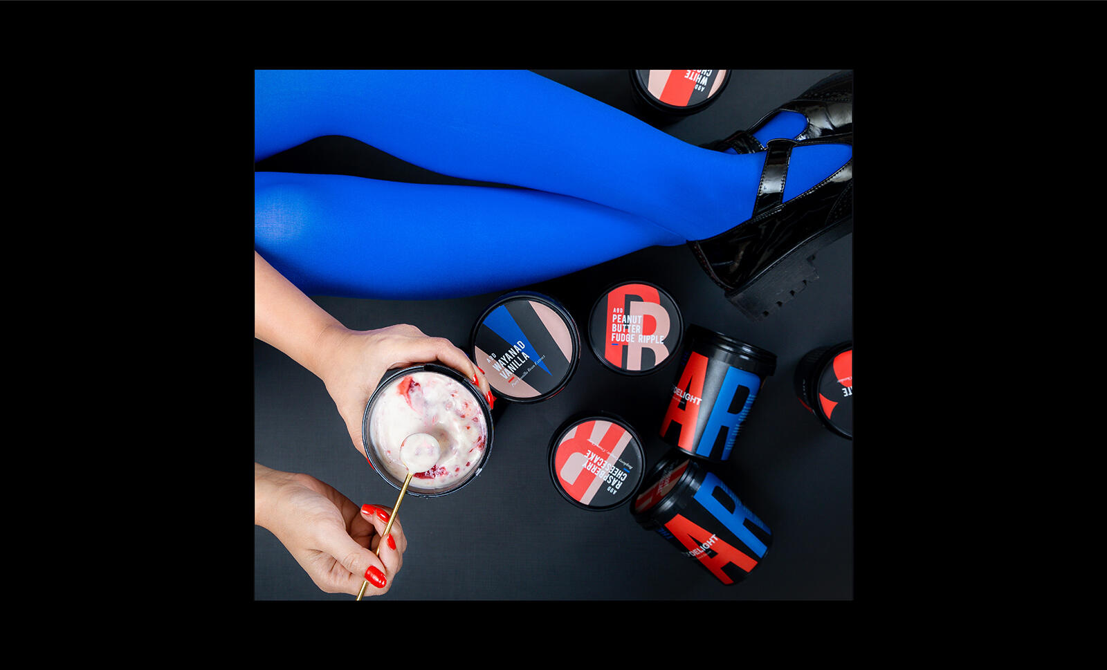
The ice cream tubs became a canvas for us to showcase their distinct brand story. Using three bold, Post-modern and stark colours, we played with typography to bring alive the spirited side of the product, while keeping a minimal visual aesthetic to cue the artisanal expertise that the brand owns. The flavours were played up on the lids extending the same colour palette and typography style.
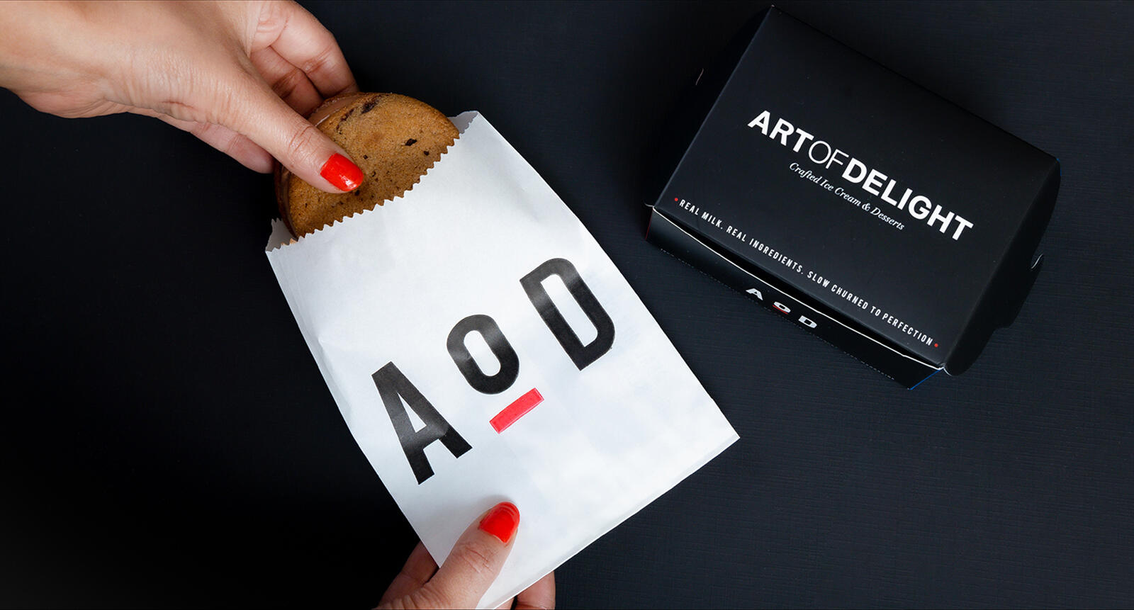
Along with this we also created a secondary brand identity- ‘AOD’.
Just like their ice creams bring out different emotions in you, we aimed to do the same with the visual language.