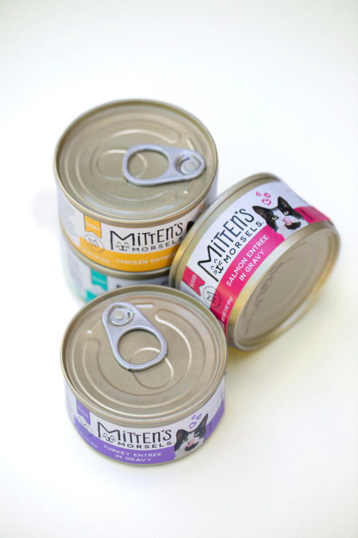
Pet retailer, Pet Supplies Plus, approached us to design a brand and packaging system for their new private label cat food. Because they’re based in Michigan, often referred to as the “Mitten State,” they dubbed it Mitten’s Morsels. Other than that, it was our ball of yarn to play with.
Positioned to make it easy to get better products for your cat, the goal was to offer tasty flavors with a fun brand experience at a competitive value. So we chose to take a less traditional approach by creating a lively and irreverent mascot, Mitten, whose Morsels are clearly the cat’s meow. Mitten, with his cute white feet, is not a perfect cat. We purposely chose a regular, everyday cat (in this case a rescue-turned-model cat who earned more on set than we did) and photographed him doing cute cat stuff. The logo incorporates a cheeky illustrated cat and Mitten endorses his namesake kibble with his own seal of approval. Bright pink and purple packaging for the dry food stands out on the shelf against a sea of orange, yellow and blue pet packaging. Snippets of the both informative and fun copy are peppered here and there to create an overall brand story of quality and taste appeal. The tagline, “Happy and healthy from toes to tail,” is on the packaging along with the Mitten Commitment to quality.