Forever Young is a newly founded company in the field of nutritional supplements. Its purpose is to export high quality products, based on domestic goods such as olives and grapes.
When we were asked to design the first three packages we had to take into account the 3 pillars on which the production of these products was based: Greekness, high quality and scientific study.
We decided to move exclusively typographically in the packaging design, wanting to bring out all of the above.
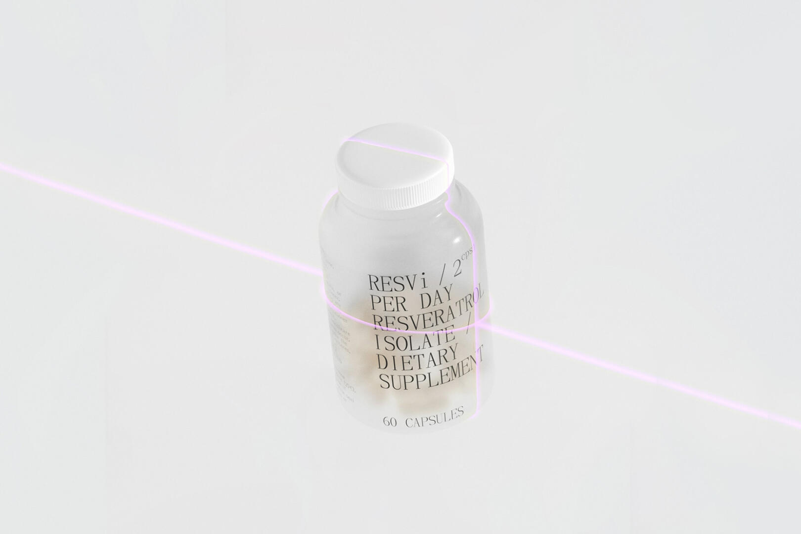
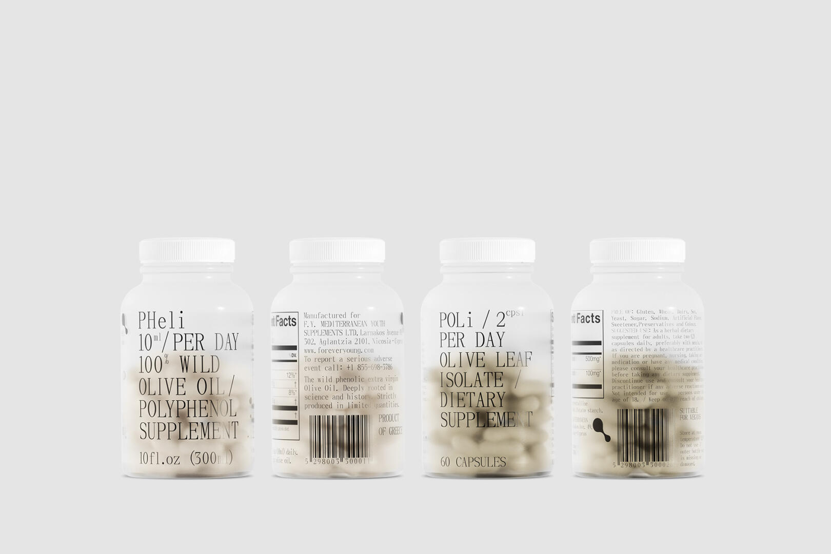
Starting with scientificity, we thought that a serif font was very fitting and came as a reference to classic pharmaceutical labels of the last century, communicating clearly and simply the content and how to use the product.
To highlight the Greek origin of our products, we selected a white 500ml bottle and accompanying white paper box, both of which evoke the Cycladic islands. The embossed typography on the box creates a beautiful play of light and shadow, further emphasising our products’ Greek heritage.
For the two smaller bottles that hold the capsules, we chose a minimalist and modern look, rendering the aesthetic of classical Greece with a contemporary twist. The bottles are translucent and have a frosted treatment that complements their design.
Finally, the high quality results from the combination of all the above, while the choice of appropriate materials and printing technologies give the consumer an overall sense of health and longevity.