Onda Skincare is inspired by Mexico’s various tropical botanicals. Clean and organic beauty made with pure ingredients, to evoke and retain natural beauty.
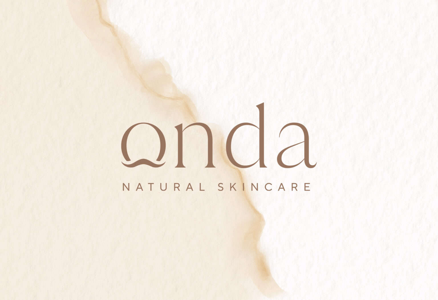
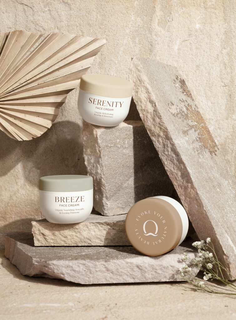
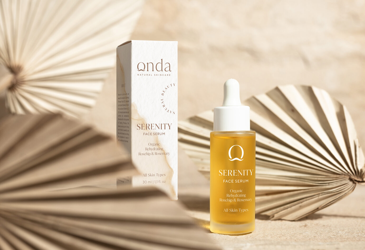
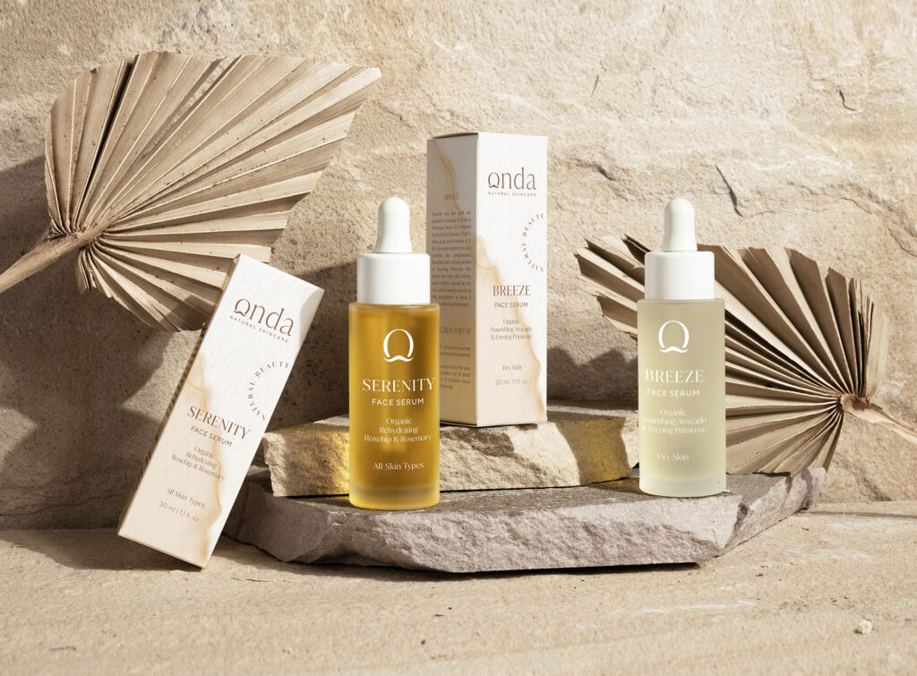
The brand name Onda – the Spanish word for wave – plays a leading role in the overall design and packaging. Water, as the most primal and essential element, stands for naturalness, youth and beauty. The logo consists of classic, elegant lettering. A wave is integrated into the letter O of the word Onda, which functions as a stand-alone monogram and is used as a branding element in appropriate places. A light-painted watercolor background, reminiscent of waves washing up on the beach, completes the look. Natural color shades further highlight the brand message and the naturalness of the product.
Onda Skincare – Evoke your natural beauty
Curator’s Insight: The brand name, which means wave in Spanish, reflects the importance of water as a source of life and beauty. The logo design is simple and elegant, with a wave motif embedded in the letter O. The wave also serves as a monogram that can be used independently on various media. The watercolor background adds a touch of softness and fluidity to the design, evoking the image of waves gently caressing the shore. The natural color palette reinforces the brand’s message of purity and naturalness. The design is effective in conveying the brand’s identity and values, as well as creating a visual appeal for the target audience.


