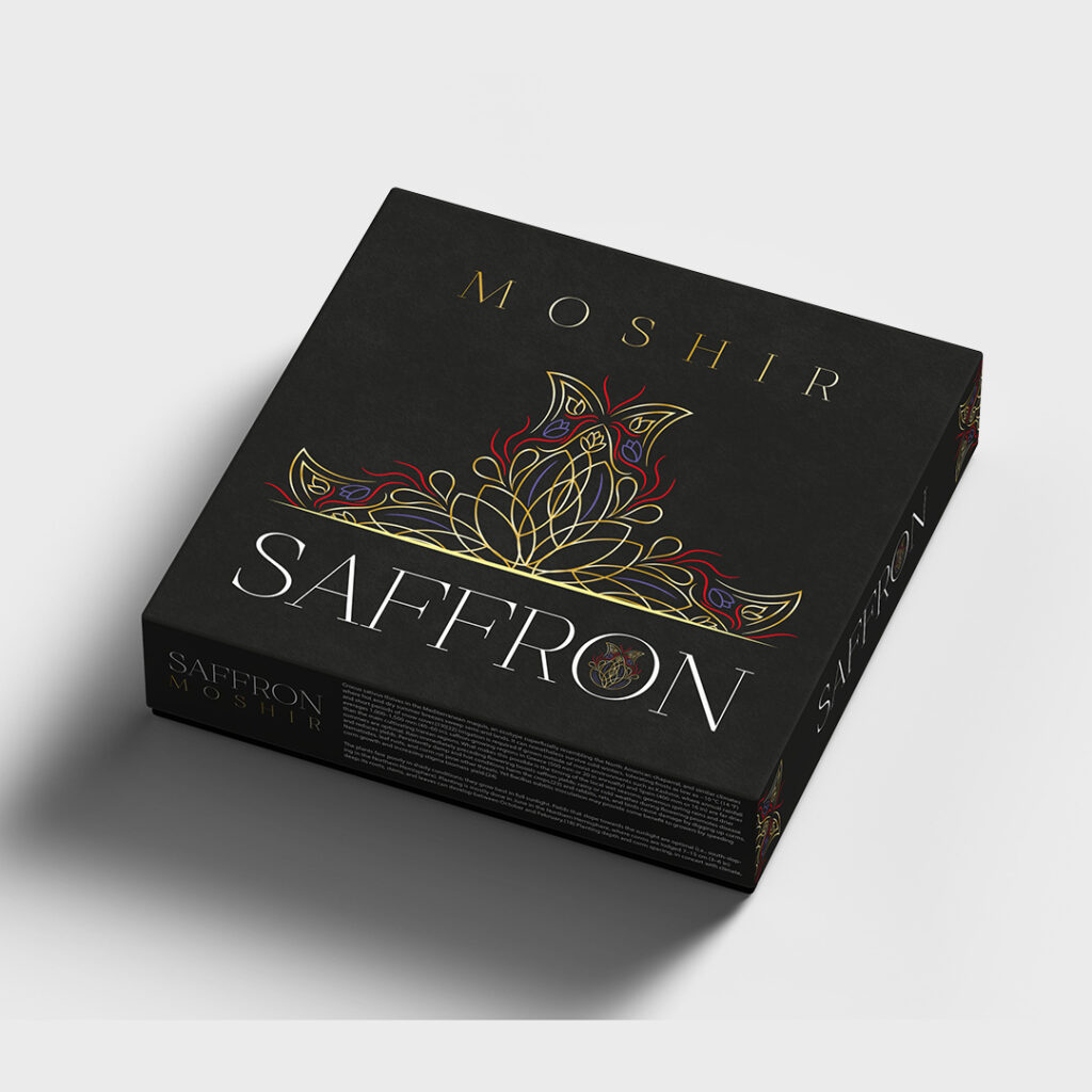
In the new era we live in, the competition for sales, branding and more effective communication with the audience has reached its peak. One of the most effective factors of a brand’s superiority over other competitors can be packaging that looks attractive to the audience and properly displays the product’s capabilities, and ultimately leads to more sales because the attractive and principled design of the product packaging screams for you. When you’re not there to promote your product. About the plan:
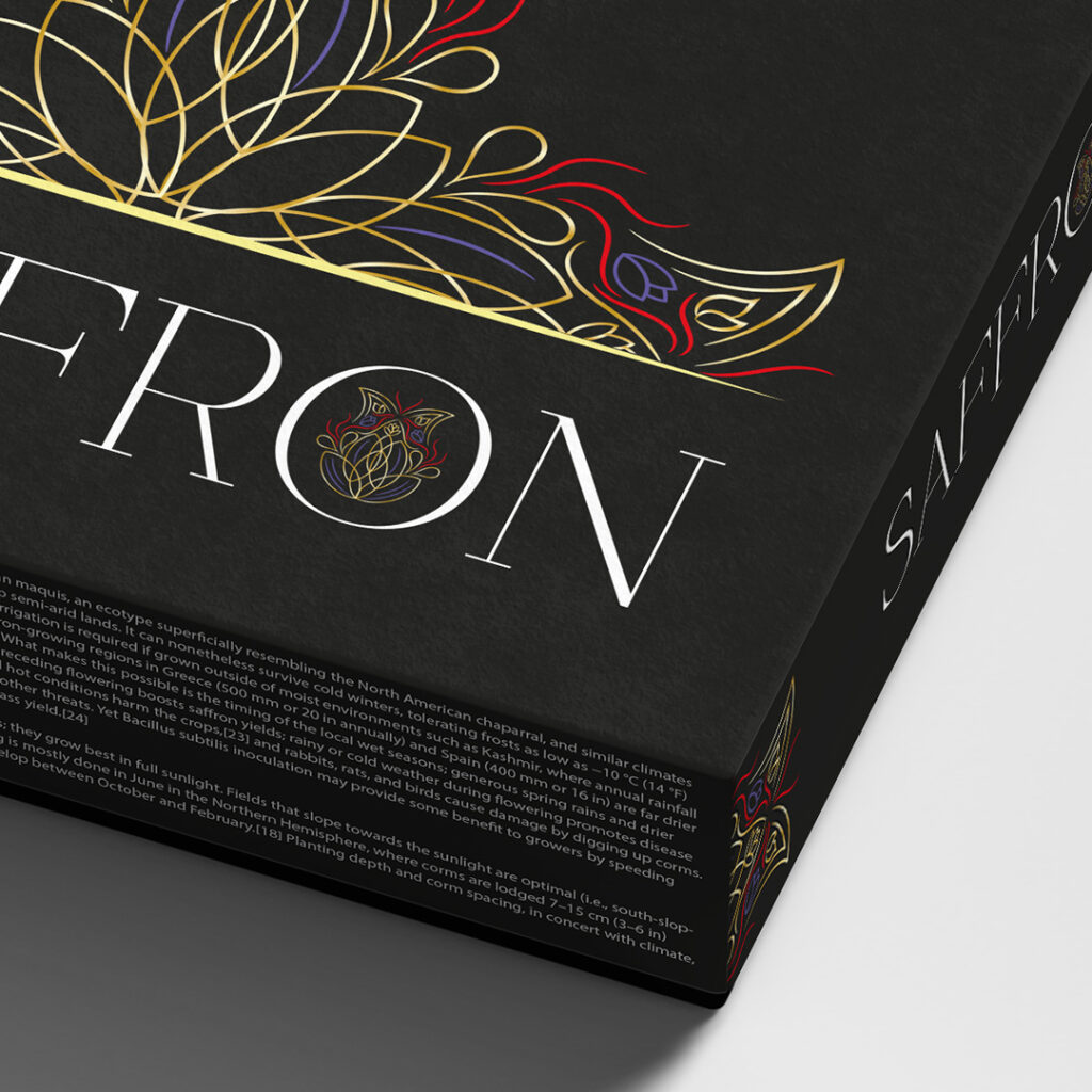
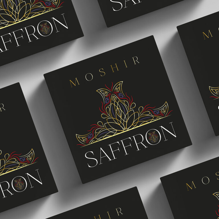
In the design of Moshir’s saffron export box, an attempt has been made to design a design away from the crowd and at the same time attractive inspired by the saffron flower (leaves, flag, etc.) geometrically in a different way and the texts are light, It should be classic and minimal, as well as the use of black color for the higher attractiveness of the geometric design and the better visibility of the saffron flower, which uses the colors of this plant to make it attractive to the audience. In order to convey the feeling of being old and luxurious of the product, after ideation and different studies, this study was finally approved.


