About
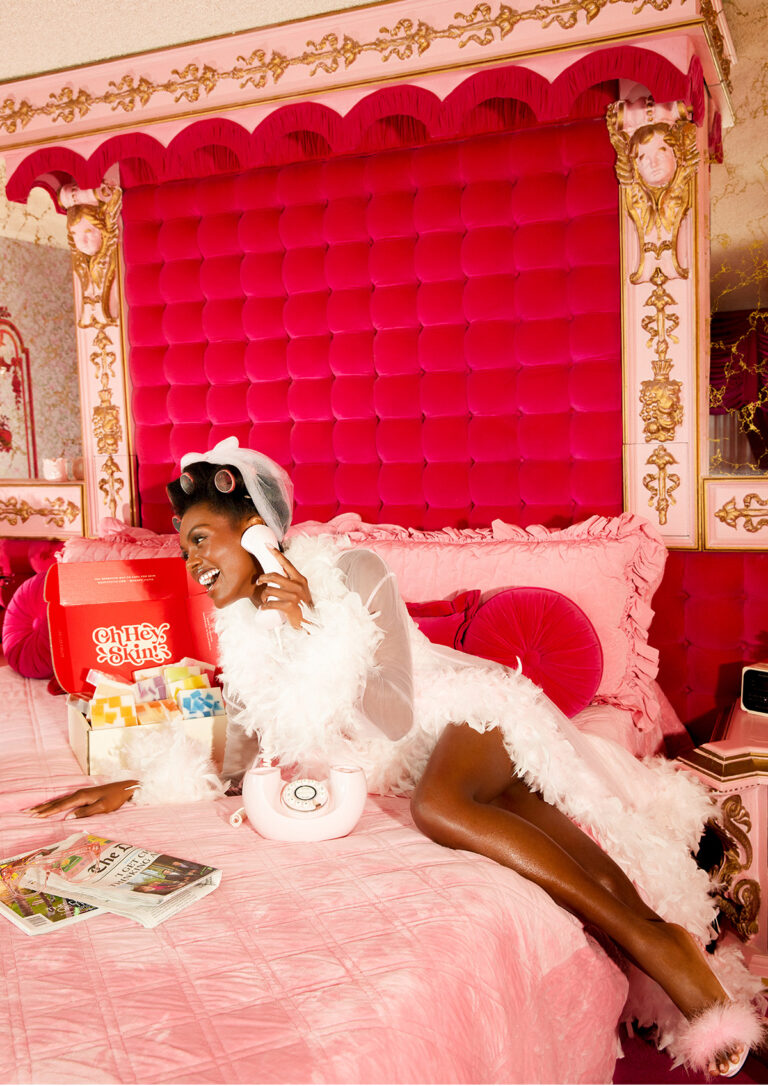
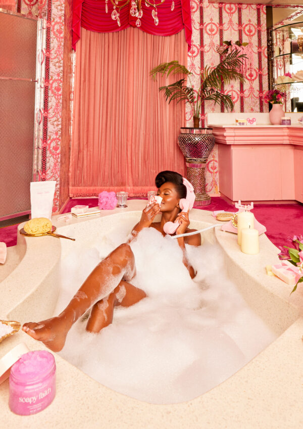
After surviving breast cancer, Krystal James was inspired to launch Soapy Faith, a family-owned clean beauty & bodycare brand specially formulated for sensitive skin. Natural products don’t have to be boring, so our agency, Saleah, partnered with them to create a visual identity designed to bring the fun to bodycare while inspiring consumers to reevaluate what they absorb physically and mentally.
Challenge
Soapy Faith was ready for their own ecommerce after successfully building a cult-following D2C but struggled to enter big-box retail due to a lack of strong branding. They needed to create a powerful yet fun brand to help them modernize perceptions of faith-based brands and change consumer behavior toward liquid and synthetic soaps vs. natural bar soap. We helped tackle all three challenges using impactful yet fun visuals and messaging.
Concept
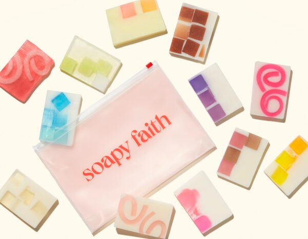
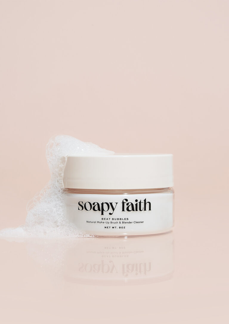
Collaborating with the founders, we dove head-first into strategy and oriented Soapy Faith around three central pillars: fun, vegan, and faith-based. Christian brands are often misunderstood as cloying or stale, so we playfully positioned the brand as Godsent, embracing puns, wordplay, and double entendres to break the mold and captivate consumers of all backgrounds. We also allowed the brand’s origin story of the Soapy Sisters’ trial to triumph to shine, empowering the verbal identity with optimism and encouragement. From there, the products helped us do the talking. We showcased their simple and clean (but never boring) formula, introduced the HappySkin guarantee, and championed glycerin as the hero vegan ingredient.
Design
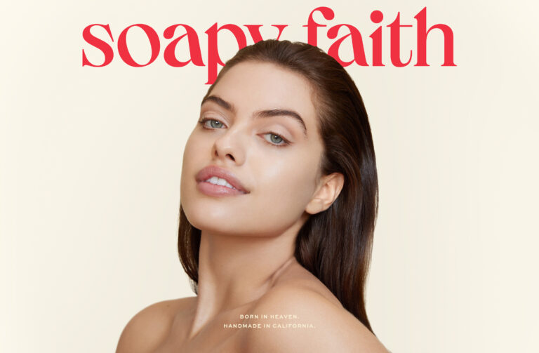
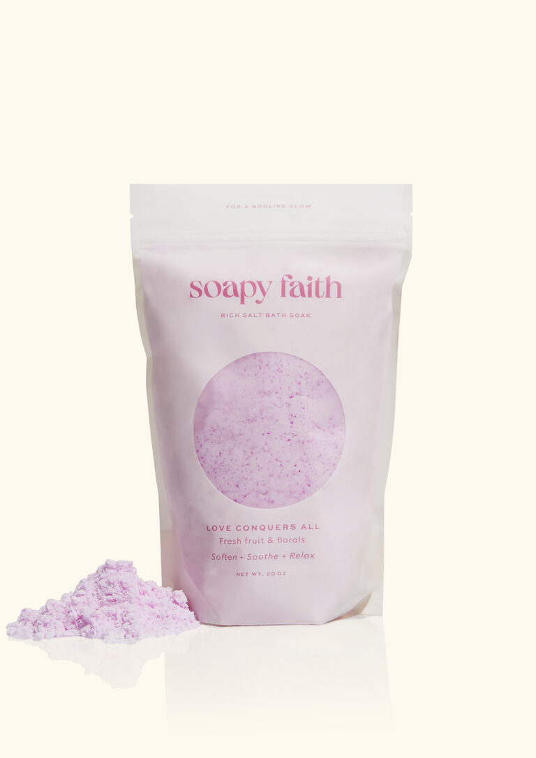
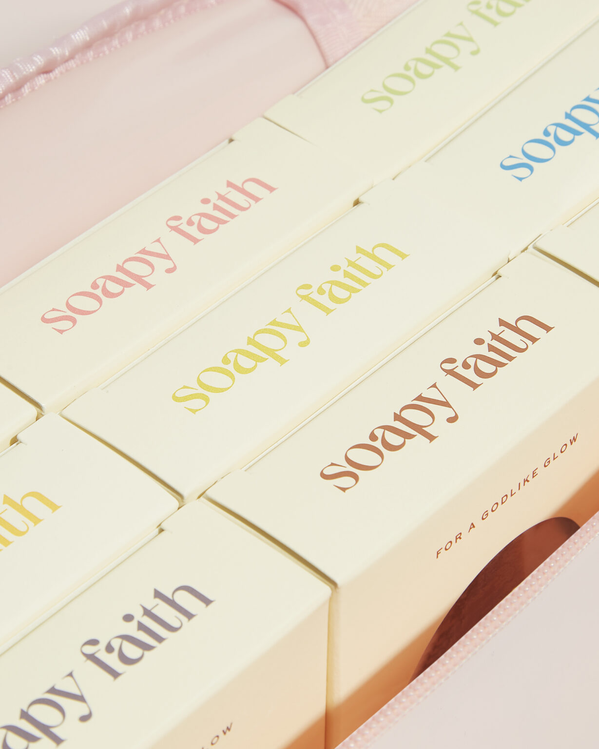
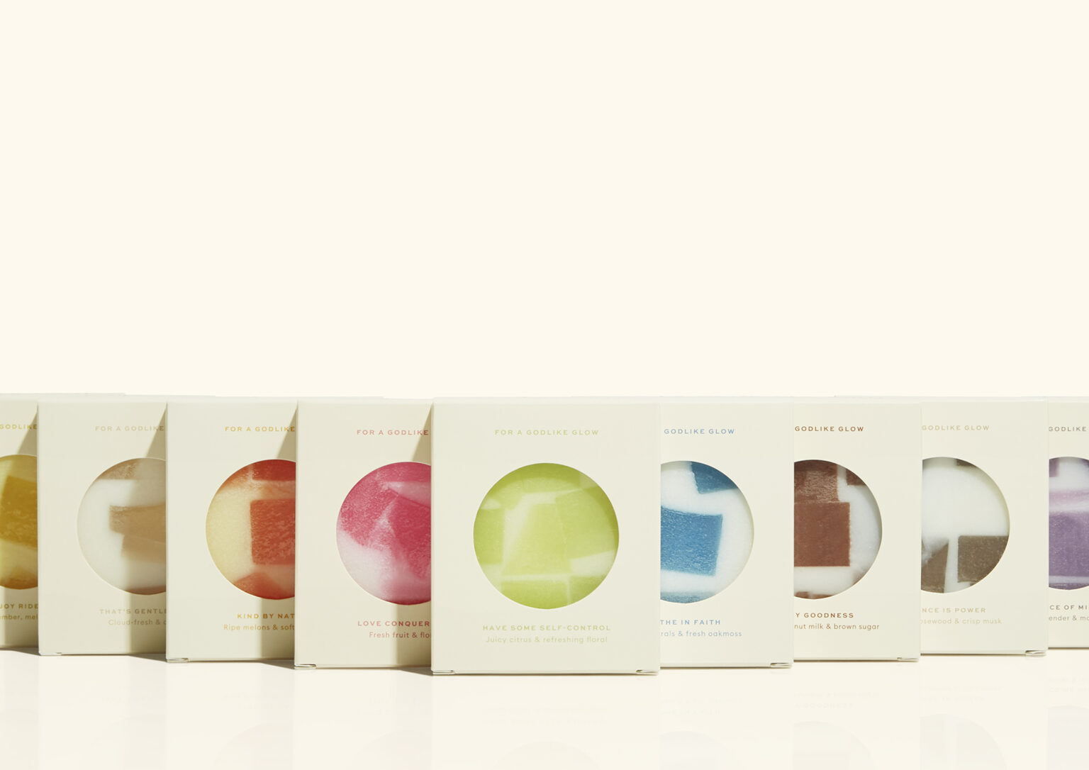
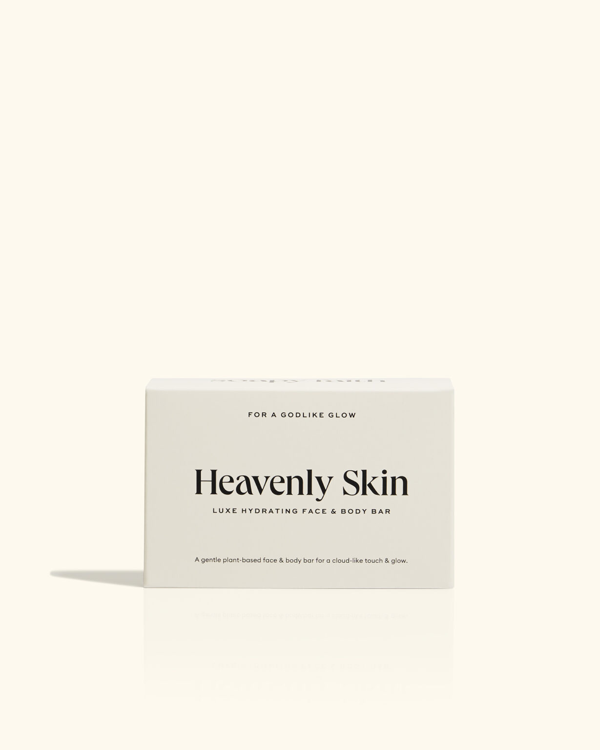
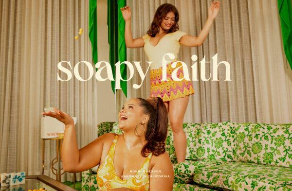
The visual identity needed to elevate Soapy Faith’s color palette and capture their sunny, uplifting brand story. We embraced a soft, swirly, 70s aesthetic as an ode to retro California, bucking the minimalist and neutral design trend in favor of bold and powerful colors that helped categorize the scents and special products such as their Breast Cancer Awareness line in the packaging phase. The relaxing design system was inspired by the brand’s original logo and its playful use of soap bubbles. We added water droplets and brought in typeface Queens to evoke that squeaky clean feeling and give the brand the final regal touch they needed to reign supreme in the bodycare space. We zigged where others zag by creating a color palette free of green and brown, setting us apart in the vegan and organic product space. Instead, our warm, friendly, and bold colors encompassed joy and allowed the natural skin tones and packaging to elicit the clean nature of the brand.
POTW Curator’s Insight
Soapy Faith is a story of resilience and rebirth. The brand is a testament to the power of faith and the courage to embrace life’s challenges. it’s about embodying a spirit of renewal that resonates with every consumer.
