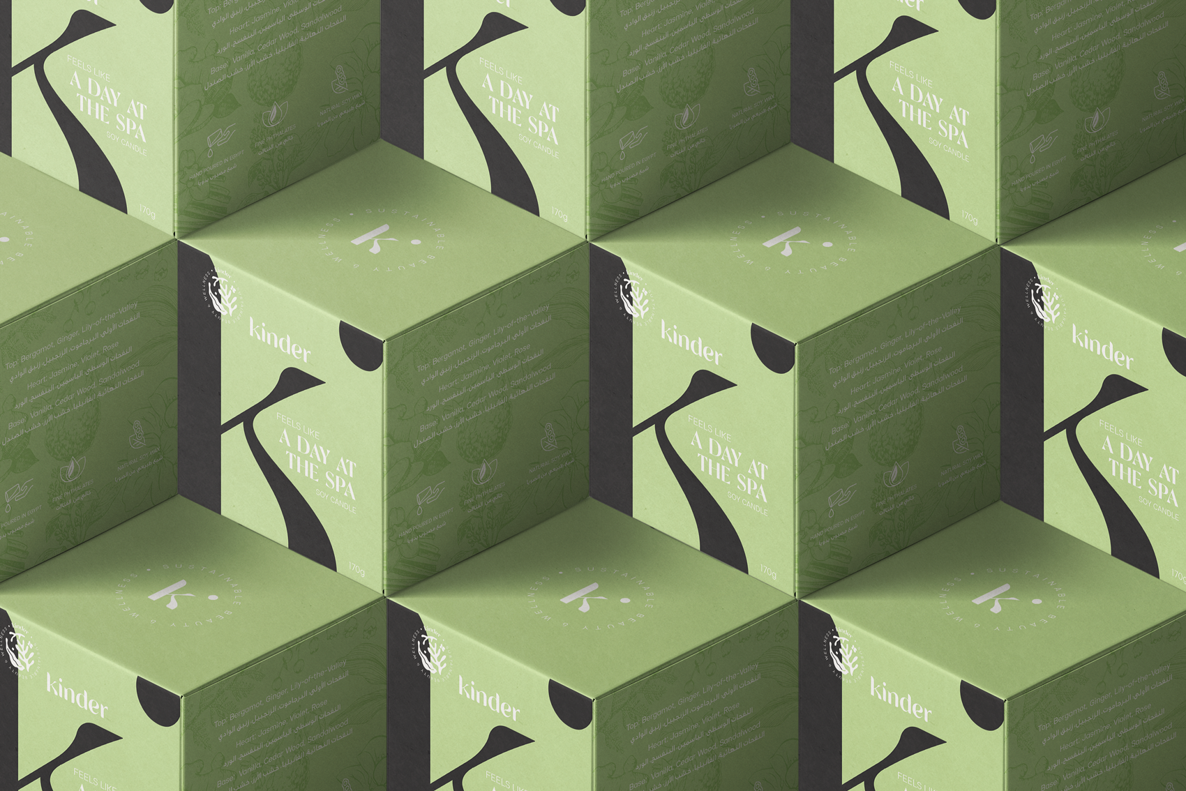
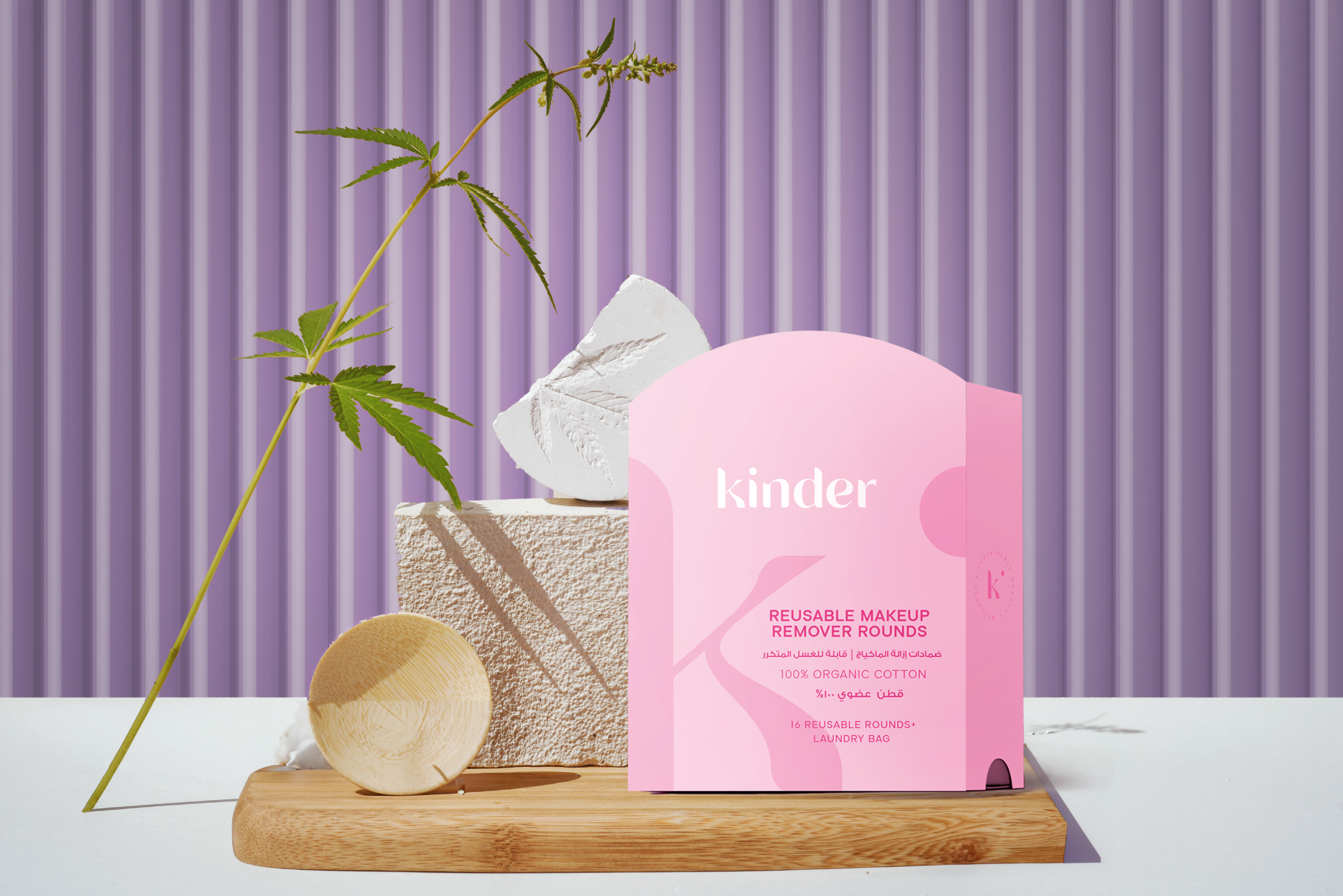
Customized eco-friendly products to the Kind Market. Rebrand the English logo, Arabic logo, packaging system, and creative direction.
About Kinder is a line of all self-care, eco-friendly products. With Kinder, we aim to prove that premium self-care and sustainable packaging can go hand in hand. With the beauty industry producing more than 120 billion units of packaging every year, we need to stop and think about the impact of our beauty routine and make it a whole lot easier.
Solution The brand’s identity is based on simplicity and minimalism. The packaging design is the most important aspect of the brand’s identity, as it reflects its values and mission in a split second. The typography used in Kinders’s branding was chosen to emphasize the brand’s minimalistic and modern style. The uniform design language of all kinds of printed materials contributes to brand recognition and strengthens the brand image.
Associations: modern, clean, stylish, simple, minimalist, aesthetic.
Tags: beauty, hair, packaging, skin, cosmetics.