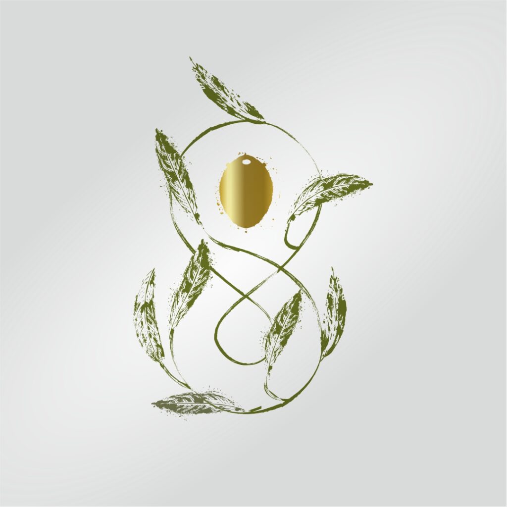
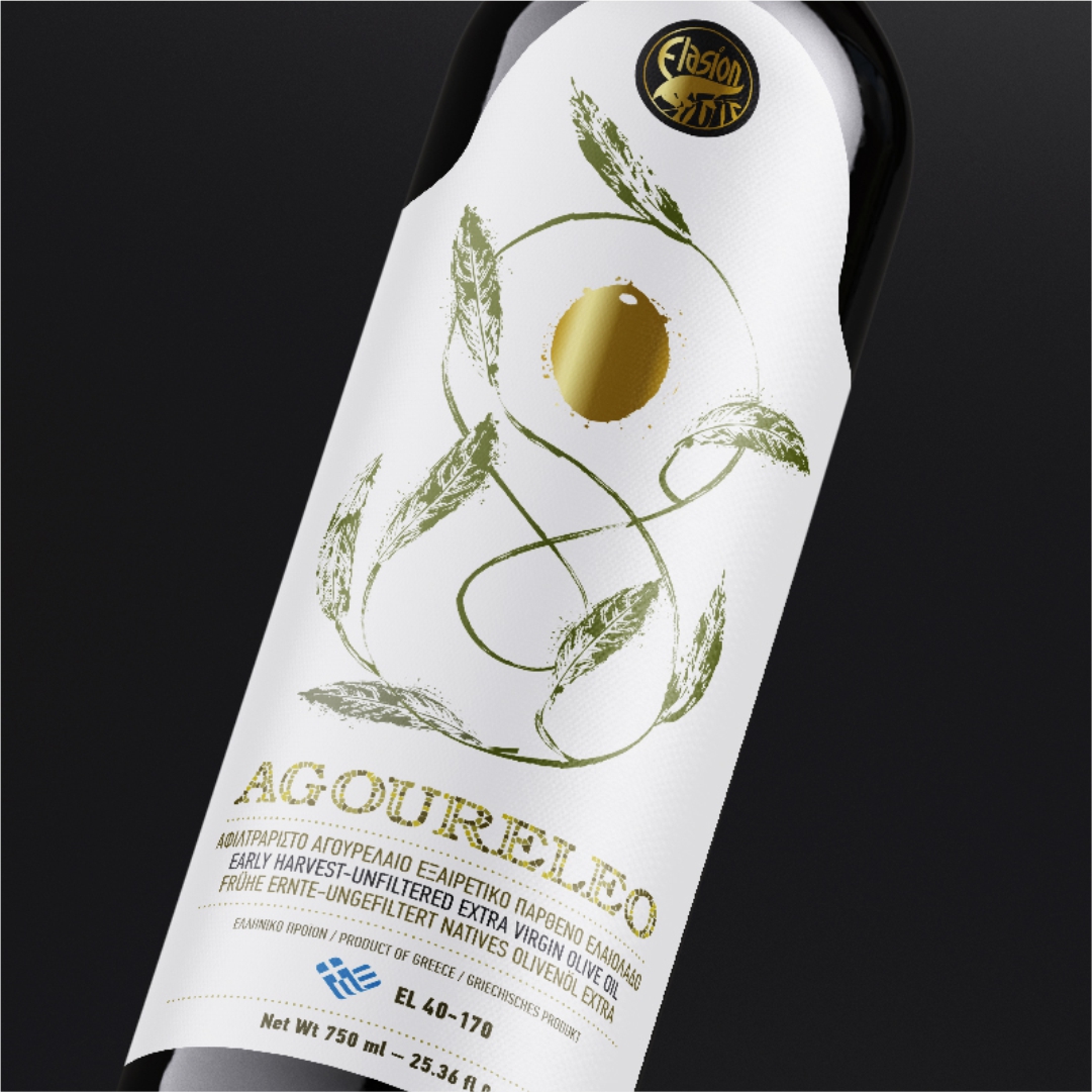
With inspired aesthetics from the olive tree, our label highlights it as a source of harmony. With its simple design and soft color, it speaks the language of nature, inviting you to discover its secrets.
The symbol of Infinity at the heart of the label reflects the constant flow of time and the mysterious evolution of nature. The olive leaves surrounding it express the sense of peace and eternity, as well as the wondrous power of nature.
At its center, the olive fruit showcases the vital strength of our product, offering a unique tasting experience that originates from the heart of the earth.
Our goal is to emphasize the authentic taste and vital significance of olive oil, conveying the eternal cycle of nature through a gift of love and well-being.
The minimalist design and clean colors of the label reflect the simplicity and natural beauty of the product, highlighting the authenticity of the taste and the renewed connection with nature.