Hopper & Copper is a harmonious fusion of hops and botanicals, creating a dry gin that defies expectations. With its unique flavor profile, this exceptional spirit bridges the gap between craft beer and gin, offering a truly distinctive experience.
The hops contribute a complex interplay of citrus, floral, and piney notes, while the carefully selected Portuguese botanicals add layers of warmth, spice, and a touch of Mediterranean charm. The result is a gin that is both familiar and surprising, inviting you to explore a new dimension of taste.
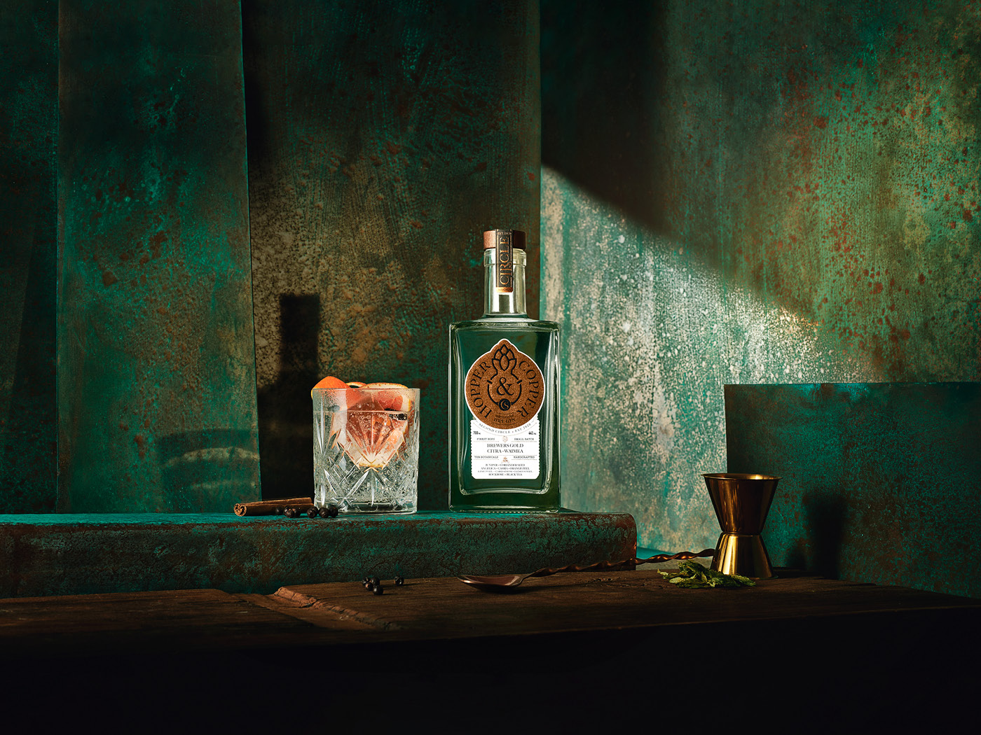
As a designer teamed up with the art director Diogo Peixoto, we were tasked with creating the concept, product naming, label, and visuals for Hopper & Copper. Our goal was to capture the essence of this innovative spirit and translate it into a visually appealing and memorable package. The final design, brought to life through the stunning photography of Numo, reflects the harmonious blend of flavors and the unique character of this exceptional gin.
Each element of the design was carefully considered to evoke the spirit of Hopper & Copper. The label’s symbols, lines with copper tones complement the gin’s rich flavor profile, while the elegant typography conveys its distinctive character. The overall aesthetic is both sophisticated and inviting, reflecting the quality and craftsmanship of the product.
Beyond its exceptional taste and visually striking design, Hopper & Copper also embodies a commitment to sustainability. The gin is crafted using locally sourced ingredients and eco-friendly production methods, ensuring that every sip contributes to a more sustainable future. Whether you’re a gin enthusiast or simply looking for a unique and memorable drinking experience, Hopper & Copper is sure to impress.