ARISE
“Crafted to Inspire, Created to Share—This is the Essence of Scotland.”
This tagline encapsulates the spirit of a groundbreaking whisky project rooted in experimental production. ARISE is more than a whisky; it’s a story, a journey, and an alchemical fusion of tradition and innovation. From the outset, this project captivated us—drawing us in with its ethos of storytelling, masterful language, and a touch of the magical. As designers, it challenged us to reimagine our craft, pushing boundaries to match the boldness of this conceptual whisky and its extraordinary evolution.
Moffat Distillery stands apart in the world of whisky. As the first Scottish distillery to embrace wood-fired stills, they are pioneers in an industry steeped in tradition. Their craft is driven by passion—a reverence for heritage, a sense of community, and a desire to invite customers on an engaging and unique journey. These values are woven into the DNA of their brand, making them truly rare in contemporary whisky production.
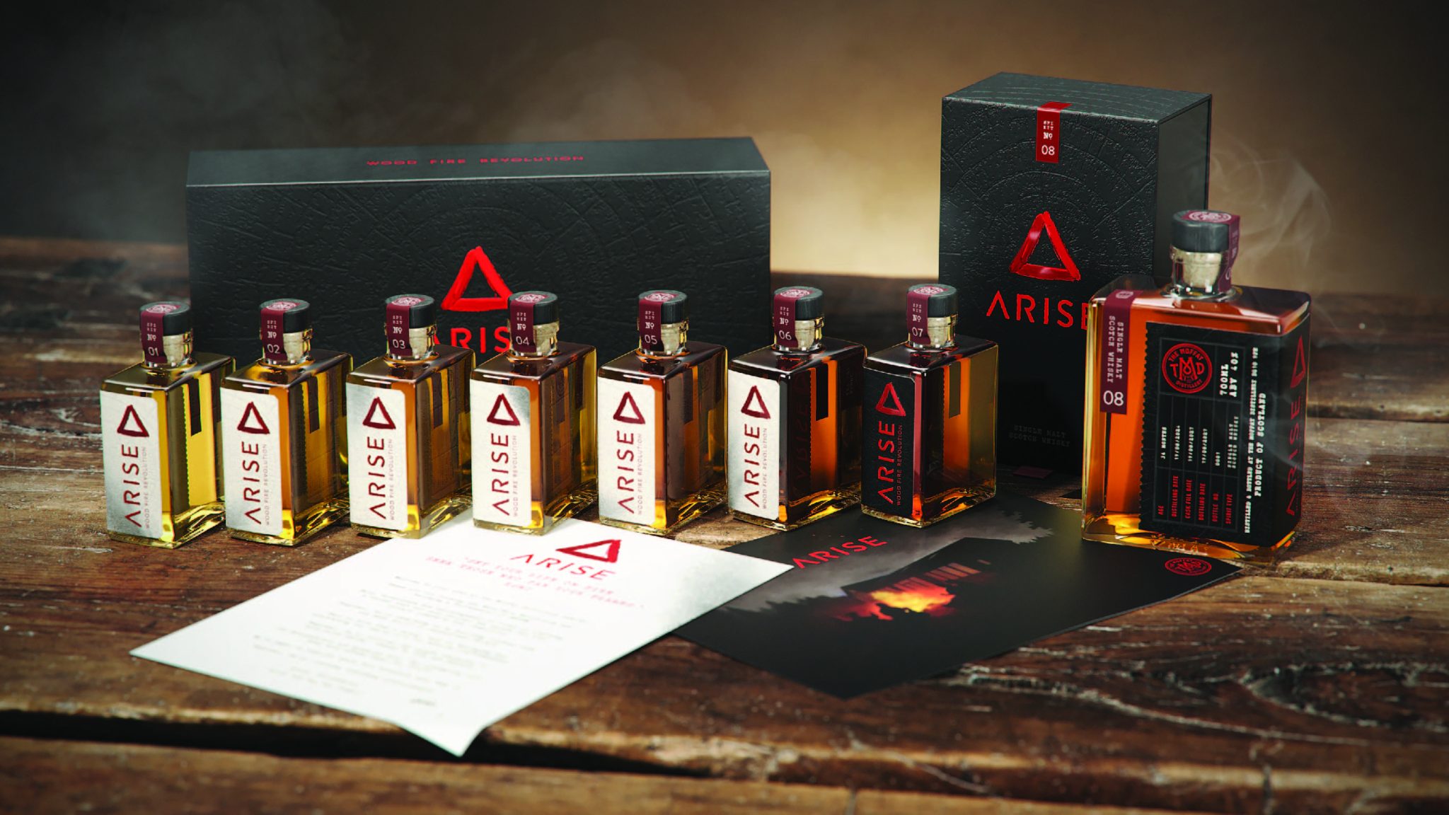
ARISE celebrates the transition from New Make Spirit to Single Malt Scotch Whisky through an extraordinary collection of eight bottles. Each spirit is born over a wood fire—a labor of love, handcrafted, hand-labeled, and individually numbered. Each batch is unique, experimental, and filled with anticipation for what’s to come. For whisky enthusiasts, it offers a magical sense of discovery, sparking the eternal question: “What’s next?”
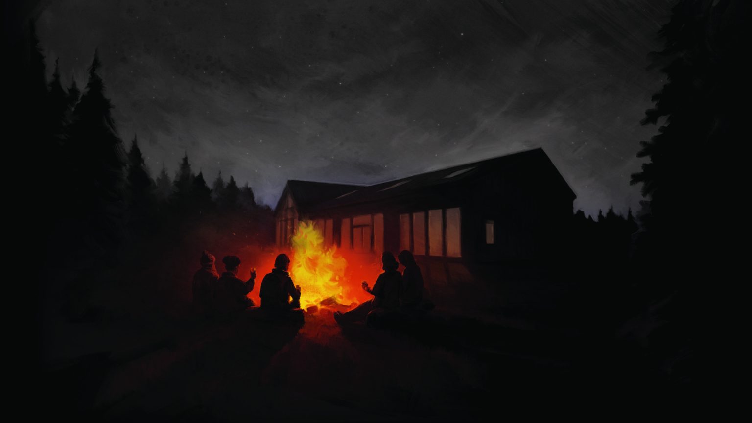
Our challenge as designers was to visually interpret this world of alchemy—melding new ideas with old traditions. The symbolism of fire inspired every element of our design. From communal campfires to flasks passed among friends, these images guided our creative process. The presentation box reflects this essence, featuring a burnt woodgrain texture. Within, seven small flask bottles contain New Make spirits, each aged six months apart, culminating in a final, fully matured bottle of Scotch delivered after three years.
In keeping with the experimental nature of ARISE, we embraced a clean, scientific aesthetic to depict the sequential evolution of the whisky. Handwritten, unique labels deliver a personal, artisanal touch across the brand’s packaging. Central to the identity is the red painted triangle, a powerful symbol in alchemy representing fire. This hand-painted mark echoes the traditional distillers’ practice of identifying casks by year and production stage, bridging the worlds of traditional craft and modern experimentation.
In every single aspect of this project, we carefully brought together an elegance, a simplicity and a sense of discovery, packaged and presented as a mysterious black and red box. While bold in its materiality, colours and textures, it still manages to communicate its story with restraint and a quiet voice over the crackle of the campfire whispering ‘ that’s just enough’.


