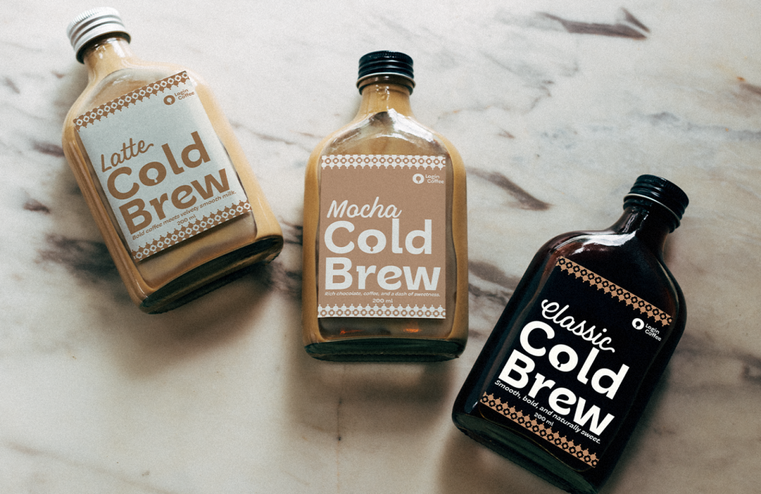
Login Coffee, a brand rooted in the art of coffee-making located in Maros, South Sulawesi, Indonesia, sought a complete rebranding to better align its visual identity with its mission and unique selling points: freshness, education, customizability, and an interactive coffee-making experience. The project scope included redesigning the logo, typeface, packaging, web interface, and overall brand identity to create a cohesive, premium image that resonates with its audience.
Identified ProblemsLogo Design Issues:
- The old logo lacks balance and proportionality, making it unsuitable for display and print in various formats. The coffee bean and key combination does not effectively represent the brand’s core values of freshness, education, or interactivity. The overall design is rigid and fails to evoke the warmth and personality associated with coffee culture.
- Typography Challenges: The typeface does not align with the brand’s vision of being approachable and modern. Font dimensions appear disconnected from the logo, leading to visual inconsistency.
- Brand Identity Gap: The old identity does not adequately communicate the premium, inviting, and interactive nature of the Login Coffee experience. The lack of a cohesive color palette and design language leads to weak brand recognition. Lack of Usability: The old design does not scale well for digital platforms or packaging, reducing its adaptability for branding across mediums . The lack of storytelling elements in the visual identity fails to create an emotional connection with consumers.
Solution:
- Solutions ProvidedLogo Redesign: The new logo combines the essence of coffee (beans and cups) with the symbolic keyhole to communicate Login Coffee’s mission of unlocking rich, customizable coffee experiences.Designed with proportionality and simplicity to ensure scalability and visual balance across all mediums.
- Typography Customization: Created a custom font inspired by the new logo’s shapes, ensuring a cohesive and unique typeface that reinforces the brand’s personality.Improved font proportions to enhance legibility and brand recognition.
- Brand Identity Development: Established a consistent visual language through the use of earthy tones, playful doodles, and premium design elements.Ensured the identity reflects warmth, authenticity, and interaction, aligning with the target audience’s expectations.
- Adaptation Across Platforms: Designed packaging that integrates the new logo and doodle elements to make products stand out on shelves and in online listings.Developed a user-friendly web design with interactive features to enhance the online shopping experience.


