(the briefing / the project)
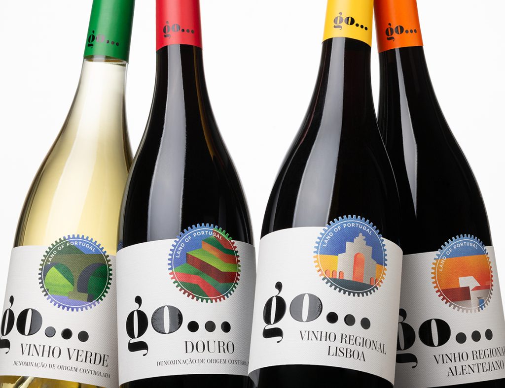
The creation of the ‘go…’ brand, the ‘land of Portugal’ copy and the graphic project were worked on simultaneously so that each bottle would be an invitation to discover the wines and the respective region.
The challenge was to design and build a narrative that would constitute an invitation to discover Portugal through wine.
The ‘go…’ brand is easy to memorise and conveys a sense of movement. The two letters and the ellipsis marks have a strong visual impact and create empathy with the consumer, reinforced by the illustrations that appear cut out on the label, referring to the shape of a seal and the sun at the same time. The illustrations recreate and represent the landscape, architectural features and colours that characterise each of the wine regions in this collection.


