Auraé is a brand that embodies freshness, elegance, and modernity in the world of personal care and beauty. Its visual identity is defined by a combination of vibrant yet sophisticated colors, a stylized typography, and a minimalist design that evokes exclusivity and well-being.
1. Packaging and Container Design
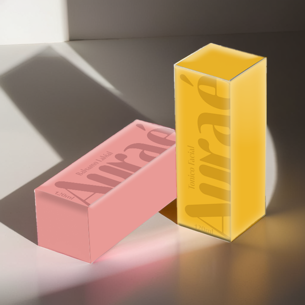
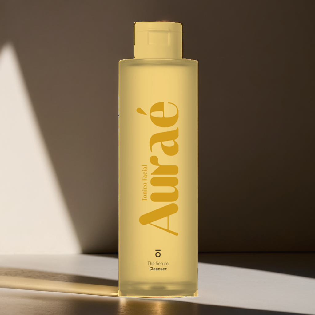
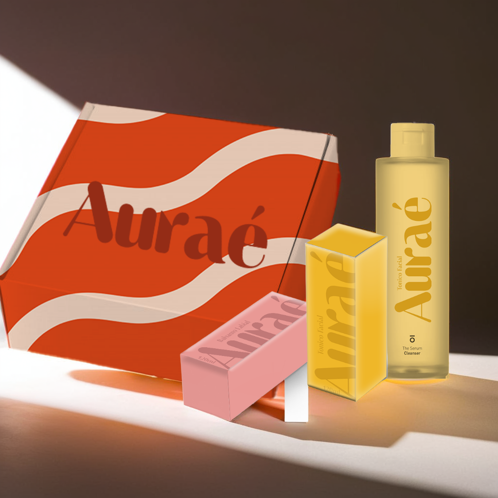
The mockups reflect a premium aesthetic, balancing natural and contemporary elements. Warm and soft colors, such as mustard yellow and pale pink, are used to evoke feelings of brightness, freshness, and delicacy.
- Facial Toner: Housed in a translucent yellow bottle that conveys purity and vitality, featuring an elegant, large-sized typography to enhance brand recognition.
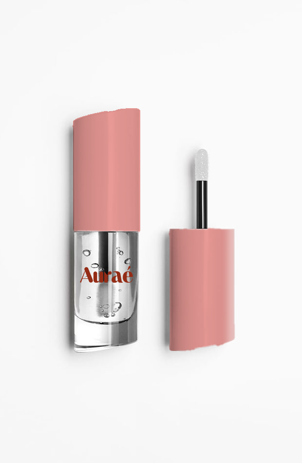
- Lip Balm: The pink packaging exudes softness and femininity, while the minimalist bottle with a practical applicator makes it appealing to consumers.
- Presentation Box: A dynamic design with wavy patterns and vibrant colors that capture the brand’s fresh and modern essence while reinforcing its visual identity.
2. Values and Emotions to Convey
- Exclusivity and Sophistication: The modern serif typography and carefully selected color palette reflect a high-quality brand.
- Authenticity and Freshness: The simplicity of the design and the vibrant colors create a connection with well-being and natural beauty.
- Innovation and Modernity: The clean and well-structured packaging reinforces the idea of an innovative product, attracting consumers who seek functionality without compromising style.
Overall, Auraé’s mockups communicate a strong visual identity, striking a balance between sophistication and accessibility, ensuring that the brand is perceived as a premium choice in the personal care market.