Robot Food has partnered with Hip Pop, an award-winning soft drinks and alternative pop company, to transform their visual and verbal brand identity.
The rebrand included a complete repositioning to fuel their growing ambition and take on mainstream pop. The new identity includes a core creative idea, strapline, packaging, brand world and improved range navigation across their kombuchas, CBD kombuchas and sodas.
Founded in Manchester in 2019, Hip Pop quickly became known in the gut health space for its repertoire of bold flavours and real ingredients. But as the category became more saturated, the ‘indie craft producer’ feel of the original identity no longer reflected founders Kenny and Emma’s bigger ambition – to take on mainstream pop to become the go-to soft drink.
Big ambitions called for a big change
In a health-obsessed market awash with gut puns and pastels, Hip Pop wanted to change the narrative, alleviate the pressure, and make pop fun again. With the category so focused on functional benefits, the brand needed to connect on an emotional level, by being a true solution, not another problem. A little treat without the weight that comes with being ‘bad’ or ‘good’.
“Hip Pop had the story, the product, and the unapologetic attitude. Our job was to craft a positioning that made them stand out, not blend in” says Robot Food’s Creative Strategist Chloe Stacey. “Inspired by its Manchester roots and the founders’ ‘say it like it is’ spirit, we took Hip Pop from just another ‘booch’ to the next Brit Pop revolution – bold, iconic, and ready to shake up the shelves.”
Serving a refreshingly real attitude
The insight pointed to consumers craving real freedom, real experiences, and choices that validate their independence. They want to feel alive and live in the moment as an antithesis to misinformation and an overtly edited view of life perpetuated by social media. The big idea therefore positioned Hip Pop as a brand that’s best enjoyed live – in the moment, with friends and without filter – because everything is more satisfying that way.
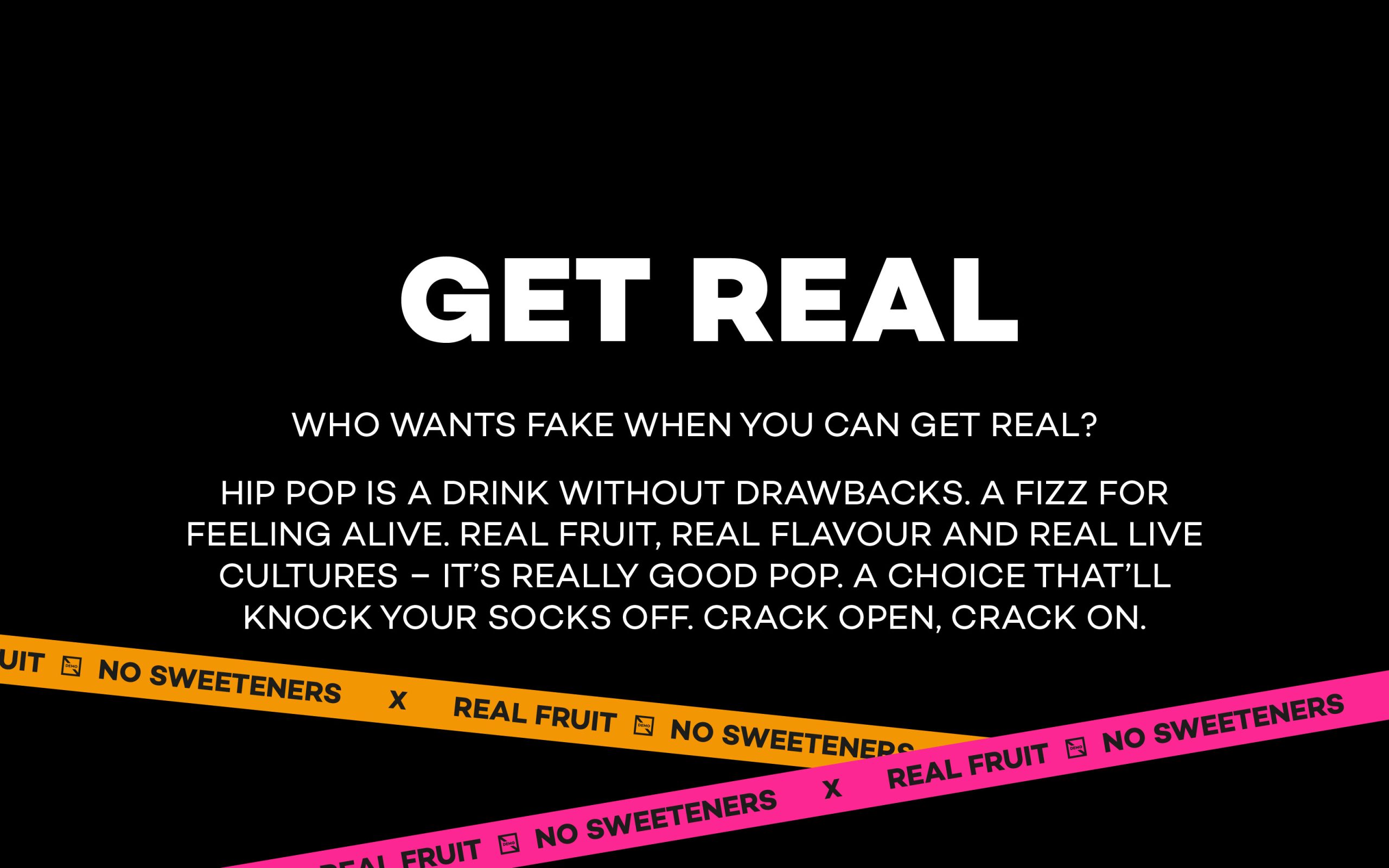
From this, the brand strapline ‘Get real’ was born to encapsulate Hip Pop’s refreshing attitude. ‘Get real’ is a wake up call, a mindset, a way of life. It heroes not only the real ingredients that go into all Hip Pop’s drinks, but also celebrates real, live, unscripted experiences – while indirectly calling out the ‘fakeness’ of their mainstream competitors.
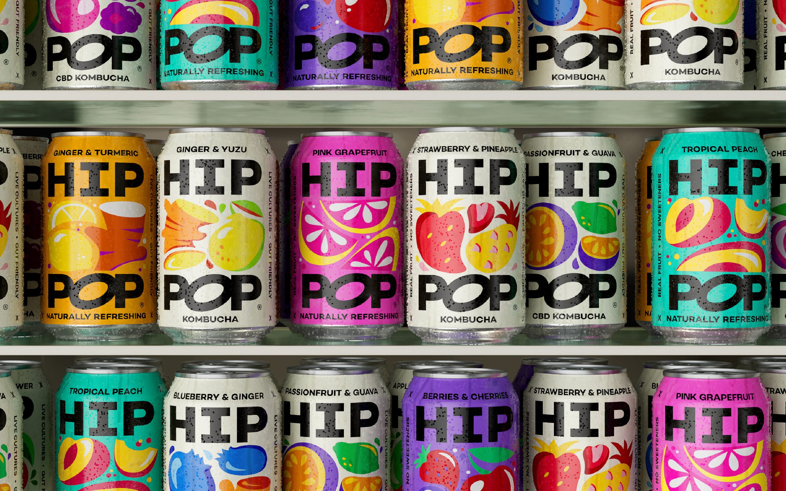
An identity that pops
Hip Pop’s previous look and feel was full of personality. But their characterful illustrations were more akin to craft beer, and the lack of colour variation across the products was confusing consumers.
To have an instant impact on shelf, the drinks had to look tasty. So the visual identity needed to bring the ingredients to the forefront and celebrate flavour. All while making the brand name more prominent.
Taking the ‘scoby’-shaped ‘O’ from the previous logo and amplifying it, the new wordmark is bolder, more impactful, and a subtle nod to the gut-friendly nature of the drinks. Now split across two lines on the packaging, ‘Hip Pop’ acts as a proud framing device for the contemporary fruit illustrations that feel almost alive – as if they’re bursting straight out of the can.
For colour, Robot Food chose to move away from the delicate palettes common in the category, favouring black – coupled with vibrant contrasting colours for sodas and cream for kombucha. Each range and flavour is now clearly distinguishable, making Hip Pop easier to spot and shop, in store and online.
“Hip Pop needed an identity that would take them from a challenger to a leader”, says Robot Food’s Senior Designer Craig Lindsey. “Channelling Hip Pop’s refreshingly alternative personality, the design is an explosion of fun, energy and attitude, while allowing the flexibility to extend beyond the cans into the wider brand world. It’s now a brand that can grow and evolve with them.”
Realistically optimistic
Born from the founders’ northern no-nonsense attitude, Hip Pop’s sweet and sour tone of voice is the antithesis of the overdone gut puns and lackluster health claims that are commonplace in the category.
Created by Robot Food, the brand voice is realistic, authentically northern and slightly self-deprecating, but always with an optimistic after taste. Bolstered by their new strapline ‘Get real’, the key messages aren’t afraid to call out competitors, and the soft drink industry as a whole, while establishing Hip Pop as a real, refreshing alternative for all moods, occasions and lifestyles.
Lizzie de Jong, Senior Copywriter at Robot Food explains; “Kenny and Emma are incredibly passionate about creating the tastiest, best-quality soft drinks possible. So we wanted Hip Pop’s voice to ramp up the real, have an opinion, and take the words right out of their mouths.”
A feeling that won’t fizzle
As Hip Pop looks to grow its direct-to-consumer presence and retail footprint, Robot Food developed an all-encompassing experience that brings the brand’s unique outlook to life beyond the can.
Now armed with an identity that packs a punch across all touchpoints, including in store, online and social media, Hip Pop are ready to break free from the confines of the gut health category and become an advocate for pop done better.
Emma Thackray, Co-Founder of Hip Pop says “Robot Food has been a joy to work with, and as fellow ambitious northerners, they just got what we’re all about. They’ve pushed us to create a new positioning that really sets us apart and the new brand not only stands out, but offers us the category leadership we hoped for. The new branding has already been directly responsible for unlocking key new retail partnerships and the feedback has been unanimously positive.”
The new look is currently being rolled out and will hit stores from February.