Contact: contact@bbrcreatives.com
Description:
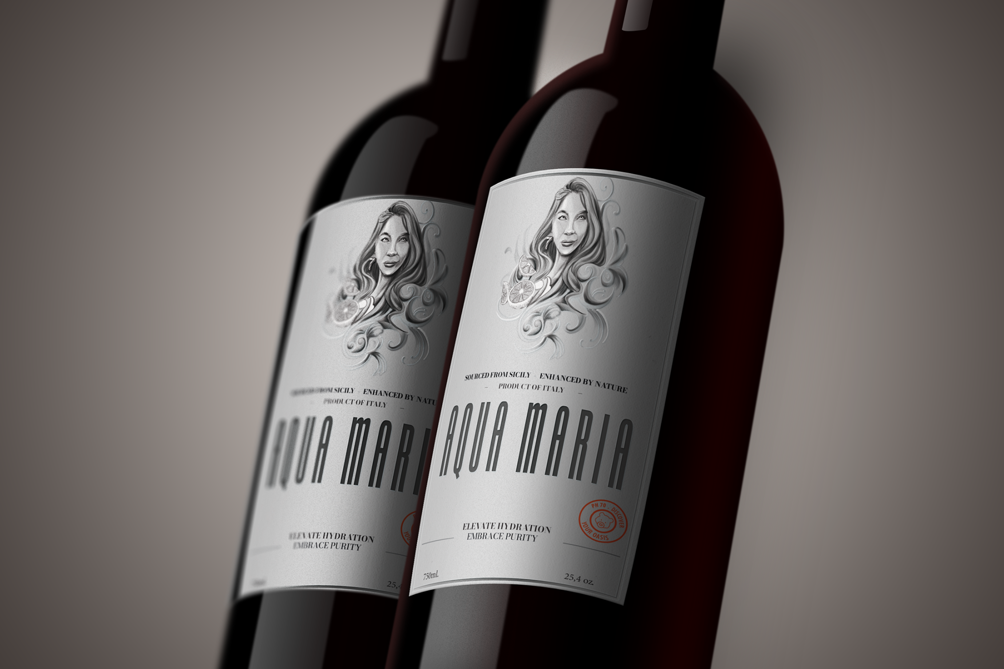
Aqua Maria is a bold conceptual packaging project that redefines premium hydration with a luxurious, feminine elegance. Sourced from the pristine springs of Sicily and enhanced by nature, Aqua Maria is more than just water—it’s a lifestyle statement.
The label design blends classical beauty with modern sophistication. A hand-drawn illustration of “Maria”—a symbolic muse—evokes purity, fluidity, and strength, while the silver-toned palette reinforces the idea of elevated minimalism. The tall, art-deco-inspired typography adds a sense of authority and refinement, making the bottle stand out on shelves and in premium hospitality spaces.
Key Design Highlights:
- Monochrome elegance: A matte silver label with dark accents for a clean, high-end look
- Illustrative centerpiece: A custom portrait that adds a personal, artisanal touch
- Typography: A tall, sleek logotype that commands attention while maintaining elegance
- Brand message: “Elevate Hydration – Embrace Purity” captures the essence of the product
- Finish: Simulated print textures and embossing details for a tactile luxury appeal
This project was created to demonstrate how bottled water can transcend utility and become a powerful branding experience. Ideal for boutique hotels, spas, or premium events, Aqua Maria showcases the potential of narrative-driven design in the beverage industry.

