Inspired by the natural rhythms of growth and the structured beauty found in botany, we developed a system rooted in symmetry, repetition, and organic forms. The custom graphic motif — a stylized botanical burst — acts as a visual anchor across packaging, textiles, and environmental branding. The design language balances minimalism with a tactile, human feel, using both clean typography and hand-crafted visual elements.
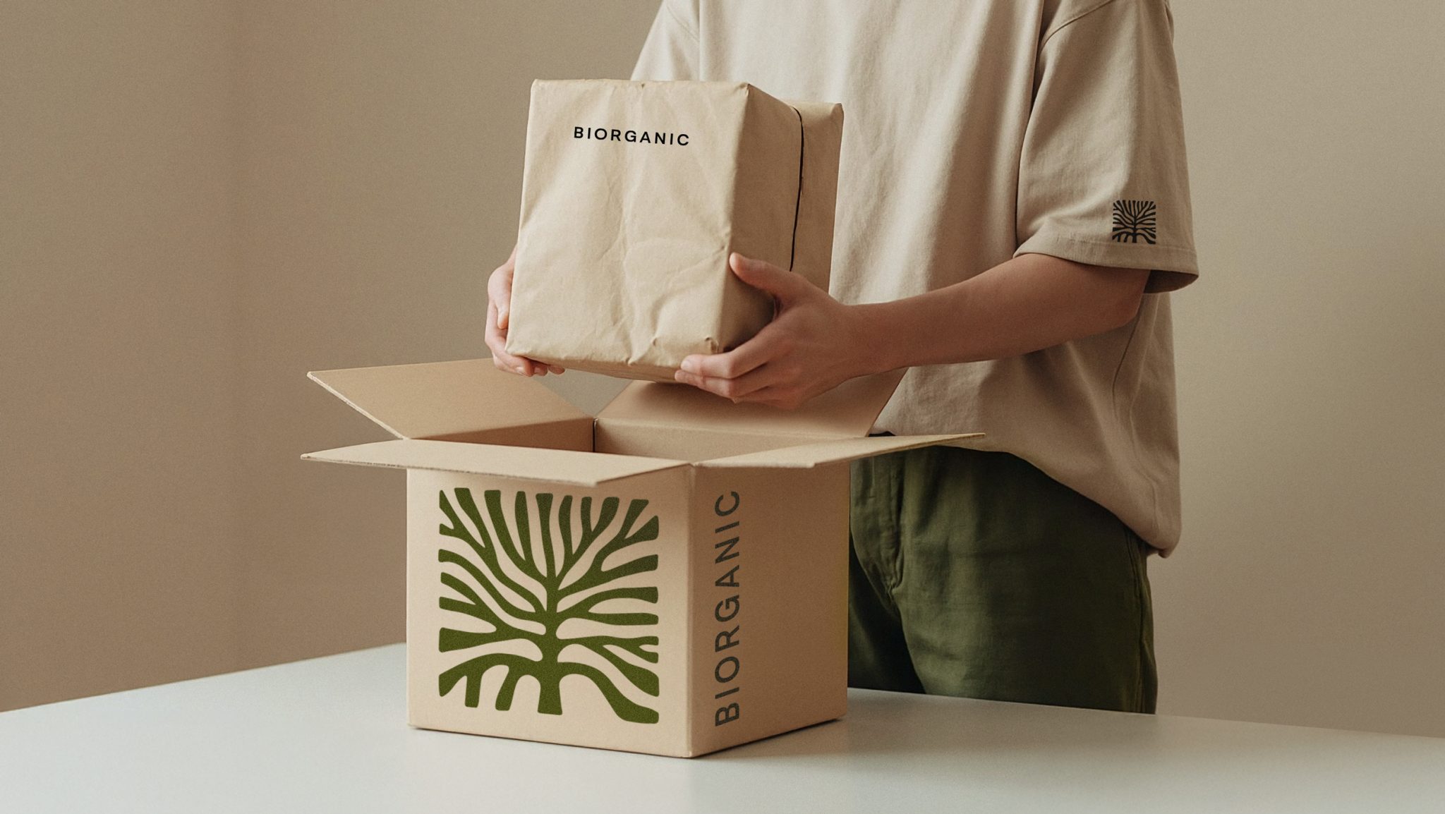
The visual identity for Biorganic delivers a sense of calm precision — a balanced blend of structure and softness, where clean geometry meets organic warmth. The design evokes a grounded, slow-living aesthetic: tactile, thoughtful, and quietly iconic. A signature graphic motif, reminiscent of botanical forms or the symmetry of cut produce, becomes the core visual element. Repeated across packaging, textiles, and in-store applications, it creates a cohesive and recognizable language without relying on loud branding.
The color palette centers around a deep, vegetal green paired with soft neutrals — evoking freshness, growth, and purity. Typography is minimal yet confident, using clean sans-serif type in restrained sizes, allowing materials and form to speak first. Packaging structures are simple and intuitive, often incorporating soft-edged boxes, paper handles, and monochrome prints. The result feels less like “packaging” and more like a system of everyday rituals — inviting to hold, reuse, and integrate into lifestyle.


