Bright, Bold, and Totally Addictive: The Daily Dose Packaging Design That Turns Heads
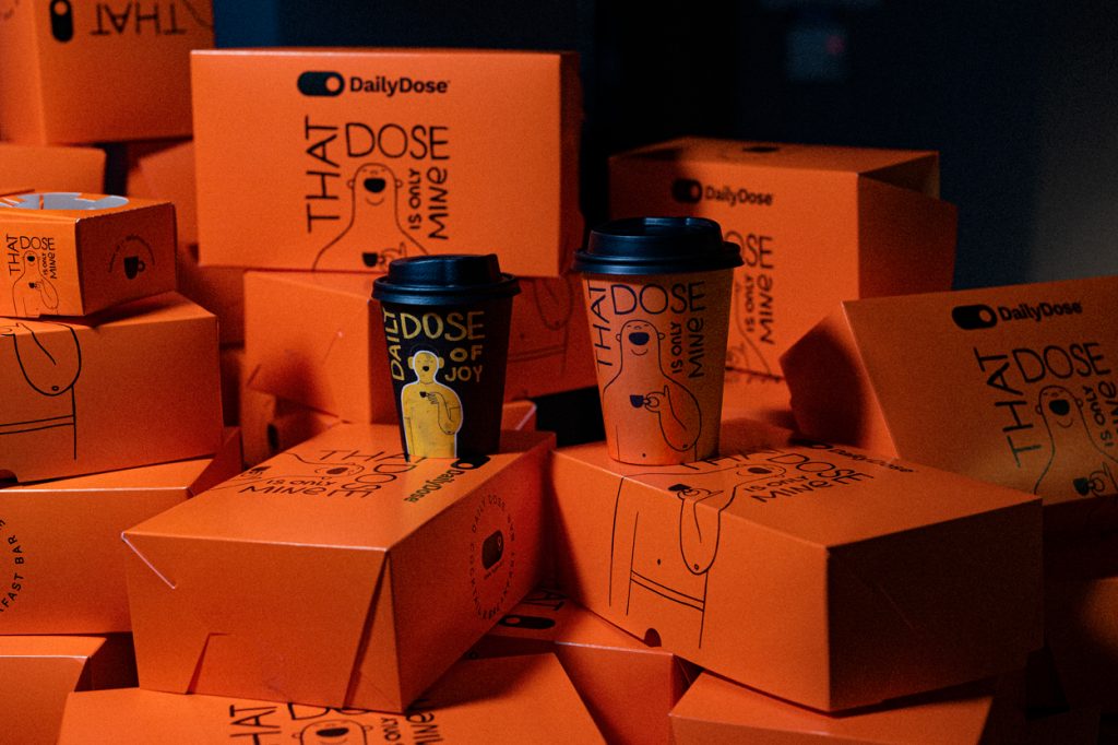
Imagine grabbing your morning treat, but instead of another boring box, you’re greeted with this: vibrant orange cartons that practically shout fun and energy. That’s exactly what Daily Dose delivers — packaging that’s impossible to ignore and perfectly matches the joy of what’s inside.
These playful boxes feature bold black illustrations and hand-lettered typography, keeping the vibe minimal yet quirky. At the center of attention? A grinning, relaxed character with a coffee cup and a caption: “That Dose is Only Mine!” — a cheeky reminder that you might not want to share your snack.
The monochromatic doodle style adds an approachable, hand-crafted touch to the otherwise loud orange backdrop. This contrast creates visual interest while maintaining a clean and modern aesthetic. Whether stacked together or opened to reveal a golden-brown pastry, these boxes tell a story of indulgence, individuality, and lighthearted humor.
Daily Dose proves that packaging can be more than functional—it’s an experience. From its attention-grabbing color palette to its witty personality, this design feels both premium and relatable. It’s not just a container for baked goods; it’s a statement piece, a mood lifter, and a small reminder to enjoy life’s little treats.
Takeaway: When design speaks, people listen. Daily Dose nails it with packaging that feels as good as the treat tastes—personal, joyful, and oh-so-shareable.


