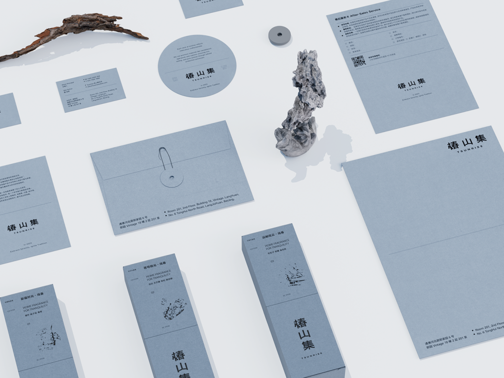
In the brand visual system of the online incense brand “TSUNRISE,” we employ a top-and-bottom zoning design approach to create a precise structural layout that evokes rich layers and a sense of spatial depth.
Each product’s design inspiration is drawn from its unique fragrance, which we artistically translate into visual symbols, seamlessly blending the scent with the visual experience.
To better convey the tranquility and lingering essence of the incense products, we carefully selected an elegant gray tone for the packaging design. This not only expresses the product’s sophistication and calmness but also fosters a serene atmosphere aligned with the brand’s temperament, allowing consumers to experience the distinctive peace and quietude of “TSUNRISE” through both sight and scent.
在线香品牌“椿山集”的品牌视觉系统中,我们采用上下分区的设计形式,以精准的结构布局营造出丰富的层次感和空间感。
每款产品的设计灵感都源自其独特的香气,我们将这些香味艺术化地转化为视觉符号,使香味与视觉体验完美融合。
为了更好地传达线香产品的宁静与悠远,我们在包装设计中精心选择了雅致的灰色调,不仅表达出产品的高雅与沉稳,还进一步营造出与品牌气质相契合的安静氛围,使消费者在视觉和嗅觉的双重体验中,感受到“椿山集”独有的平和与静谧。


