Ezousa Winery – Packaging Redesign Inspired by Nature’s Rhythm
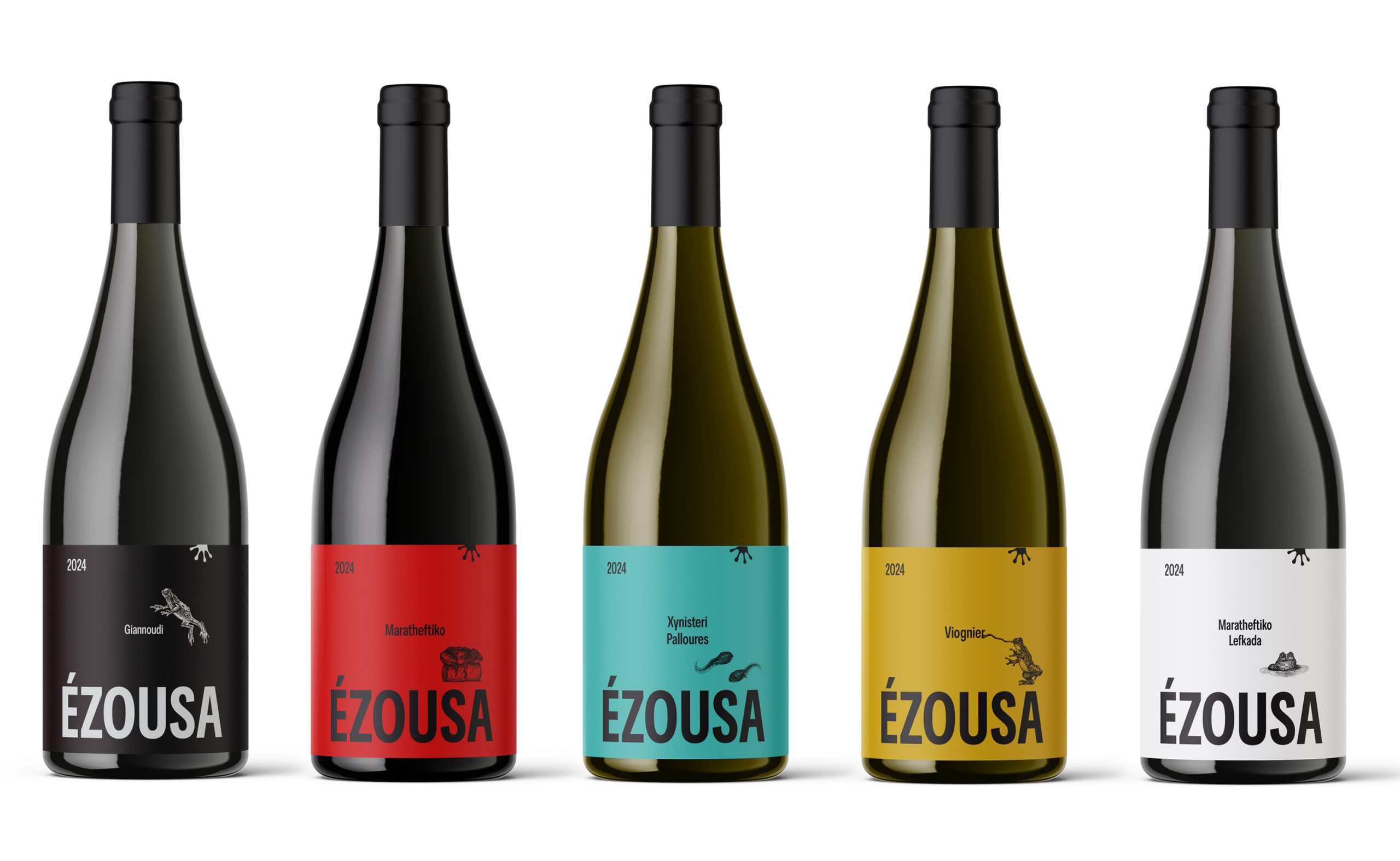
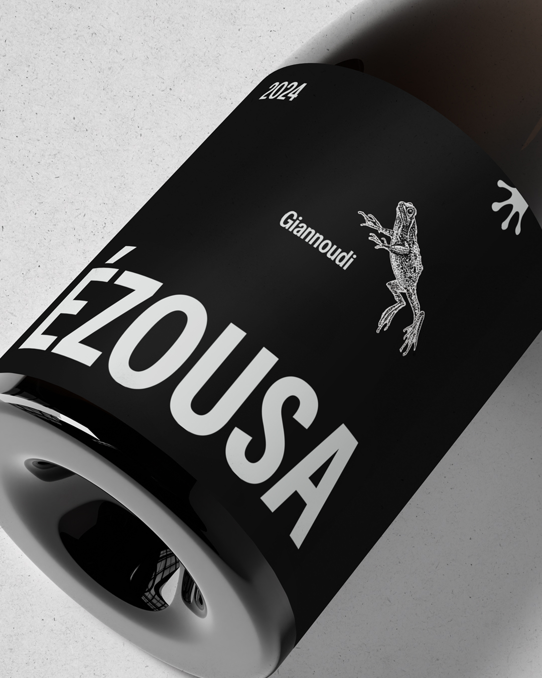
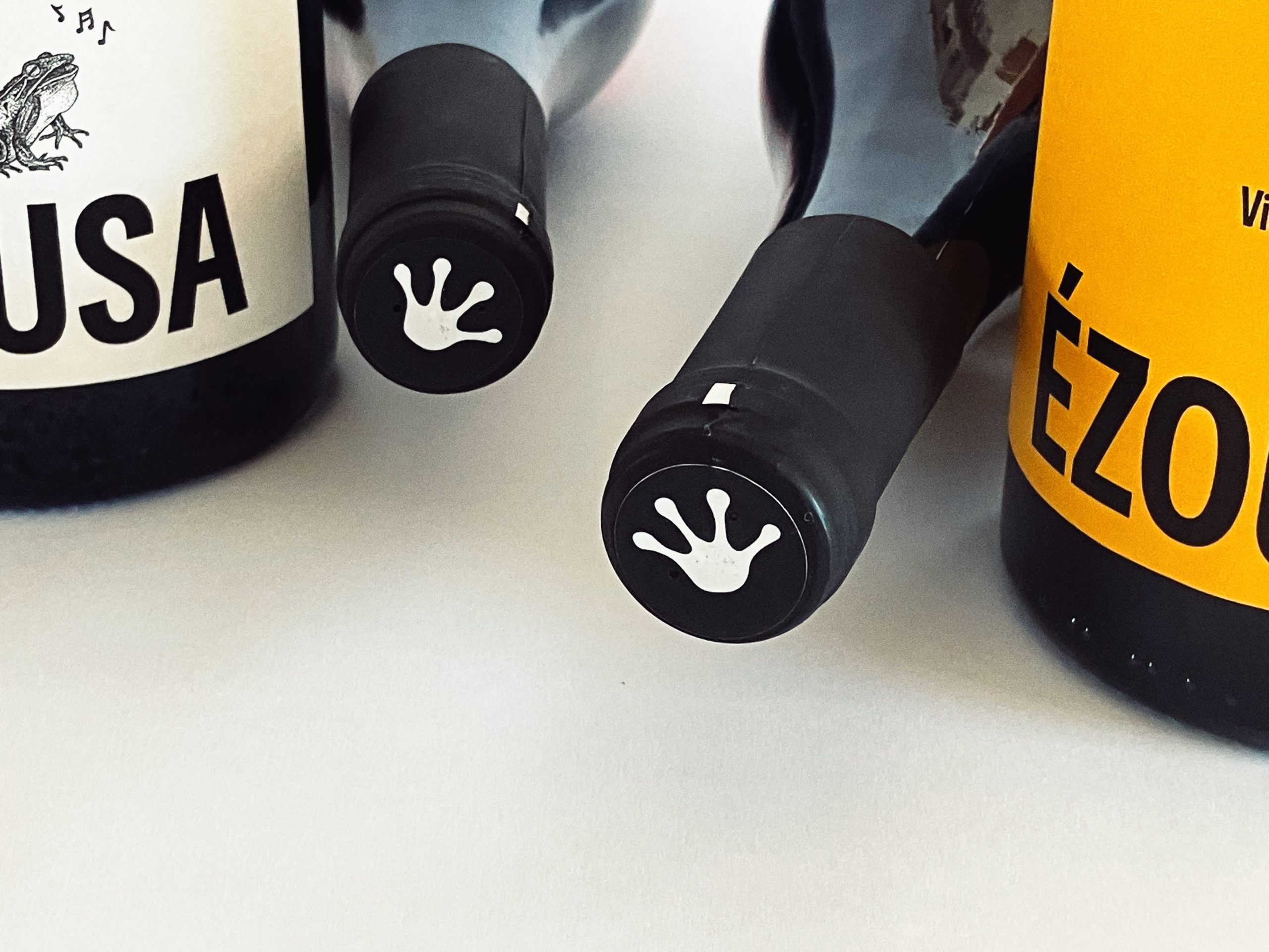
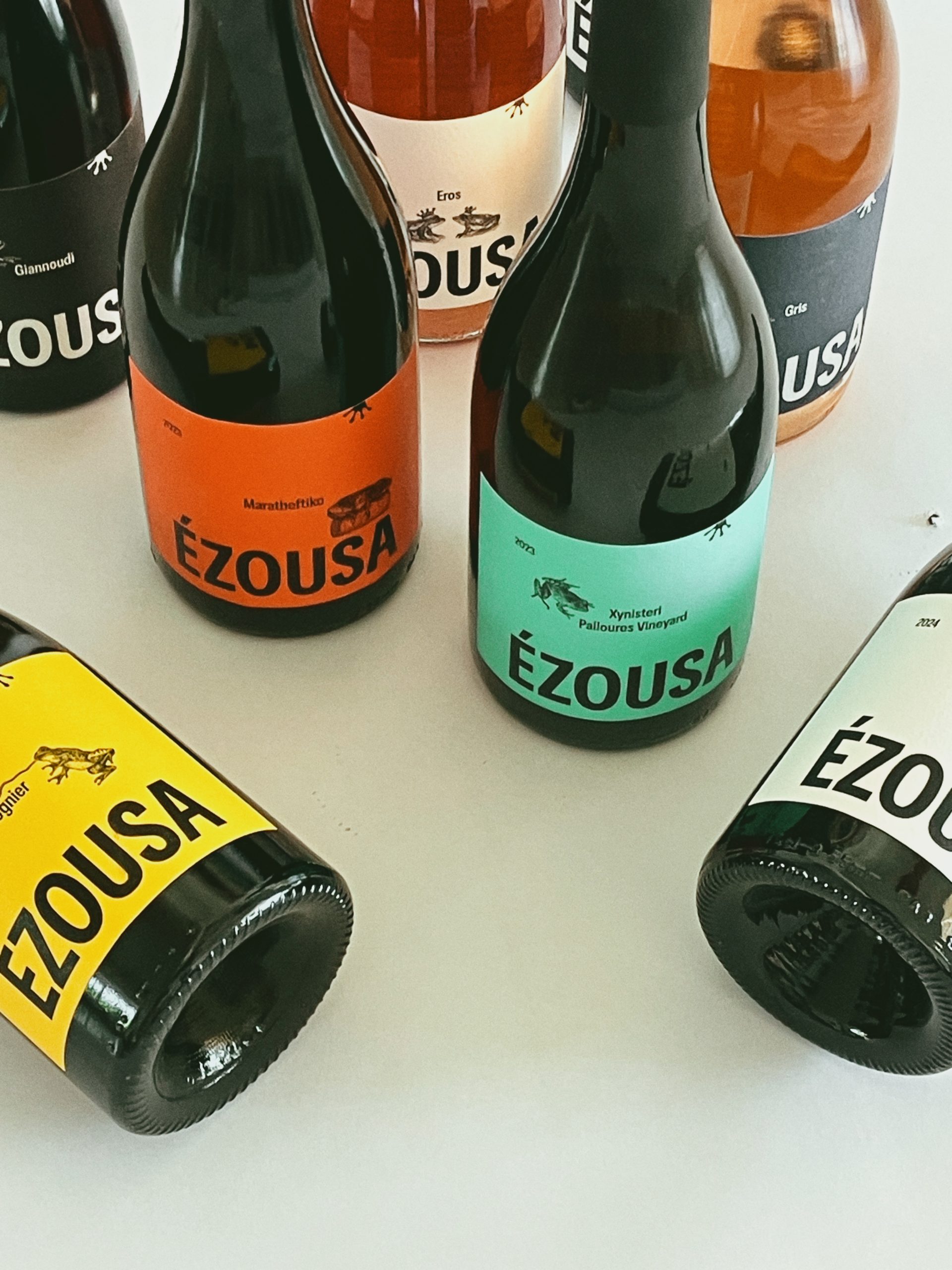
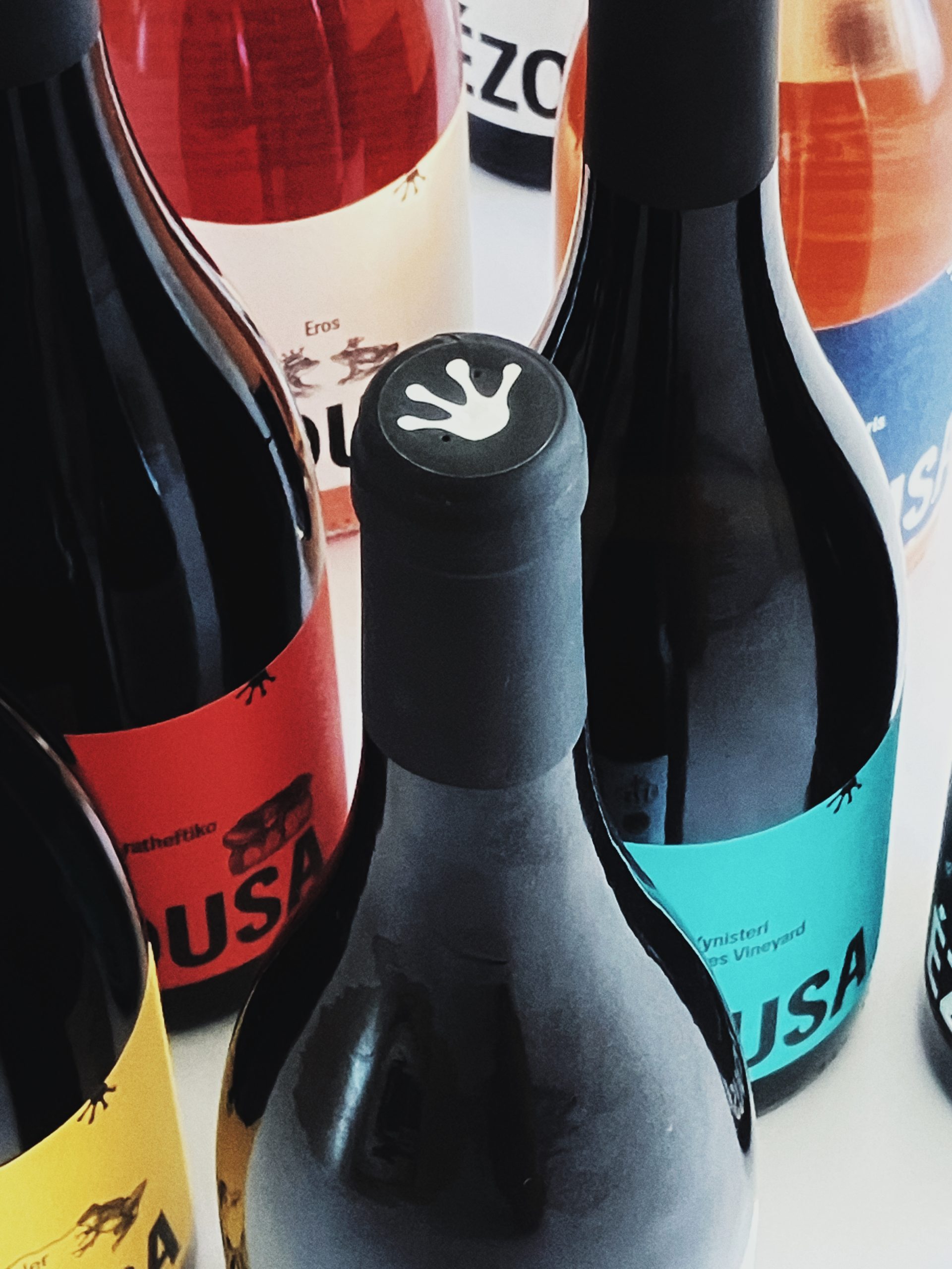
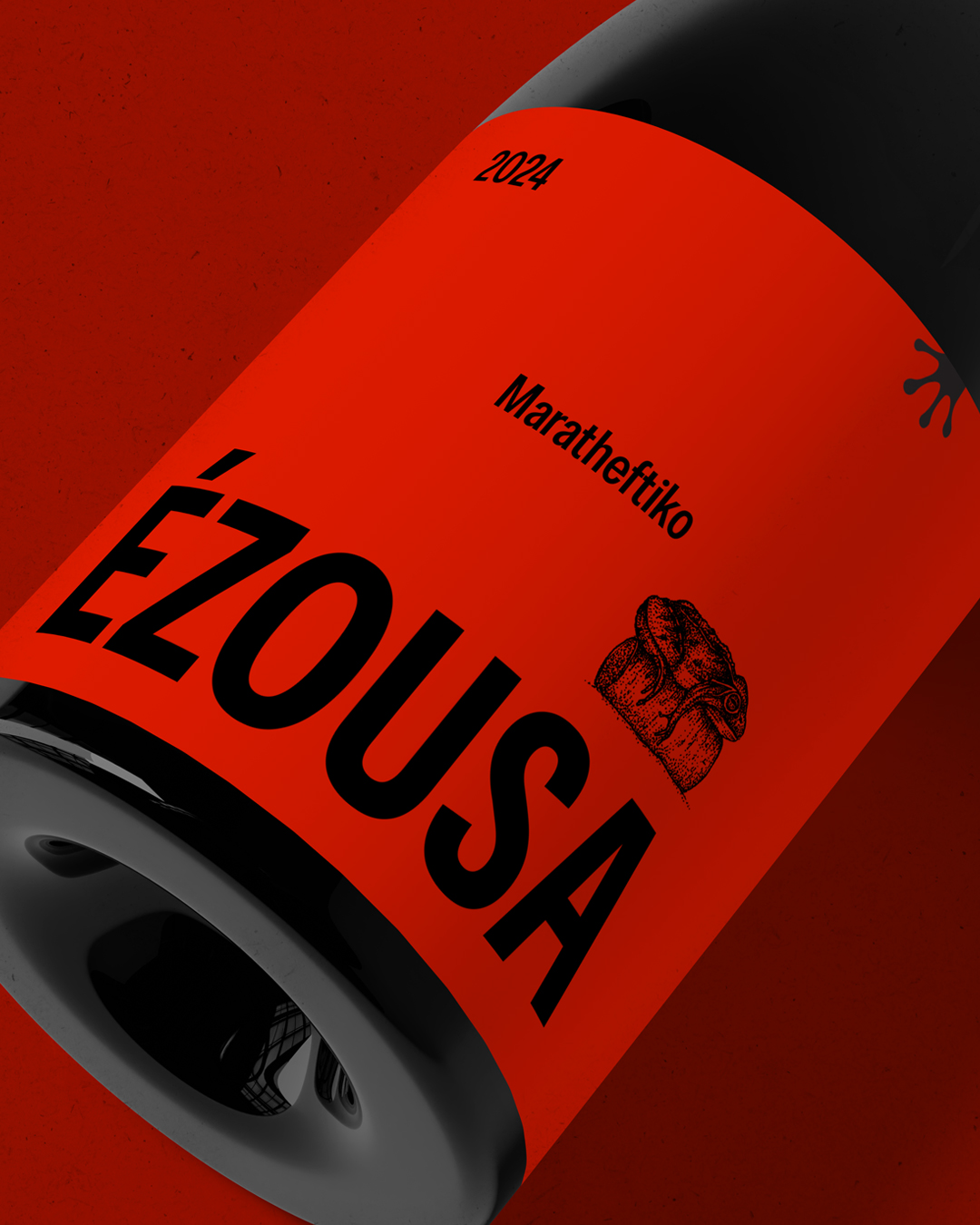
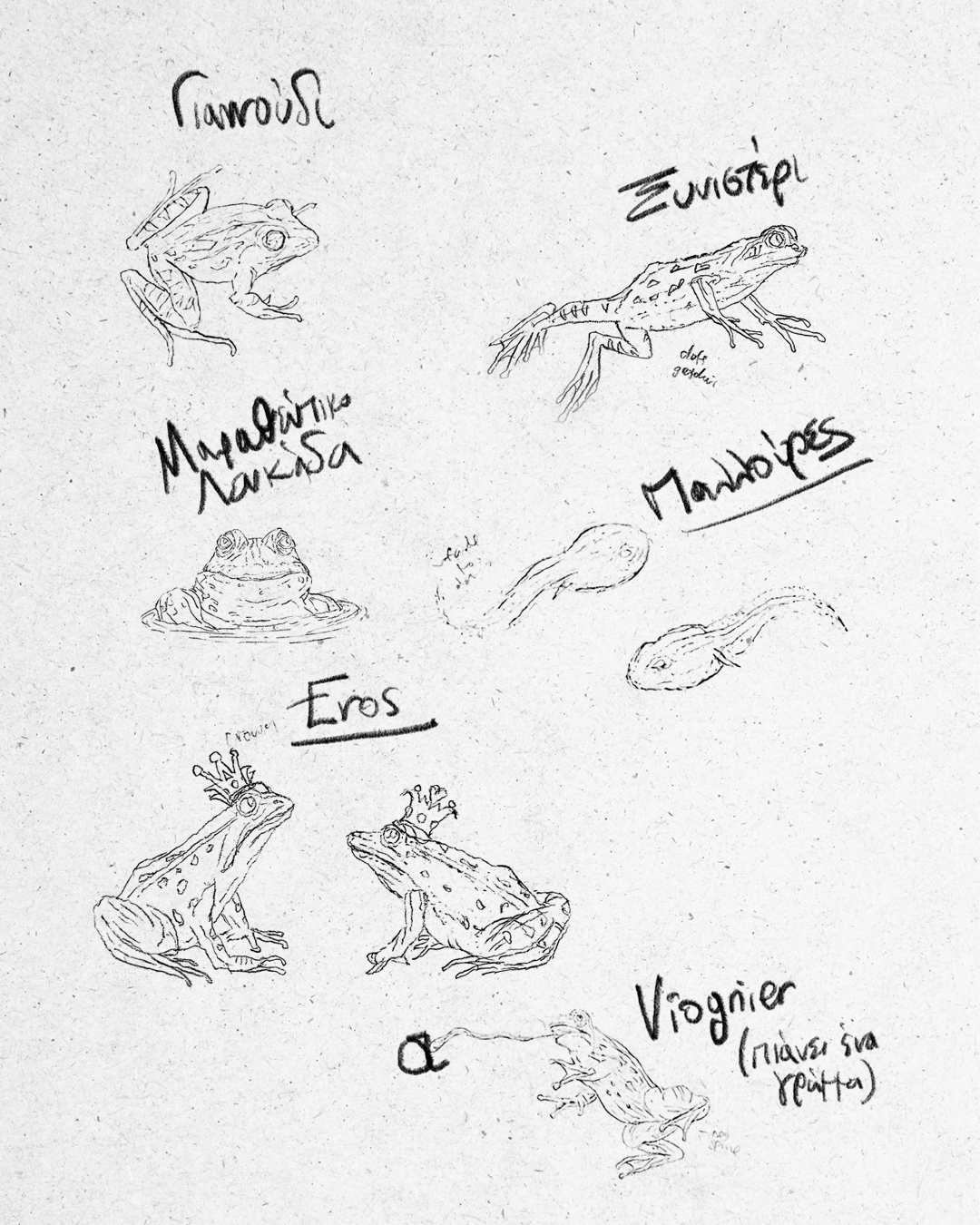
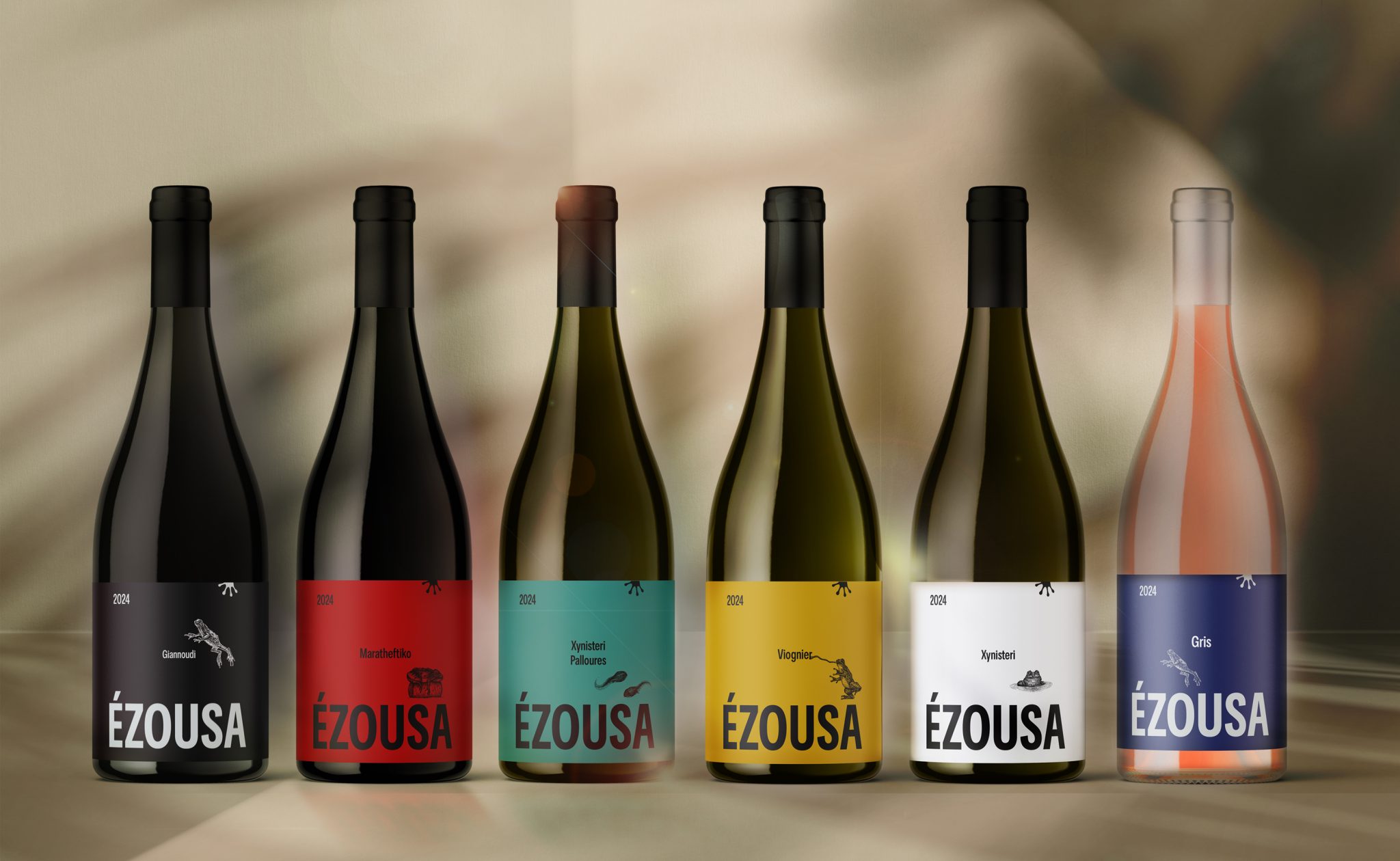
Nestled in the dramatic landscape of Kannaviou, Pafos, Ezousa Winery has reimagined its visual identity with a packaging redesign that captures the soul of its land and story. At the heart of the concept are the frogs of the Ezousa River—silent guardians of the valley, thriving where extremes meet. Their presence reflects the winery’s values: resilience, harmony with nature, and deep respect for origin.
The design draws from the unique terroir of the region—soils born of ancient fire, untouched by phylloxera, and cooled by dramatic temperature shifts. Indigenous and exotic grape varieties grow in this raw environment, shaped by nature rather than intervention. The new packaging expresses this contrast through clean, bold typography, minimalist structure, and an earthy, contemporary colour palette that reflects both river and soil.
Each label is a balance of tradition and modernity, echoing the family’s commitment to quality winemaking while speaking to a new generation of wine lovers. More than just a visual update, the redesign is a storytelling tool—communicating place, process, and the pulse of the land through thoughtful, timeless design.