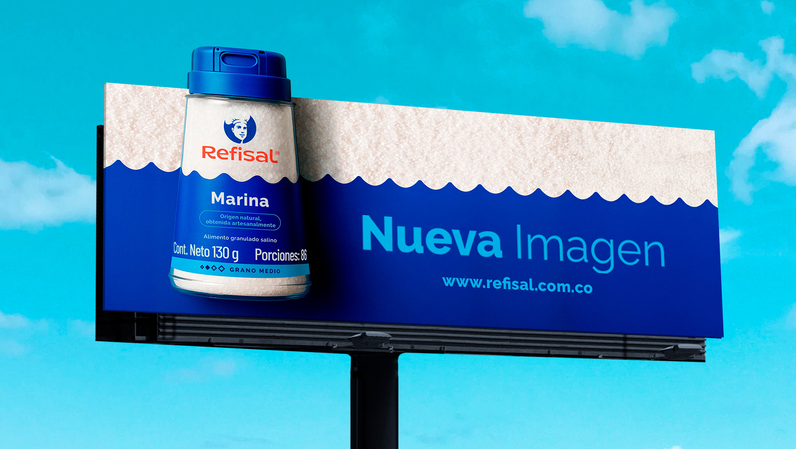
Refisal, Colombia’s leading salt brand, needed to refresh its image and packaging design with two clear objectives: stand out on the shelves and bring greater clarity to its product range.
Our analysis showed that a brand with such a strong heritage shouldn’t change what it has built, but rather amplify it.
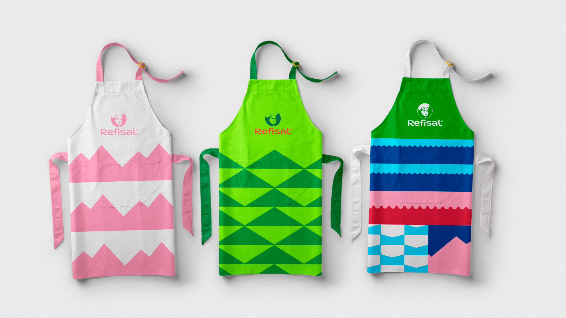
- We crafted a custom, fluid, and approachable typeface for the logo to make the name stand out even more.
- We rejuvenated the iconic chef—both in graphic style and in his features.
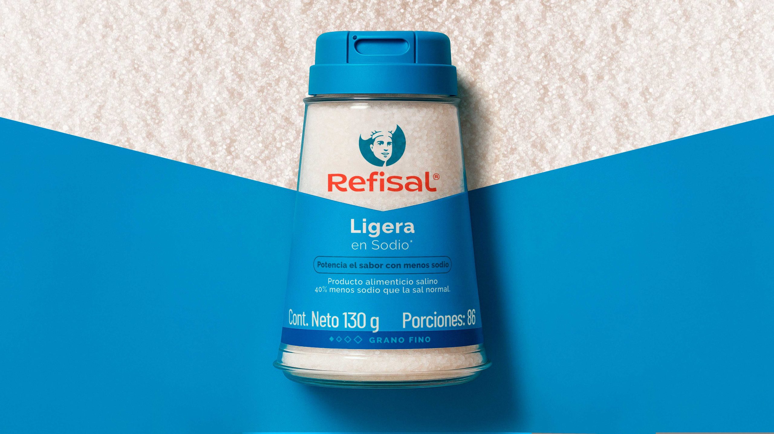
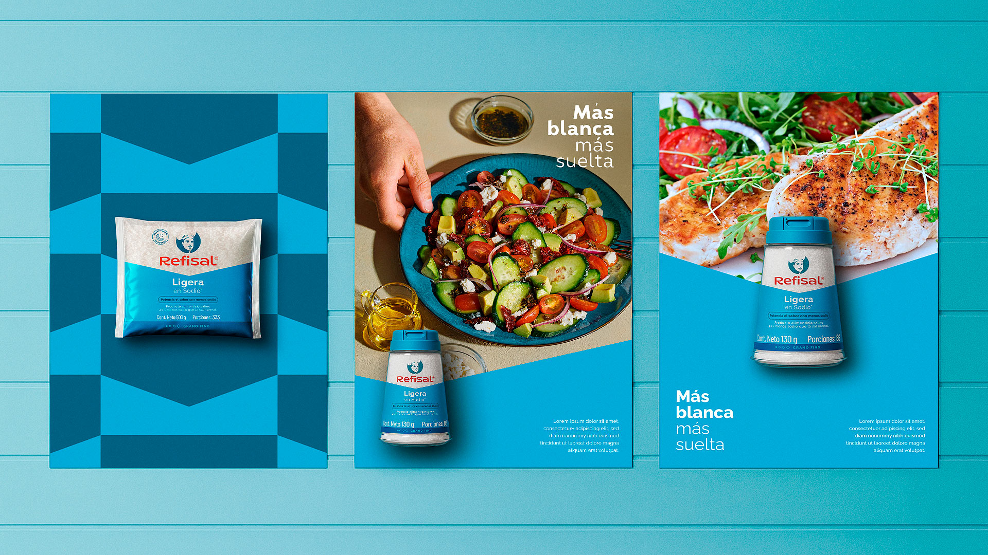
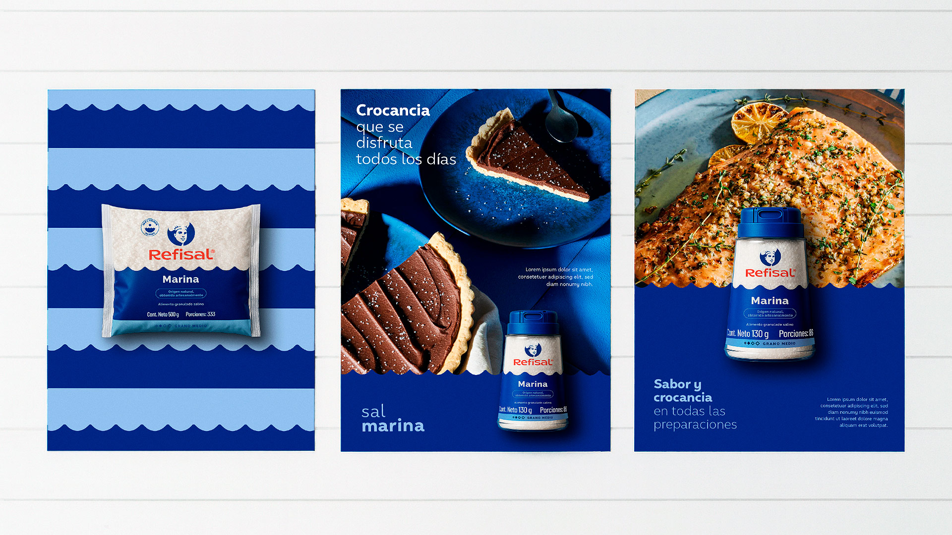
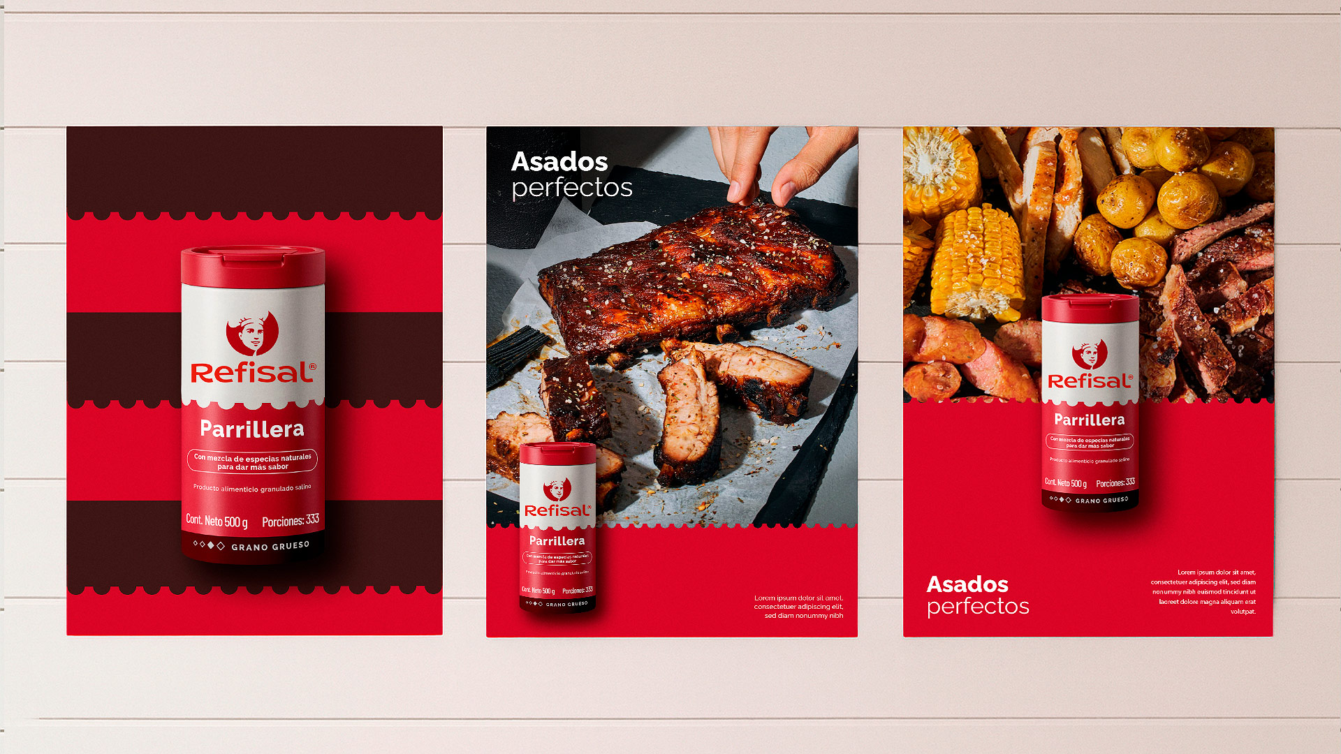
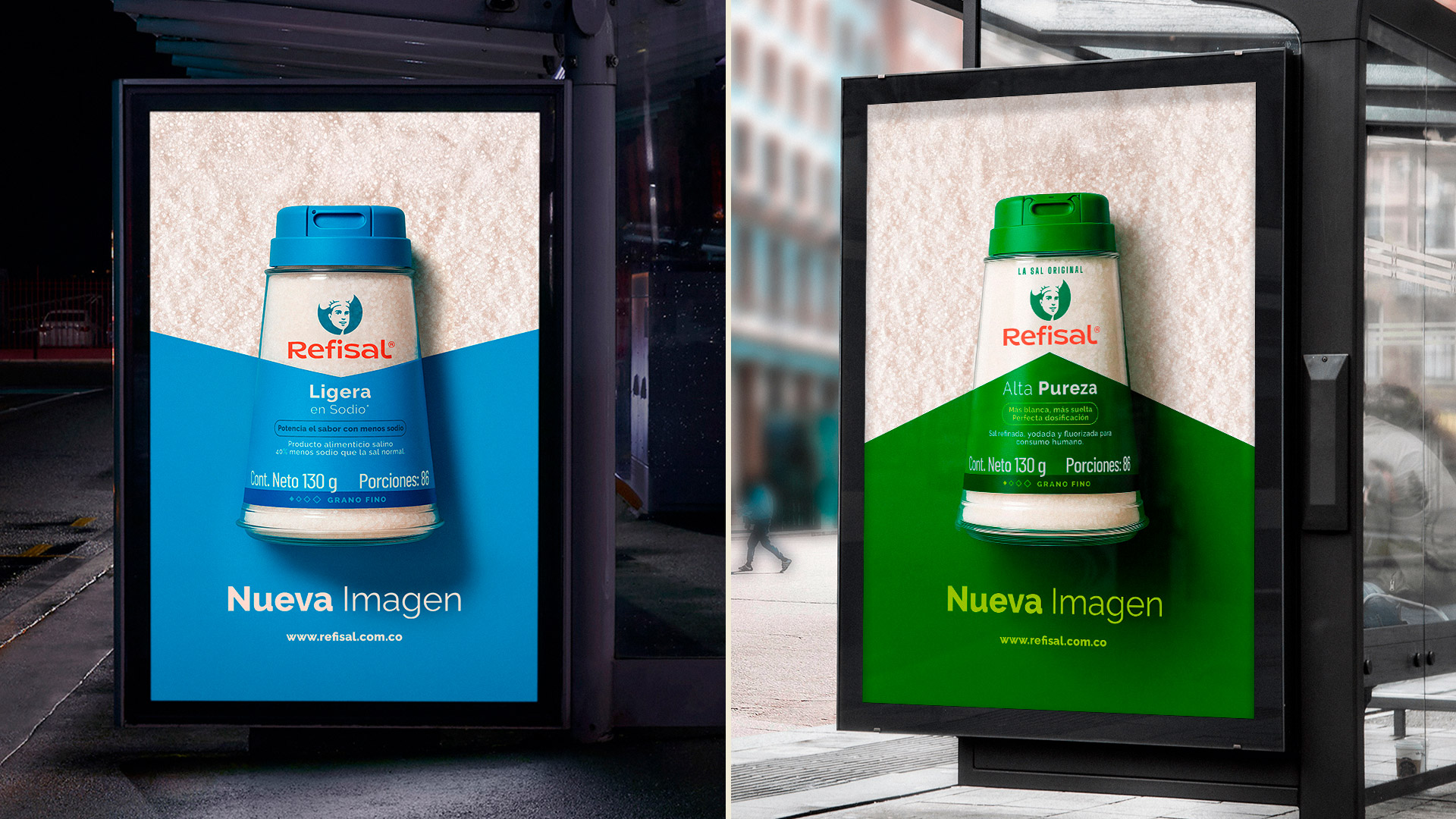
- For the packaging, we discovered that while people recognized the color stripes, they didn’t associate them with the product attributes.
That insight inspired us to create a new graphic system of stripes, each one telling its own story:
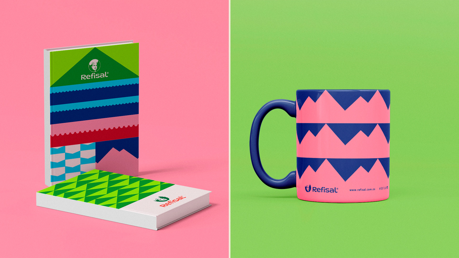
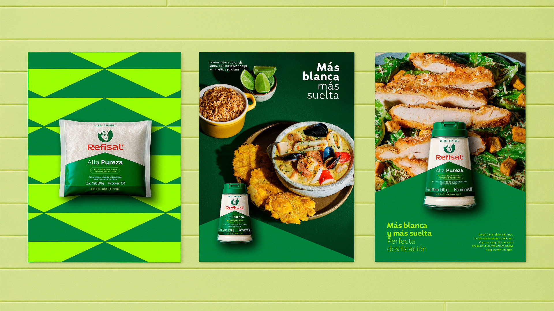
- Green: High Purity, rising like a mountain of premium-quality salt.
- Light Blue: Low in Sodium, pointing downwards like the reduced sodium it contains.
- Dark Blue: Sea Salt, shaped as waves from where it originates.
- Pink: Himalayan, evoking its mountain origins in Asia.
- Red: Grill Salt, echoing the lines of a barbecue grill—its perfect match.
The result: a fresher, more contemporary version of Refisal—one that appeals to new generations without losing the recognition and trust built with current consumers.