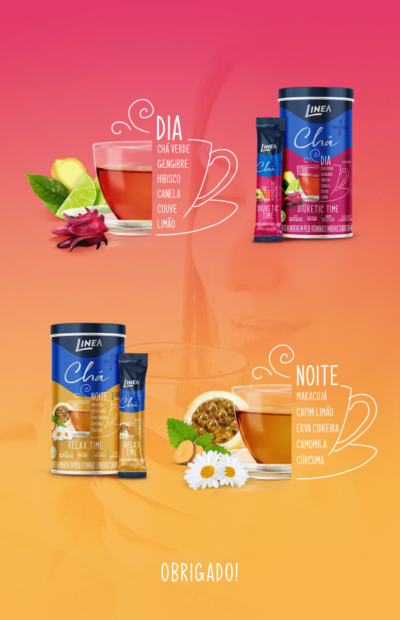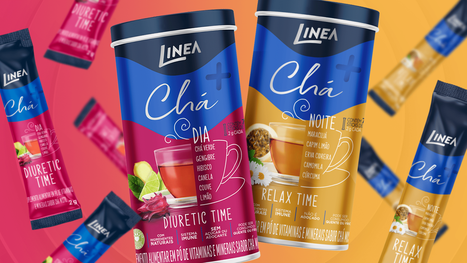
Chá+ is part of Linea’s functional line, whose basic concept was developed in partnership with the Narita Strategy & Design.
This partnership established the idea of merging nutritional technology with a light, accessible consumer experience. Building on that strategy, I developed a visual identity that expresses fluidity, metabolism, and natural energy. Organic, dynamic graphic flows create movement, while fresh color palettes differentiate each variant.
Bold typography reinforces the functional nature of the product while remaining consistent with the line. The layout prioritizes immediate visibility of key benefits, aligning Chá+ with premium functional beverages. The result is a contemporary and high-value packaging expression that strengthens the brand’s modern and wellness-driven positioning.