

Client and task
The “Skorozharka” brand by the company “Yuniant” encompasses a wide range of fish and vegetable semi‑processed products. Its positioning is built on a combination of time‑honored culinary traditions and modern production processes. In today’s fast‑paced lifestyle, its key advantage is cooking speed.
To attract young parents and expand their “adult” shopping basket with new products, “Yuniant” decided to launch a children’s product line. DS1 branding was tasked with developing a sub‑brand for this line, combining the recognizability of “Skorozharka” with the preferences of the youngest consumers.
Analytics and trends
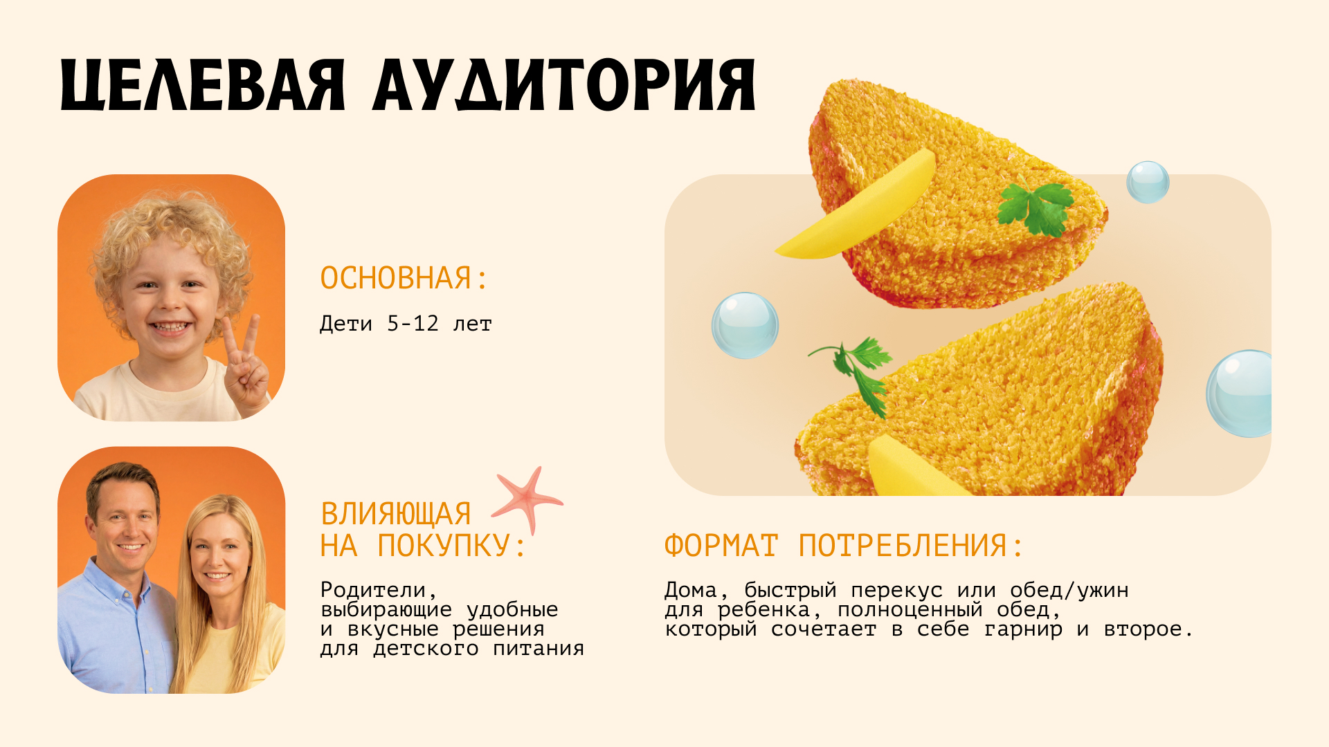
Modern parents, including working mothers, lead intense lifestyles and strive for work‑life balance, often opting for ready‑to‑eat products. At the same time, they are highly attentive to product selection and prioritize safety and children’s health.
When a wide range of high‑quality products is available, more than half of parents take children’s preferences into account. For example, about 60% of Russians consider it appropriate for children’s brands to have a mascot so the product can spark interest and the desire to try it. Brand characters also help build emotional connection and loyalty.
Therefore, in the children’s sub‑brand it was important to combine naturalness and safety with brightness and friendliness, while strengthening the overall positioning of the “Skorozharka” product line.
Idea and concept
The “Skorozharka” brand is fully compatible with a more child‑oriented positioning of the product line: its vivid identity, “active” typeface, and dynamic stamps stand out among more classical competitors and attract attention.
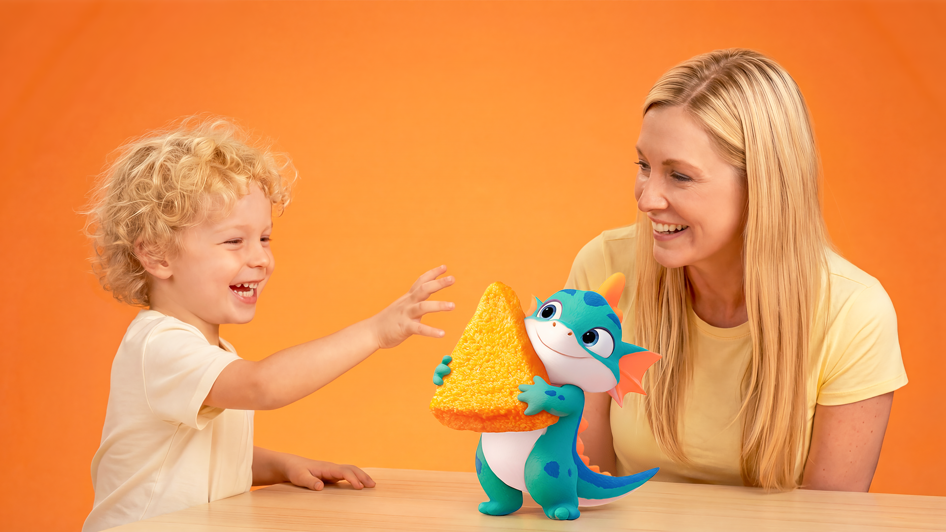
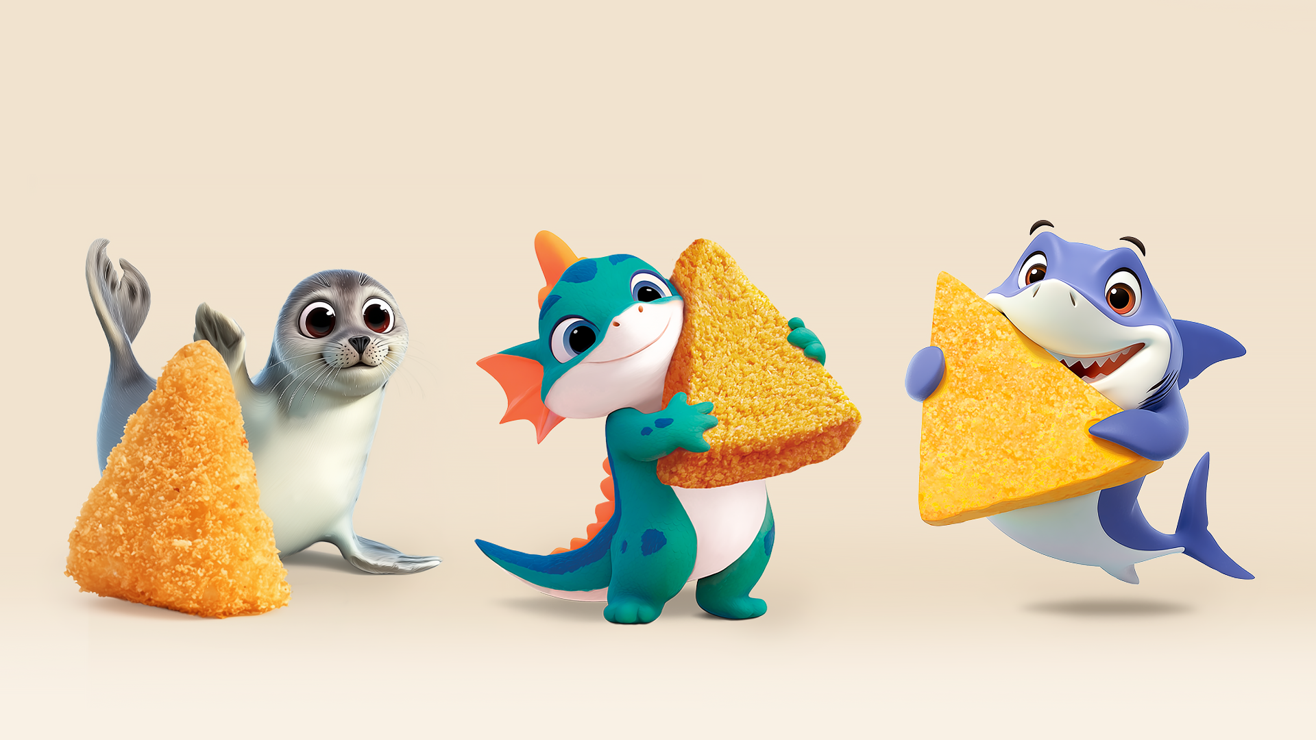
To win over the youngest audience segment and trigger the reaction “Mom, I want it!”, the team decided to introduce a mascot—a friendly little dragon cuddling a nugget and evoking a sense of magic.
The character heightens children’s interest while its openness and positivity additionally reinforce trust among parents.
Implementation
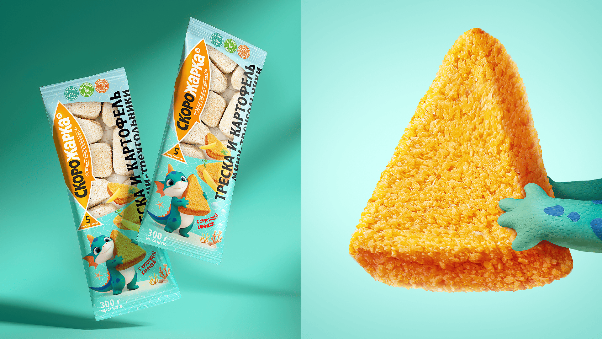
In the sub‑brand’s visual identity, the dominant mascot is combined with a large, highly recognizable brand zone, the “with a crispy crust” stamp, and a dynamic, almost moving food zone. This creates a cartoon‑like, interactive feel: nuggets seem almost “catchable” and tempting to eat right away.
Thanks to the product’s “window” packaging, it is easy to see the product itself, while a soft neutral shade reinforces the perception of naturalness and safety. Together with the “5 minutes and ready” stamp, this conveys the main brand values of “Skorozharka” (naturalness and speed), which are crucial for the parenting audience.
Results
The new “Skorozharka” line combines the emotional and functional needs of both children and parents, helping boost purchase volumes, attract new customers, and strengthen the brand’s product‑range matrix.
Comment
DS1 branding successfully aligned our already recognizable “Skorozharka” identity with the child‑friendly character of the new line. For us, launching a children’s product featuring a baby‑dragon mascot is an opportunity to increase average basket size and attract new consumers by creating a product tailored to the most attentive audience—parents.
 softmachine
 monther al omari
 alchimistestudioParis
 airobtq
 Buzz & Co.
 Ruby
Ruby themythographer
 IDNB Inc.
 viktorflr
 Zenpack
 Wessam Hussien
 samarabdelmonem
 StudioMordius
 Polaris Designs
 Atiq Alam
 duha mohamed
 HassanEtman22
 agarcia studio
 Wynand88
 Eva Chistyakova
 Maria Bukhtilova