

Welcome to Issue #141 of Packaging of the World. This issue brings together ten packaging projects that lead with strong concepts, purposeful design, and branding that sticks. Each one is a reminder that great packaging isn’t just about looking good — it’s about communicating something true about a product.
These projects are already making waves on social media. Follow us on Instagram, Facebook, and Pinterest to stay updated with the latest packaging trends and creative work.
Have a packaging project you’re proud of? We welcome submissions from designers, studios, and brands around the world. Whether it’s your first submission or not, simply sign in or create an account to share your work with our global community.

Sad Lunchbreak Snack Pot designed by owtcanny
Some packaging concepts are born from a very specific, very relatable kind of misery, the kind that hits at 1pm on a Tuesday when lunch was disappointing and the afternoon stretches out endlessly ahead. Grindstone Snack Co.’s Sad Lunchbreak Snack Pot gets it.
Designed by OwtCanny, this gloriously unhinged concept packaging comes loaded with cigarettes and black coffee, gluten free and dairy free, naturally. The brief clearly called for something loud, jittery, and completely self-aware, and the design delivers on all counts. A blazing red and yellow palette, jagged zigzag assets, and a typeface that practically vibrates off the surface all work together to mirror the nicotine and caffeine chaos waiting inside.

Barca Napoletana designed by Atyan
There’s something immediately arresting about BARCA NAPOLETANA — before you even read the name, the shape tells you everything. The container echoes the silhouette of a boat, a nod to “barca,” the Italian word for it, and a quiet declaration of where this product comes from and what it stands for.
The color story is simple but confident. White and deep orange sit in sharp contrast — one speaking to freshness and cleanliness, the other to bold, full flavor. A small Italian flag sits at the top, understated but deliberate, the kind of detail that doesn’t shout but doesn’t go unnoticed.
At the center, a fish in black metallic finish carries a sense of weight and quality. The serif typography feels lifted from the signage of an old Italian port town — classic and assured. Wooden oars bring craft and tradition into the mix, while the deep purple background ties everything together with quiet confidence.

Jean Martin De Provence desiged by Dragon Rouge
Jean Martin has been making jarred Provençal recipes since 1920, but its redesigned packaging finally gives the brand a presence that matches its heritage. The brief was clear: stop being overlooked and start looking like the iconic Provençal brand it actually is.
The solution puts the vegetable front and center — literally. Lush, painterly illustrations take over the label, turning each jar into something closer to a piece of art than a grocery item. There’s a warmth to the color palette that feels genuinely Mediterranean, sun-baked and unhurried, reinforced by copper-toned lids that quietly signal artisanal quality without overstatement.
What makes the redesign work beyond aesthetics is its clarity. The typography is structured enough to help shoppers navigate the range at a glance, balancing beauty with function. After over a century of slow-crafted cooking, Jean Martin now has packaging that tells that story before the lid even comes off.

Apriori Wine Can Redesign by 43oz
Canned wine has a perception problem. The format is fine for cocktails and sparkling beverages, but serious still wine? That’s a harder sell. Apriori takes that tension head-on rather than tiptoeing around it.
The design anchors itself in the most recognizable symbol in wine culture: the wine glass. Its silhouette sits at the center of the can, and inside it, a detailed vineyard landscape pulls in the visual language of classic wine labeling and terroir. The contrast between that traditional imagery and the decidedly modern can format is the whole point. It creates curiosity and quietly argues that what’s inside hasn’t changed, only the vessel has.
What elevates the concept further is the embossed texture applied to the glass illustration. Running your fingers across it adds a tactile layer that reinforces quality in a way that print alone can’t. Apriori doesn’t just put wine in a can. It makes you reconsider what a can can be.
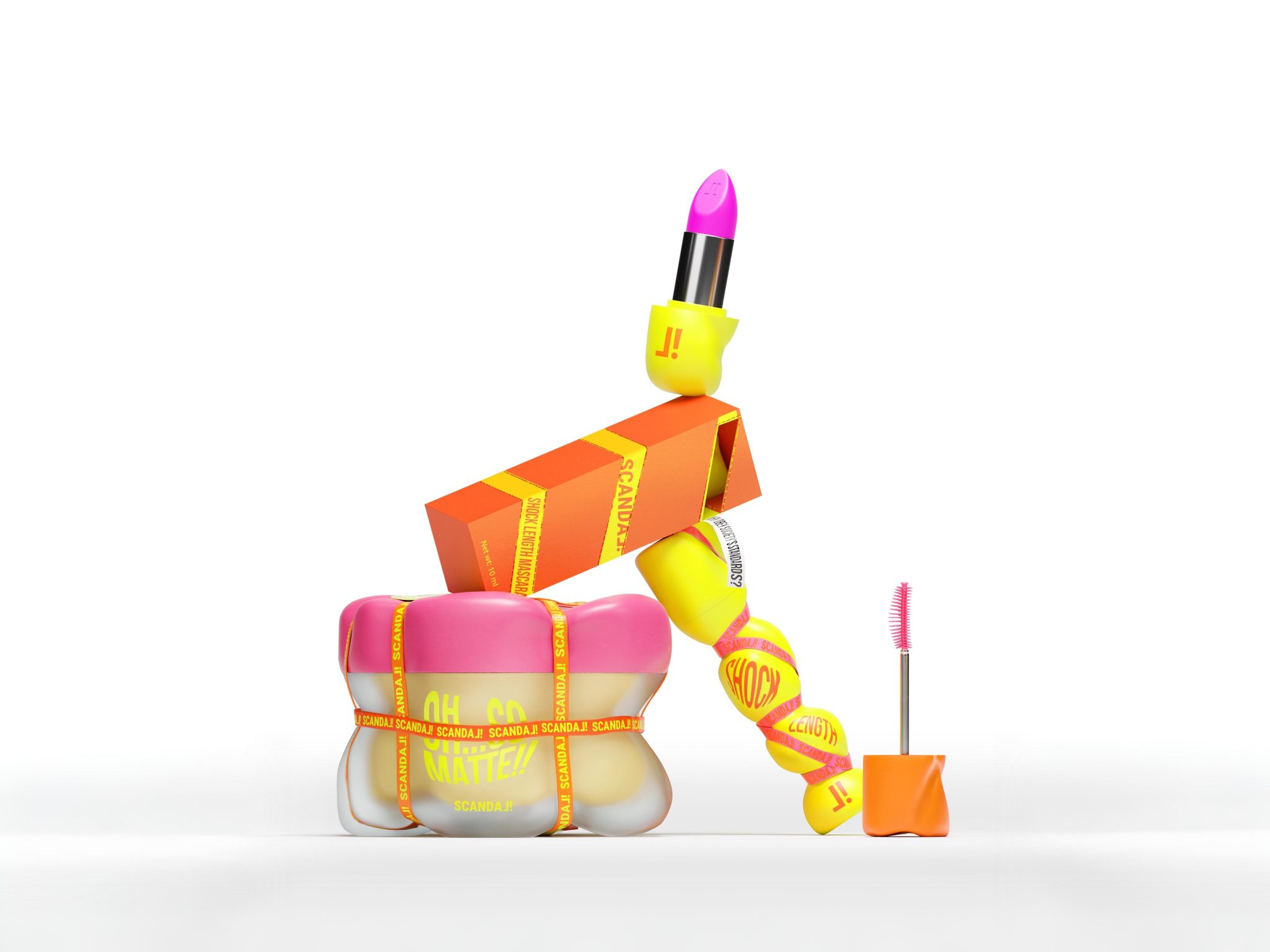
SCANDAL! designed by Dwd Gspr
Most cosmetics for older adults follow the same quiet script — muted tones, anti-aging messaging, and an overall aesthetic that treats aging as something to be corrected. SCANDAL! tears that script up entirely.
The brand is built on a single, defiant idea: visibility doesn’t diminish with age. Its packaging reflects that with a bold color palette and confrontational slogans that make no attempt to blend in. This is cosmetics that announces itself.
The most striking design choice is the rubber band wrapped tightly around each product, resembling barrier tape. It’s not just decorative — it’s a ritual. To open the product, you physically remove the band, an intentional gesture that mimics breaking free from the societal pressures and stereotypes the brand is pushing back against. The bands can also be reused, giving them life beyond the packaging.
SCANDAL! doesn’t ask older consumers to be subtle. It hands them a megaphone instead.

Ministerio del Café designed by Dragon Rouge
Ministerio del Café is built around a belief that most coffee brands overlook — that great coffee isn’t made by one person or one process, but by countless small gestures working together. Founded in Nicaragua, the specialty brand advocates for fair compensation across its entire supply chain, from the farmers down to the most invisible contributors.
And that includes the insects. Pollinators are given a place of honor in the visual identity, a deliberate choice that reflects the brand’s conviction that nothing in the process is too small to matter.
That philosophy is expressed through pointillism — every illustration on the packaging is made up of thousands of tiny dots, each one a stand-in for the gestures, hands, and living things that make a great cup possible. It’s a technique that rewards a closer look, which feels right for a brand asking you to pay attention to what you’d normally take for granted.

KARU — Concept Rebranding by Packagenius / Erhan Ozden
KARUSOTJU strips everything back to what matters most — the Jalak Bali bird, one of Bali’s most iconic and endangered species, and a natural symbol for a brand rooted in the island’s identity.
The redesign removes visual clutter and lets an embossed bird illustration do the talking. Inspired by the purity of Bali’s natural water sources and the bird’s white feathers, the label uses a clean, textured white paper that reveals the illustration through subtle embossing and the way light plays across its surface. It’s the kind of detail you notice gradually, which is exactly the point.
A metallic blue accent around the bird’s eye serves as the brand’s signature touch — small but memorable. It flows beyond the label and reappears as a wax seal on the bottle neck, threading a visual connection through the entire package. Two editions, white embossed and gold foil, round out a range that feels quietly, confidently premium.

LIMM Botanical Fragrance Set designed by hello ocean
LIMM Botanical Fragrance Set doesn’t try to look like a fragrance product, and that’s precisely what makes it work. The bottle, designed by Hellocean, is chunky and sculptural with deep vertical ridges that feel almost architectural. In a retail landscape of smooth, glossy perfume bottles, that ribbed surface stops you cold.
The color palette is equally unexpected. Citrus orange, lime green, and cool blue collide with an energy that most botanical brands actively avoid, proving that “natural” doesn’t have to mean beige and understated. Abstract geometric icons replace the usual leaves and florals, bridging nature and modern visual culture in a way that feels fresh rather than forced.
A band wrapping around each bottle adds a ceremonial quality, as though the contents are precious. The presentation box completes the experience, opening it feels like unveiling a small sculpture. With LIMM, the ritual begins long before the fragrance does.

Barking Frog designed by Cornershop
Have you ever heard of a frog that barks like a dog? As it turns out, the Barking Frog is a real species found in Australian wetlands, and its bizarre, delightful existence turned out to be the perfect foundation for a wine brand.
The range is built for Gen Z and Millennial consumers who want something approachable, affordable, and a little more personality-forward than the average bottle on the shelf. At around $25 a bottle, it hits the right price point without sacrificing character.
That character comes largely from Fred, a frog who is thoroughly convinced he is a dog. Playing fetch, tugging his lead, chasing cats. Fred is the kind of mascot you remember, and more importantly, the kind you want to pick up.
A minimal bright green label on a bold bottle keeps things fresh and eye-catching, while eco-friendly paper stock quietly backs the brand’s genuine commitment to environmental causes.

OHLALA · Sculptural Skincare Branding by Vailio
OHLALA is a skincare brand that earns its name through restraint rather than flair. There are no decorative graphics competing for attention here. Instead, the identity begins with shape, a sculptural jar modeled after the soft movement of a cream drop, the kind of form that feels considered before you even pick it up.
The custom logotype is embossed directly into the object rather than printed onto a label, a detail that makes branding feel like part of the product rather than something stuck on top of it. The palette of white, cool blue, and warm yellow keeps things calm and clean without feeling clinical.
At first glance, everything reads as minimal. But spend a little more time with it and the playfulness comes through in the proportions, the curves, the way materials catch the light. OHLALA turns a daily skincare routine into something worth slowing down for, which is exactly the point.
 softmachine
 monther al omari
 alchimistestudioParis
 airobtq
 Buzz & Co.
 Ruby
Ruby themythographer
 IDNB Inc.
 viktorflr
 Zenpack
 Wessam Hussien
 samarabdelmonem
 StudioMordius
 Polaris Designs
 Atiq Alam
 duha mohamed
 HassanEtman22
 agarcia studio
 Wynand88
 Eva Chistyakova
 Maria Bukhtilova