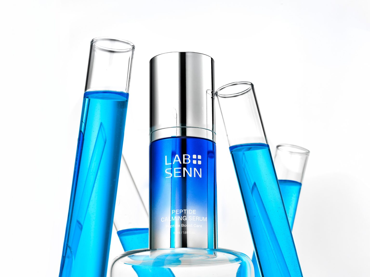

LABSENN is a high-performance derma skincare brand developed by HLB PEP, built on proprietary peptide technology and pharmaceutical-grade expertise. By combining the precision of a laboratory with sensory intelligence, LABSENN positions itself as a “Peptide Derma Science” brand that reads and responds to the skin’s natural signals. Through scientifically validated data and advanced bio-peptide innovation, the brand delivers deep-penetrating efficacy, offering fundamental solutions to skin concerns while setting a new benchmark in the derma skincare market.
The objective was to translate LABSENN’s scientific credibility and advanced peptide technology into a compelling brand identity that clearly communicates its efficacy and value. YNL aimed to establish a differentiated positioning within the competitive derma skincare market by building a cohesive brand system—one that not only reflects pharmaceutical expertise but also resonates with modern consumers seeking both proven results and refined brand experiences.
YNL developed a comprehensive brand design concept and verbal identity centered around LABSENN’s core philosophy—responding to the skin’s signals through peptide science. The name LABSENN, derived from Laboratory and Senses, reflects a derma skincare approach that prioritizes understanding and responding to the skin’s natural signals rather than artificially controlling them. Based on this concept, the skin is positioned as an active “speaker,” while peptides act as the key responsive element, clearly articulating the brand’s functional value and philosophy.
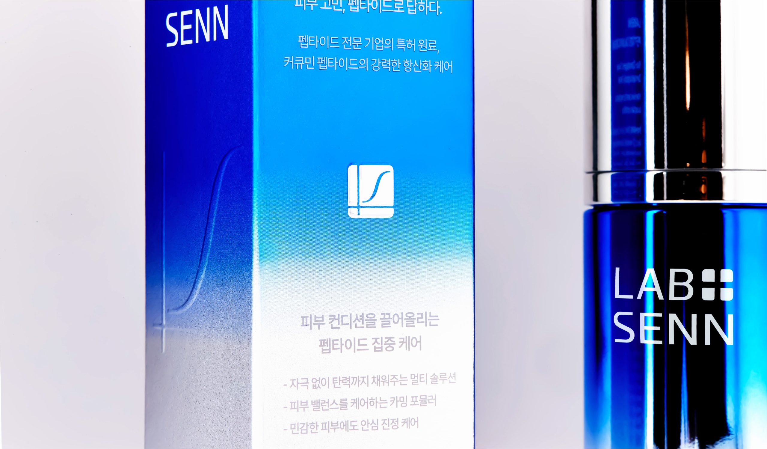
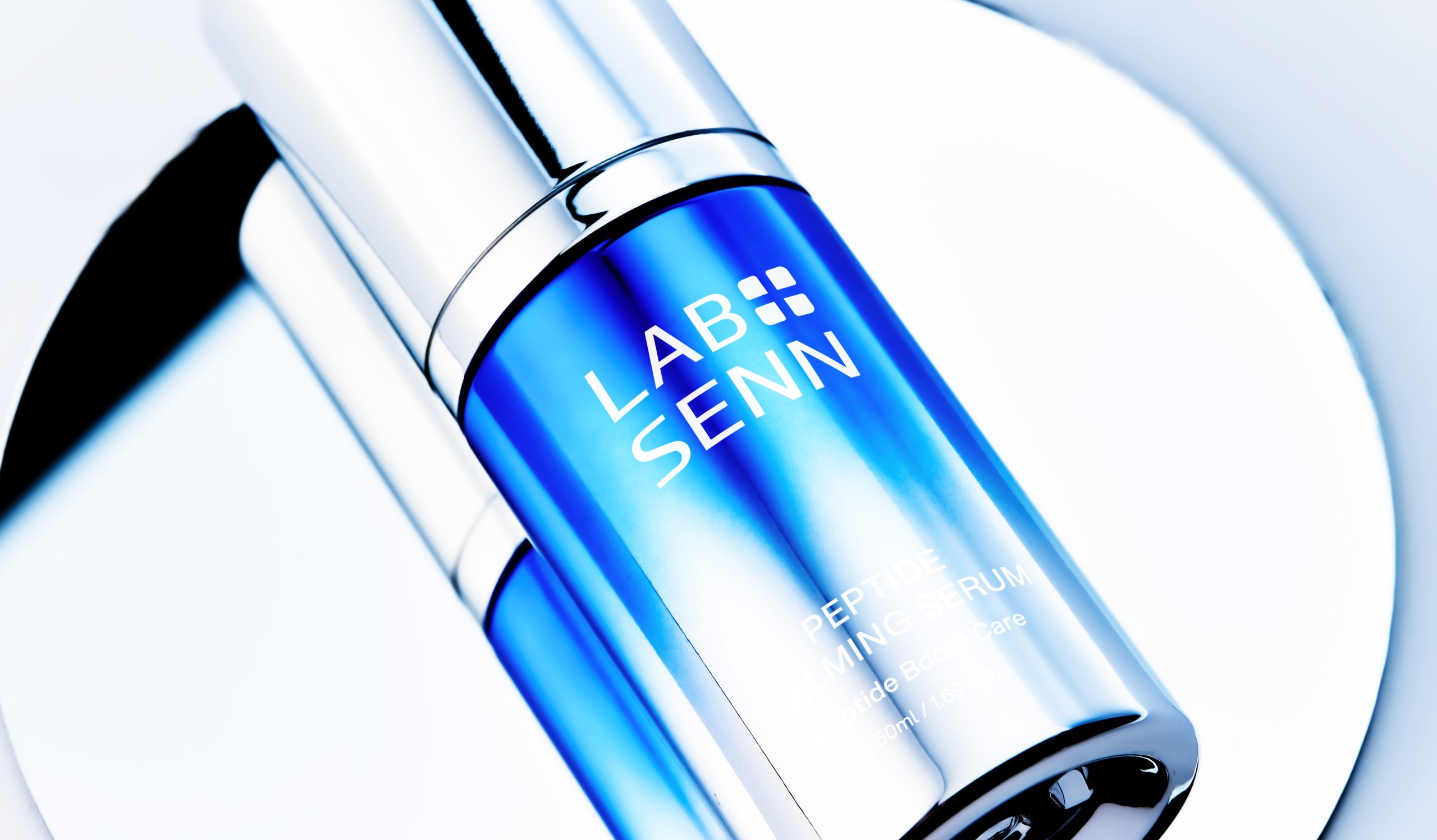
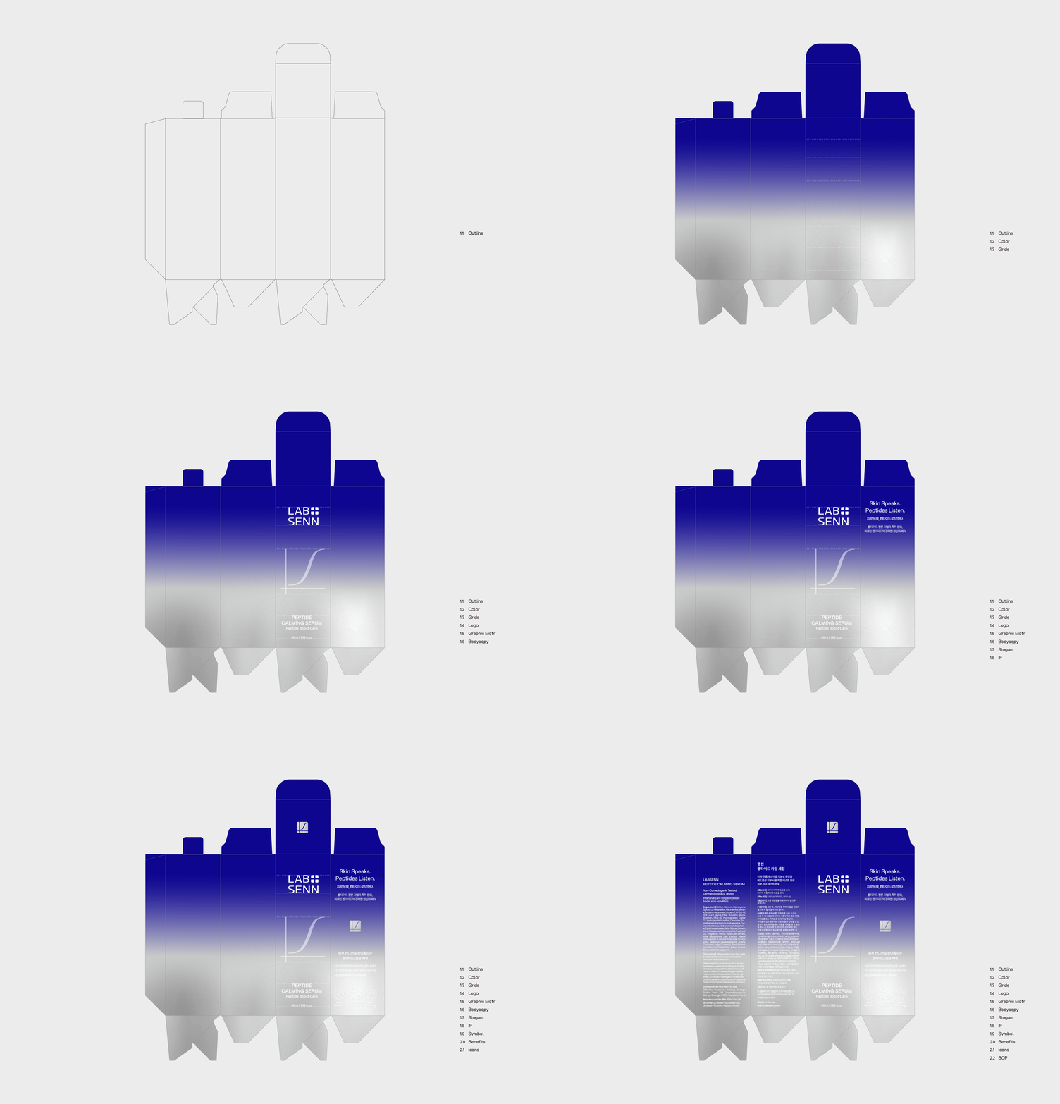
The brand slogan, “Skin Speaks. Peptides Listen.” encapsulates this philosophy as a core message, defining the skin as an active system that reacts to its environment and reinforcing LABSENN’s commitment to delivering optimized skincare solutions. Visually, the identity system reflects scientific precision and pharmaceutical credibility. The symbol is inspired by an S-shaped function graph, representing peptide penetration and measurable improvement, while intersecting axes subtly form the initial “L,” reinforcing a structured and data-driven brand foundation. The logotype was designed with a linear and controlled structure to ensure clarity and legibility across applications, supported by the geometric sans-serif typeface Aspekta.
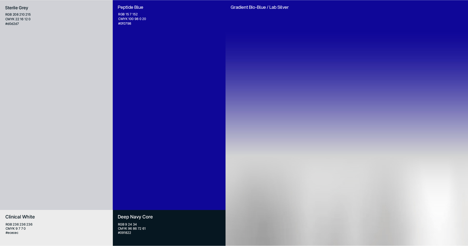
A restrained color system—featuring confidence-driven blue, light grey, and metallic silver—enhances the perception of trust and premium functionality, positioning LABSENN as a sophisticated, high-efficacy derma skincare brand.










 lunapanda
 Tridimage
 Analoguecreative
 lettera7
 alchimistestudioParis
 Lana B
 Colossal
 Pivot Studio
 M&A CREATIVE AGENCY
 monther al omari
 Anastasia Cherepanova | xtramez
 Hollóka Grafikai Műhely / Graphic Design Studio
 BOLD branding
 Antonia Skaraki
 Pâmella Lorrany
 Z9BKAdsgn
 Francesco Paternoster
 b1studio.ro
 Chris Creative Works
 Boordon
 Dmitriy Kuzovlev
 Brand Society
 yasharpic