Client
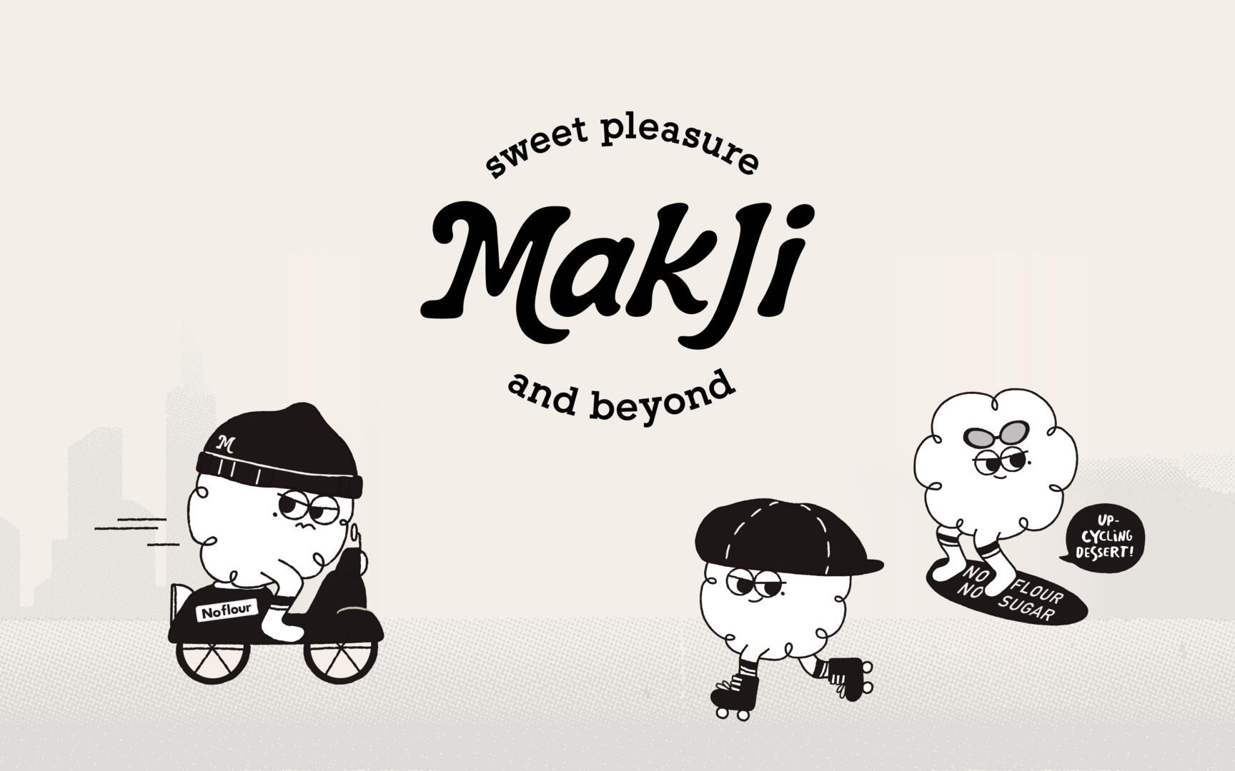
Makji is a dessert brand that develops sustainable food and beverage products and services. They use high-quality makgeolli residue, a byproduct of making makgeolli, and apply food upcycling technology to create their desserts, thus practicing zero waste. Makji powder is used as a substitute for flour and is reborn as a sweet dessert that supports people’s healthy lifestyles and is beneficial for the environment. Makji, which utilizes makgeolli residue, is low in calories but rich in nutrients such as protein and dietary fiber, and has a unique and distinctive flavor. Makji offers a wise and attractive choice that promotes healthier eating habits and contributes to environmental protection.
Objective
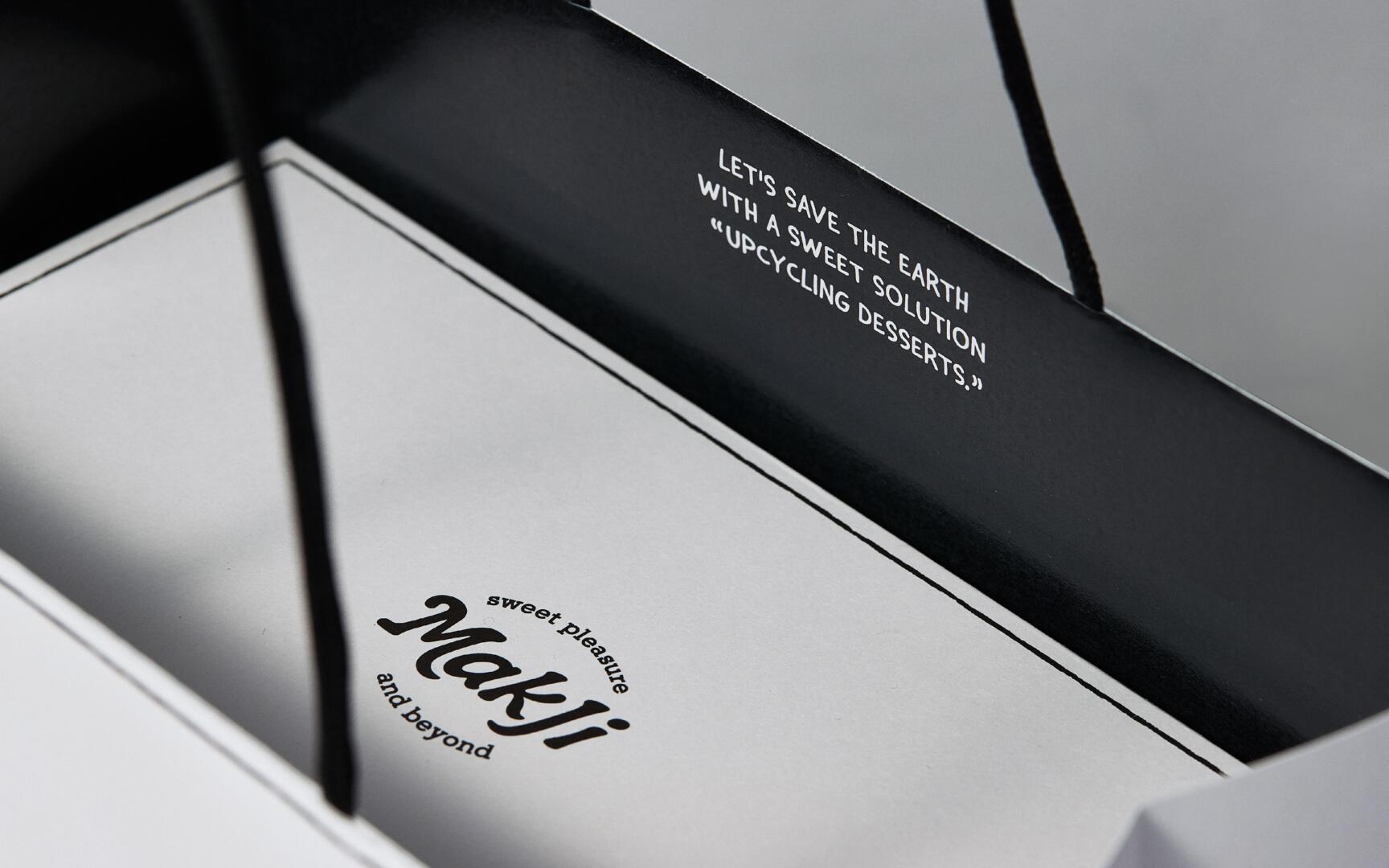
YNL Design has created a witty and compelling brand communication strategy to convey the serious message of a brand proposing a food upcycling culture for a sustainable future. By building a brand design that utilizes a character inspired by the shape of makgeolli sediment and a cartoon style to deliver the brand story, they have made it easier for consumers to understand a potentially difficult message. The character for Makji, the brand, uses the round and adorable appearance of makgeolli sediment to convey the unfamiliar topic of ‘food upcycling’ in a friendly and approachable way. The brand slogan, ‘sweet pleasure and beyond.’, represents the values of the brand that go beyond just offering sweet desserts and propose environmental protection and healthy eating culture.
Solution
YNL Design developed the brand with an organic and premium mood visualized through a wordmark design that embodies the essence of “Healthy Pleasure.” The concept of the character “Makji Gangster” represents the core concept of fighting against flour and environmental pollution to promote a healthy eating culture and protect the planet, expressing the brand value in a witty way. The package design appeals to the MZ generation by incorporating the product’s features, such as NO FLOUR/NO SUGAR, into the hip daily life of Makji Gangster and cleverly expresses the brand’s excellence. The design of the promotional materials, such as business cards, leaflets, brochures, etc., creatively expresses the brand story and detailed research results in a cartoon format. The color scheme consists of ivory, the main color inspired by Makgeolli Jigae, and six muted sub-colors that represent refined black and subtle flavors. YNL Design builds a unified look and feel for Makji’s BI, gift packages, leaflets, brochures, stickers, tags, SNS guides, etc., to deliver the value of promoting a healthy eating culture in a more appealing way.