
What If We Drank One Level Above?
+1 is a Swiss luxury dark beer brand built around a name that acts as a smart call to action. It does not invite people to drink more, but to drink better, deeper and with more intention. The brand turns +1 into a premium statement: one more level of taste, one more layer of character, one more moment of intensity.
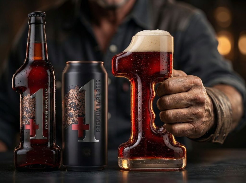
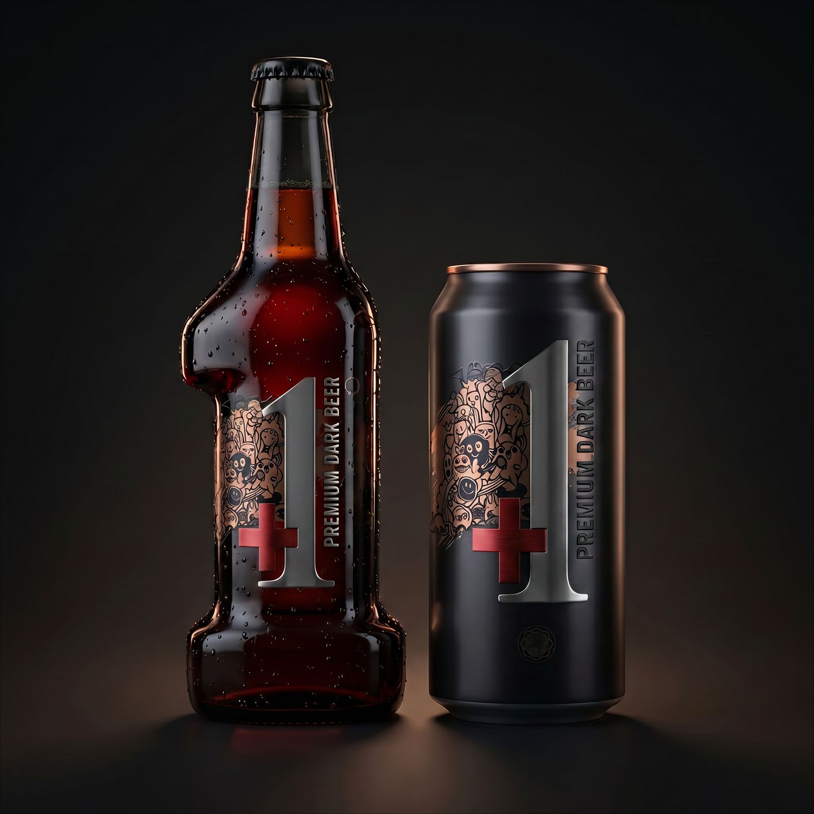
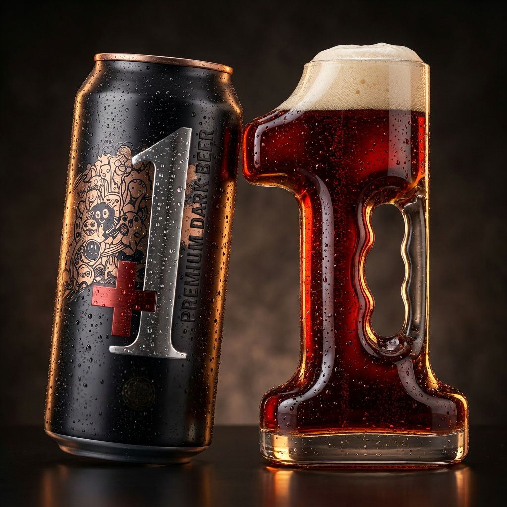
Designed as a complete brand universe, +1 transforms the number 1 into a strong visual and structural icon. It becomes the logo, the bottle silhouette, the custom glass shape and the main packaging signature. Every element is created to make the beer instantly recognizable and emotionally memorable.
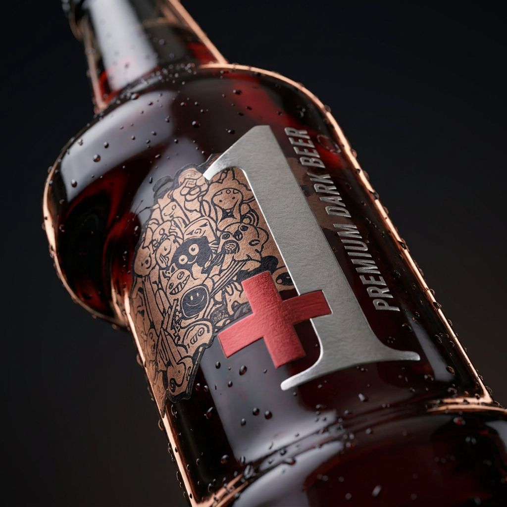
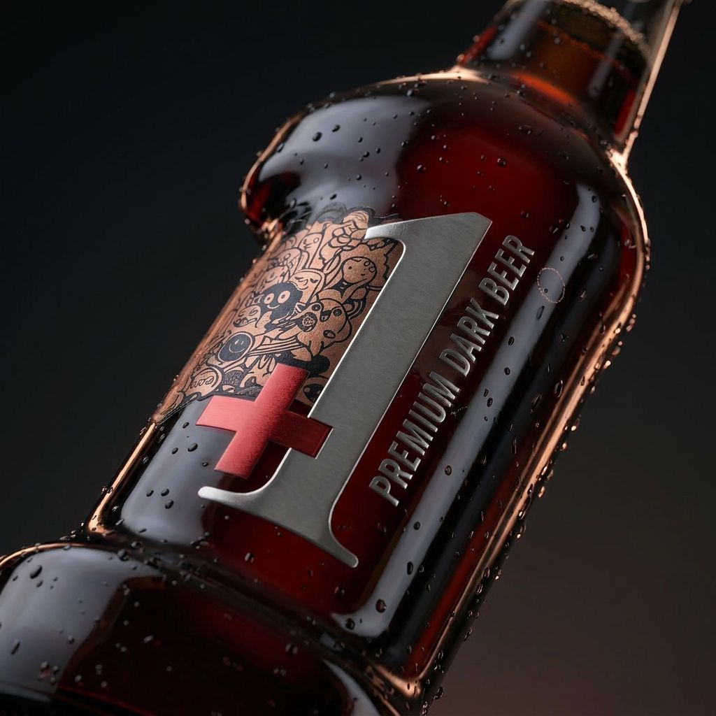
Inspired by Swiss precision, dark luxury and contemporary craft culture, the identity combines deep amber beer tones, matte black finishes, metallic textures and sculptural glass forms. The red + brings energy, contrast and a subtle reference to Swiss identity, while the oversized metallic 1 creates a bold and iconic brand code.
The packaging balances refinement with attitude. The bottle brings depth and elegance, the can adds a modern premium edge, and the glass shaped as the number 1 turns the tasting moment into a ritual. Condensation drops, embossed details and dramatic lighting highlight the freshness, richness and sensory depth of a luxury dark beer.
Behind the main symbol, the illustrative artwork adds a human and expressive layer. It gives the brand an artistic, urban and emotional personality, creating contrast with the clean, precise structure of the identity.
+1 is not about drinking more.
It is about drinking one level above.
A Swiss luxury dark beer created for those who do not choose the obvious, but the one that adds more meaning, more craft and more emotion to the beer experience.
Curator’s Insight:
What stands out here is the tension between the two visual registers on the label. The bold, reductive numeral and the red cross read as cold and precise, while the dense illustrative artwork behind it pulls in the opposite direction, loose, expressive, and warm. That contrast keeps the design from feeling like just another dark premium beer dressed in matte black. The decision to let the number 1 drive the entire structural language, from label composition to vessel shape, gives the system a coherence that is hard to fake. It is a concept that scales without losing its identity.
 Hi estudio
 43oz
43oz monther al omari
 Rosario Lo Iacono
 Ebbi
Ebbi Maruf Nishat
 Mind Brand
 宏洛图品牌设计HONGLT
 Iyioluwanbelarami
 sahildoesartt
 Denis Ulianov
 Garry Veda
 arutza
 Lucid mk2
 MaheswariMadhu
 sanjnasnair
 POSH FMCG BRANDING
 Modern Theory
 Shubhashish Roy
 Affogato Brand Design
 Backbar Studios
 hello ocean
 Luciana Gutierrez
 Valérie Colace
 marjusguza