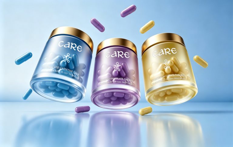

CARE Sports Health Brand Complete Creative Design
Design Agency: HONGLUOTU
1. Project Overview
Brand: CARE
Scope of Work: Complete brand creative design, including brand strategy refinement, visual identity system development, product packaging design, and integrated brand communication assets.
Core Product Range: Natural sports nutrition supplements and professional sports personal care products, covering energy replenishment, muscle relief, sports injury recovery, and post-workout restoration.
Applications: Official brand website, offline marketing materials, product packaging, e-commerce visuals, brand campaigns, corporate identity enhancement, and portfolio presentation.
2. Brand Background
CARE is a premium Australian sports wellness brand founded by Dr. Zane. Built around the philosophy of “Scientific Care, Empowering Recovery,” the brand is dedicated to providing thoughtful protection, relief, and support through natural sports nutrition and body care solutions.
Recognizing common challenges faced by athletes and fitness enthusiasts, including slow recovery, physical fatigue, overly complicated ingredients, and poor nutrient absorption, CARE combines Australia’s advanced scientific research with cutting-edge extraction technologies. Guided by strict standards of natural formulation, safety, and scientific development, the brand sources premium ingredients globally to create highly absorbable sports recovery products.
Every product is manufactured according to rigorous Australian production standards, eliminating unnecessary additives while supporting everyone from everyday gym-goers to elite athletes. Through continuous product innovation and scientific research, CARE aims to become one of the world’s most trusted natural sports recovery brands.
To reflect the brand’s premium, professional, natural, and approachable personality, HONGLUOTU developed a comprehensive visual identity system that revitalizes the brand image, strengthens recognition, and creates a seamless connection between CARE’s philosophy and its visual expression.
3. Core Design Philosophy
HONGLUOTU’s design approach is rooted in science, centered around care, and focused on making professional sports wellness more visual, accessible, and human.
The identity moves away from the cold, rigid aesthetic commonly associated with sports supplements. Instead, it blends CARE’s core values of science, nature, safety, and protection with contemporary minimalism and energetic sports-inspired design.
The visual language balances advanced scientific innovation with premium craftsmanship and a sense of warmth. It highlights CARE’s Australian heritage, strong research capabilities, and uncompromising quality standards while expressing the brand’s commitment to protecting athletes and supporting overall well-being.
The result is a cohesive, memorable, and highly recognizable visual system that helps CARE stand out within the competitive sports wellness industry.
4. Brand Visual Identity
4.1 Logo Design: Expressing Care, Empowering Performance
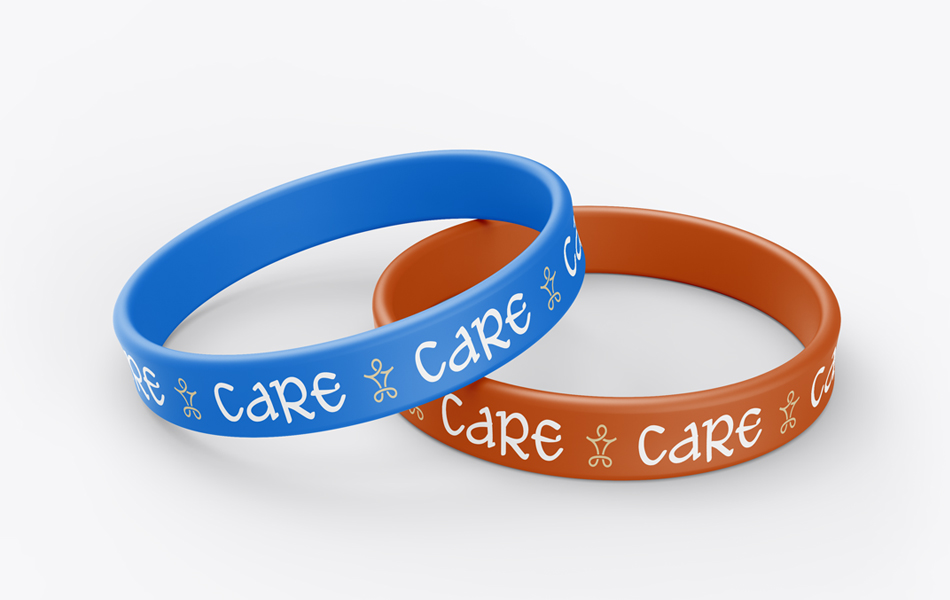
The logo centers on the brand name CARE, embodying its mission of protection and support.
A custom typeface with smooth, elegant curves replaces conventional industrial lettering, symbolizing flowing athletic energy and the body’s natural ability to recover.
An abstract human figure is subtly integrated into the logo, conveying movement, relaxation, and vitality while directly referencing sports recovery and performance enhancement. The clean, premium design clearly communicates CARE’s promise of scientifically supporting athletic health, creating a strong connection between the visual identity and the brand philosophy.
4.2 Brand Color System: Storytelling Through Layered Color
Rather than relying on the overly saturated palette commonly found in sports branding, CARE adopts a refined collection of custom low-saturation colors with a premium appearance.
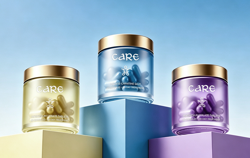
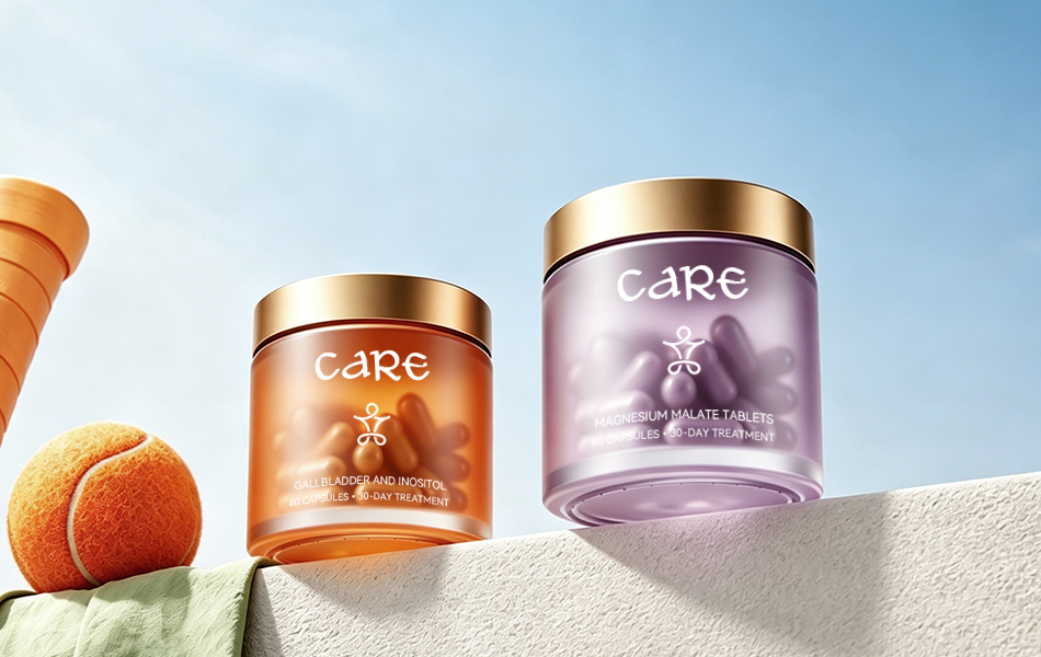
Each product category is assigned its own color family based on its function, creating a systematic visual language:
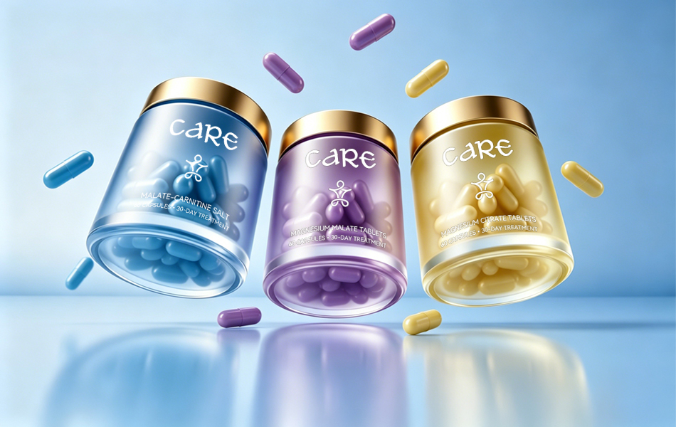
- Soft Gold represents natural energy supplements, communicating purity, gentle ingredients, and sustained energy.
- Deep Ocean Blue is used for performance activation products, symbolizing professionalism, focus, and advanced sports science for high-intensity training.
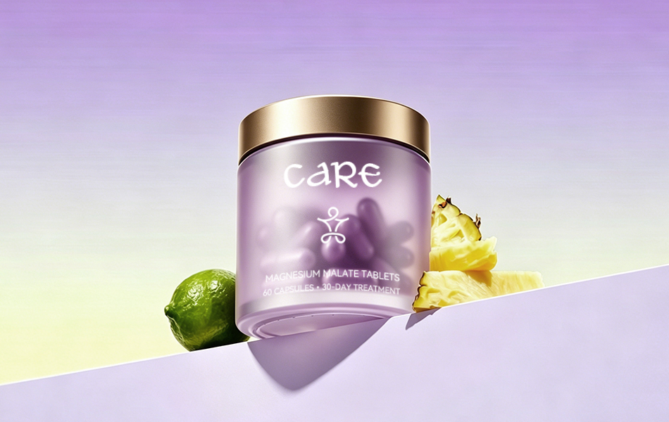
- Soft Lavender and Warm Cream Yellow identify muscle recovery and relief products, creating a calming visual experience aligned with post-exercise relaxation and healing.
Champagne Gold serves as the premium accent color across the entire product family, balancing natural wellness with scientific credibility. The unified color system ensures consistent recognition across digital platforms, retail environments, and marketing communications.
5. Packaging Design
Visualizing Science, Communicating Quality
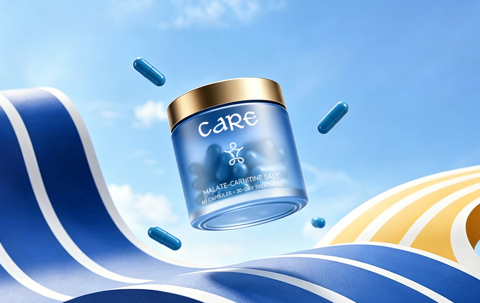
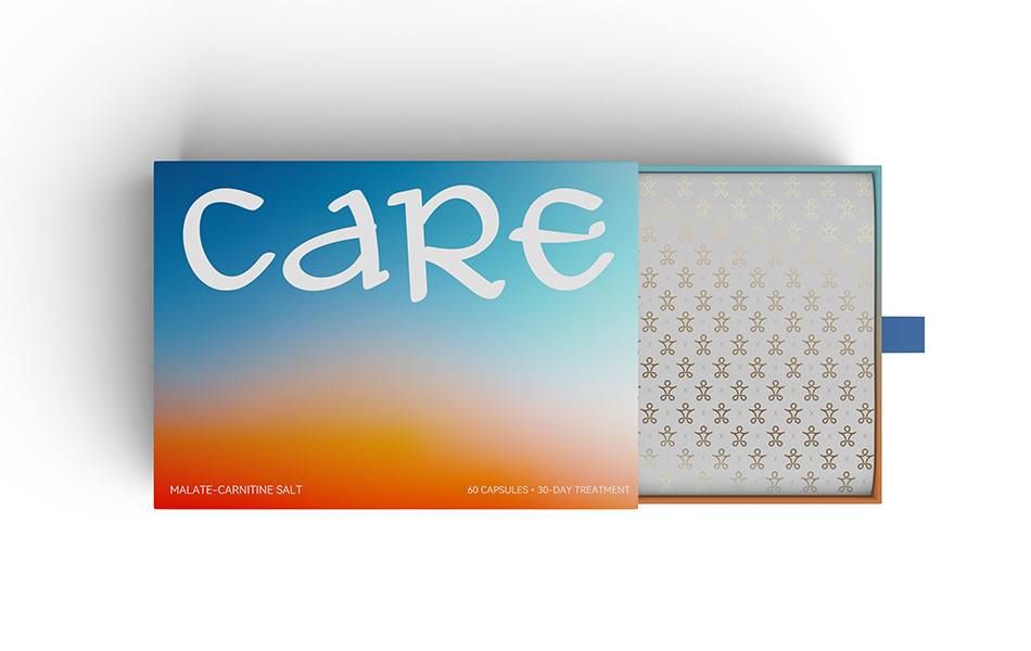
The packaging follows principles of minimalism, authenticity, transparency, and functional adaptability.
Designed to emphasize the brand’s natural formulations, safety, and effectiveness, the packaging delivers a solution that is practical, visually refined, and highly communicative.
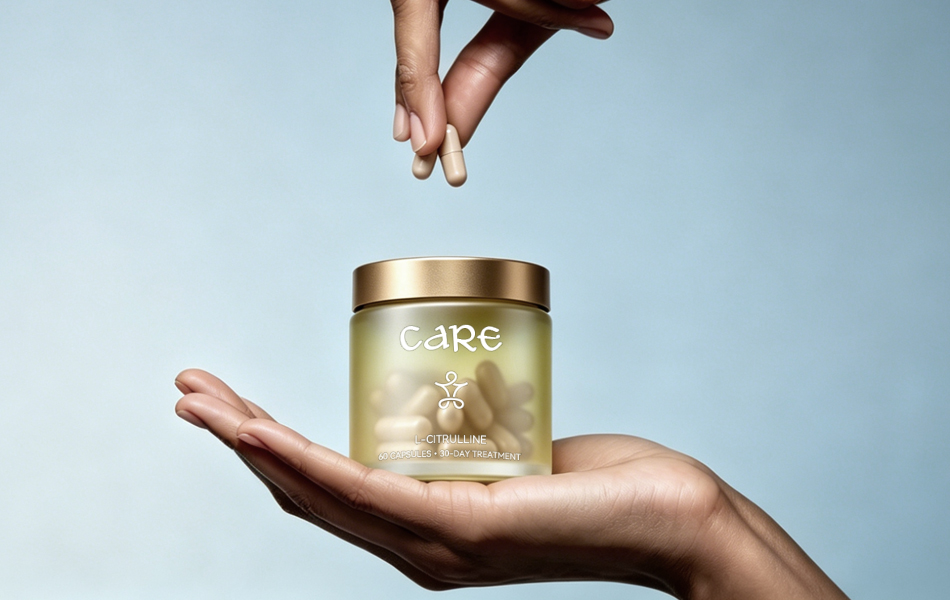
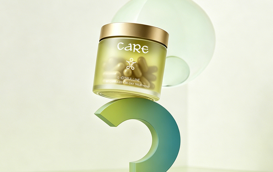
Premium matte-frosted containers create a sophisticated tactile experience, while transparent sections reveal the product itself, reinforcing CARE’s commitment to clean formulations with no unnecessary additives. This transparency helps build consumer trust by addressing concerns surrounding overly complex supplement ingredients.
Custom champagne gold lids elevate the premium positioning while reflecting Australia’s strict manufacturing standards and meticulous craftsmanship.
The information hierarchy follows international minimalist design principles, clearly presenting product specifications, key ingredients, intended use, and usage instructions. This organized presentation reinforces the brand’s scientific credibility.
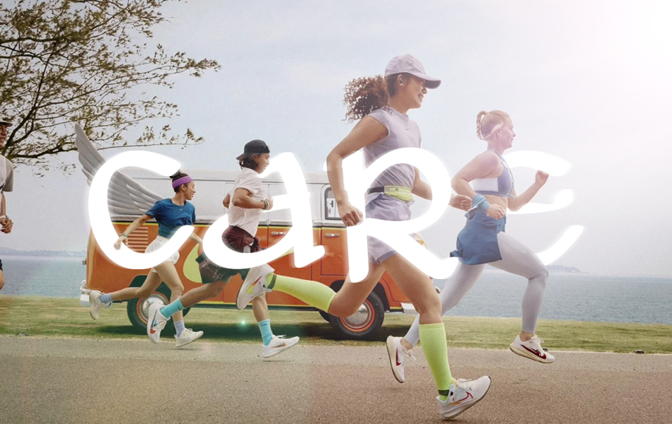
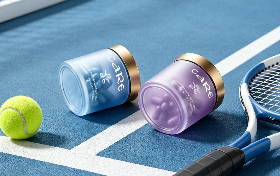
Each product line also incorporates dedicated sports imagery that connects its benefits to everyday fitness, intensive training, and professional competition, helping consumers immediately understand real-world applications while creating stronger emotional connections.
6. Brand Communication Design
One Visual Language Across Every Touchpoint
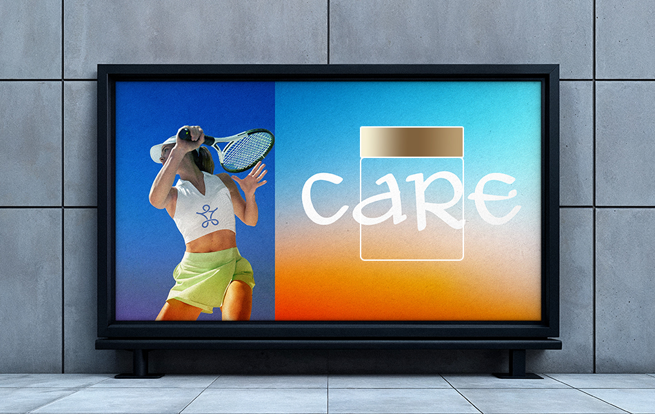
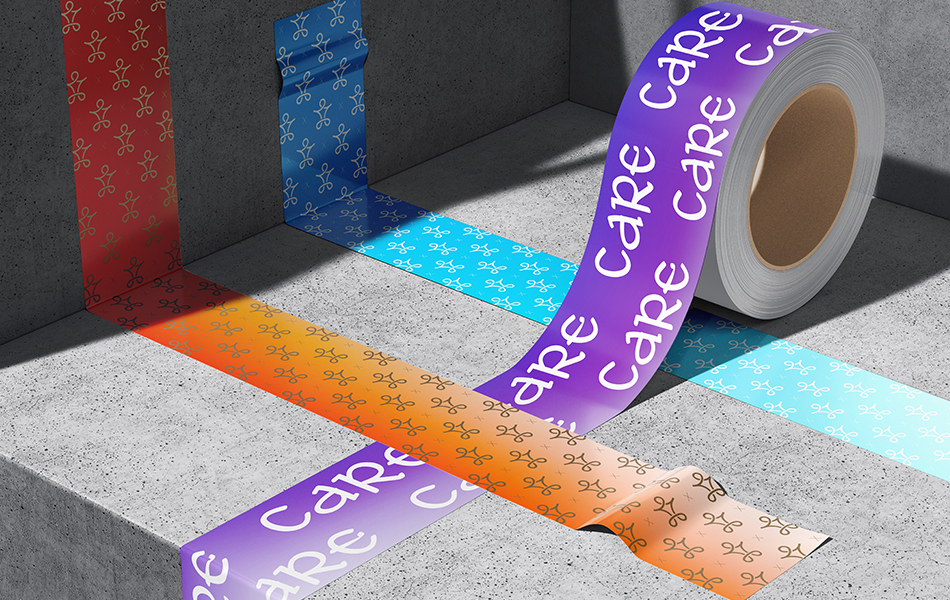
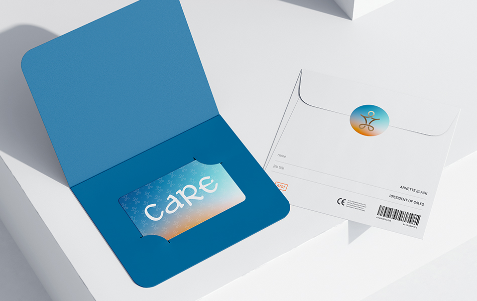
A comprehensive communication system was developed to support omnichannel marketing with consistent storytelling and a unified visual identity.
The central visual language revolves around the CARE logo, combining dynamic athletic imagery with flowing energy graphics that reinforce the brand message:
“Scientific Care. Empowering Sports Recovery.”
This visual approach highlights CARE’s ability to unlock athletic performance while accelerating physical recovery.
Supporting marketing assets continue the established color palette and minimalist aesthetic across product family presentations, ingredient storytelling, immersive sports environments, and brand messaging.
The complete visual system is refined, understated, and memorable, making it highly adaptable for official websites, e-commerce platforms, retail displays, promotional materials, and integrated marketing campaigns while presenting a unified, professional, and approachable brand image.
7. Design Value & Conclusion
HONGLUOTU’s branding for CARE is built upon the brand’s Australian research heritage and premium sports wellness positioning, balancing scientific expertise with genuine human care.
The comprehensive identity upgrade spans the logo, color system, packaging, and communication materials, addressing common industry challenges such as visual homogenization, inconsistent color usage, and unclear brand positioning.
The new identity clearly communicates CARE’s strengths in natural ingredients, scientific research, and product safety while expressing its mission to support athletic health with warmth and care.
By moving beyond the stereotypical visual language often associated with health supplements, the project establishes a contemporary, internationally positioned premium brand that resonates with both fitness enthusiasts and professional athletes, reinforcing CARE’s position as a benchmark in natural sports recovery.
Design Agency: HONGLUOTU

 krrrrrllii
 babyage
 Deep
Deep monther al omari
 Atiq Alam
 TUERCA Studio
 neo creative studio
 Pinot Agency
 Pixels Studio
 Anastasia Cherepanova | xtramez
 awaiskhadim
 Studio Be Design
 Belova Oksana
 We Craft Studio
 ArtDesignByDIna
 Ananya Taran
 Nadezhda Gorelikova
 orhanirmaktasarim
 WillBe
 Hi estudio
 43oz
43oz Rosario Lo Iacono
 alchimistestudioParis