

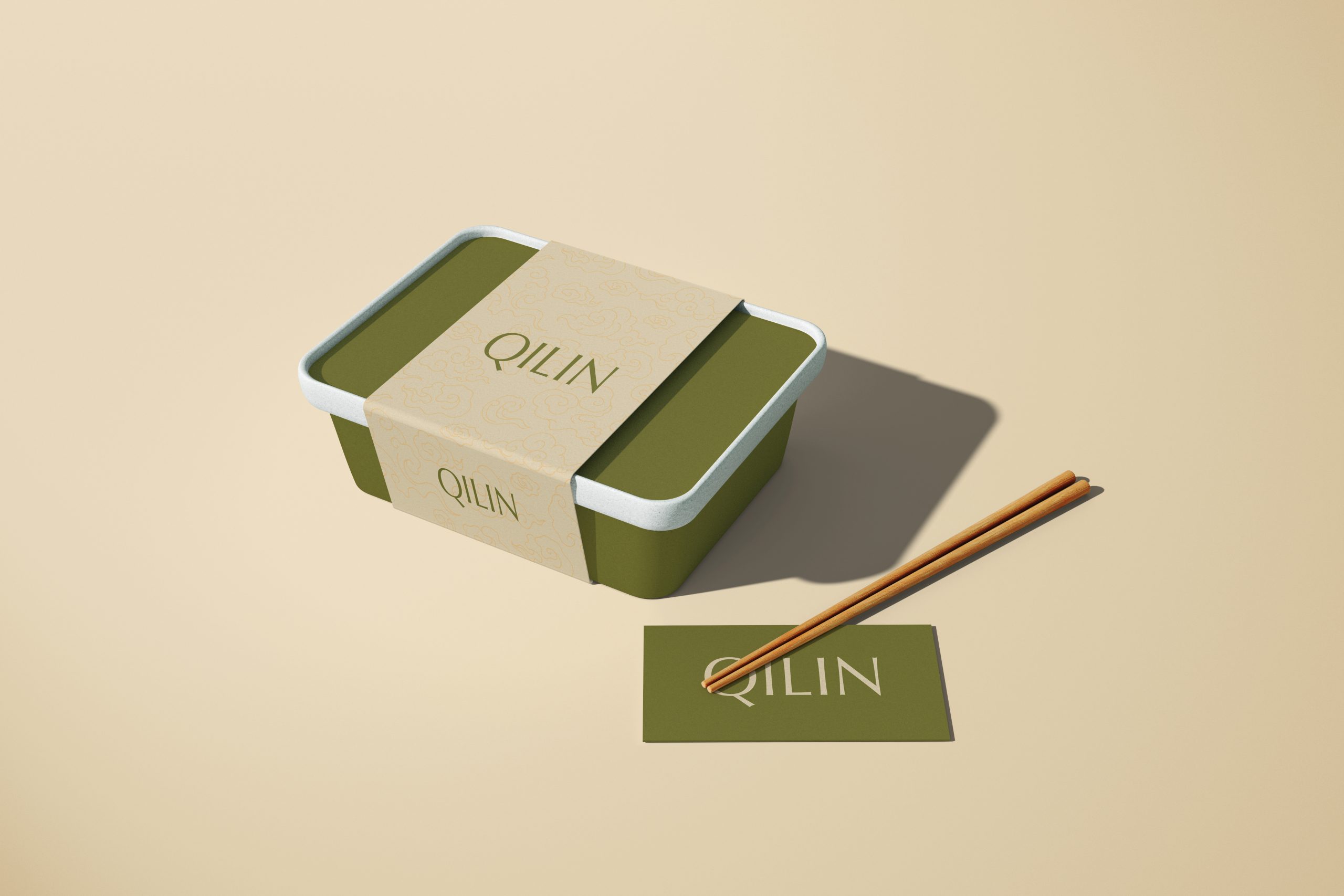
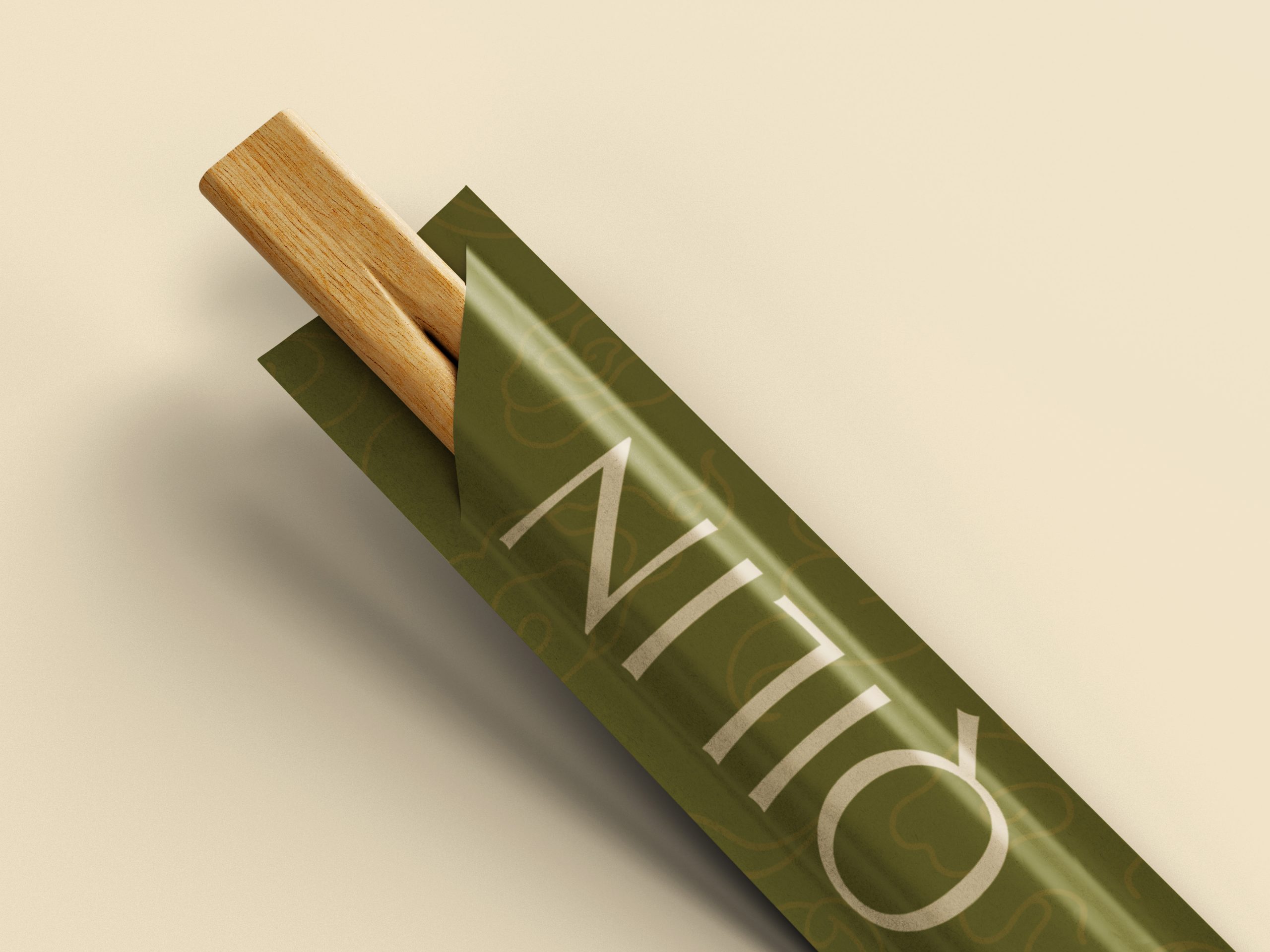
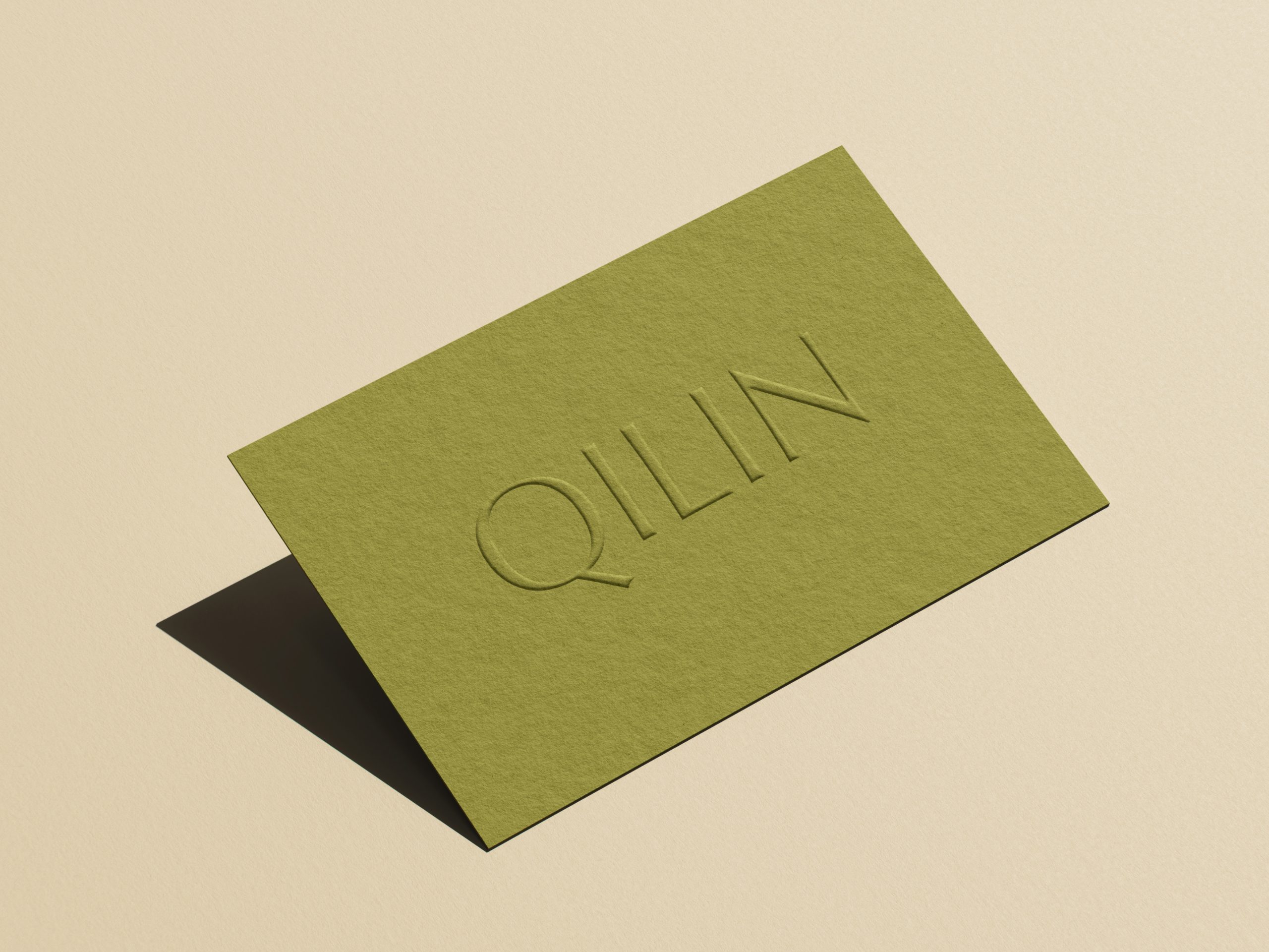
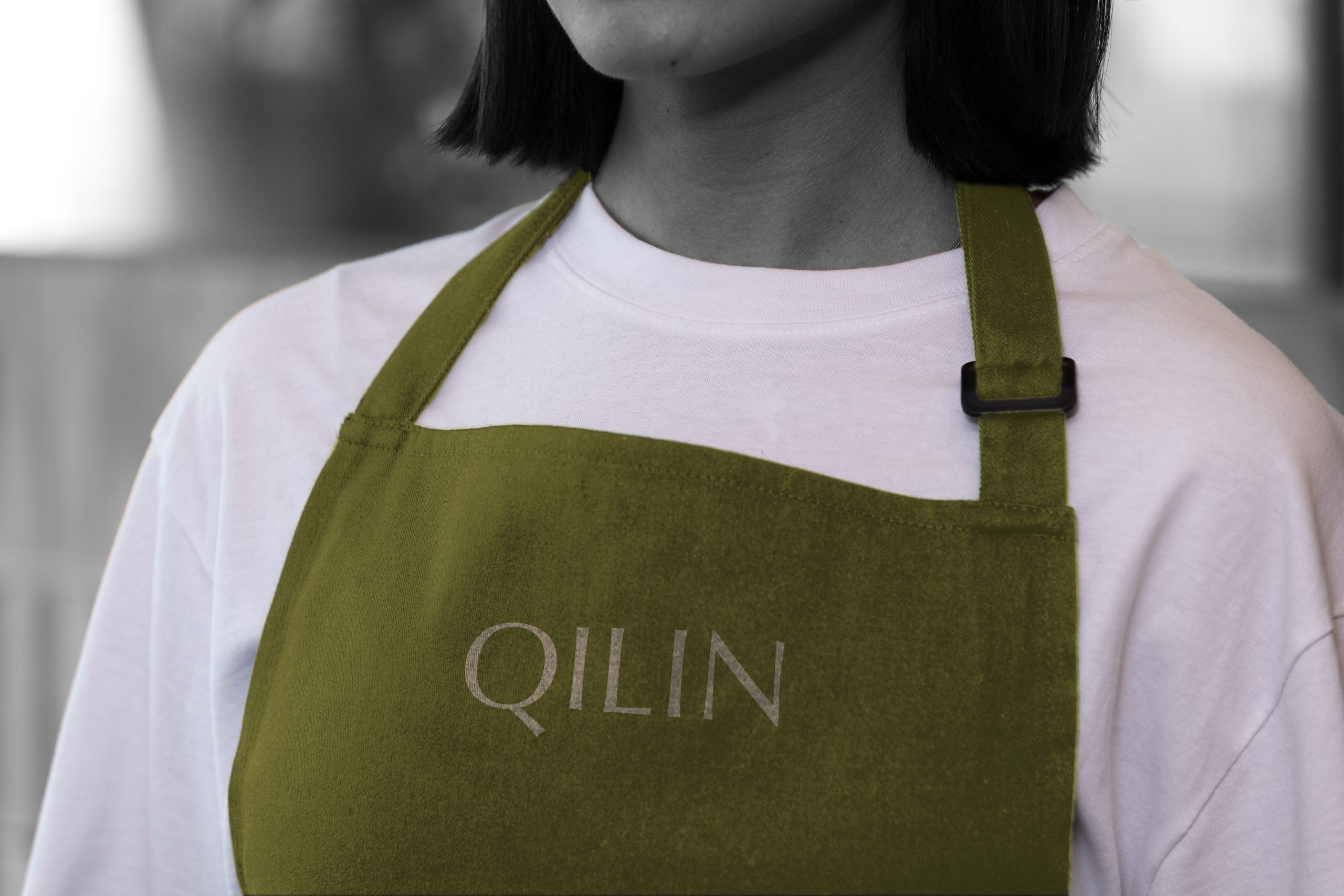
QILIN is a visual identity system created for a luxury Chinese restaurant concept, drawing its name from the mythical guardian creature of Chinese folklore ; a benevolent, dragon-like being said to appear only before moments of great significance, such as the birth of a wise leader or the dawn of a prosperous era. Rather than relying on the conventional red-and-gold restaurant tropes so often used to signal “Chinese cuisine,” the identity is built around an unexpected palette of deep olive green and warm cream, evoking jade, rice paper, and aged parchment; materials associated with heritage, scholarship, and quiet wealth rather than spectacle. This restraint is carried through into a custom wordmark, hand-cut with deliberately imperfect letterforms that reject the precision of typical luxury branding in favor of something that feels crafted, considered, and human. A subtle auspicious cloud motif, drawn from traditional Chinese decorative patterns, recurs discreetly across packaging and collateral, woven into the texture of the brand without ever competing for attention. The system extends fluidly across chopstick sleeves, bento packaging, business cards, and dimensional wood signage, resulting in a cohesive, tactile expression of luxury that mirrors the Qilin itself: present, dignified, and unwilling to announce itself unnecessarily.
 Hashem Gerashi
 monther al omari
 Emi Renzi
 Bonsanco Creative Studio
 Isha
Isha Confetti Design Studio
 Luks Piekut | Wytrawny
 TOGNOLLO STUDIO
 Svea Bode
 Valérie Colace
 宏洛图品牌设计HONGLUOTU
 Toolstika
 Marta Wasilewska
 Heramb Arora
 Hakob
Hakob Nadya Chunikhina
 Elodie Clarke
 MID-AIR STUDIO
 Tríona O'Donoghue • Design
 Cocoon Prague
 alchimistestudioParis
 hugo zapata