
Bonna Brings Everyday Flavour to Life Through Design
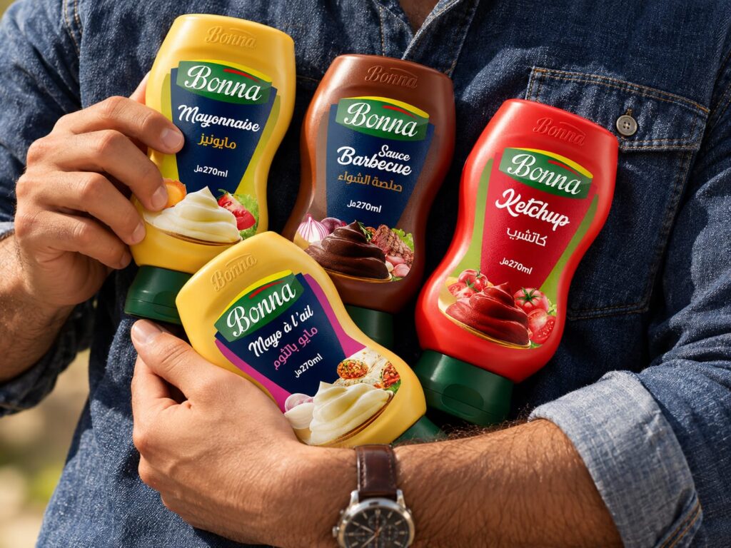
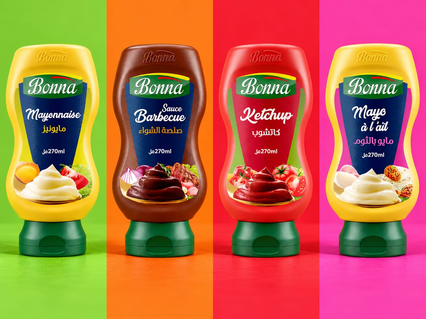
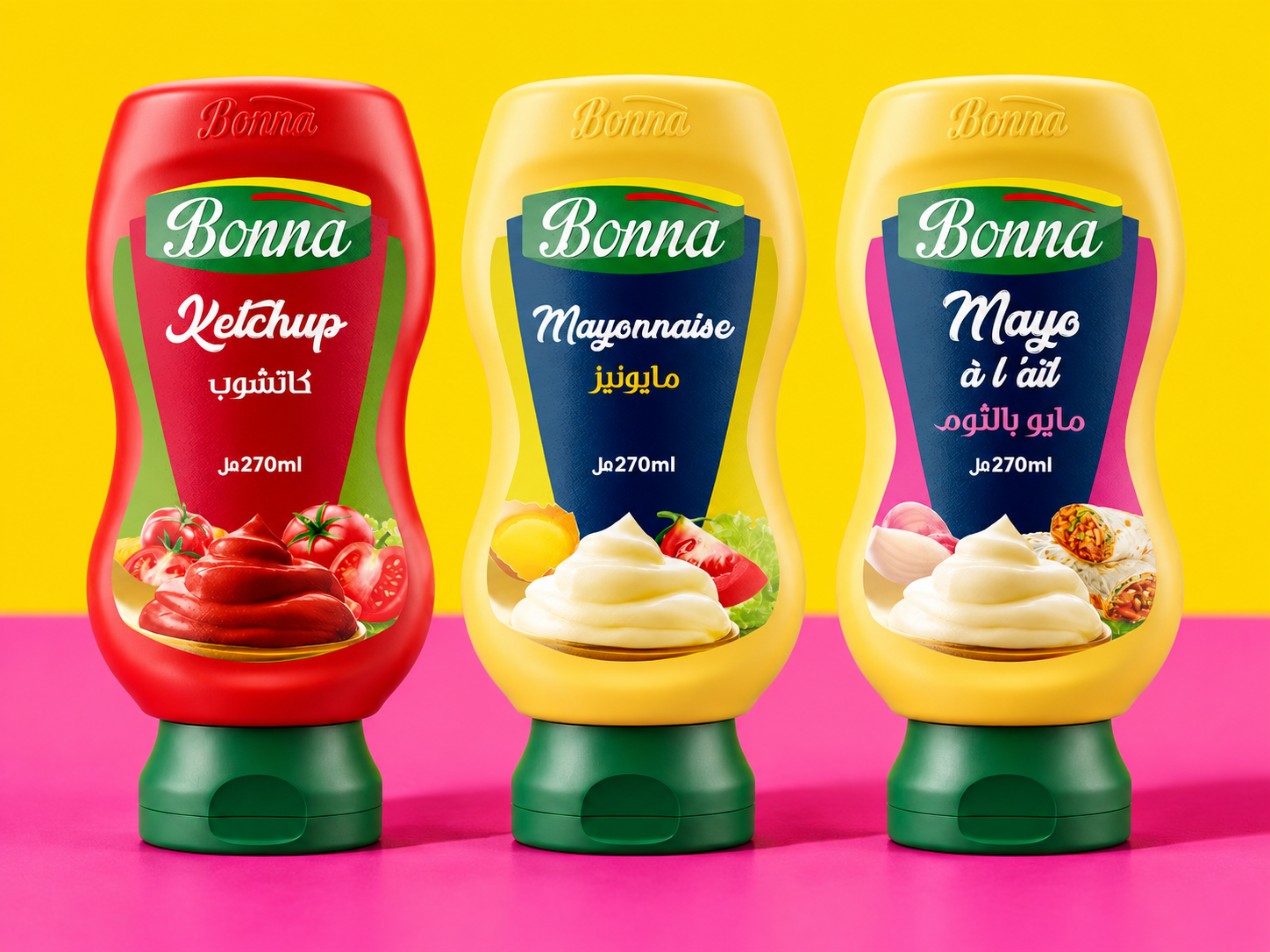
Bonna celebrates the pleasure of everyday food through a vibrant packaging identity. Across mayonnaise, ketchup, barbecue sauce and garlic mayonnaise, the range combines expressive colour, appetising imagery and a consistent visual structure, giving each flavour its own personality within one recognisable family.
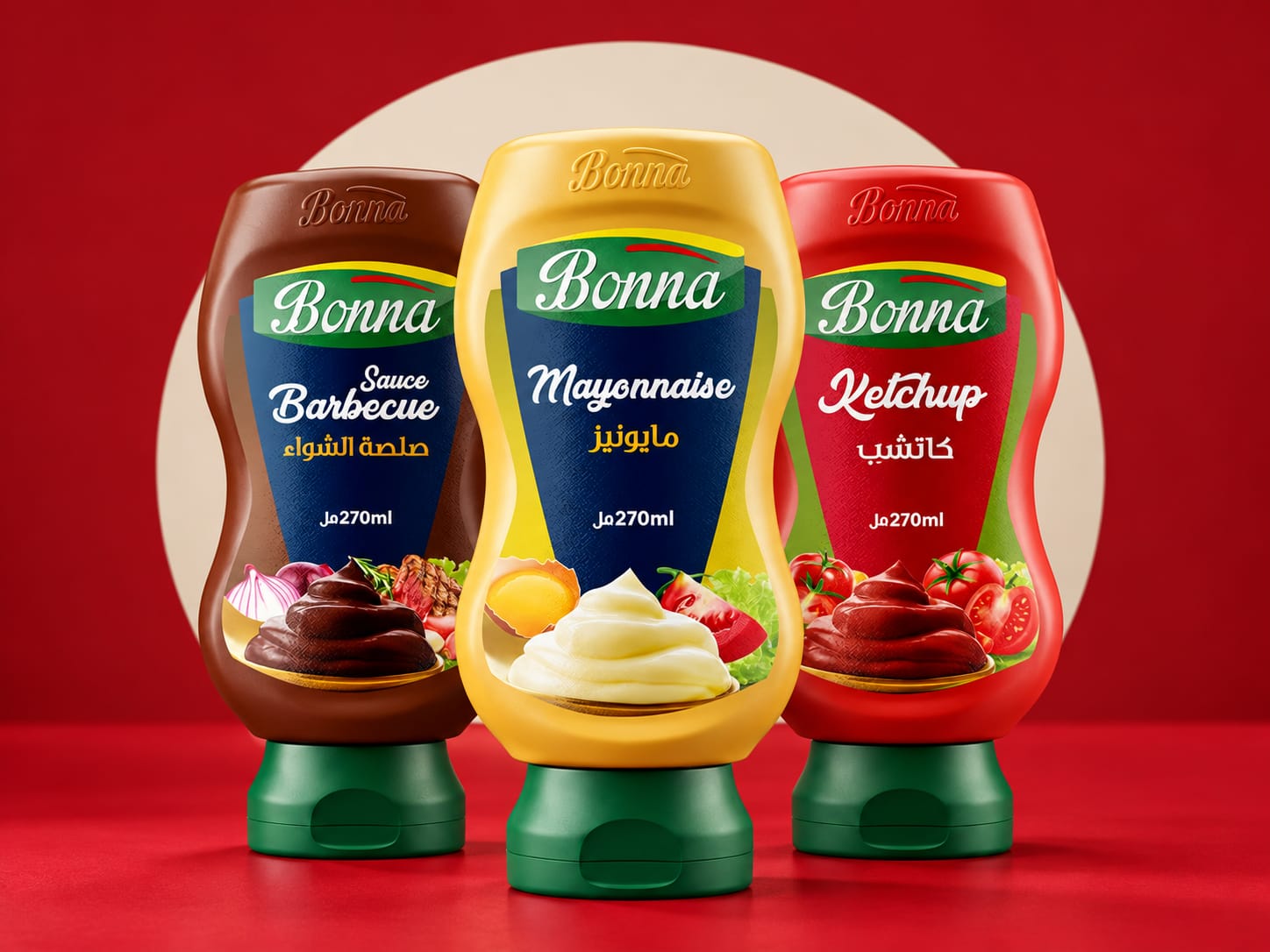
The design balances generosity with clarity. Bonna’s flowing white logotype sits within a green panel, creating a shared signature across the collection. Prominent product names and French–Arabic typography establish a clear hierarchy, while contrasting colours help distinguish the varieties. Deep navy frames the mayonnaise and barbecue labels, red echoes the character of ketchup, and pink accents bring a distinctive touch to garlic mayonnaise.
At the heart of the packaging is a direct invitation to taste. Generous swirls of sauce communicate creaminess and richness, while surrounding ingredients and serving suggestions connect each product to familiar meals. This visual language makes flavour the central element of the brand experience.
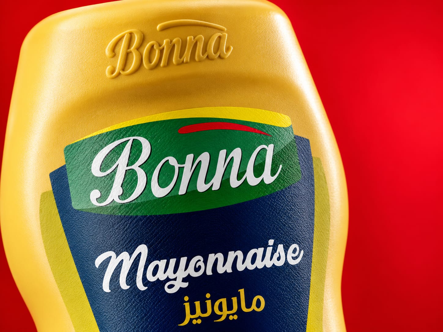
The curved bottles extend the identity beyond the label. Their contours frame the graphic composition, matching green caps unite the range, and the embossed Bonna signature introduces a tactile expression of the brand. Together, these details create a cohesive presence, whether the products appear individually or as a complete collection.
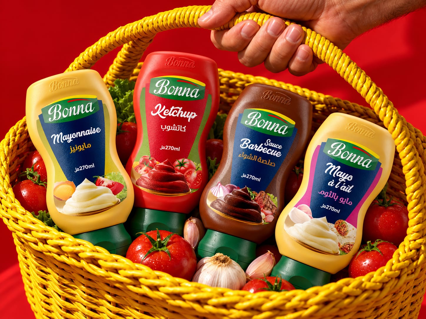
The accompanying art direction builds on this colourful character. Bold backgrounds highlight each variety, while compositions featuring a shopping basket, fresh ingredients and products gathered in someone’s arms introduce warmth and everyday familiarity. Close-up imagery draws attention to surface textures, lettering and embossed details.
Through this combination of colour, appetite and human connection, Bonna presents its sauces as natural companions to shared meals. Four distinct flavours come together around a simple idea: making everyday food more inviting.
 NEV
NEV Stefano Bracci
 Alina
Alina monther al omari
 Lizakjx
 JOAOMARCOSDESIGN
 Harriet Neild
 octavio rojo
 宏洛图品牌设计HONGLT
 DESIGN CONCEPTS
 Alexander Skurihin
 Studio K95
 ARMBRAND
 Richa Rai
 houseoferas by Miti
 Agence des Coteaux
 Kushi Eaknath
 Ann Treasa
 Xiao Ning
 krrrrrllii
 babyage
 Deep
Deep Atiq Alam