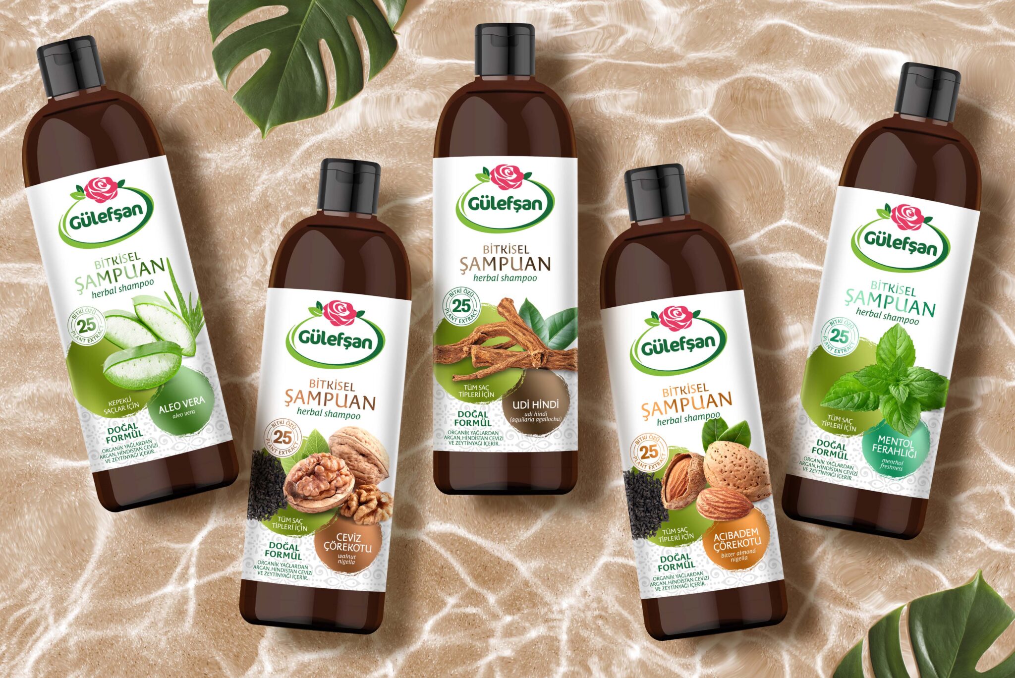
We designed the label graphics for our brand, which has released a brand new herbal shampoo series.
We benefited from the pure and clean effect of white on the floor. We explained the product contents with the visuals we positioned in the middle. We used the circular brush trace, on which we wrote the product content, as metallic in different colors. Thus, we supported the differentiation of variants with colors.
We used a traditional texture in the lower part of the design. This is a result of the brand’s consumer analysis.
