Spa Theory offers a line of aromatherapy products that bring the spa experience to one’s home. The brand’s philosophy is centered around authenticity and purity, drawing inspiration from nature and catering to the emotional needs of its users. Their vast product range is carefully crafted with great attention to detail, making it a standout brand that advocates a life filled with inner peace, harmony, and balance.
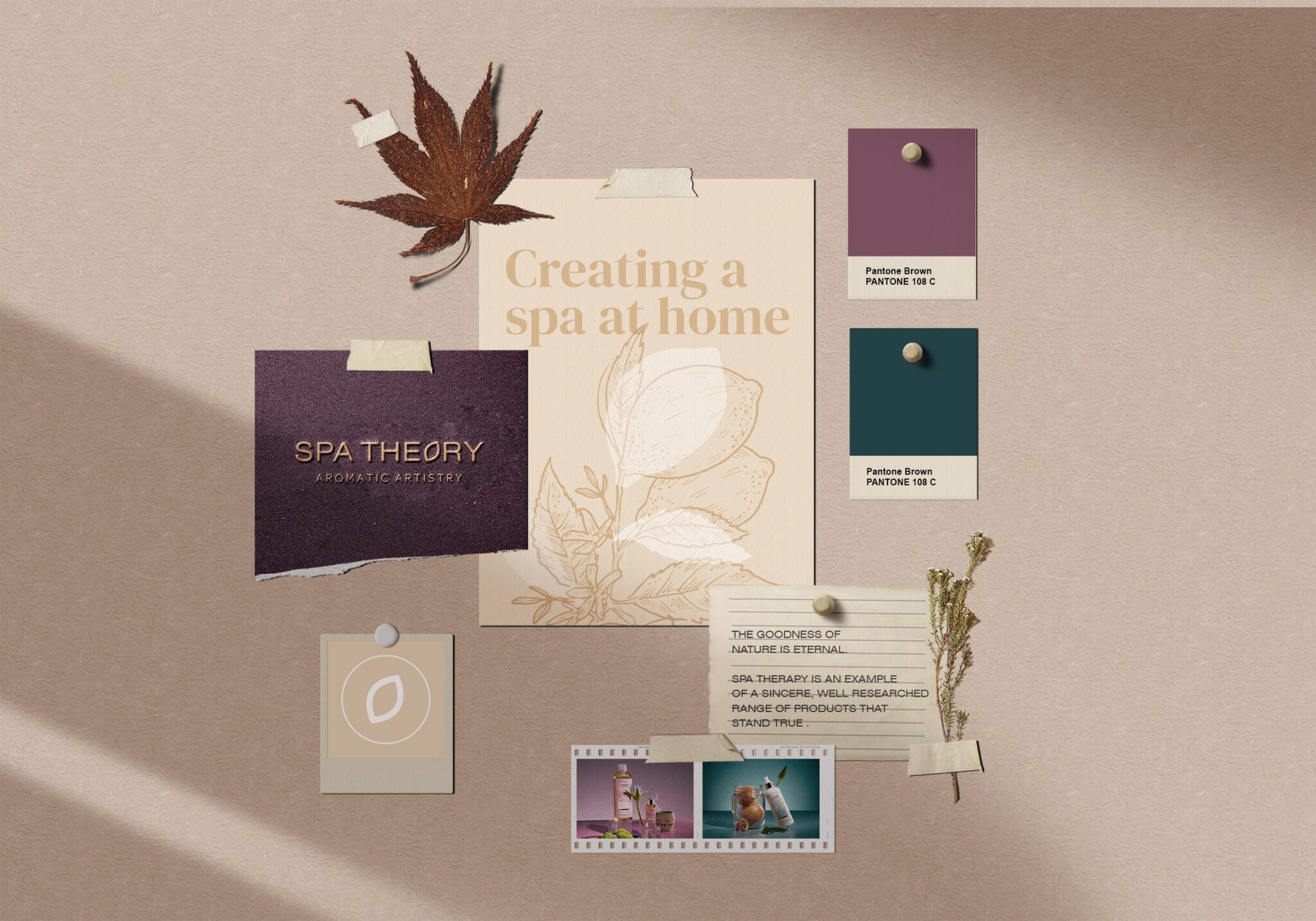
The design ideology behind Spa Theory’s brand identity and packaging, created by Beyondesign, is to reflect the brand’s commitment to developing products that are rooted in nature and cater to the emotional needs of its users.
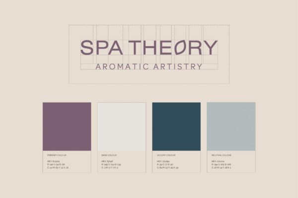
The logo design is bold yet elegant, with a form that emanates a soothing effect on the mind and senses, embodying the trust that they are building with their consumers. The brand colours are established to distinguish each product’s quality and composition while maintaining a certain balance and harmony among them. The fonts with elegant curves and a soothing balance of strokes highlight the brand’s essence.
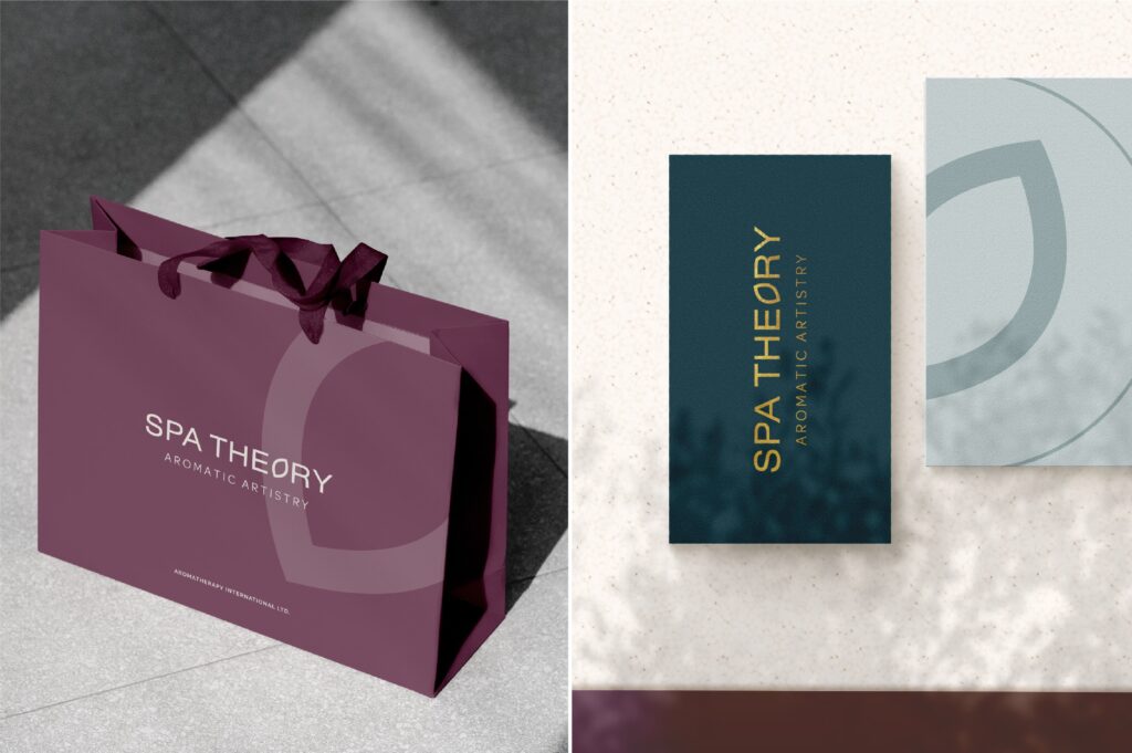
The packaging design follows a minimalist approach, with a focus on natural ingredients and simplicity, creating a sense of calmness and relaxation. The fresh pastel palette is in line with the brand’s promise of providing soothing and fragrant products.
The identity and packaging design are elegant, modern and visually appealing capturing the essence of the brand’s philosophy while adding a contemporary touch. The brand stands out as a market grabber, with products that are sincere, well researched, and stand true to every test, catering to the needs of its customers with the purity and prosperity of nature.

