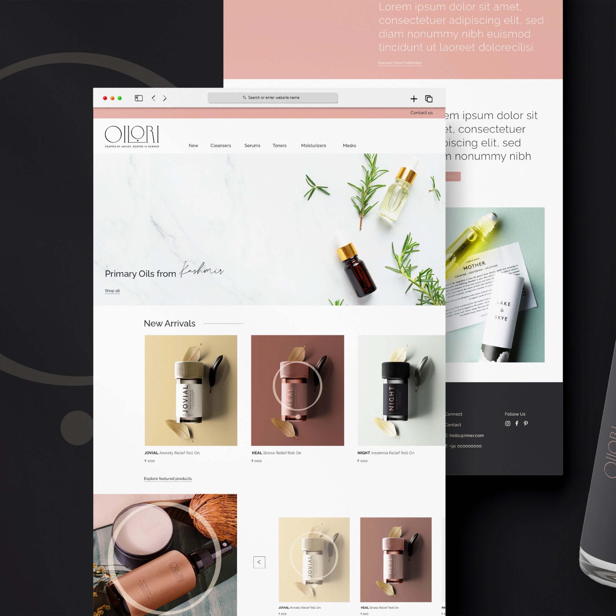
Our collaboration with Oilori brought about a brand identity and packaging design that reflects simplicity and authenticity.
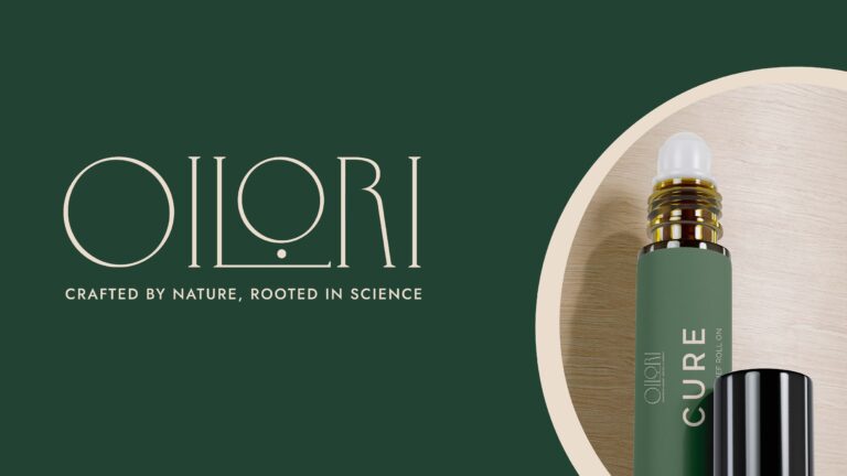
A simple, minimal logo was created, which highlights the luxury, trust and warmth of the brand. The extended L represents the strong foundation that the brand has been built on – with the founders rooted knowledge and scientific insight into the nature and uses of essentials oils. The dot highlights the focus and precision with which the oils are made. The ‘o’ of the logo is identified as the main symbol as it is the most prominent aspect of the logo. It stands for the holistic impact of the products’ and it can be recognized immediately creating improved brand recall.
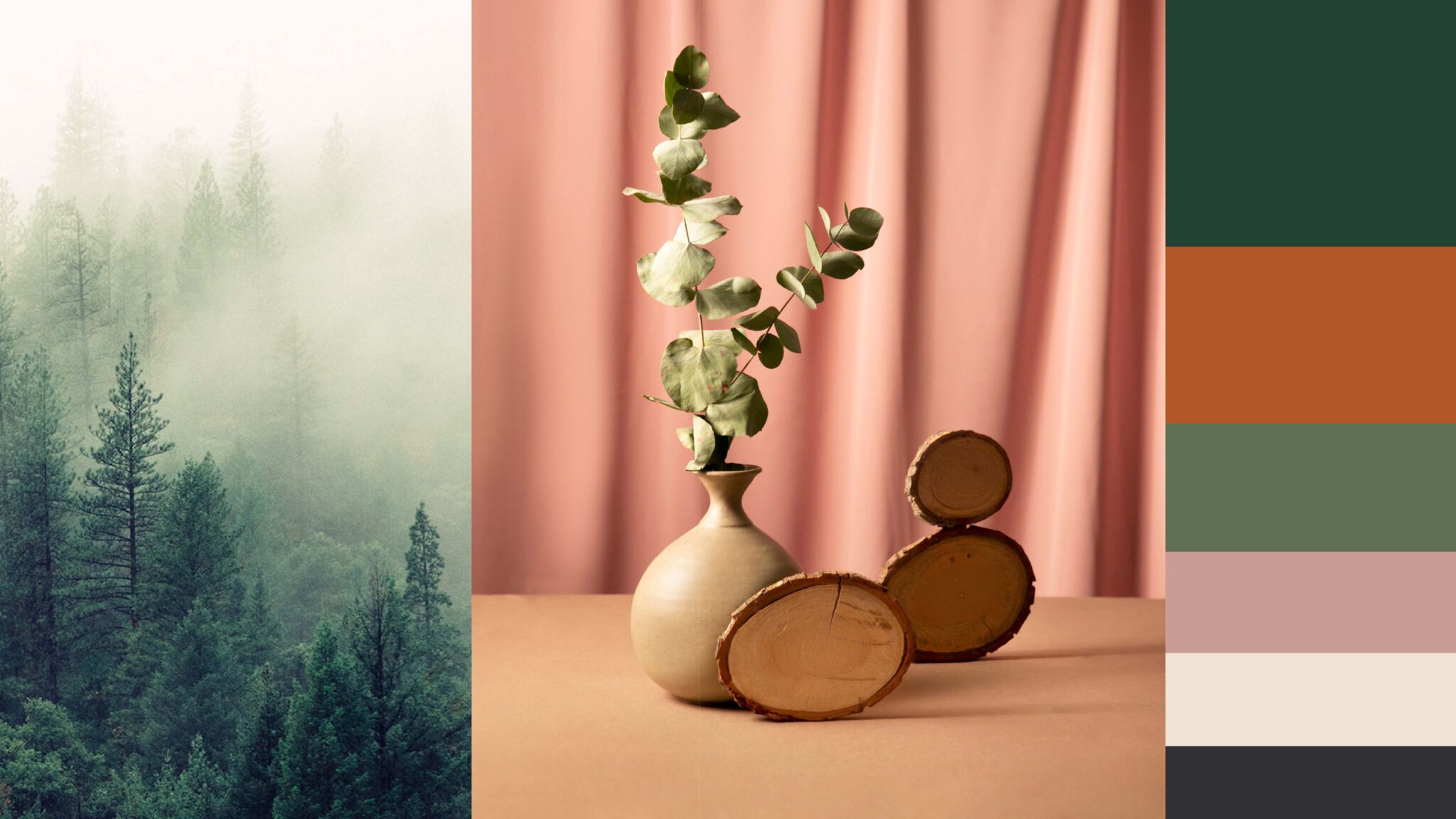
The colour palette was carefully curated to align with Oilori’s core values of warmth and compassion, reflecting the healing qualities of nature. This palette accentuates Oilori’s genuine and modest character while connecting with consumers who appreciate simplicity.
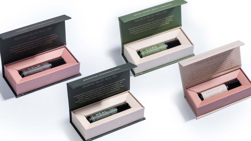
The packaging design seamlessly blends elegance and respect for nature, inviting customers on a sensory journey. Crafted to evoke the potential of essential oils, it creates an aesthetic unboxing experience that aligns with Oilori’s ethos—celebrating the power of nature’s gifts.
Our branding approach for Oilori centres around simplicity, authenticity and a deep respect for nature’s wisdom. Grounded in minimalism, the design reflects Oilori as a brand firmly rooted in its principles, dedicated to providing sincere products.


