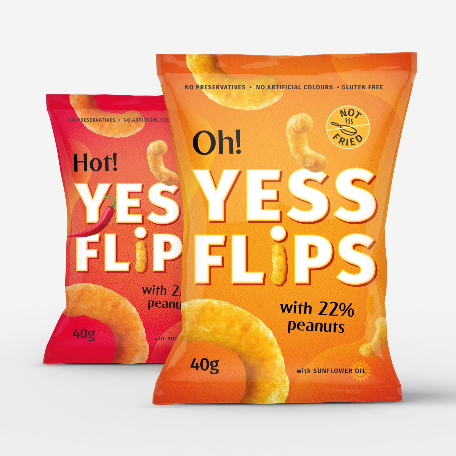
The Challenge
Designed a packaging identity for a flips snack that captures its light, crispy texture and bold flavors. The goal was to create a fun, energetic, and appetizing look while ensuring strong shelf visibility.
Our Approach
- Vibrant Colors & Playful Typography – Reflecting the snack’s crunchy, flavorful, and fun personality.
- Bold Flavor Cues – Using dynamic visuals to instantly communicate taste and texture.
- Cohesive Branding – Ensuring a consistent yet flexible design across multiple flavors.
- Consumer-Friendly Packaging – Easy-to-handle design that stands out in both retail and grab-and-go settings.
The Result
A modern, eye-catching packaging that not only attracts consumers but also reinforces brand recognition. The playful design enhances the snacking experience, making it memorable, fun, and irresistible.