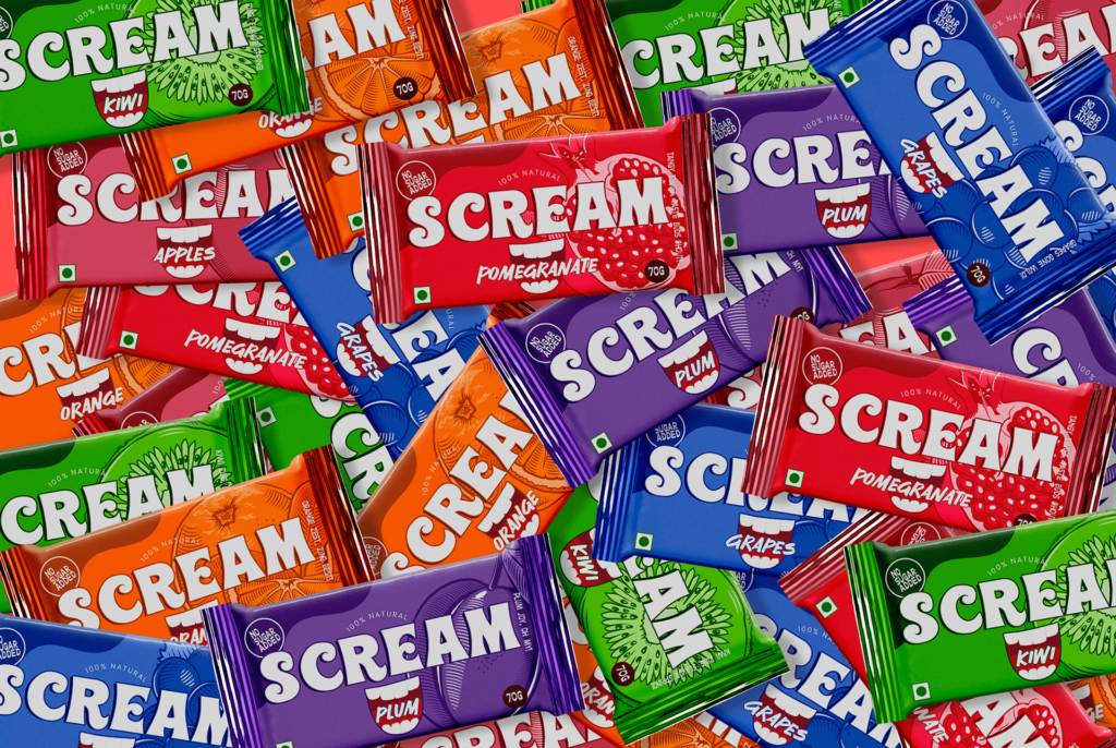
Scream™ Energy Bar: Fuel Your Roar, Naturally
Prepare for a sensory explosion that transcends taste and sight! Scream™ Energy Bar’s packaging isn’t just a visual treat; it’s a vibrant testament to the fusion of flavor and sustainability.
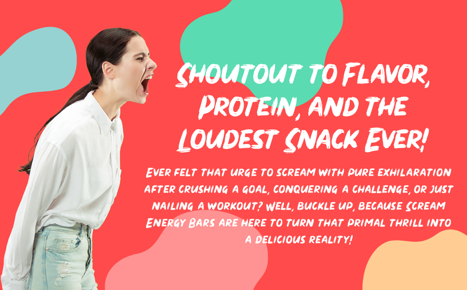
The inclusion of ‘Scream’ in the brand name isn’t mere happenstance – it’s a bold proclamation of energy, echoing the exhilarating burst of vitality packed into every bar. Like an exclamation mark that adds emphasis to a sentence, ‘Scream’ injects a jolt of dynamism into the brand identity. Brace yourself for a journey where taste meets visual delight in perfect synchrony.
Welcome to the realm of Scream Energy Bars – where each bite is a surge of strength, and every wrapper is a tribute to the power of nature!
Brand Vision: At Scream Energy Bars, our vision is as clear as a crystal-clear sky: we’re committed to amplifying your energy levels while championing the cause of sustainability. Our belief is simple – the true essence of power lies in natural ingredients. That’s precisely what we deliver: a symphony of flavors sourced from the finest, all-natural ingredients that not only invigorate your body but also nourish your spirit.
Picture a world where every munch is a victorious roar, a testament to your triumphs and vitality. That’s the essence of Scream Energy Bars – transforming the energy within you into a delectable, vibrant experience. With each bar, you’re not just consuming; you’re channeling your strength, reveling in your accomplishments, and stoking your inner fire.
Case Study: The dynamic visual identity of Scream Energy Bars has been meticulously crafted to address the challenge of presenting a compelling brand that resonates with a broad audience, all while championing sustainability. Our branding strategy aimed to position the product as a genuine, dependable, and revitalizing solution for diverse needs through premium energy bars.
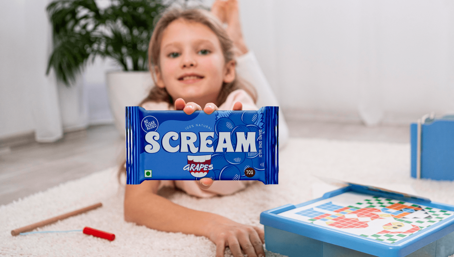
Our target audience encompasses individuals of all ages who lead dynamic lives and prioritize holistic well-being. This includes students, professionals, fitness enthusiasts, and anyone seeking a sustainable energy boost on the go.
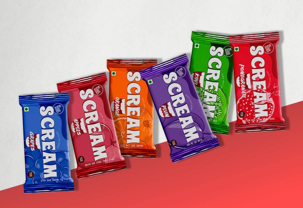
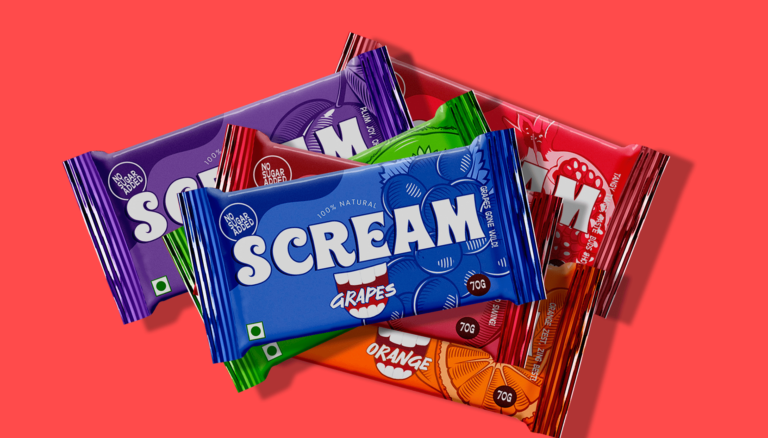
The visual identity of Scream Energy Bar is a celebration of the word “Scream” in all its vibrancy and vitality. Through lively colors, the design encapsulates the promise of high-energy nourishment. The packaging is thoughtfully engineered for modern living, ensuring convenience without compromising on sustainability. Images spotlight fresh, natural ingredients and active lifestyles, resonating deeply with health-conscious consumers. Bold typography amplifies the invigorating essence of “Scream,” reinforcing the brand’s commitment to delivering an emotionally charged and eco-conscious experience.
Conclusion: Scream Energy Bar’s packaging isn’t just about enclosing a bar; it’s a statement of our dedication to energy, sustainability, and flavor. With vivid colors, robust typography, and a focus on natural ingredients, our packaging invites consumers to unleash their inner power while honoring the planet. Here’s to fueling your roar with Scream Energy Bars – where every bite is a celebration of life, energy, and sustainability!


