Naturaw Honey is a passion project of a retired electrician that was born and raised in a small mountain village and was parted away from there because of work. He dedicated his life to his work, and after retirining went back to his home village and started making honey.
The pure thought of the person and not looking at the product as a quick cash grab, the client decided to create this brand in its truest form.
Nothing added, nothing reduced, pure clean and raw honey packed in small jars.
When the client approached me he had a vision that he wants to produce honey in the same style that his grandfather produced back in 1940s. We quickly started working on the brand identity, naming, logo creation and a deep research on “What is the current state and opportunity on the market”. Our study gave us a clear picture about the supply, but also while doing the research we were taking notes on the demand.
What we saw was that every honey brand looks almost the same, bees, honey dripping, flowers… and it was boring, cheap and oversaturated shelf with the same product. Something like blind picking. You have no idea what you buy, except that you buy a jar of honey.
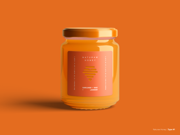
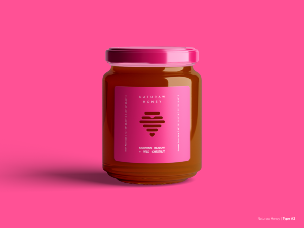
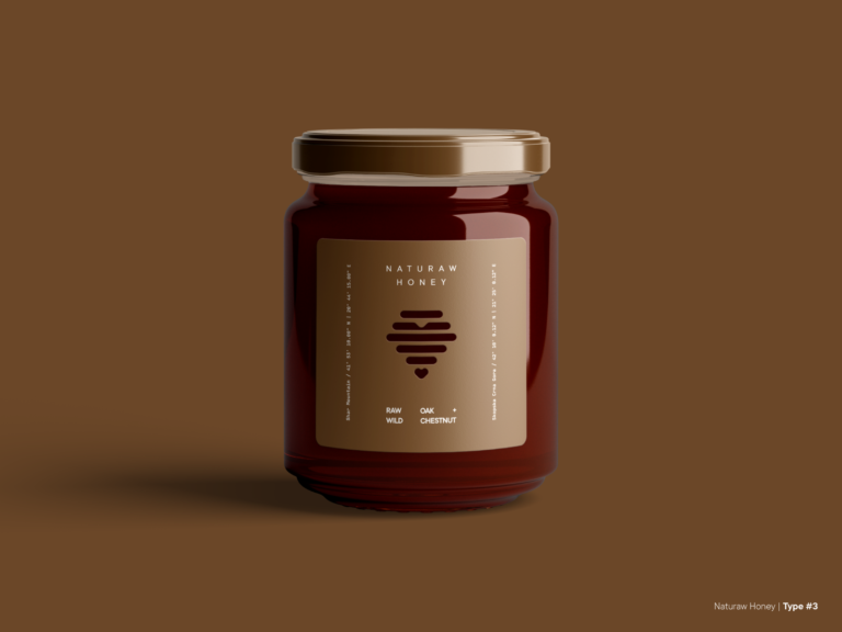
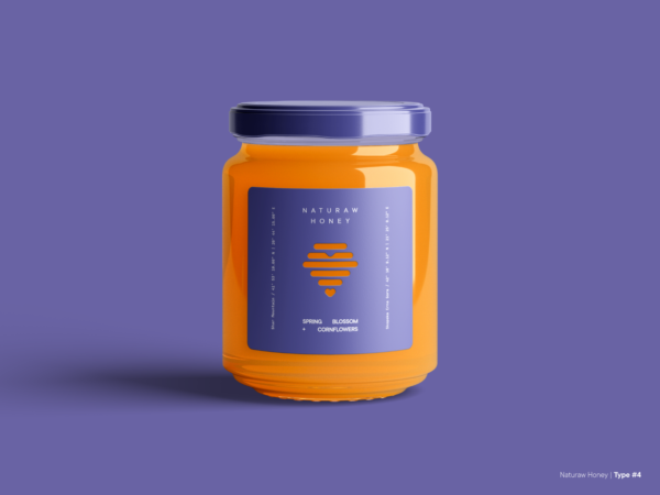
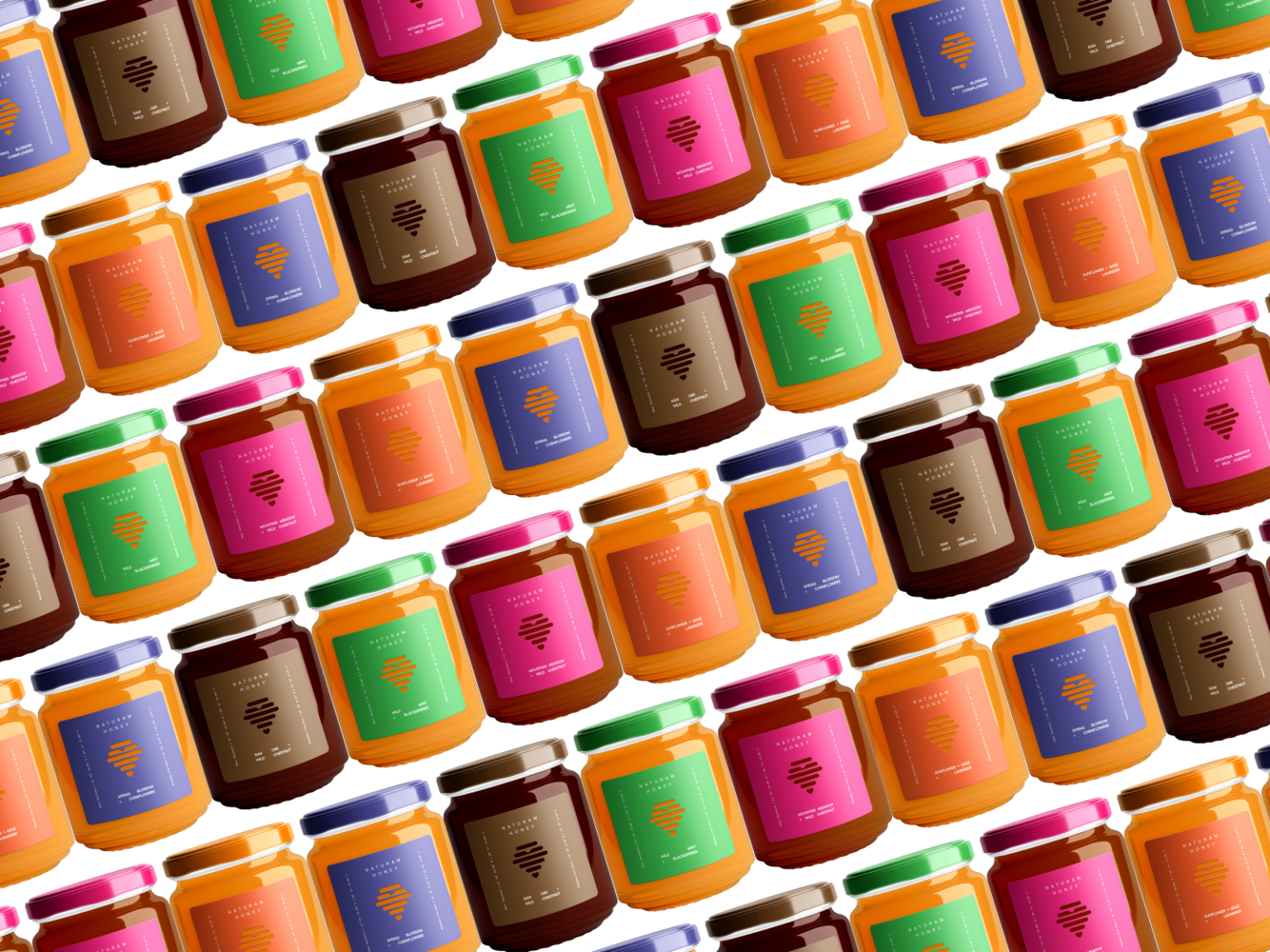
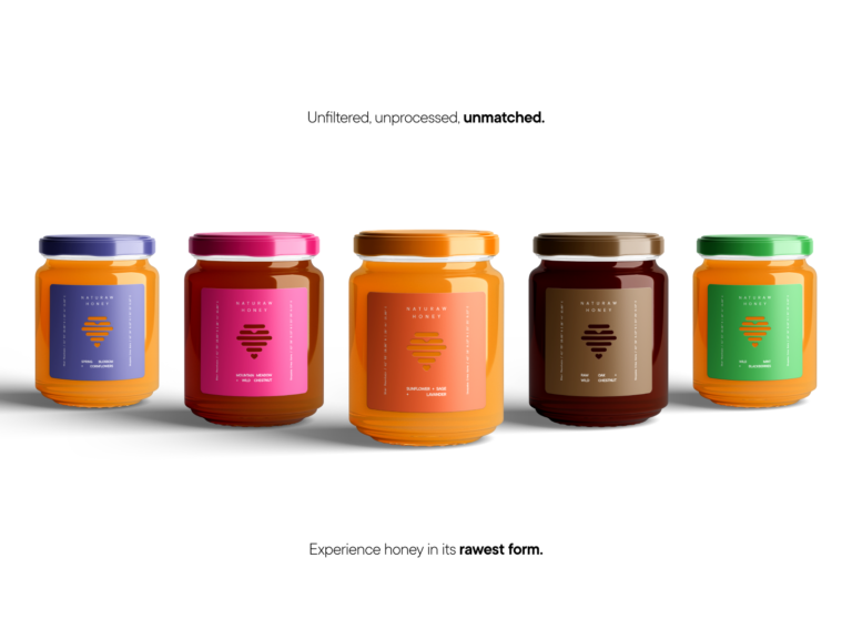
And with that, we’ve created a vibrant packaging, straight forward and standing out of the crowd.
The vibrant colors are our main selling point, when our product is placed between the 99.999999% of yellow and black labels, this one stands out and gives you a kick, you have the desire to pick it up and see what is the fuzz about it.
Straightforward approach with the typography. What is the product? Honey! From what? Mountain Meadow and Wild Chestnut. Okay. Good enough for me to buy it.
We’ve also added the coordinates of the bee hives for the extra curious customers that would want to see from where does their honey comes.
