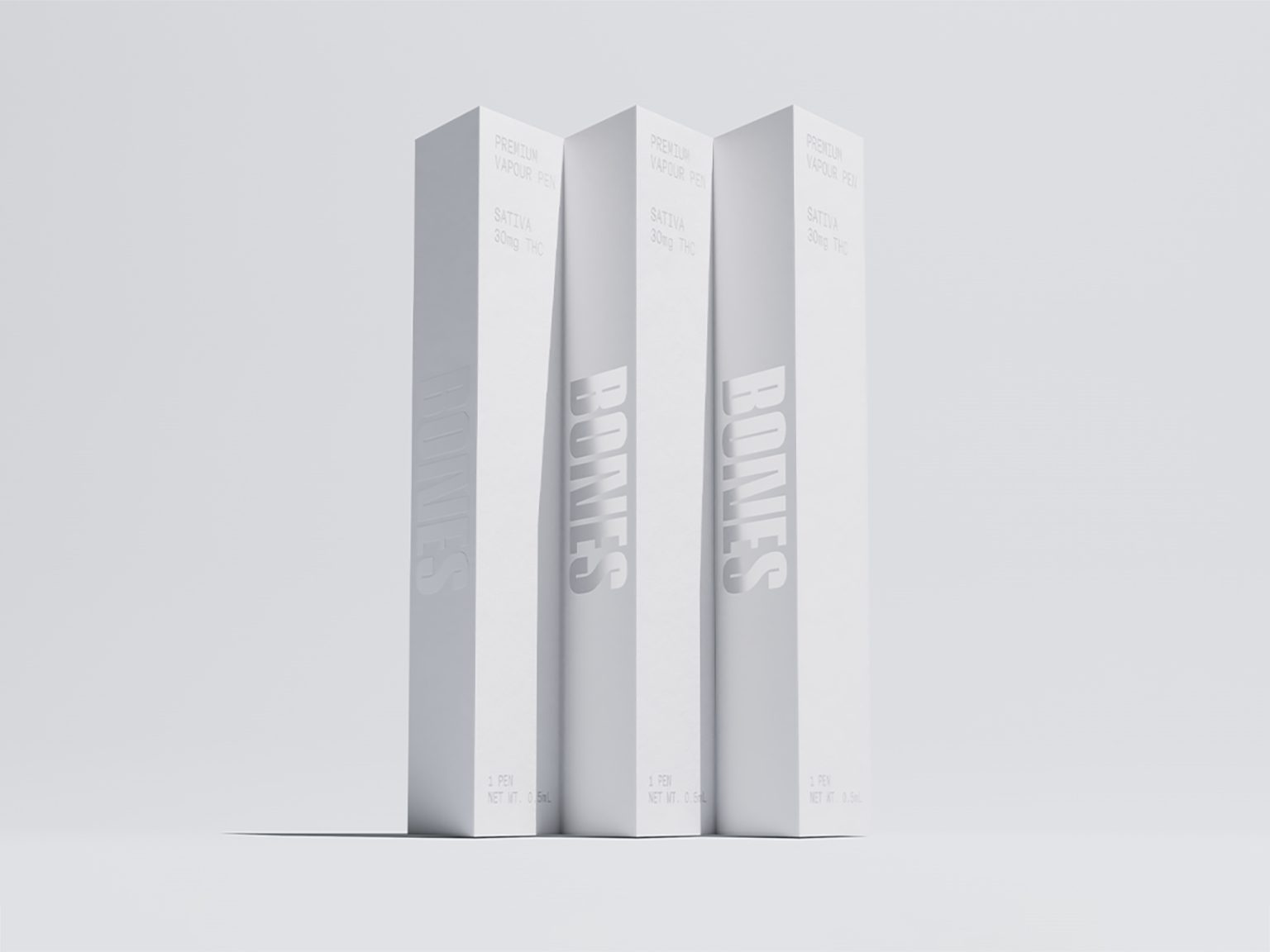

Bones is a premium cannabis brand offering pre-rolled joints and electric vape pens.
The name — a slang term for “joint” — became the foundation of the brand identity. A stripped-back palette of bone white and soft grey evokes a sense of weightlessness, or “highness.” While subtle motion further reinforces this ethereal, elevated world.
As cannabis legalization expands across the U.S., so does the challenge of building a distinctive brand within a patchwork of regulatory constraints. Packaging must flex to accommodate varying requirements for labelling, language, and design. A minimal, low-contrast system creates the space needed for extensive legal copy or secondary markers—without compromising the brand’s clarity or elegance.
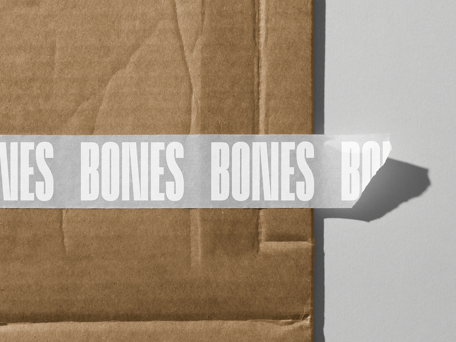
In many states, the only brand marker would be the logotype on standardized or plain containers. To meet this challenge, we chose to use a bold, extra-condensed typeface that holds its presence even at the smallest scale.
The angular “N” seen in the logotype became the stylistic foundation for the brand’s icon: an abstract, geometric representation of the product line—pre-rolls and vape pens.
Taken together, the system delivers a refined brand that doesn’t just sell the high—it embodies it.



 NEV
NEV Stefano Bracci
 Alina
Alina monther al omari
 Lizakjx
 JOAOMARCOSDESIGN
 alchimistestudioParis
 Harriet Neild
 octavio rojo
 宏洛图品牌设计HONGLT
 DESIGN CONCEPTS
 Alexander Skurihin
 Studio K95
 ARMBRAND
 Richa Rai
 houseoferas by Miti
 Agence des Coteaux
 Kushi Eaknath
 Ann Treasa
 Xiao Ning
 krrrrrllii
 babyage
 Deep
Deep