Fuji Coffee House
Fuji Coffee House is a modern café and packaging identity inspired by the calm spirit of Japan. Designed to bridge cultural storytelling with contemporary café culture, the brand invites coffee lovers to pause, sip and savor whether in a cozy café corner or on-the-go with takeaway cups and cans.
Challenge:
The task was to create a coffee branding system that honors Japanese influence while appealing to today’s global café audience. The identity needed to stand out in the saturated coffee packaging design market and adapt across cans, pouches, takeaway items and merchandise.
Solution:
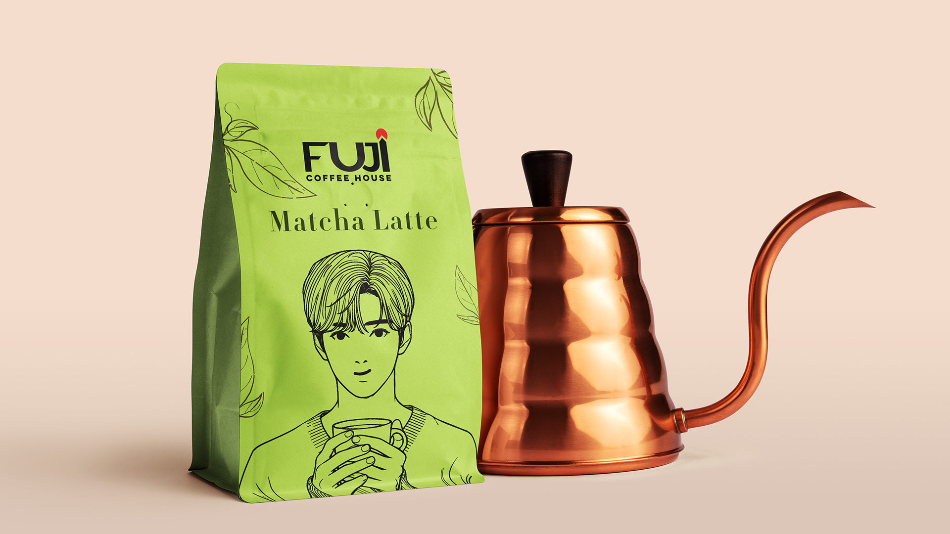
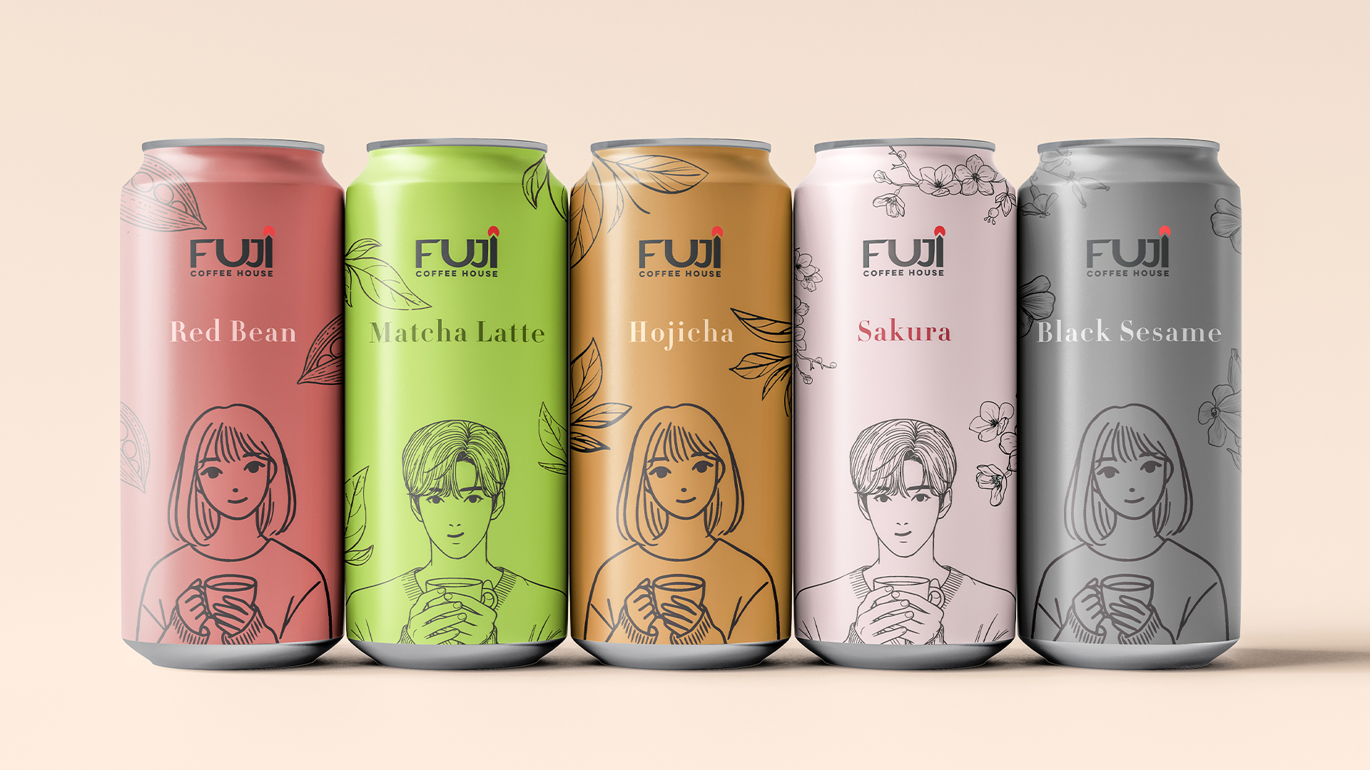
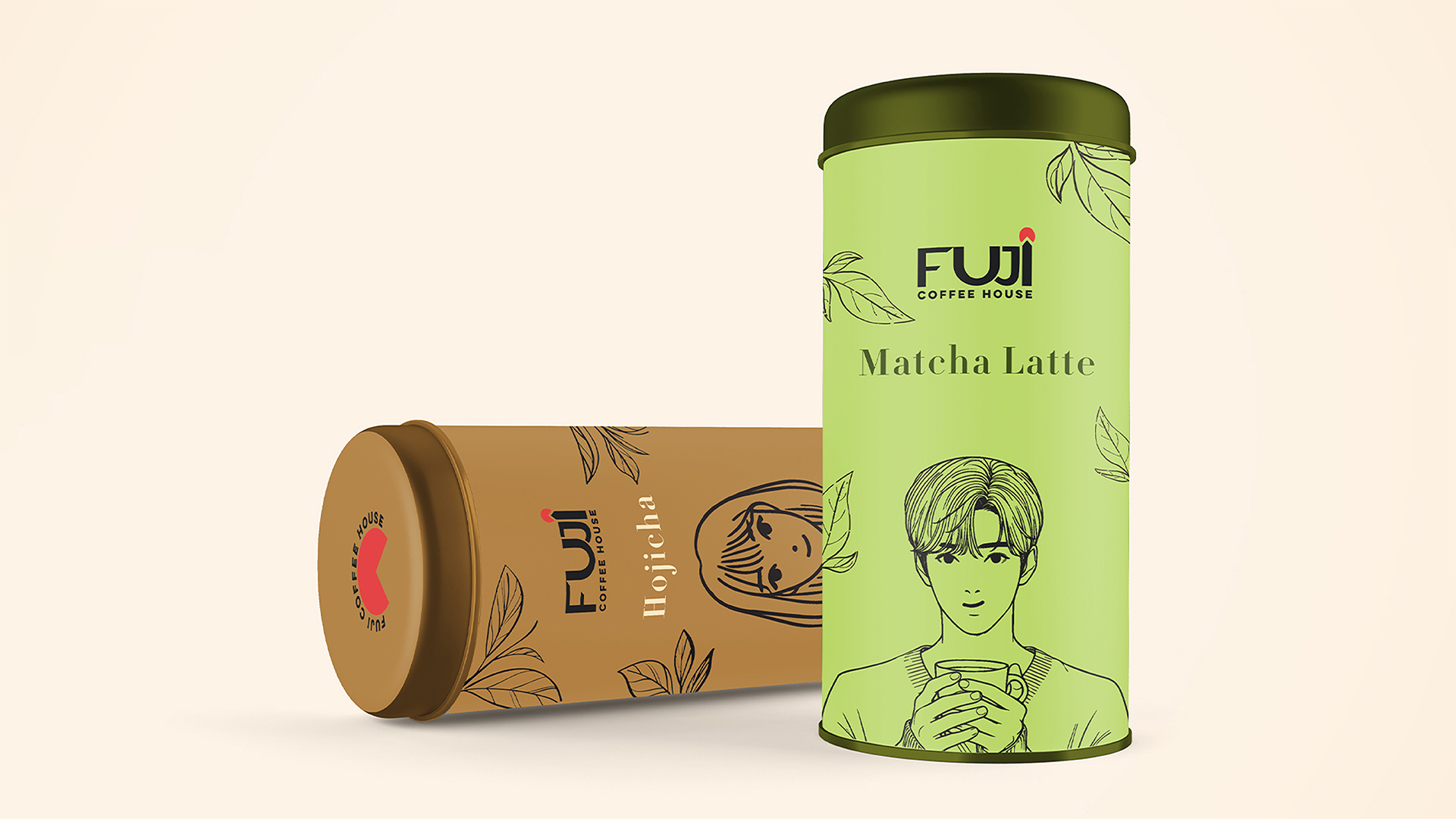
The solution was a minimalist packaging design system rooted in clarity, craft and emotional storytelling. Character-driven illustrations humanize each SKU, while bold colors inspired by matcha, hojicha and sakura add flavor recognition and shelf impact. The visual identity merges Japanese simplicity with modern café branding to feel premium, approachable and memorable.
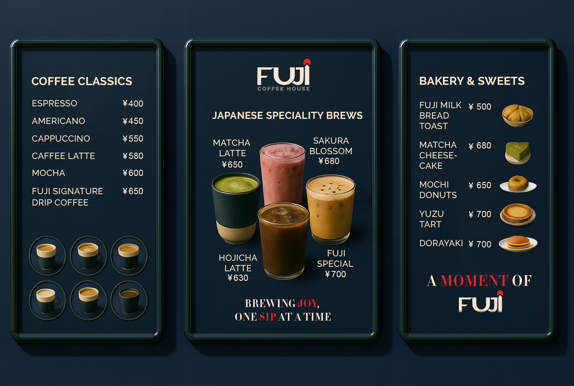
Color Palette
A rich mix of Bold Navy, Matcha Green, Sakura Pink and Hojicha Beige each tied to natural ingredients and cultural cues gives the brand warmth and distinction.
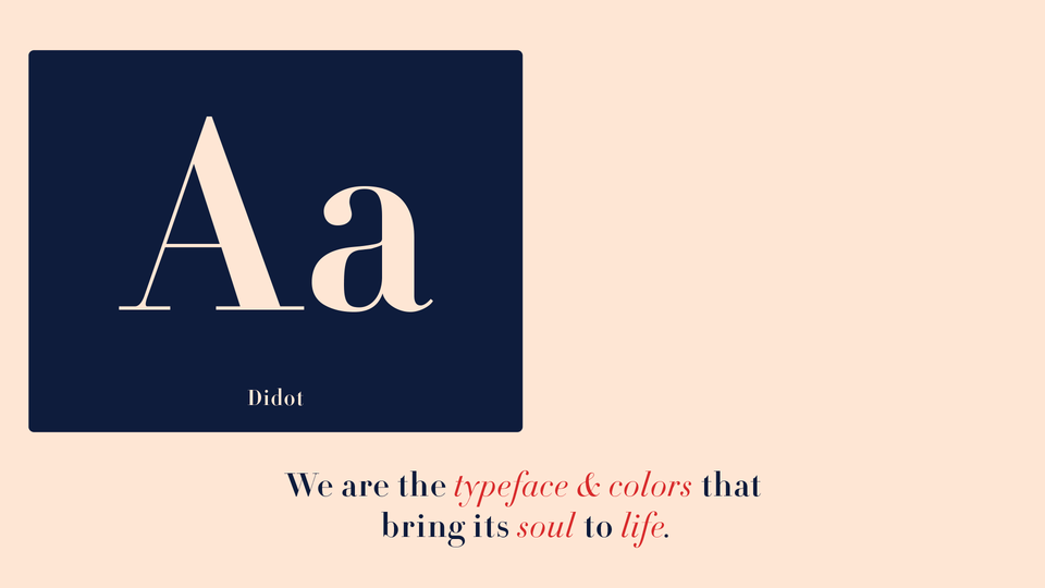
Typography
A clean sans-serif type system balances modern elegance with cultural softness, ensuring clarity across packaging, menus and digital platforms.
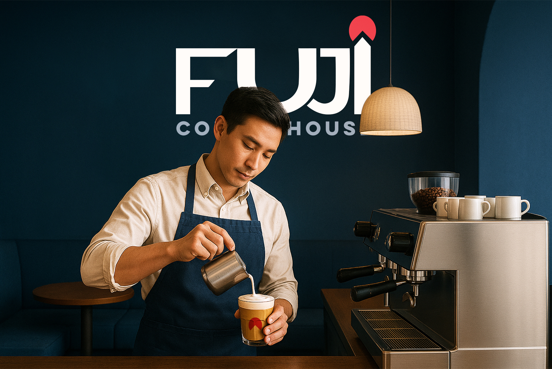
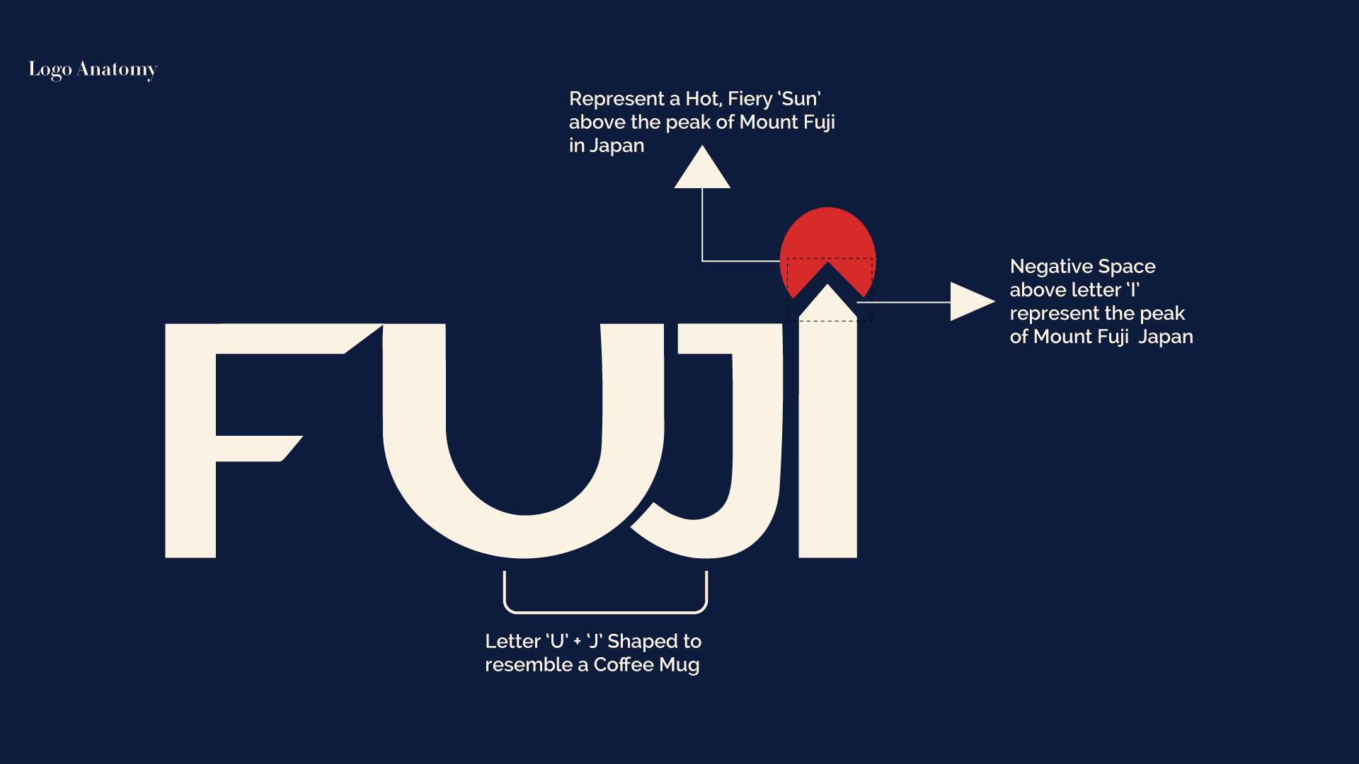
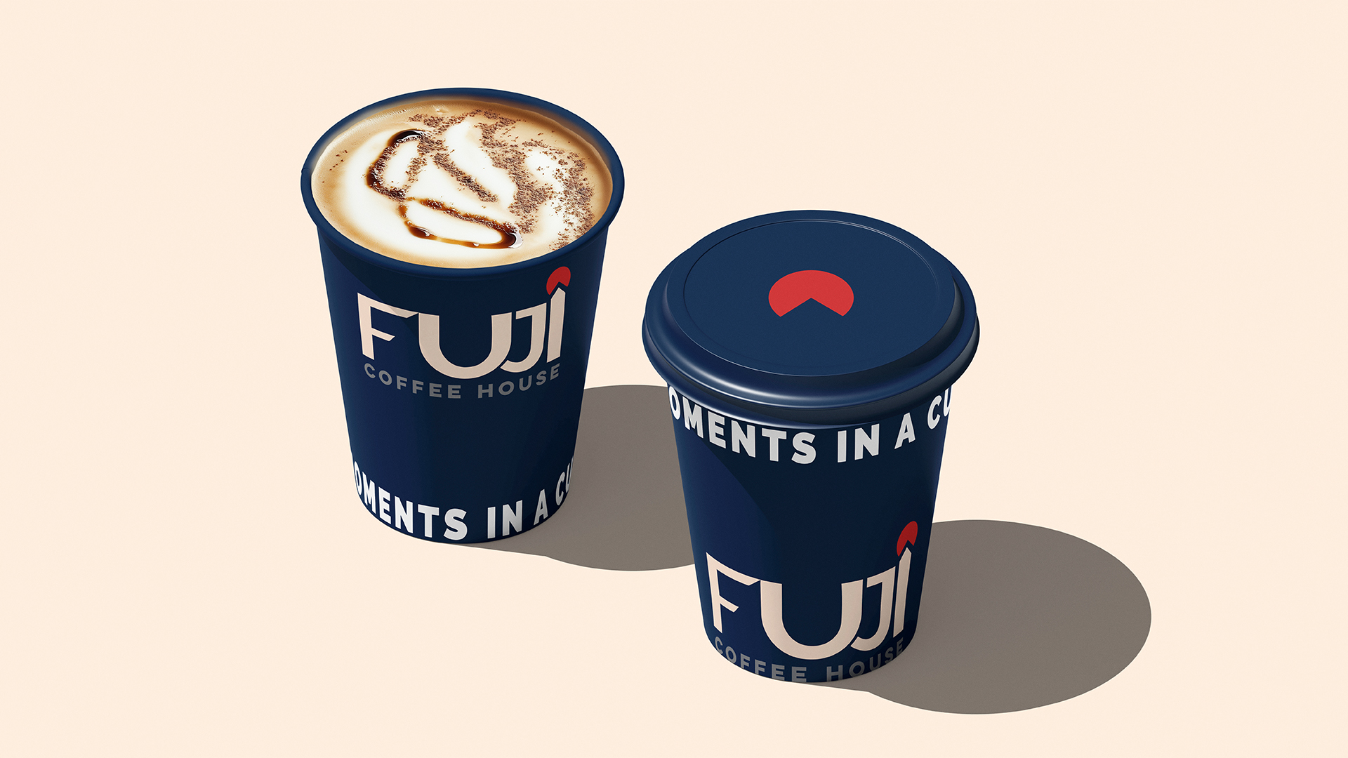
Logo System
The logo’s minimal form is enhanced by the red sun dot above the “I,” symbolizing Japan’s rising sun. It works seamlessly across scales, from packaging to signage.
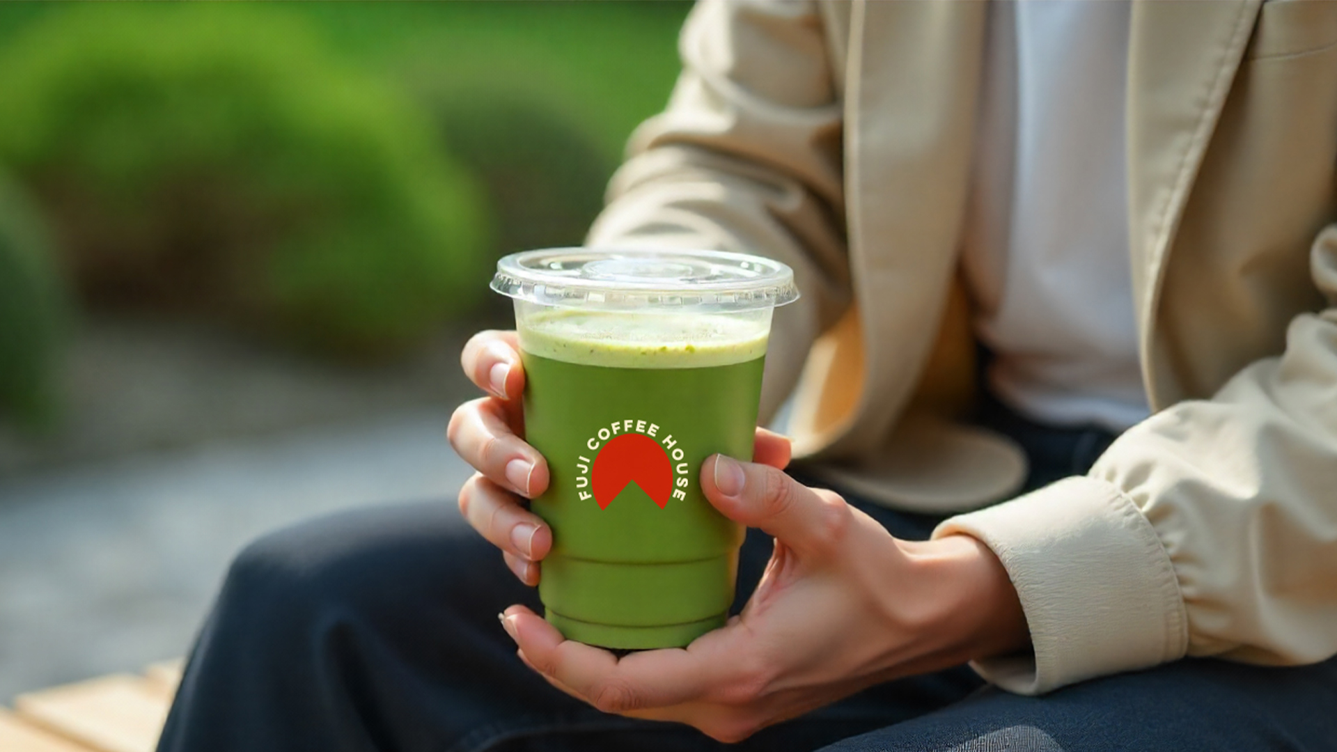
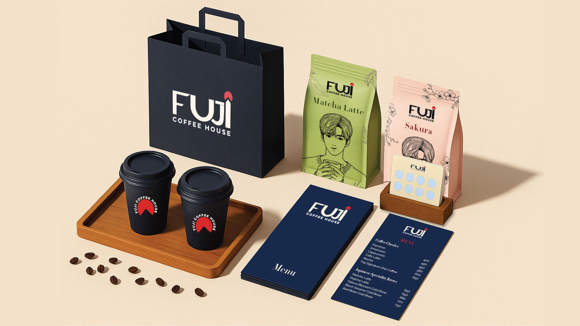
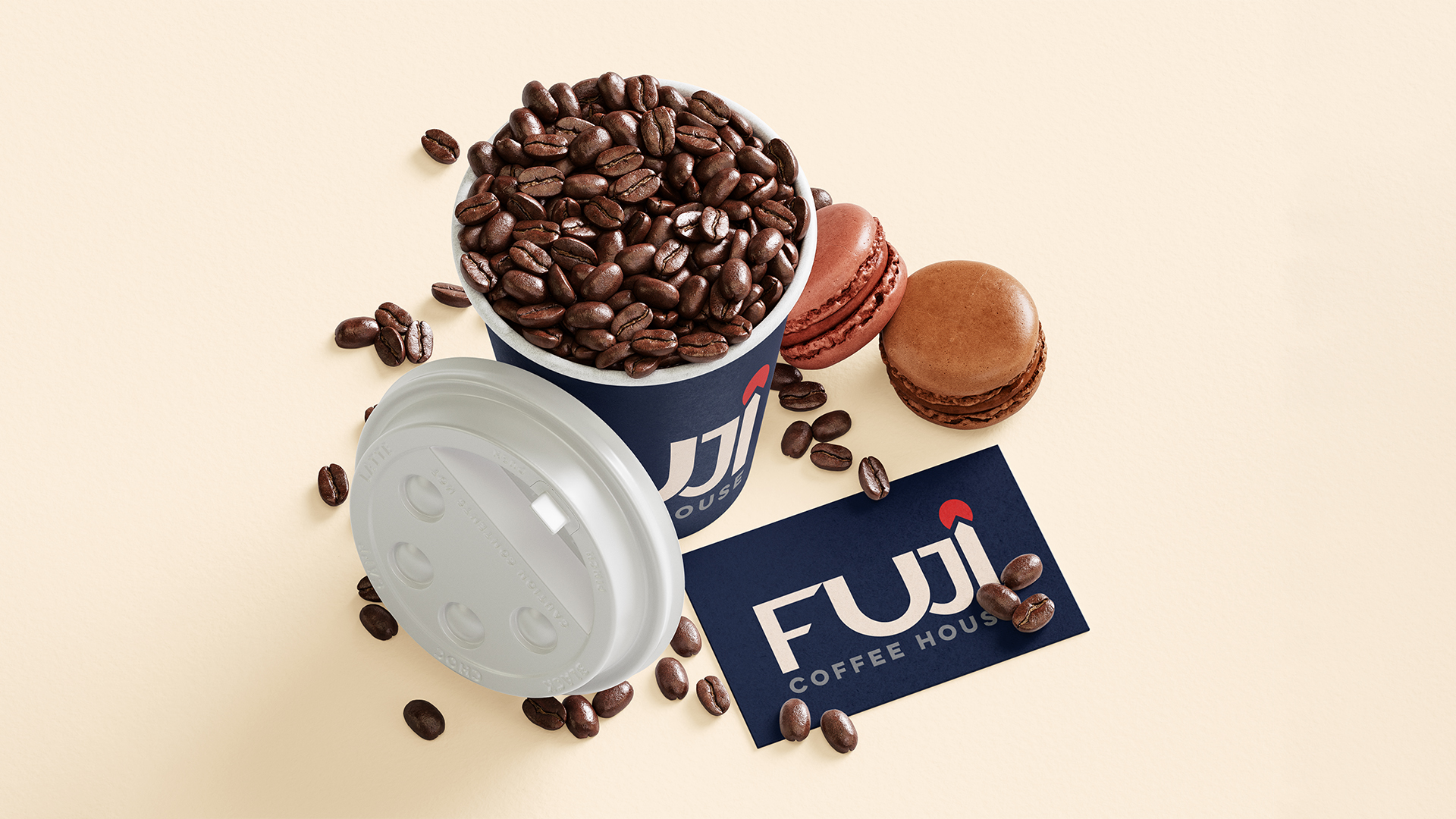
Packaging
From illustrated coffee pouches to cylindrical cans, Fuji’s packaging design creates a cohesive yet distinct family. Each variant tells a story through illustration, color and flavor-specific cues, designed to attract both café visitors and design-conscious consumers.
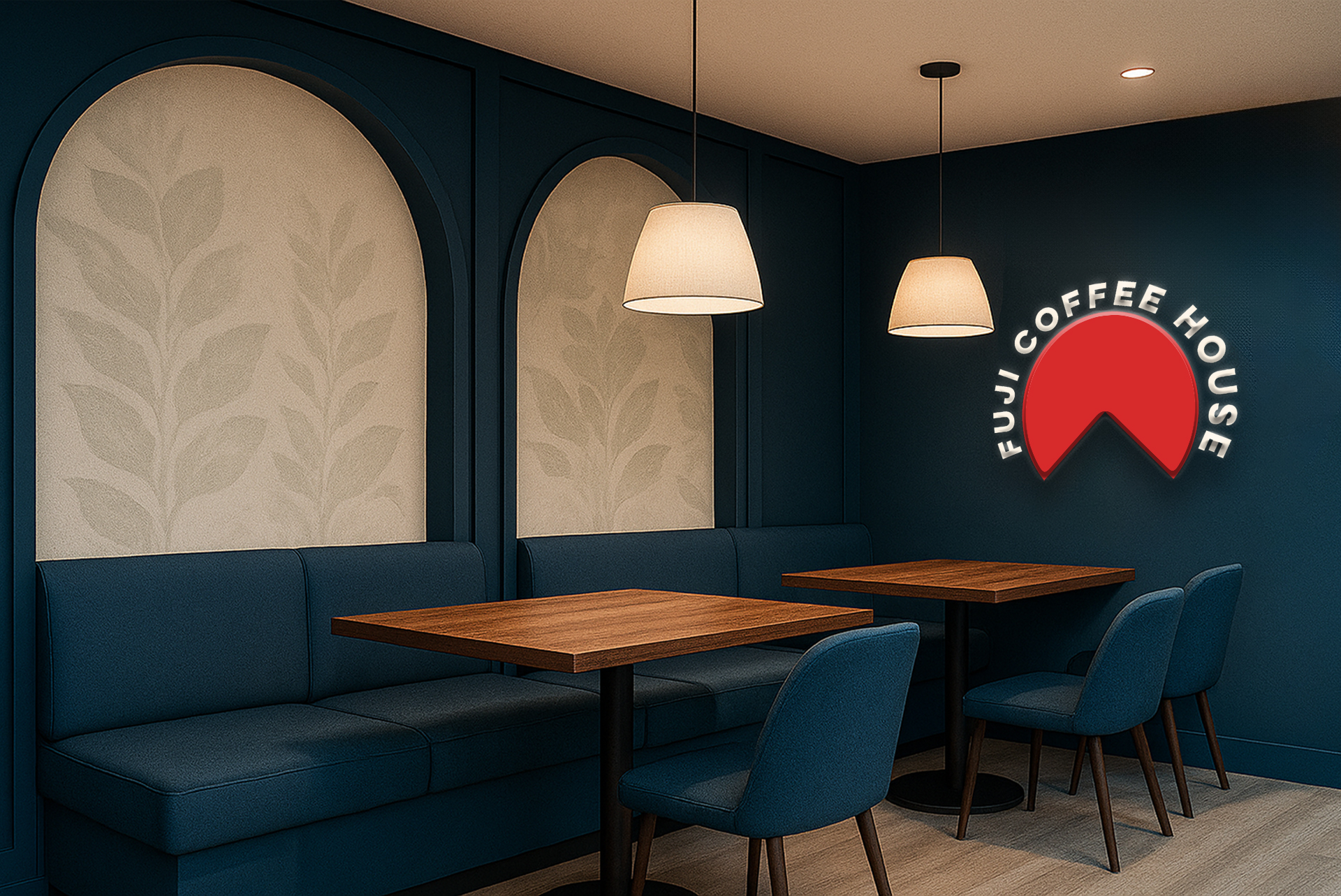
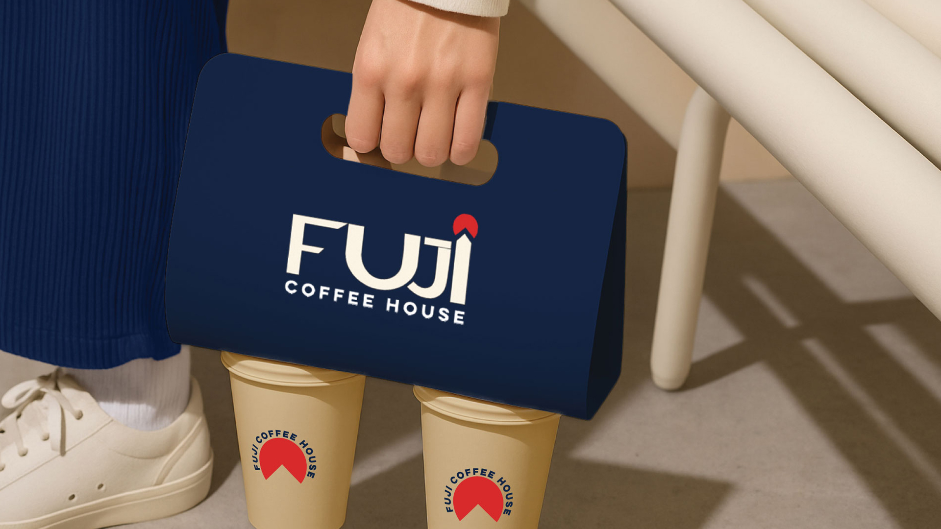
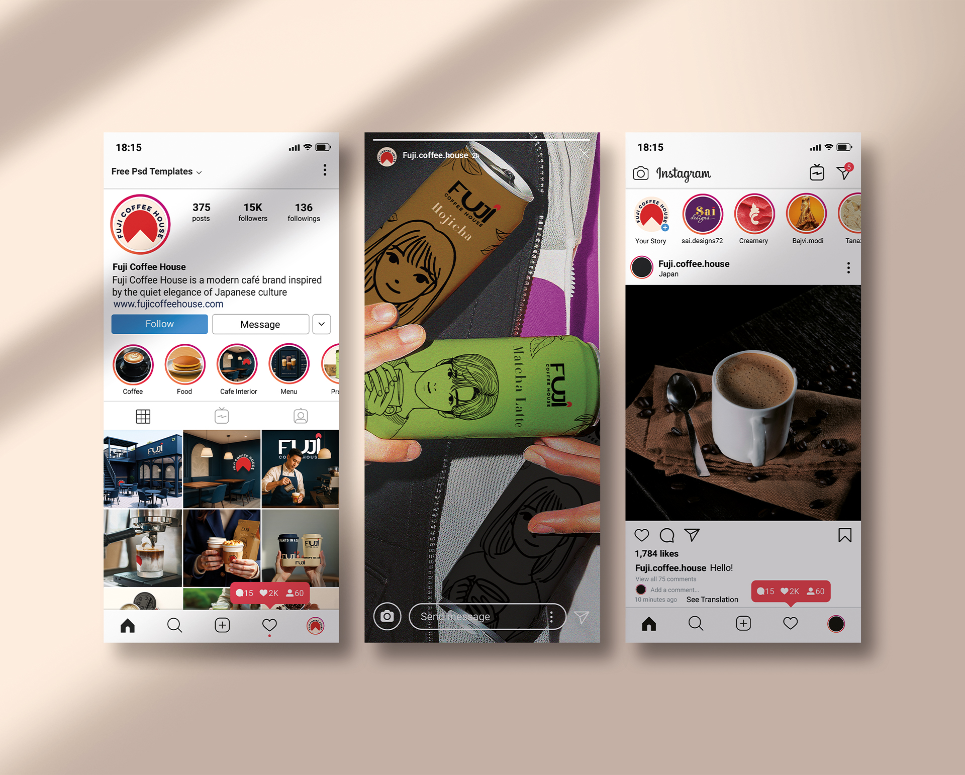
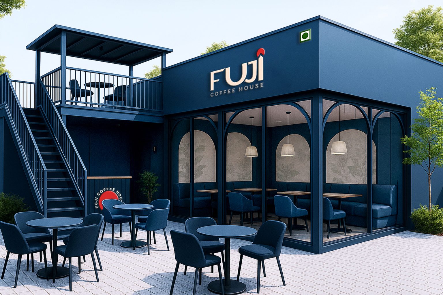
Applications
The identity extends beyond packaging into menus, takeaway cups, café interiors and merchandise. Every touchpoint reinforces Fuji’s promise: modern Japanese coffee branding with soul.