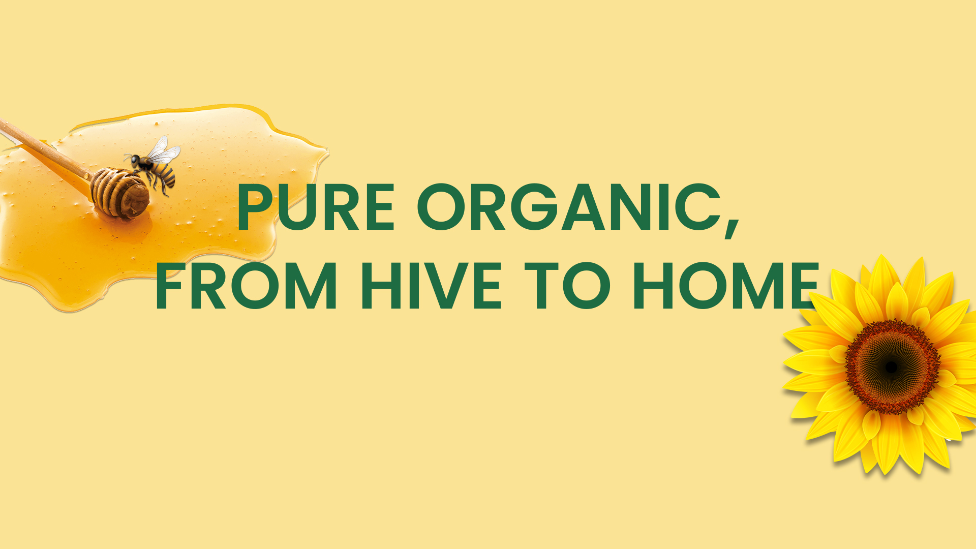
Nektar Nature’s Sweetest Gift
Project Overview:-
Nektar is a premium honey brand born to celebrate nature’s purest essence the golden rhythm of wellness, taste and authenticity. The project centered on crafting a refined brand identity, cohesive visual language and versatile packaging system that reflects the purity, elegance and modern sophistication of honey.
Our vision was to position Nektar as a trusted, contemporary honey brand, bridging the honesty of nature with modern design sensibility. The identity extends across packaging, retail and digital platforms, creating a seamless, elevated honey brand experience that feels tactile, authentic and luxurious.
The Challenge:-
Launching a new honey brand in the crowded wellness and FMCG segment meant standing apart from conventional, overly commercial honey brands.
Key challenges included:
- a. Designing a premium, authentic and emotionally resonant honey brand identity.
- b. Developing a scalable packaging system for multiple jar sizes, flavors and seasonal editions.
- c. Ensuring a consistent brand language across digital and physical touchpoints.
Objectives:
- a. Craft a memorable honey brand identity conveying purity, elegance and wellness.
- b. Develop a flexible visual and packaging system adaptable across products and platforms.
- c. Establish Nektar as a symbol of trust, natural indulgence and modern sophistication.
Moodboard & Inspiration:-
The moodboard set the soul of Nektar:
- Color palette: Warm ambers, golden hues and natural neutrals inspired by raw honey, sunlight and flowing nectar.
- Textures & materials: Matte and tactile finishes echoing the authenticity of natural honey jars.
- Design tone: Minimalist, serene and boutique wellness-inspired.
- Visual cues: Honeycombs, flowing nectar, sunlight reflections and organic geometry.
Every design choice was guided by the vision of translating the essence of honey into modern, luxurious design, creating a world that feels calm, refined and connected to nature.
Approach & Process:-
We collaborated closely with the client, aligning creative strategy with brand vision, audience expectations and retail goals. The process combined research, concept development, iterative design and refinement.
Research & Strategy
- a. Studied honey, wellness and FMCG categories to identify market gaps.
- b. Analyzed competitors to find opportunities for differentiation.
- c. Focused on simplicity, storytelling and purity as core principles.
Concept Development
- a. A signature wave motif beneath the emblem symbolizes the flow of honey, energy and balance.
- b. Organic shapes and gentle movement informed the visual language.
- c. Messaging highlights wellness, refinement and authenticity, reflecting honey’s natural qualities.
Design Execution
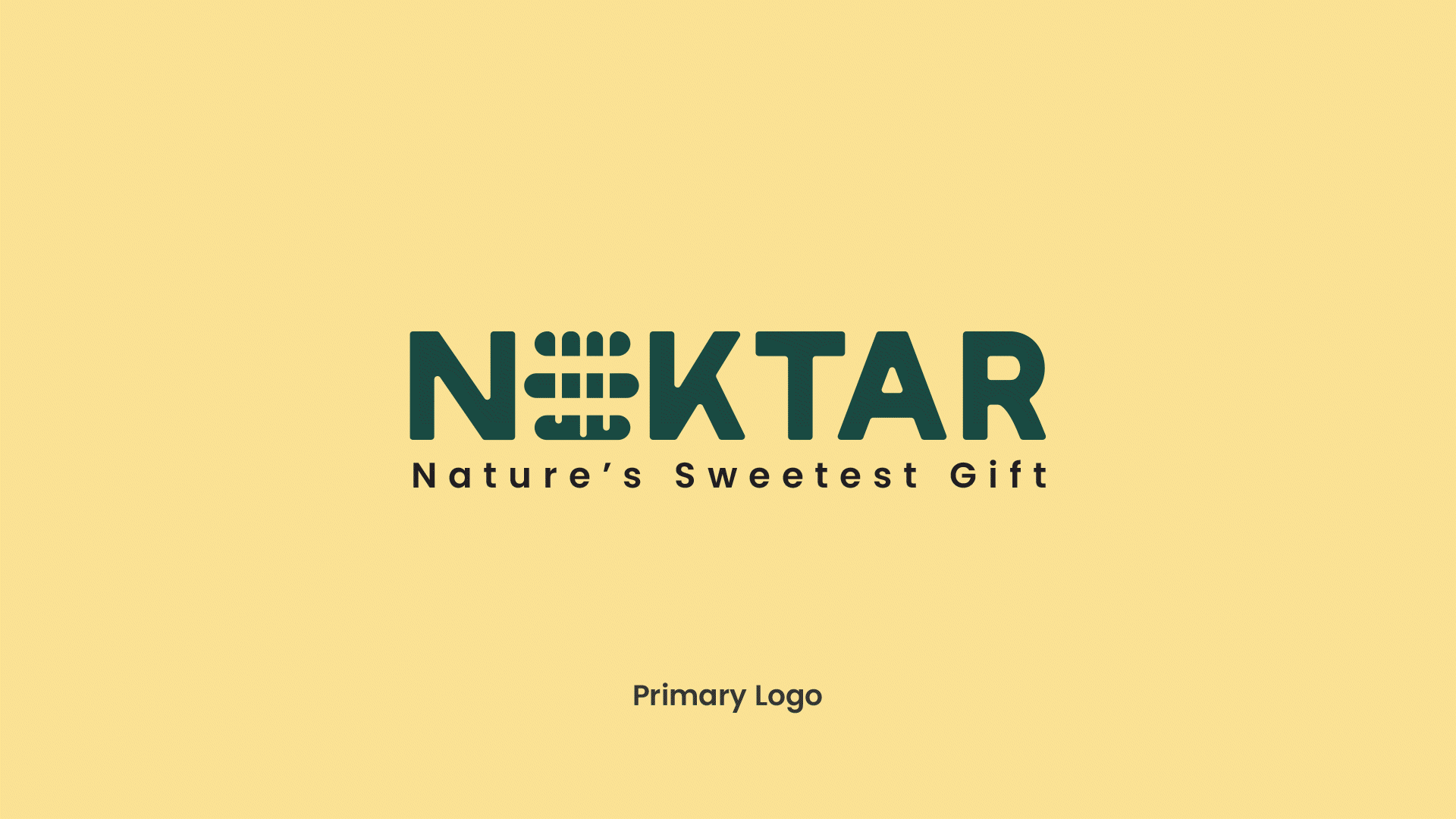
- Logo & Symbolism: Inspired by organic geometry, representing purity, expansion and sacred balance.
- Color Palette: Warm ambers, golden hues and soft neutrals for a premium honey feel.
- Typography: Timeless serif for elegance paired with a clean sans-serif for readability.
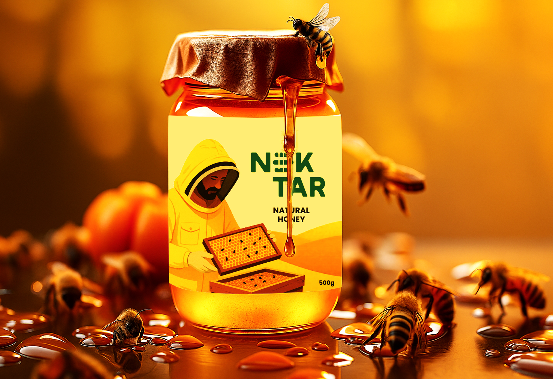
- Packaging: Minimal, tactile and clean layouts for premium honey jars.
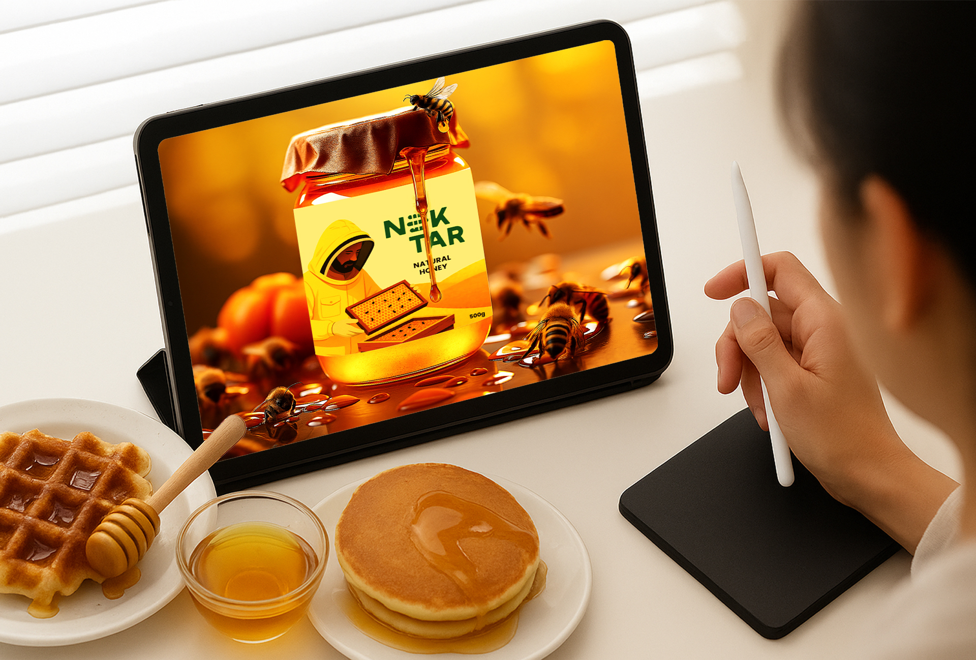
- Digital & Retail Applications: Social media templates, e-commerce visuals, stationery and retail collaterals that extend the honey brand story.
Solution & Deliverables:-
Brand Identity:
- a. A premium honey brand system combining logo, typography, color palette and visual language.
- b. Emphasis on authenticity, luxury and modern refinement.
Packaging Design:
- a. Primary and secondary packaging for jars of varying sizes and honey flavors.
- b. Minimal layouts with tactile finishes and gold foil accents.
- c. Designed for shelf impact, brand recall and scalability across honey products.
Digital & Social Media:
- a. Templates for Instagram, website and e-commerce platforms.
- b. Visual storytelling highlighting purity, wellness and lifestyle appeal.
Retail & Collateral Applications:
- a. Stationery, product tags and thank-you cards that extend the premium honey brand experience offline.
- b. Maintains a refined, nature-inspired brand language throughout all touchpoints.
Result:-
Nektar successfully establishes a premium, contemporary presence in the honey and wellness segment.
- a. Cohesive brand identity ensures strong honey brand recall, shelf visibility and scalability.
- b. Elevates honey from a commodity into a modern lifestyle product rooted in purity and craftsmanship.