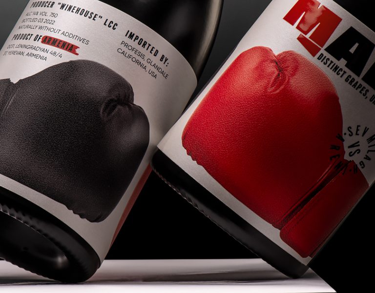

We faced a captivating challenge: to conceive packaging and a name befitting a red wine crafted from a blend of distinct grape varieties. Inspired by the dynamic interplay between these varieties, we envisioned a concept that would encapsulate their spirited clash.
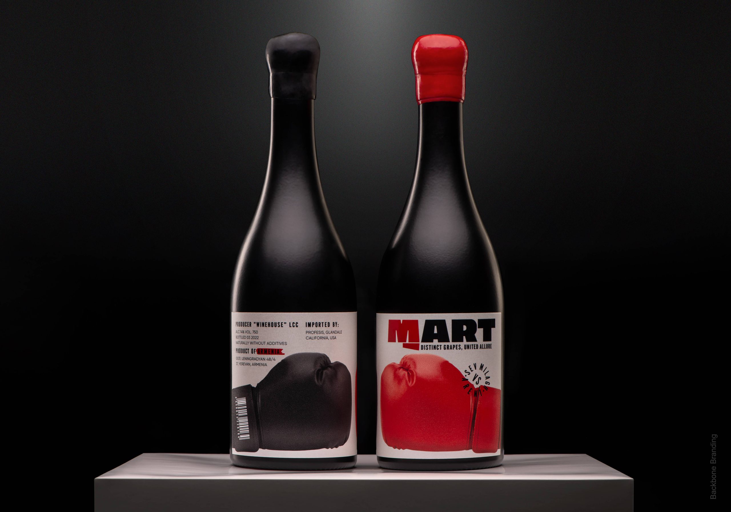
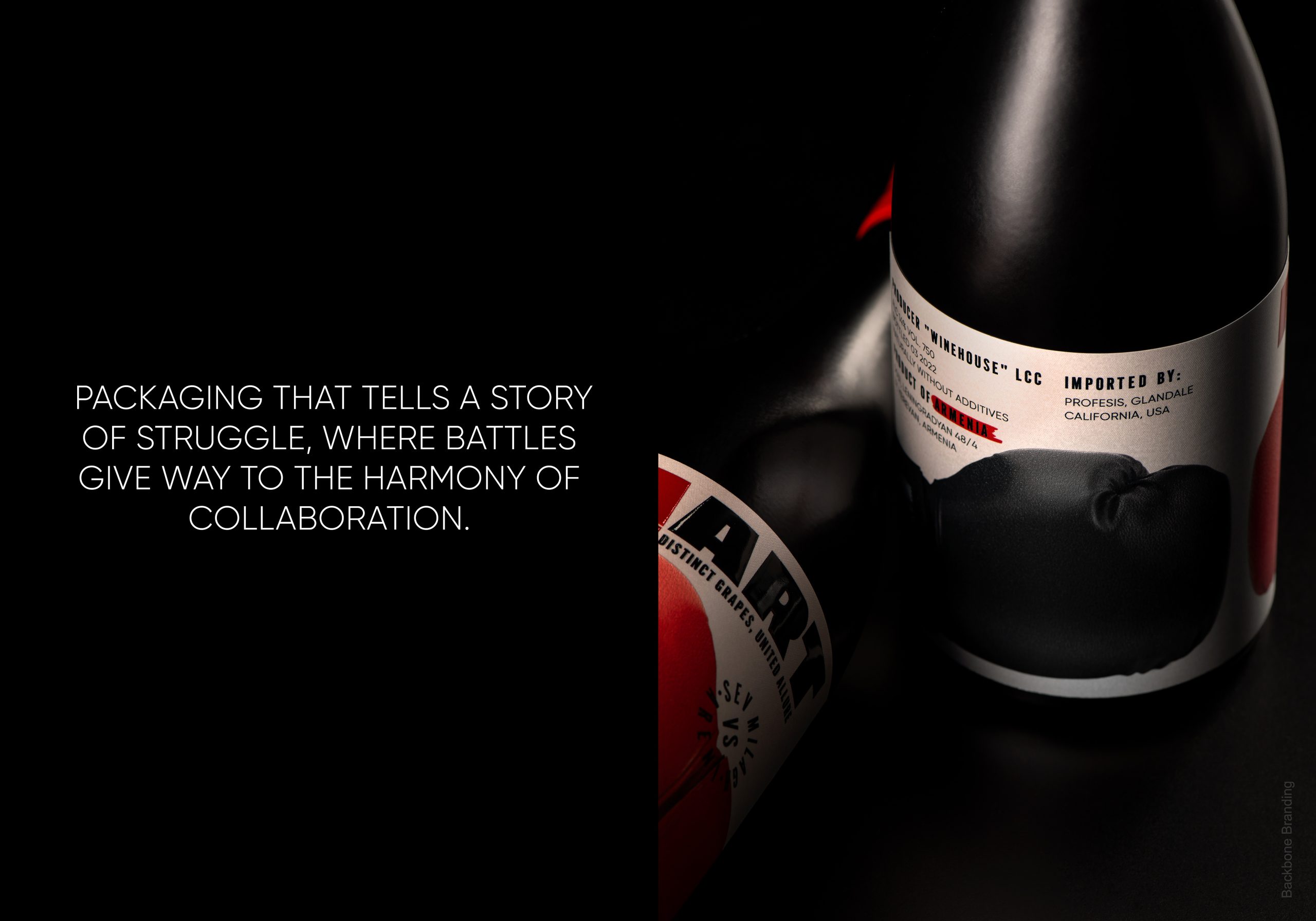
We came up with “Mart,” a name derived from the word meaning “fight.” The very essence of this wine embodies the struggle and eventual collaboration between the grape types, resulting in a harmonious and singular flavor profile. To visually represent this concept, we designed the packaging to feature two boxing gloves engaged in a symbolic battle. Instead of depicting a winner or loser, the design celebrates the mutual respect and cooperation between the grapes, ultimately resulting in a victorious synergy of flavors.
The logo further reinforces this narrative, with the letter “M” fashioned into a clenched fist, poised to represent the intense struggle while also hinting at the unity and strength that emerge from it.
In essence, “Mart” wine speaks to the profound beauty found in the convergence of differences.


 monther al omari
 43oz
43oz Thirst
 Carreto Concepts Design Studio
 M&A CREATIVE AGENCY
 pastellofactory
 Omar Altayeb
 Cocoon Prague
 古戈品牌
古戈品牌 Pascal Riviere Design
 ZIMO Studio
 alchimistestudioParis
 Valérie Colace
 Platon Ivantsov
 Leyma Design
 Dina Gamal eldin
 clermentza
 Redlana
 anushrishah
 Natania Doshi
 NewFolderStudio
 francapovilla
 Mother Tongue Design
 CJMartins