TAK FLOUR
We innovatively changed “Tak” flour’s design, keeping brand recognition.
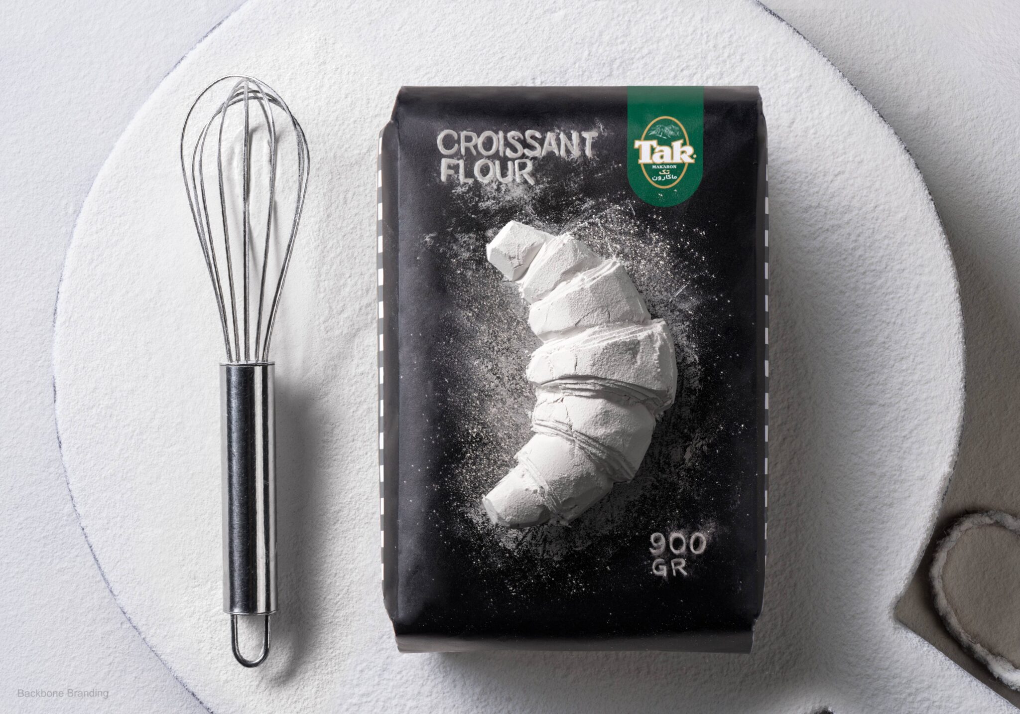
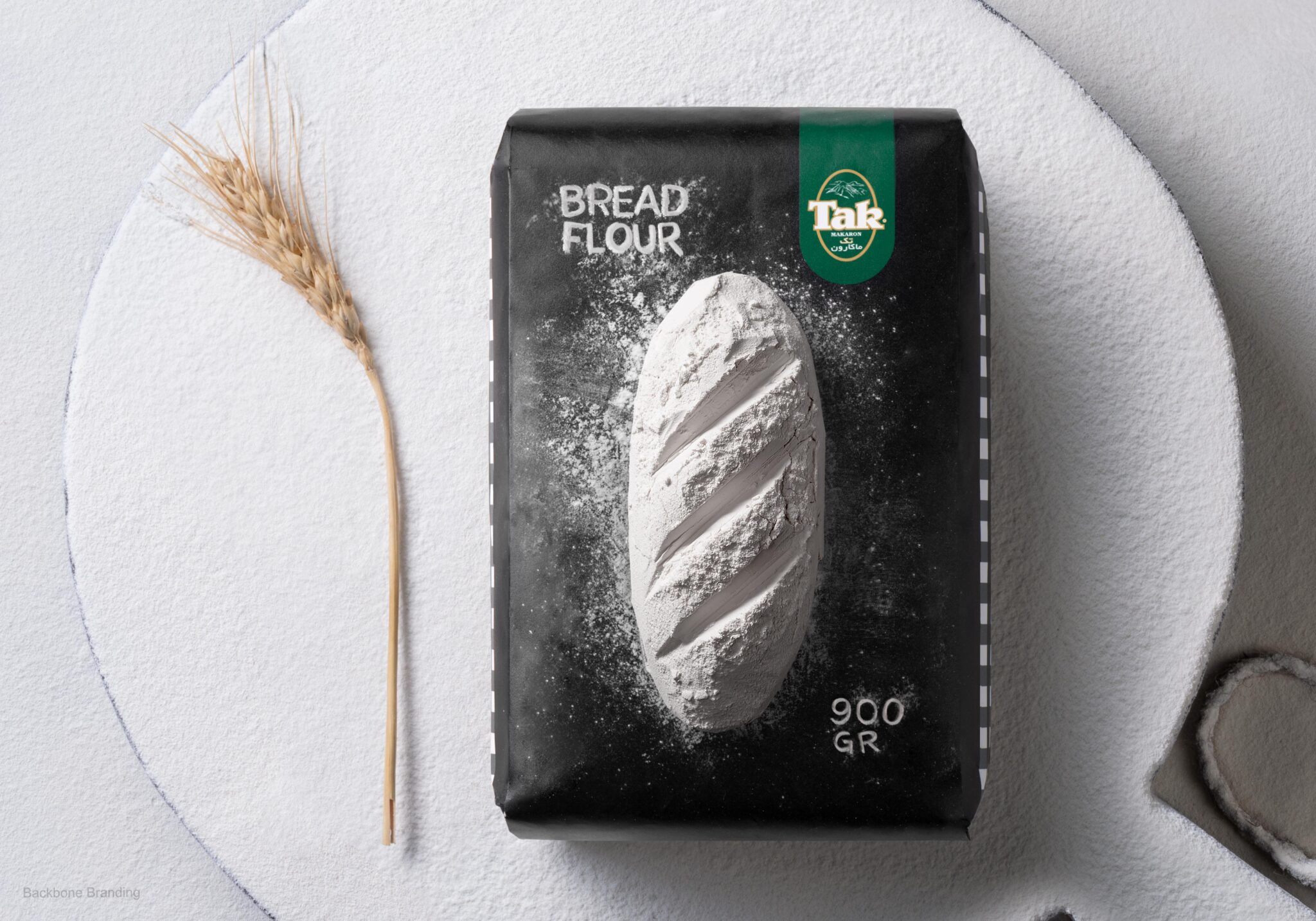
Our goal was to enhance the on-shelf attractiveness of “Tak” flour while maintaining its distinctive brand identity and ensuring recognizability. Considering that flour is a product with a singular flavour and limited variation in packaging options, we needed to devise a clever marketing strategy to differentiate “Tak” flour from its competitors.
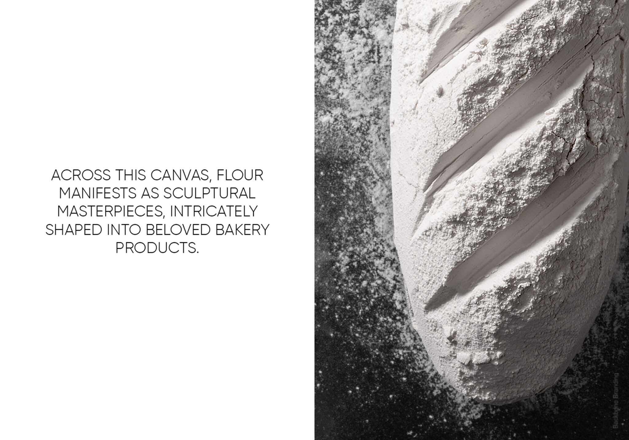
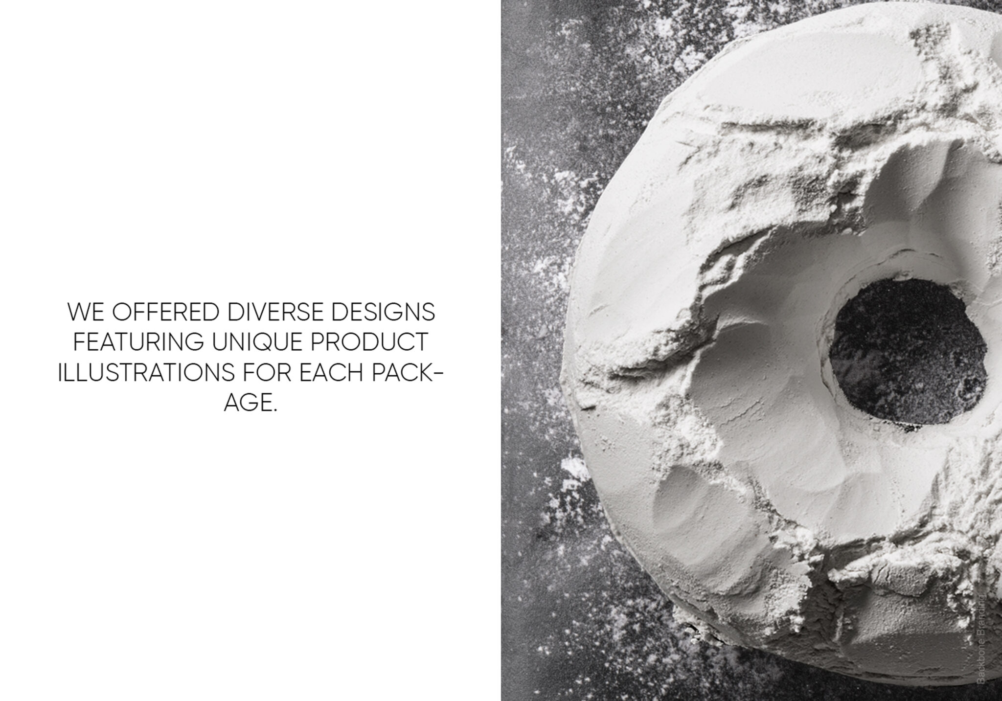
We created diverse designs with unique illustrations on each “Tak” flour package. The bold black packaging serves as a backdrop for the flour’s artistic display, showcasing sculptural shapes of popular bakery items like bread and croissants. These designs highlight the product and give a nod to its craftsmanship. The “Tak” logo stands out prominently, helping to maintain brand recognition, while the brand’s signature pattern on the sides reinforces its identity. This combination of art and branding makes “Tak” flour visually appealing and easily recognizable on the shelf.