Mer Yerkir
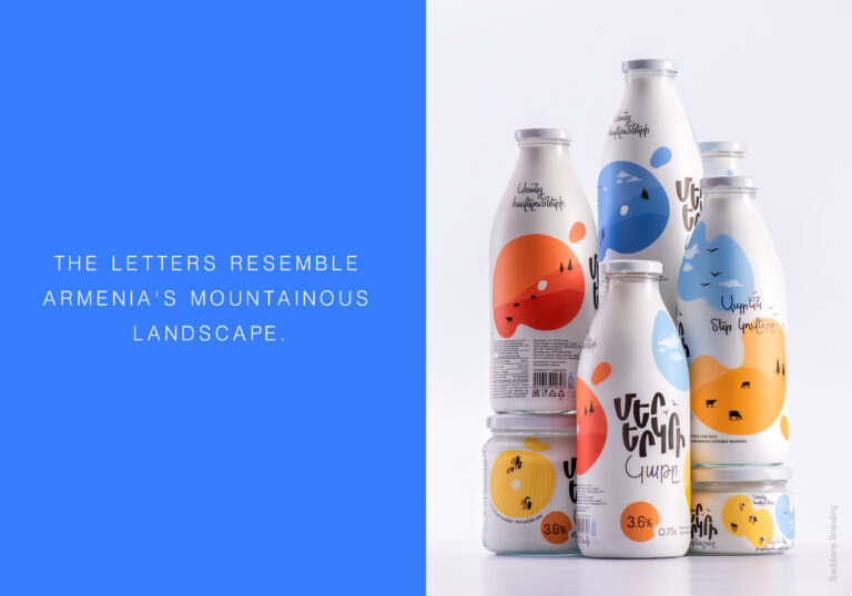
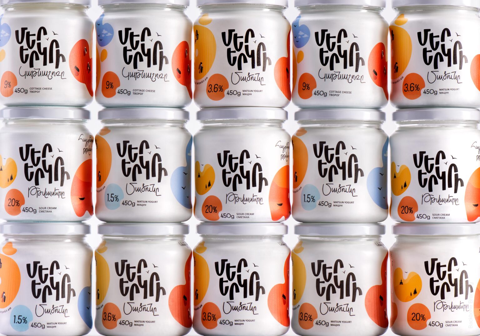
“Mer Yerkir,” meaning “Our Land” in Armenian, produces a range of dairy products with patriotic and playful branding. The colorful labels feature different shades of the Armenian flag: red, blue, and orange, making the brand highly recognizable.
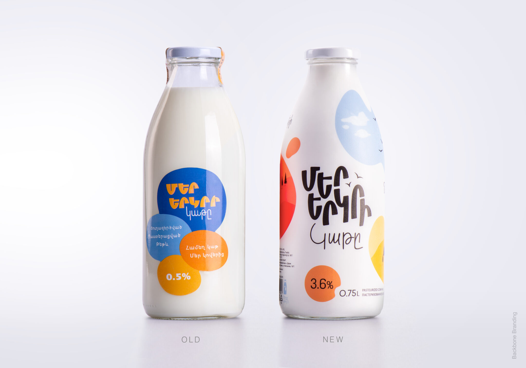
We needed to redesign the labels of the “Mer Yerkir” brand without losing the colorful look and its patriotic essence. Although the current labels were eye-catching, they lacked consistent color logic. We also needed to redesign the logo, as it was incohesive and didn’t stand out on the colorful labels.
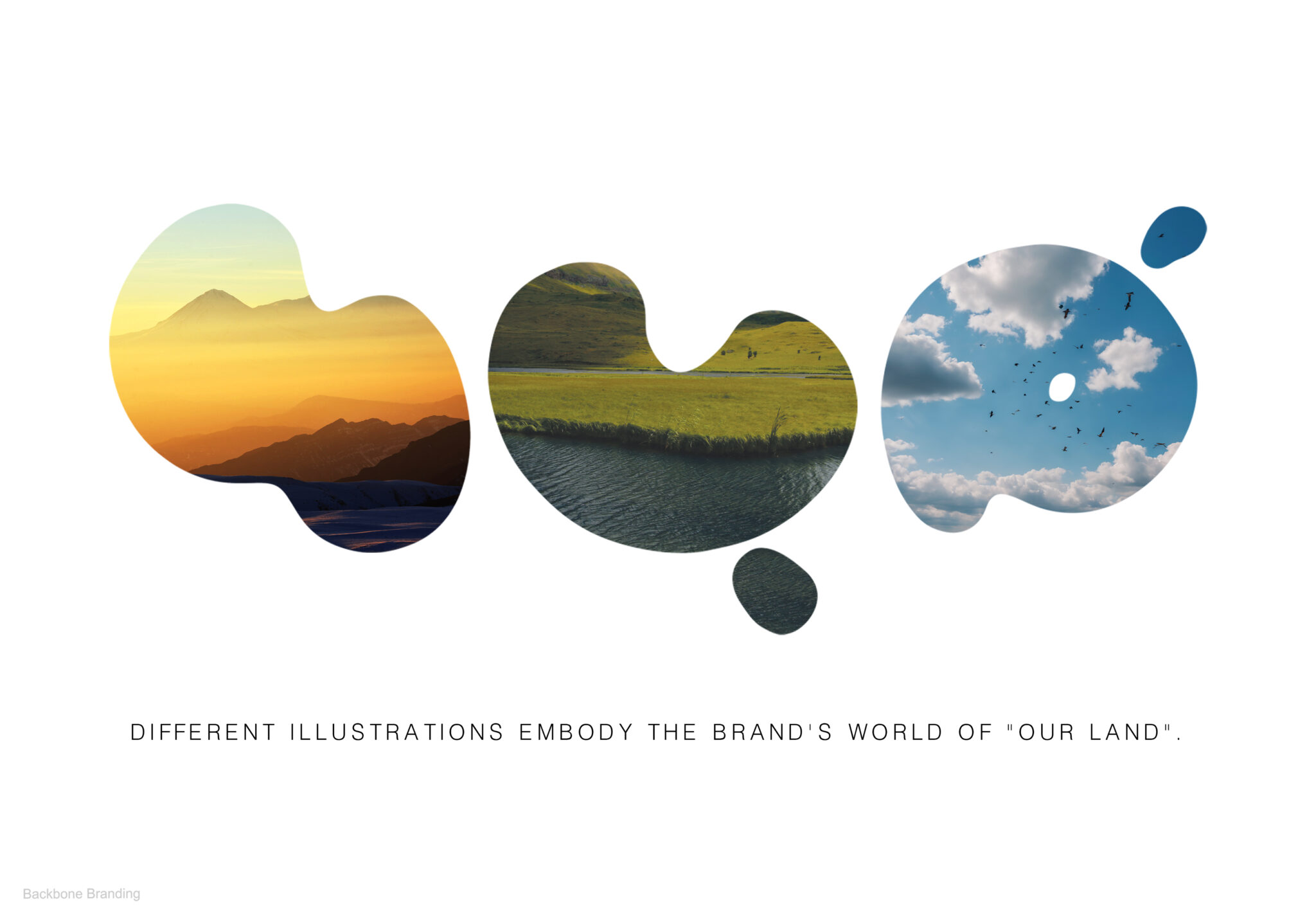
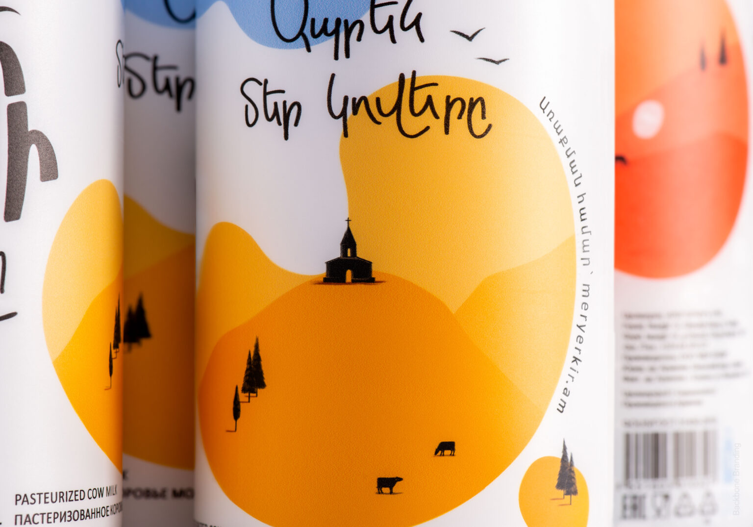
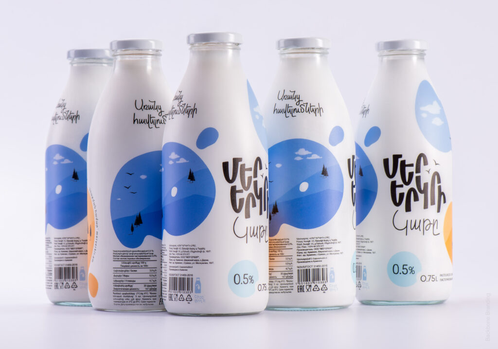
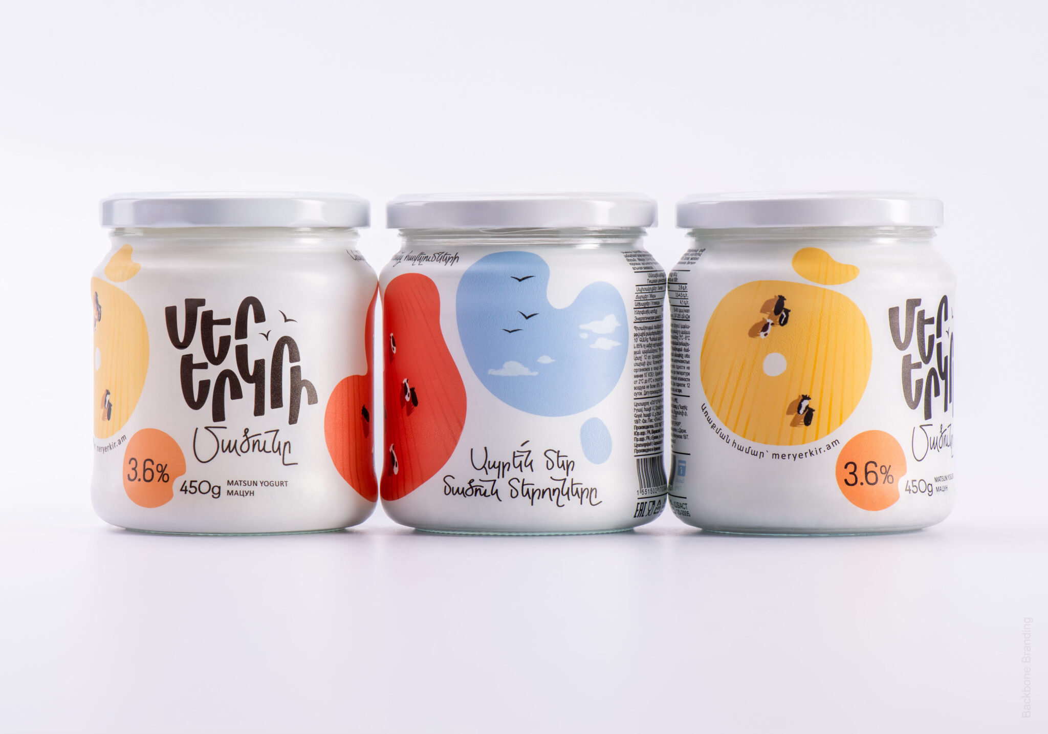
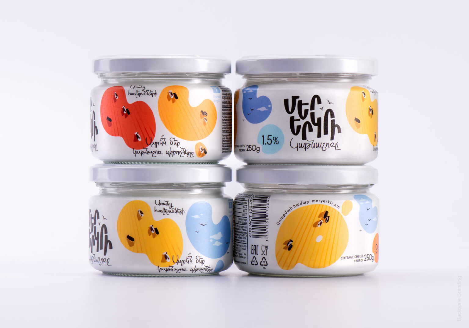
Our new typographic logo features uneven letters that represent Armenia’s mountainous landscape. To ensure the logo could coexist with colorful labels, we made it completely black. We transformed the previous colorful spots into abstract, colorful letters that spell out product names. The so-called “letter-spots,” which are actually sticker labels, allowed us to expand the brand world of “Our Land.”
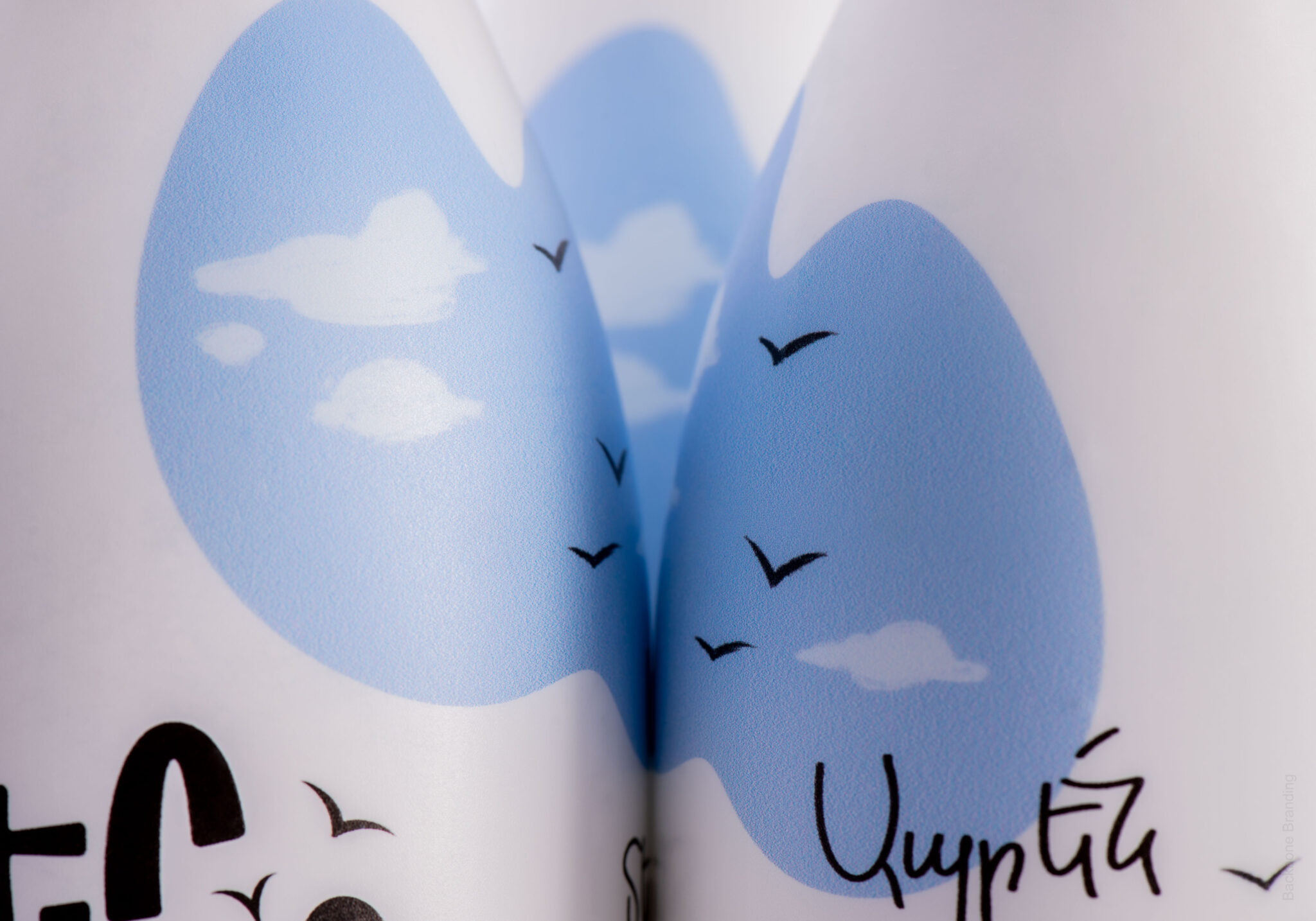
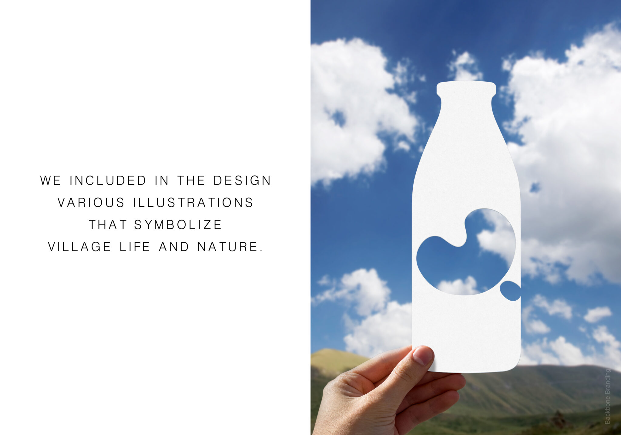
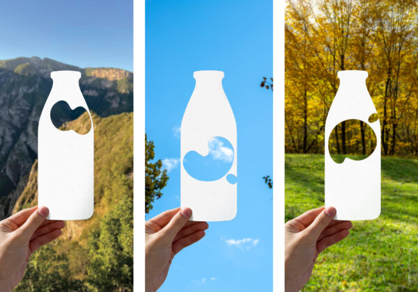
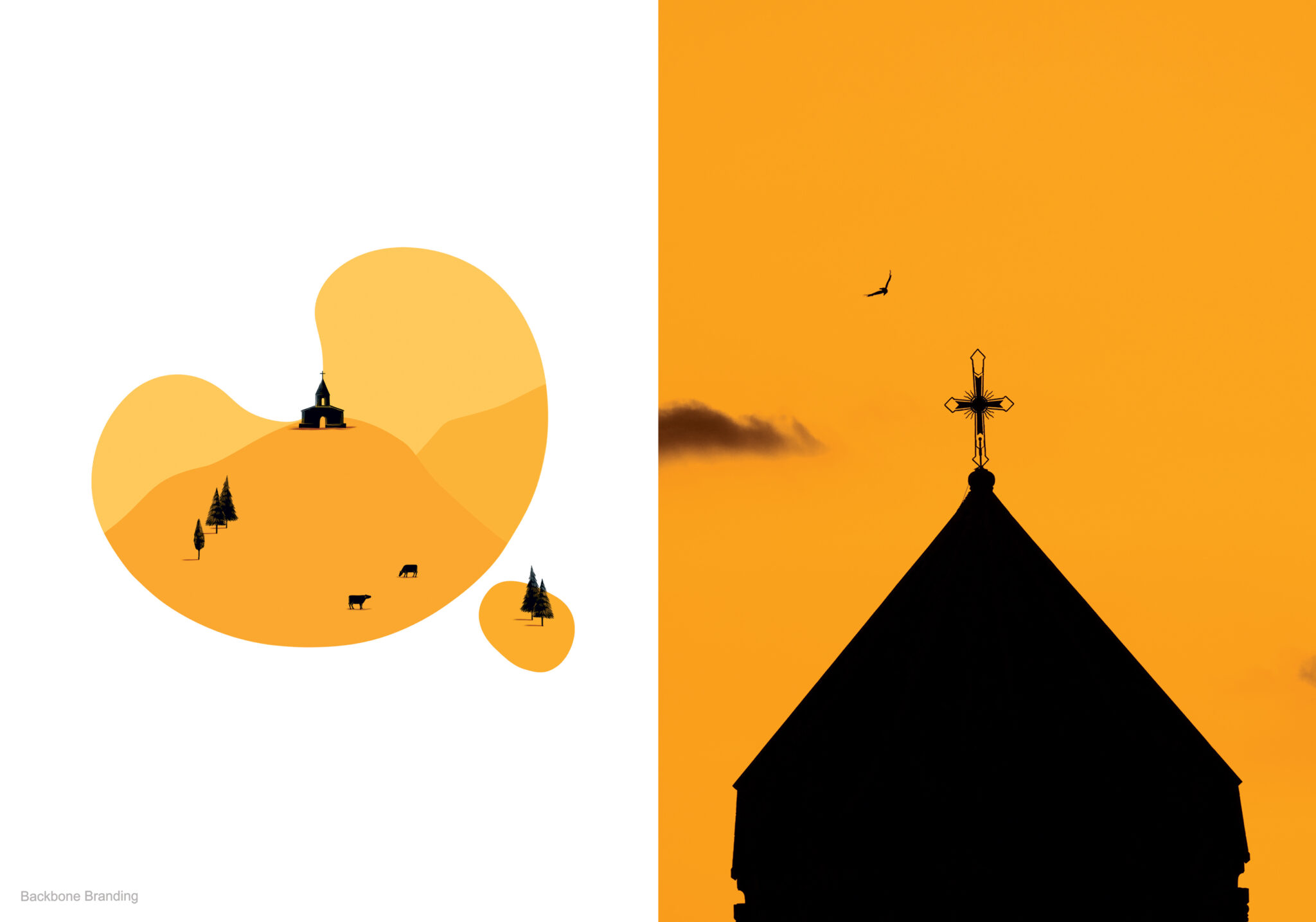
We achieved this by including various illustrations that symbolize village life, including cows, crop fields, agricultural machinery, churches, birds, and blue skies. Unlike the previous design, the “letter-spots” are now evenly distributed around the surface of the bottle, making the product easily recognizable from any angle on a supermarket shelf or in a fridge.


