Identity | Packaging design
Supplement brand | Velner
Company
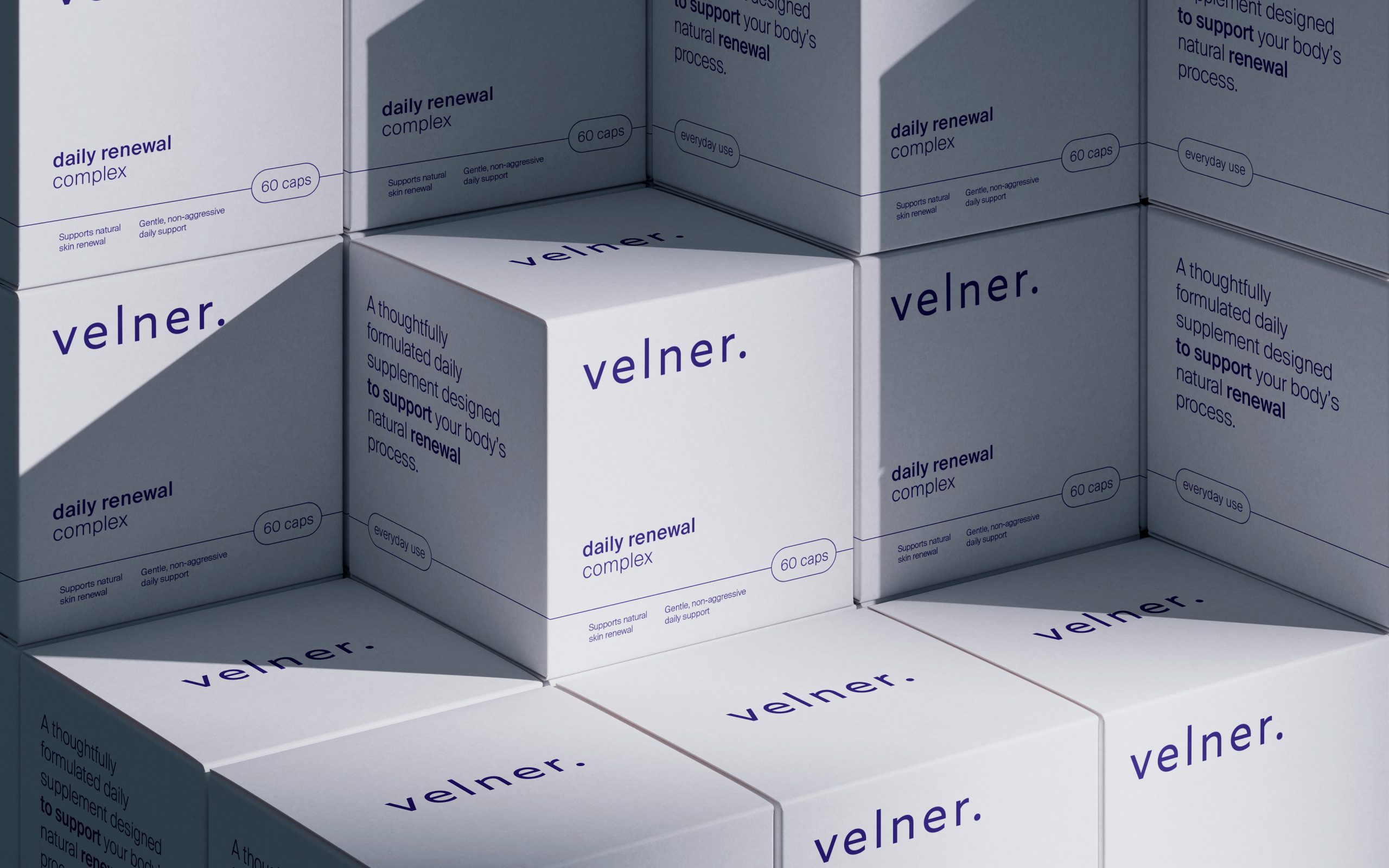
Velner was conceived as a daily supplement brand built on consistency, not intensity. From the beginning, the mission was simple: support the body’s natural renewal processes with formulas that are gentle, evidence-aware, and designed for long-term use.
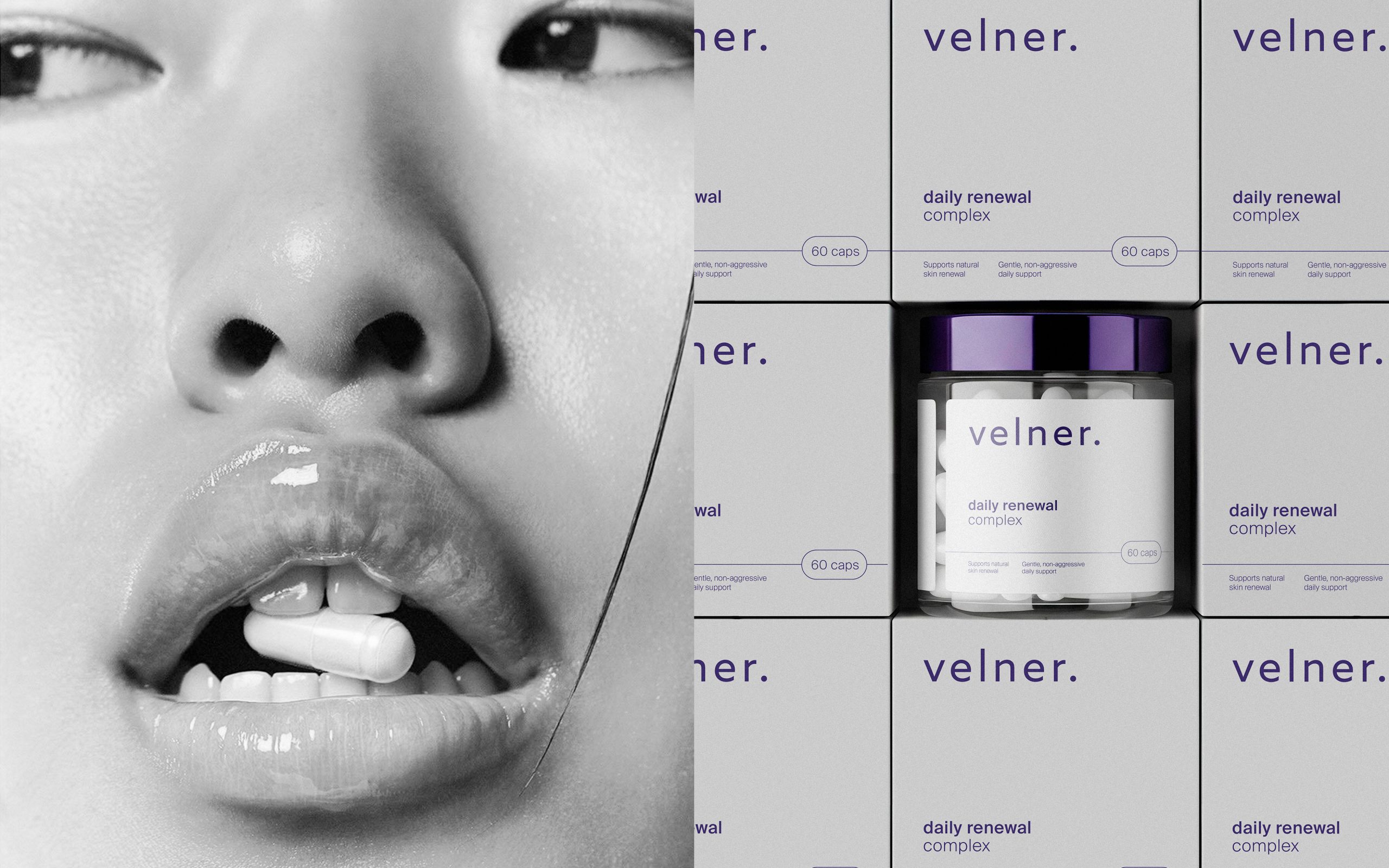
Logotype
Lowercase typography communicates accessibility and humility, while precise letterforms maintain scientific credibility. The period at the end of velner logo acts as a visual anchor, signaling completeness, intention, and trust.
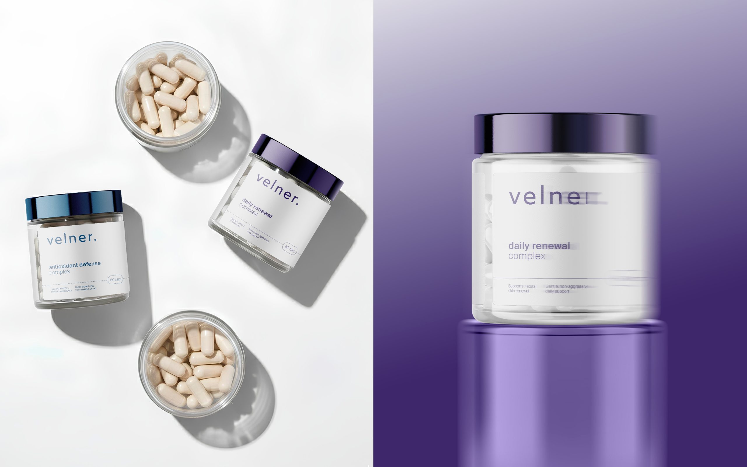
Packaging
Transparency plays a key role in the brand identity. The clear jar reveals the capsules inside, reinforcing Velner’s commitment to honesty and simplicity. The label design leaves negative space intentionally, reflecting mental clarity as much as visual restraint.