

AMASÉE
Reviving the Art of Taste Through Luxury Confectionery
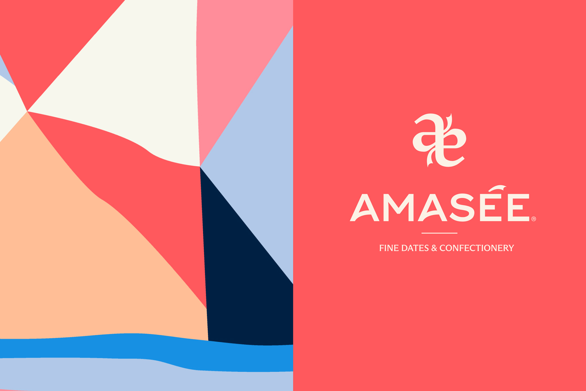
Brand Lounge was tasked with creating the brand strategy, visual identity, and packaging system for Amasée, a luxury dates and confectionery brand rooted in the Jordan Valley, home to some of the world’s finest Medjool dates. The ambition was to reposition dates beyond their traditionally expected visual codes and transform them into a more elevated, contemporary, and globally relevant experience.
Within the Middle Eastern luxury confectionery market, date brands often rely on familiar visual tropes such as gold ornamentation, heritage motifs, and predictable packaging structures. The challenge was to create a packaging system that felt culturally authentic while simultaneously introducing a more modern, artistic, and experiential approach to the category.
The concept behind the brand was built around the duality of “Time and Taste.” Time reflects heritage, ritual, permanence, and continuity, while Taste represents sensory discovery, expression, and evolving cultural interpretation. This duality became the foundation of the entire packaging experience and visual identity system.
THE DIFFERENTIATED SOLUTION
Rather than treating packaging as a simple container, the design approach transformed it into a ritualistic interaction built around the brand’s core philosophy of “Time and Taste.”
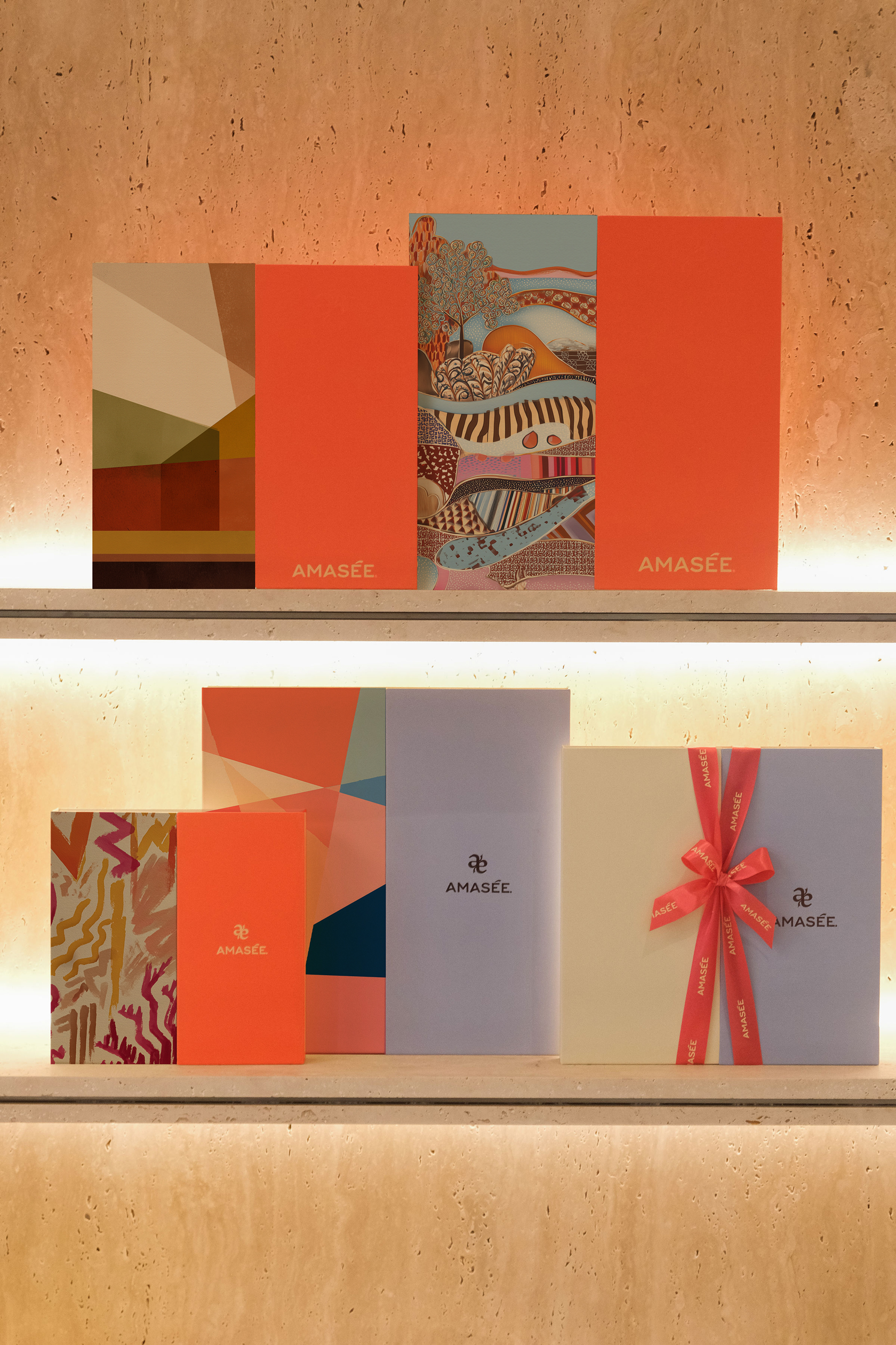
The packaging system was intentionally designed around a distinctive dual-flap opening mechanism, where every box opens from two sides simultaneously. Each flap represents one side of the brand’s conceptual duality.
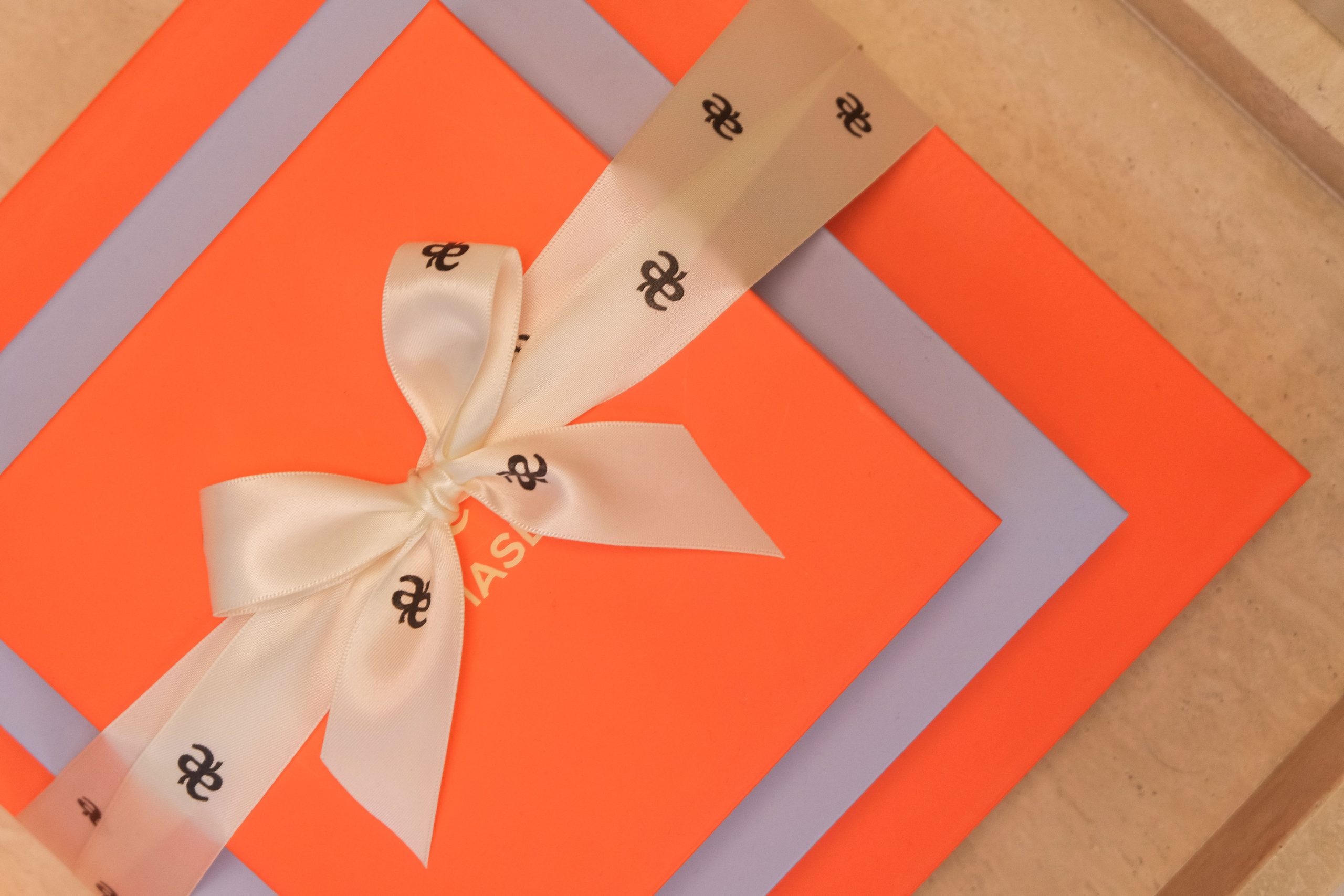
The first flap represents Time. It is the constant. Across the packaging system, this side consistently carries the logo and core brand color, acting as a recognizable anchor throughout the brand world. While time continuously moves forward, the concept of time itself remains universal and permanent.
The second flap represents Taste. Unlike time, taste is treated as a variable. Artistic movements, design languages, color meanings, and cultural aesthetics continuously evolve across generations. This side of the packaging therefore becomes the expressive and ever-changing canvas of the brand, allowing artwork, compositions, textures, and visual narratives to shift over time.
This contrast between permanence and evolution became the foundation of the entire packaging system. The opening ritual physically reveals the relationship between the two ideas, transforming the act of unboxing into a symbolic and sensory experience rather than a purely functional gesture.
The visual language was designed with restraint and balance, combining contemporary typography, minimal compositions, and expressive artistic interventions inspired by the ingredients themselves. The system consistently uses split layouts, contrasting surfaces, and controlled asymmetry to reinforce the idea of duality across every touchpoint.
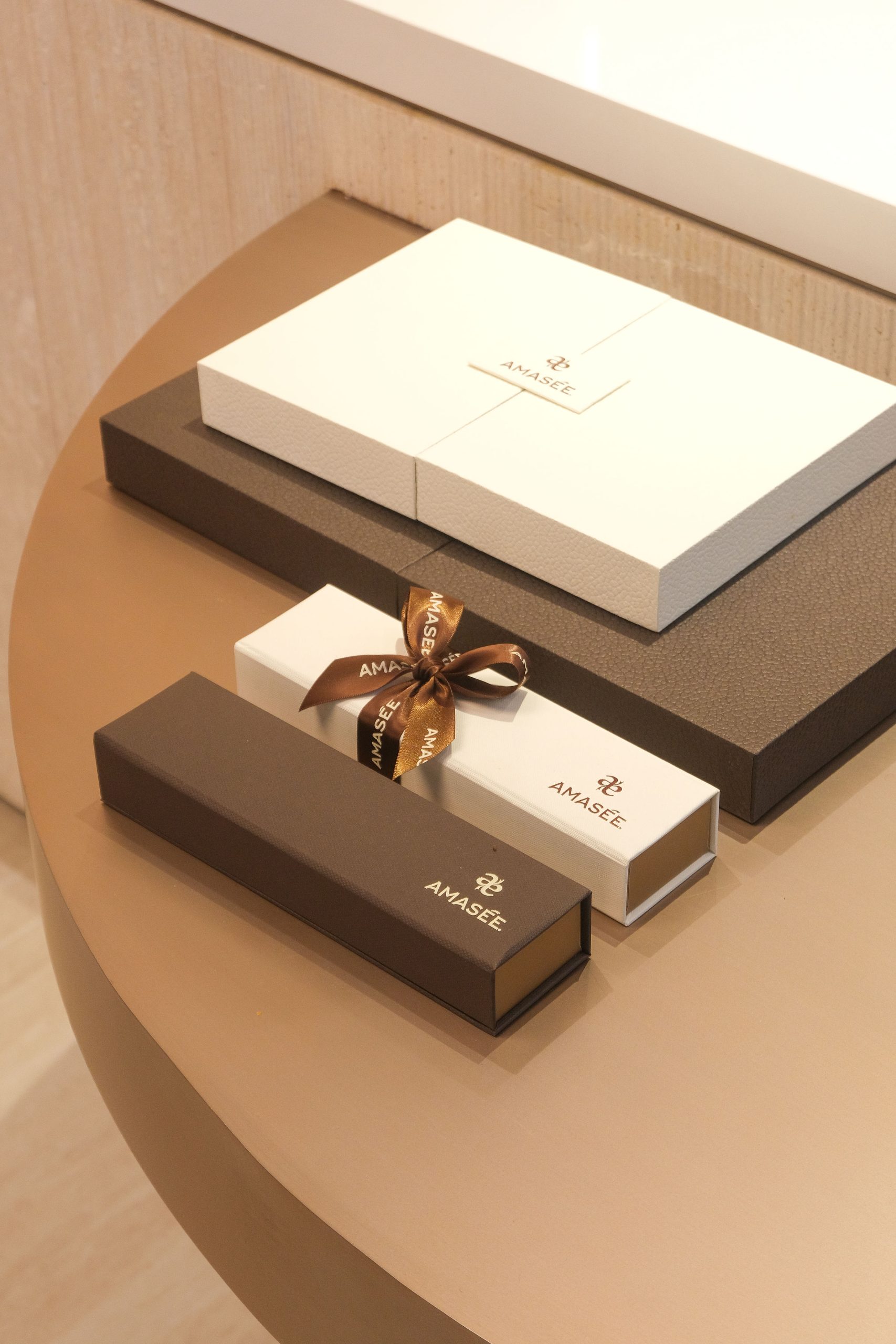
Materiality also played an important role in elevating the experience. Soft-touch finishes, tactile surfaces, refined proportions, and carefully considered structural detailing were used to create packaging that feels collectible, premium, and intentional without relying on excessive decorative elements.
The result is a packaging language that bridges confectionery, culture, art direction, and ritual, positioning the product closer to a curated luxury object than a conventional dates brand.
THE OUTCOME
The final packaging system introduced a more contemporary perspective to the luxury dates category while remaining deeply connected to its Middle Eastern origins.
By transforming the opening mechanism into a recognizable ritual, the packaging became one of the brand’s most ownable assets and a defining part of the consumer experience itself. The duality framework also allowed the system to scale flexibly across future collections and product ranges while maintaining a strong and cohesive identity structure.
The launch of Amasée generated strong engagement across both Middle Eastern and international design communities, helping establish the brand as a distinctive new voice within the Middle Eastern luxury confectionery space.
PROJECT CREDITS
Head of Design & Creative Impact: Mo Saad
Lead Senior Designer: Francisco Belo dos Santos
Lead Senior Strategist: Tima Zara P
Designer: Tanya Agarwal
Motion Designer: Sahar Baniabbasi
Agency: Brand Lounge
© Brand Lounge 2026. All rights reserved.
Brand Lounge is a global, independent, and award-winning strategic brand consultancy headquartered in Dubai. We help organizations uncover the meaning behind their brands, turn it into strategy, express it through identity, and activate it through experiences that last. Grounded in differentiation, we build the strategic, creative, and cultural foundations that transform brands into true competitive advantages.







 Hi estudio
 43oz
43oz monther al omari
 Rosario Lo Iacono
 alchimistestudioParis
 Ebbi
Ebbi Maruf Nishat
 Mind Brand
 宏洛图品牌设计HONGLT
 Iyioluwanbelarami
 sahildoesartt
 Denis Ulianov
 Garry Veda
 arutza
 Lucid mk2
 MaheswariMadhu
 sanjnasnair
 POSH FMCG BRANDING
 Modern Theory
 Shubhashish Roy
 Affogato Brand Design
 Backbar Studios
 hello ocean
 Luciana Gutierrez
 Valérie Colace