
ABOUT
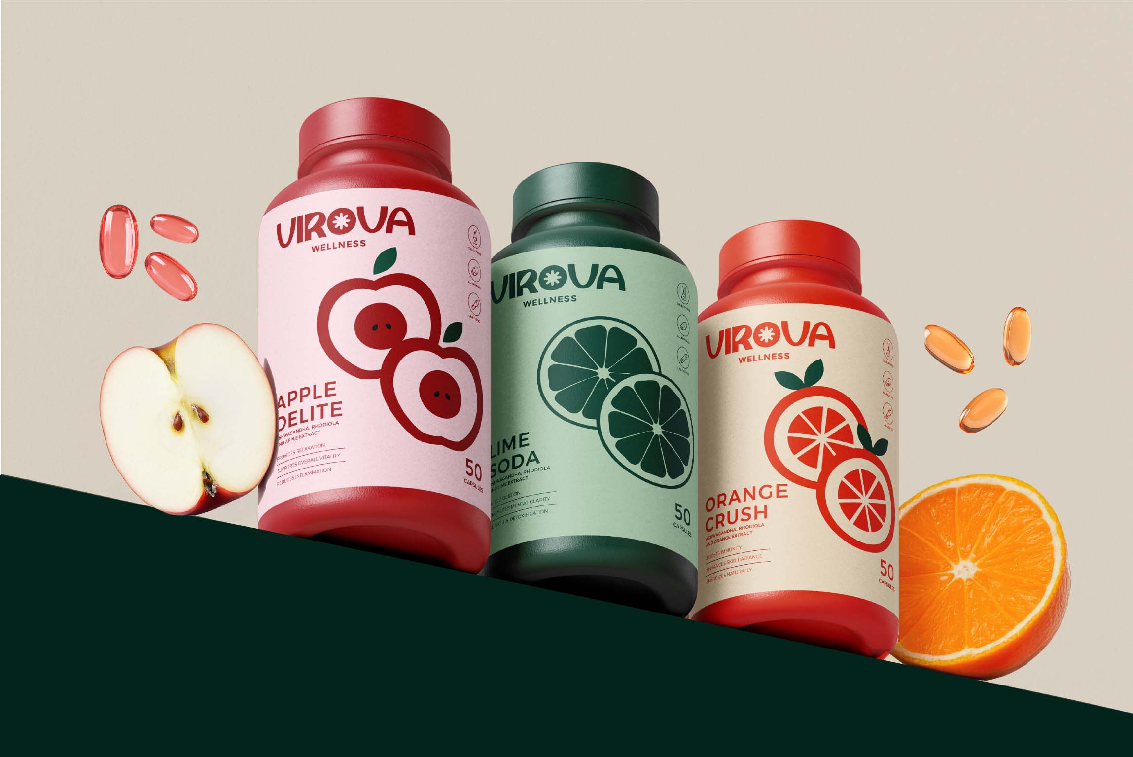
Virova Wellness was created around a simple idea: wellness should feel like a part of everyday life, not another complicated routine to keep up with. With a growing supplement market filled with clinical aesthetics, functional claims, and visually similar products, Virova needed to establish a more approachable and contemporary point of view.
The challenge was to build a wellness brand that could make supplements feel less intimidating and more desirable while still communicating the trust and efficacy expected from the category.
SOLUTION
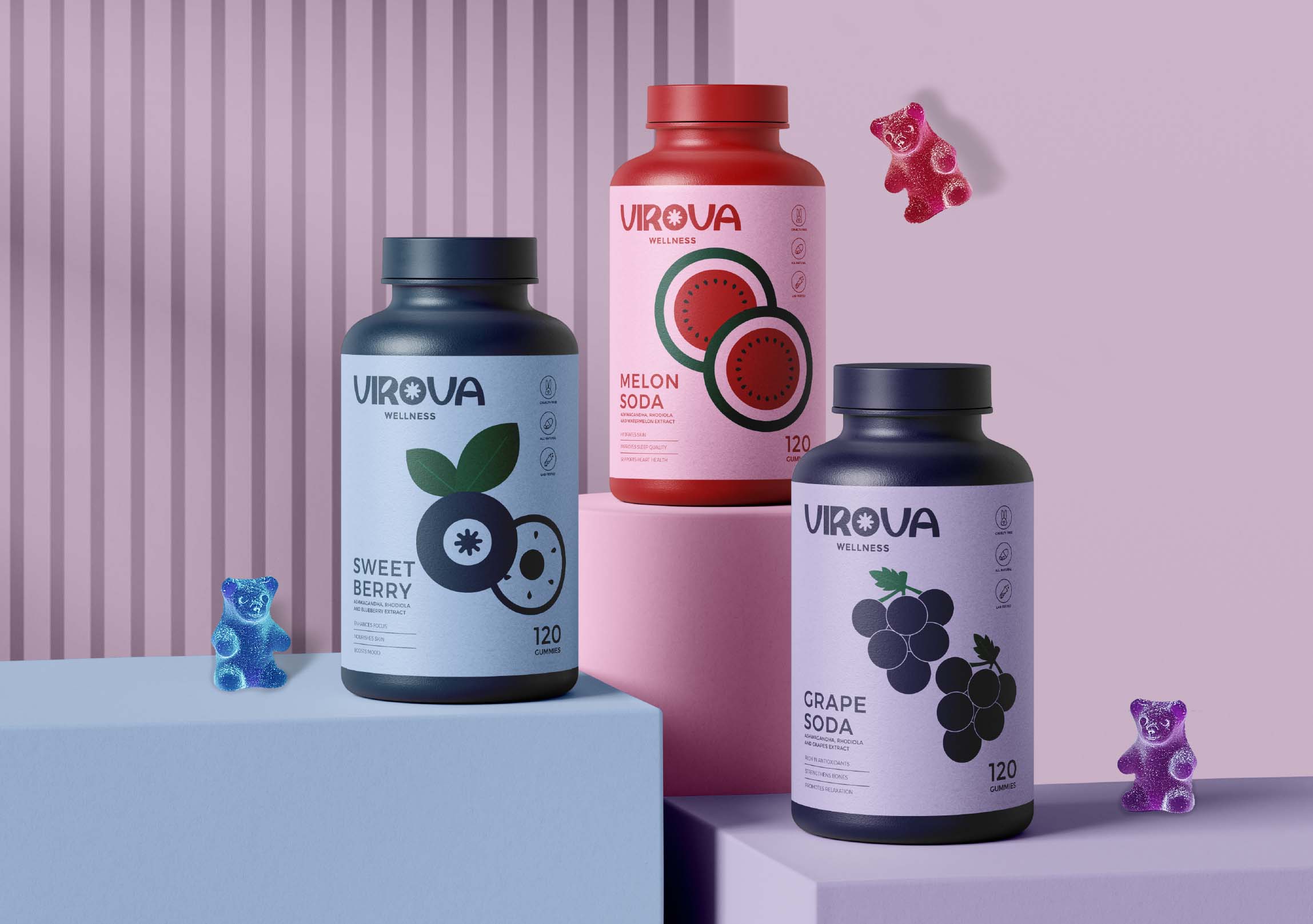
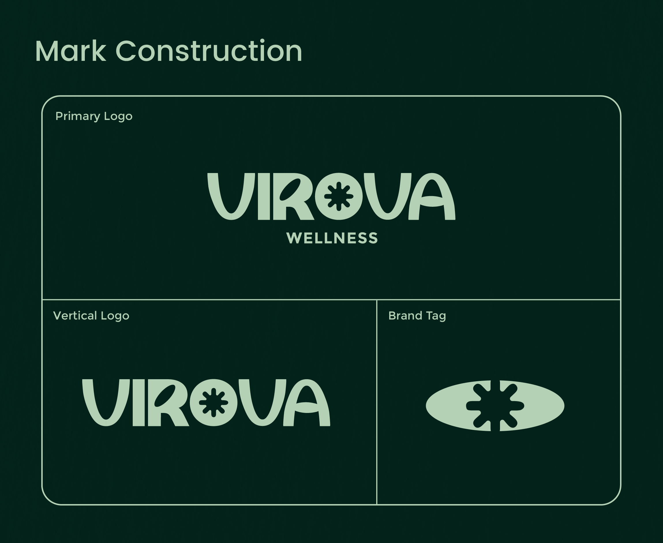
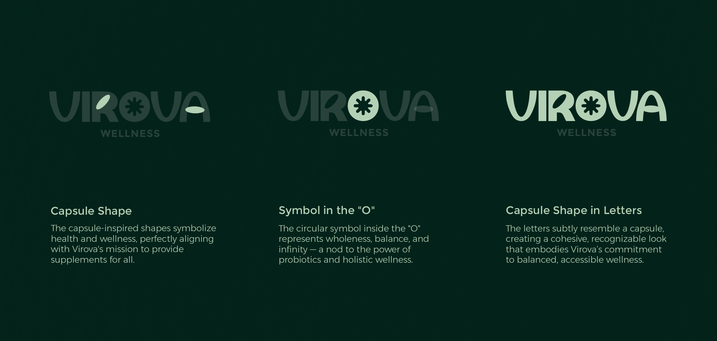
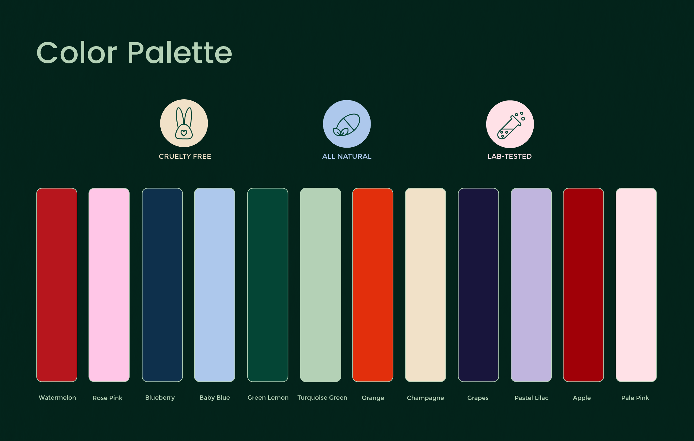
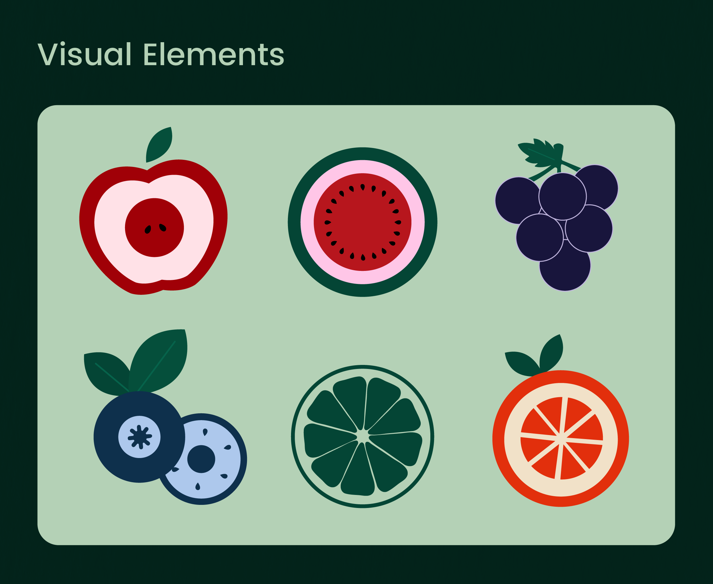
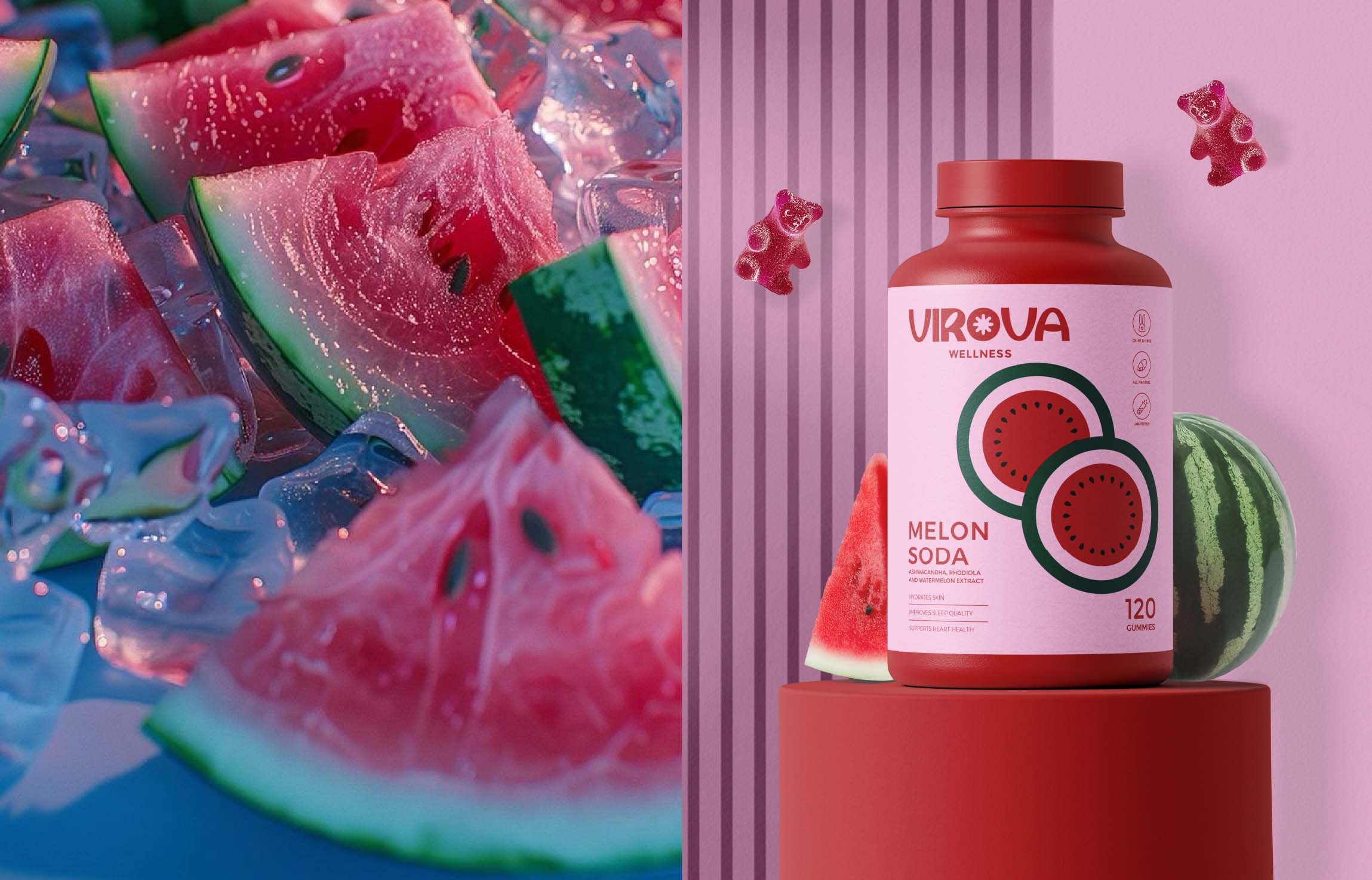
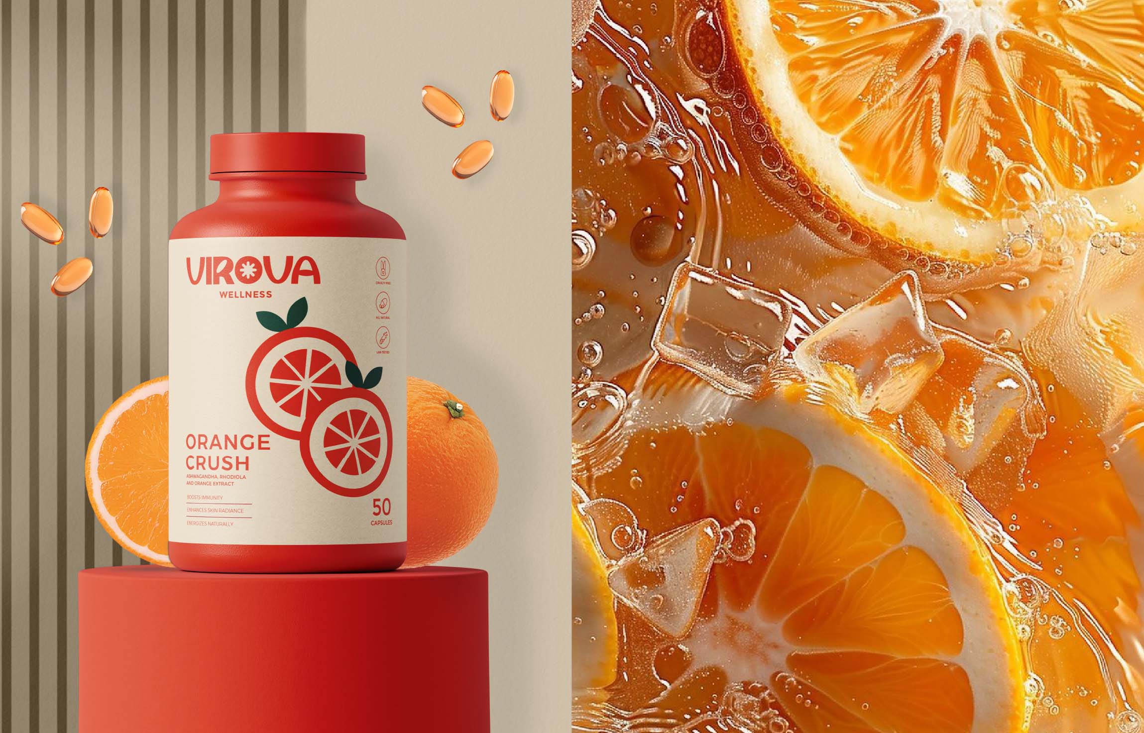
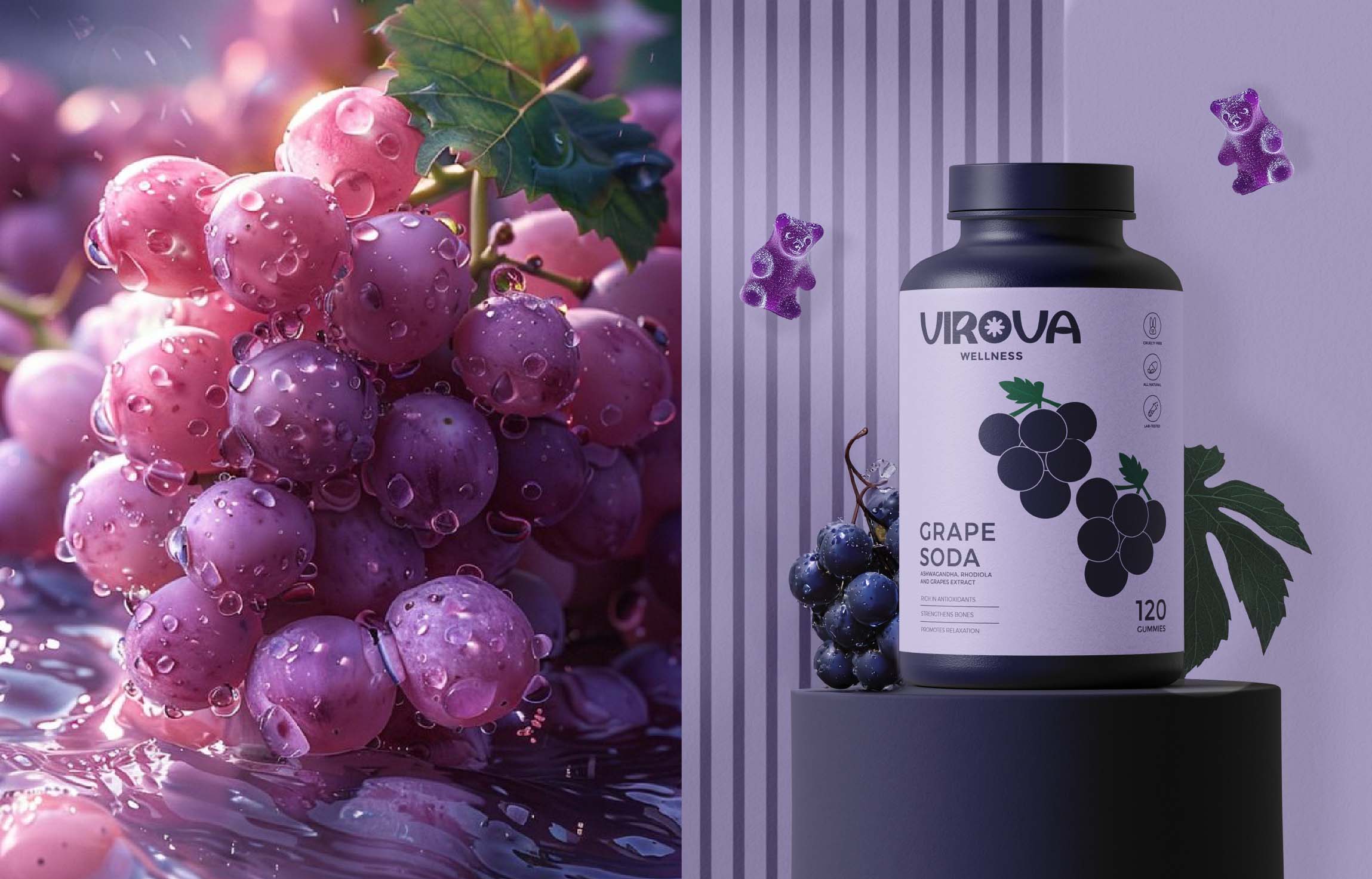
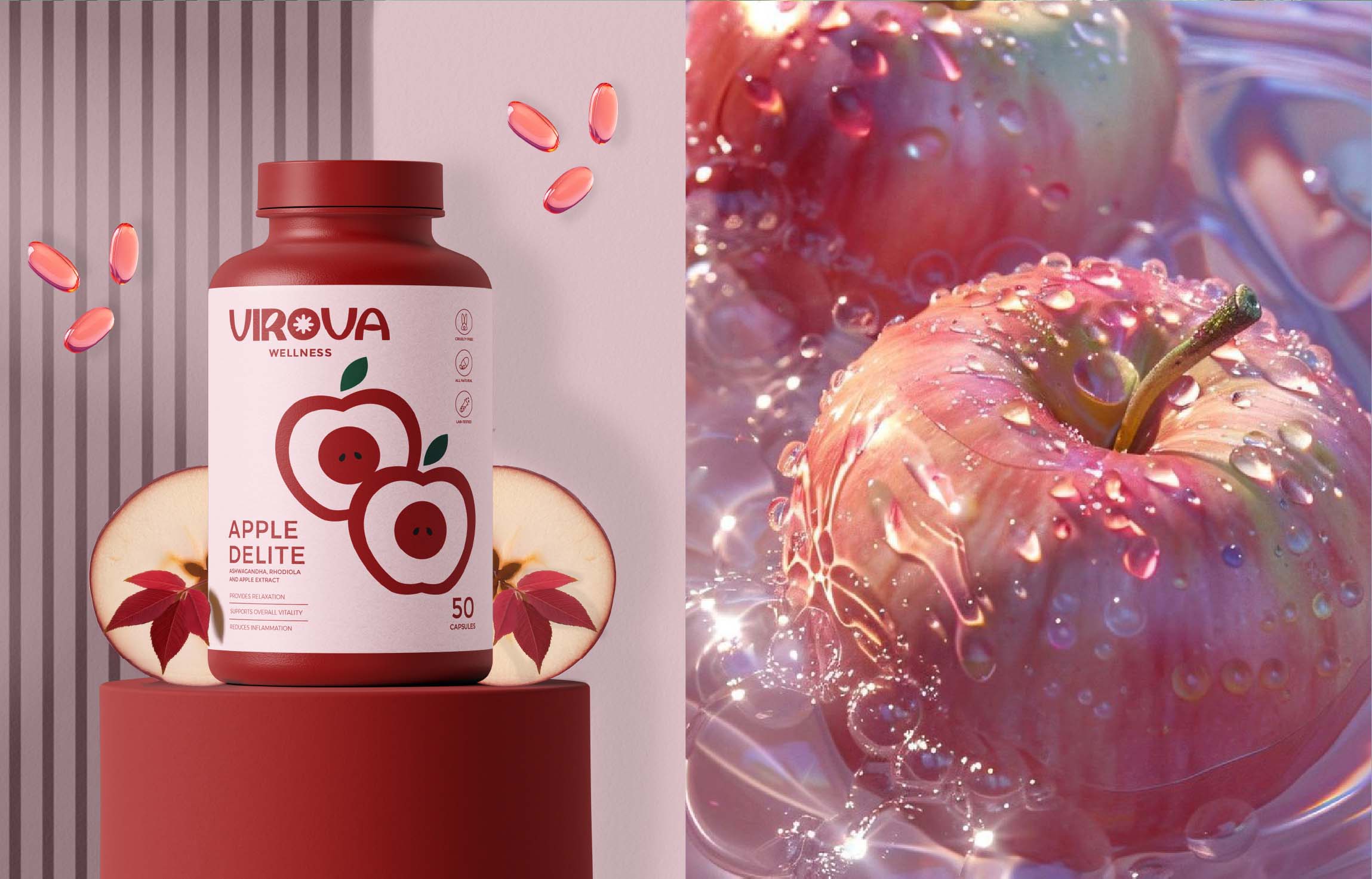
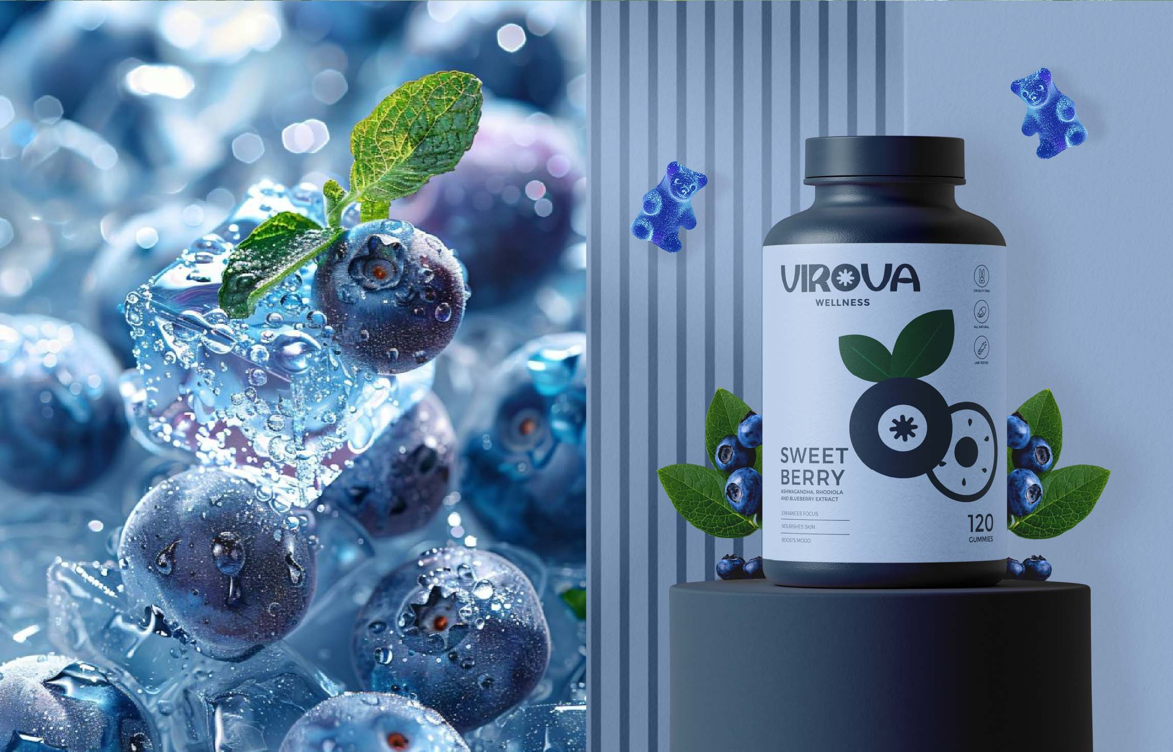
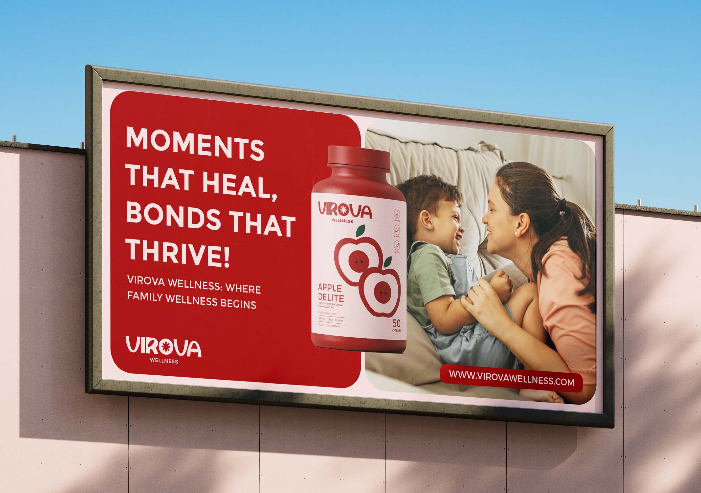
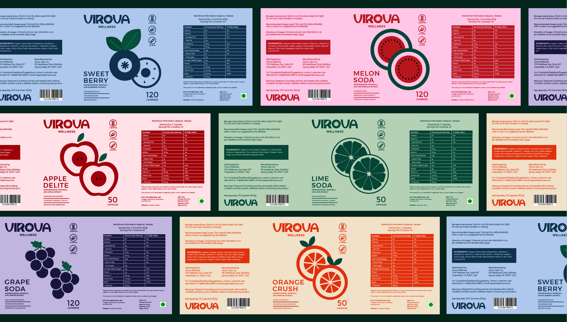
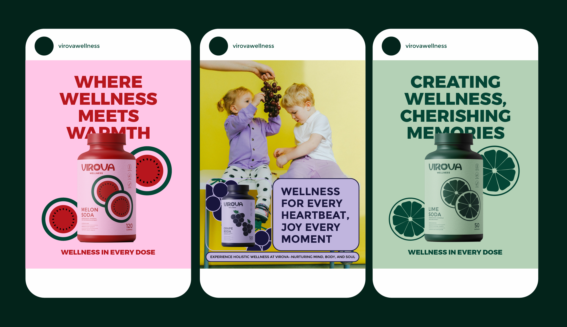
We developed a visual identity that brings a more expressive and human perspective to the world of supplements. Instead of leaning into the conventional clinical language of wellness, the system uses bold typography, distinctive colour combinations, playful graphic elements, and clear product differentiation to create an identity that feels energetic, contemporary, and approachable.
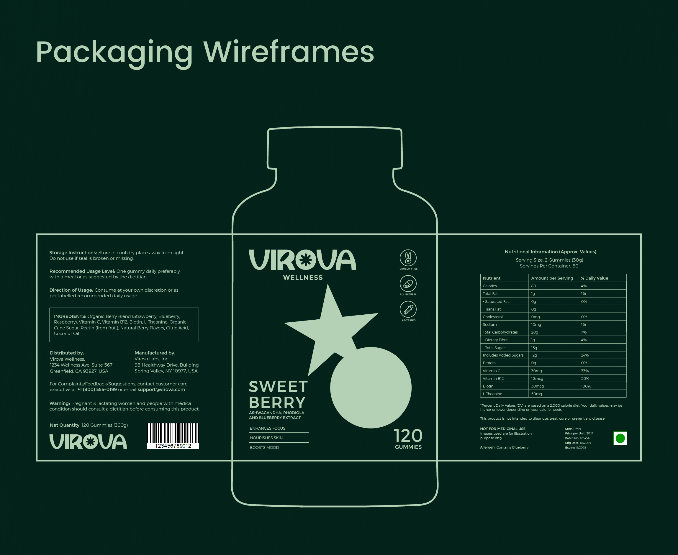
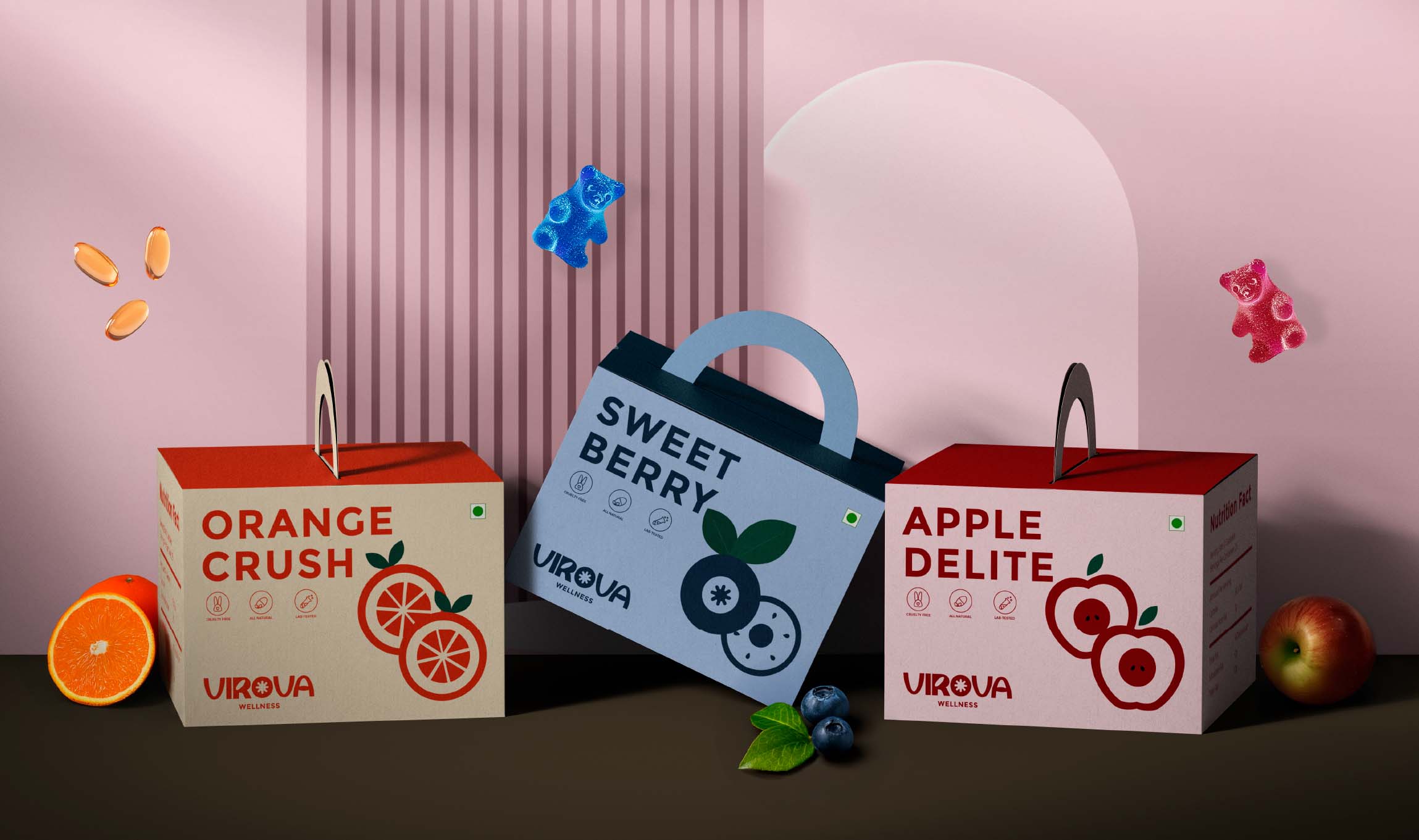
The packaging system was designed around a simple visual hierarchy that makes each formulation immediately recognisable while keeping the entire range connected. From capsules to gummies, the identity creates a flexible framework that can expand across products without losing its personality.
The result is a wellness system that feels confident without being clinical, playful without losing credibility, and distinctive without becoming difficult to navigate.
RESULT
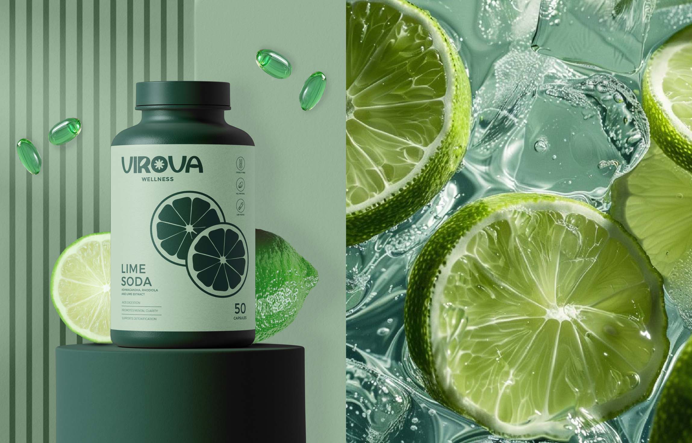
Virova transforms everyday supplementation into something that feels less like a chore and more like a lifestyle choice. The packaging brings clarity and personality to a crowded category, creating strong shelf presence while making each product easy to identify and understand.
By moving away from the expected visual codes of supplement brands, Virova establishes a contemporary identity built to connect with a new generation of wellness consumers—one that makes feeling good look as good as it feels.
 Up-Brands
 Almighty
 Desember Design Studio
 Daria Levina
 Yuliya Likhacheva
 carola matalinares
 daniitenaa
 StudioMordius
 Simon Pendry Creative
 Sti&Co Design
 Yasmin Sherif
 Roberto De Simone
 aseelstudio
 Rabia zouina
 UPRISE
 HazelBishop
 Qianyu Liu
 siyajacob
 Rohan Barwal | D2C Brand Identity, Logo & Packaging Designer
 Karen Salem
 omarchafik
 nastyaabeketova
 Roberto Núñez Studio