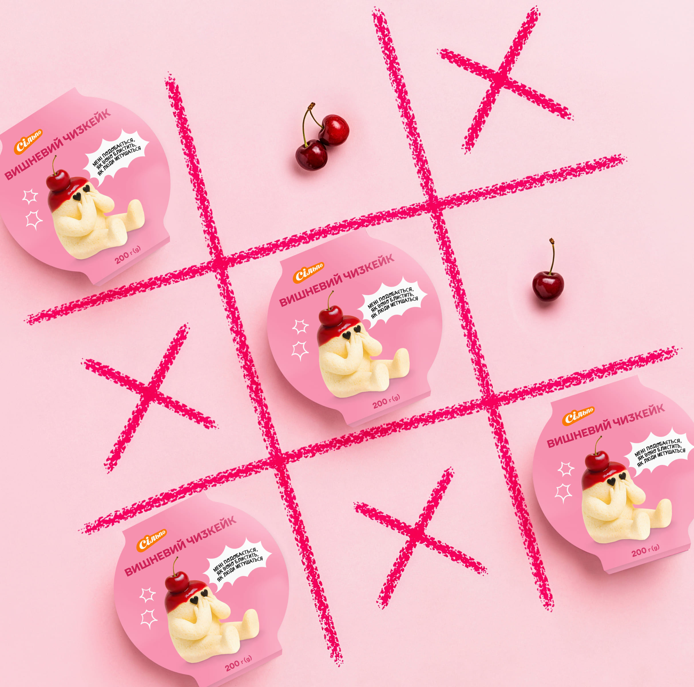

Silpo’s own production team came to us with a simple brief: make the range feel as joyful and unexpected as the brand itself.
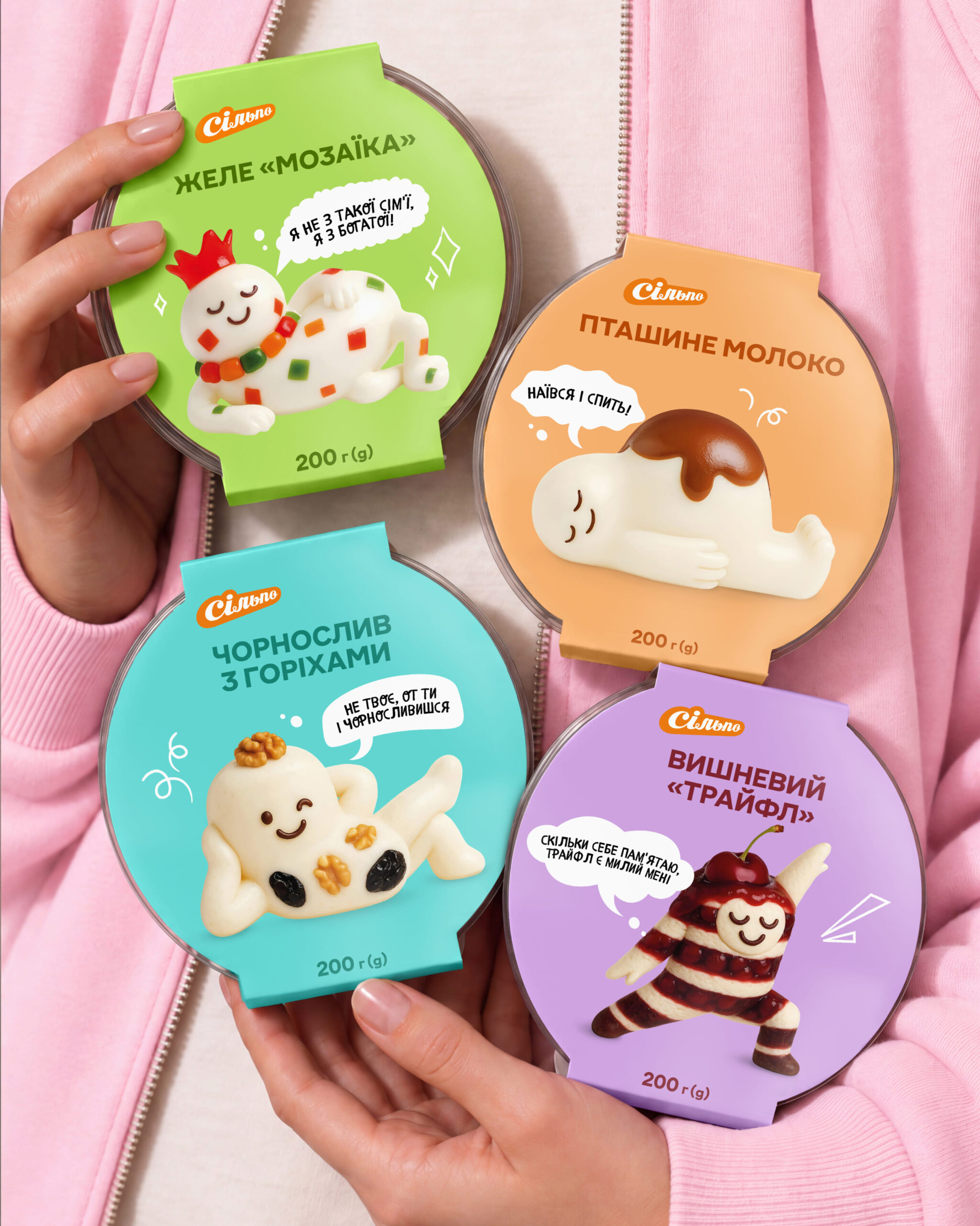
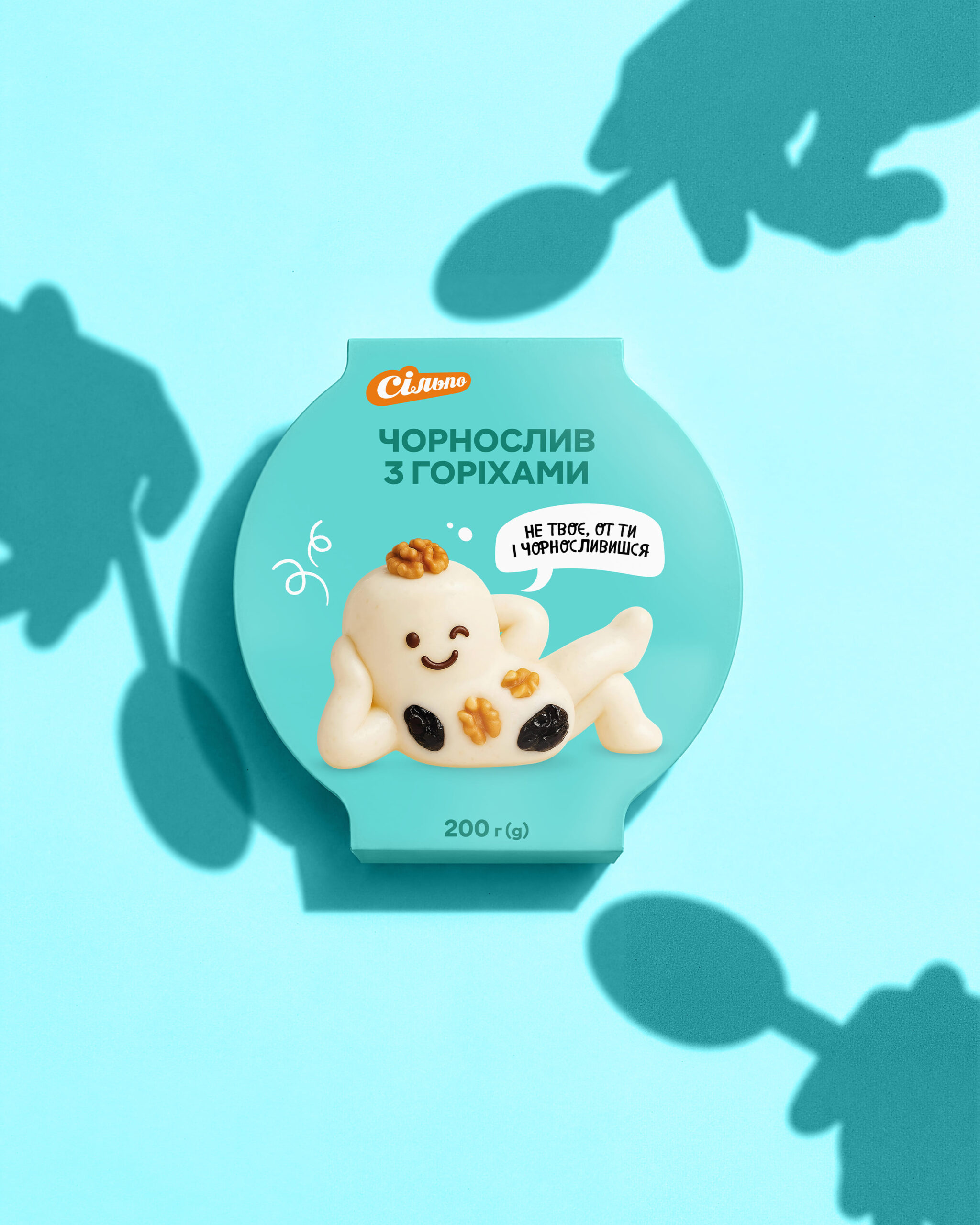
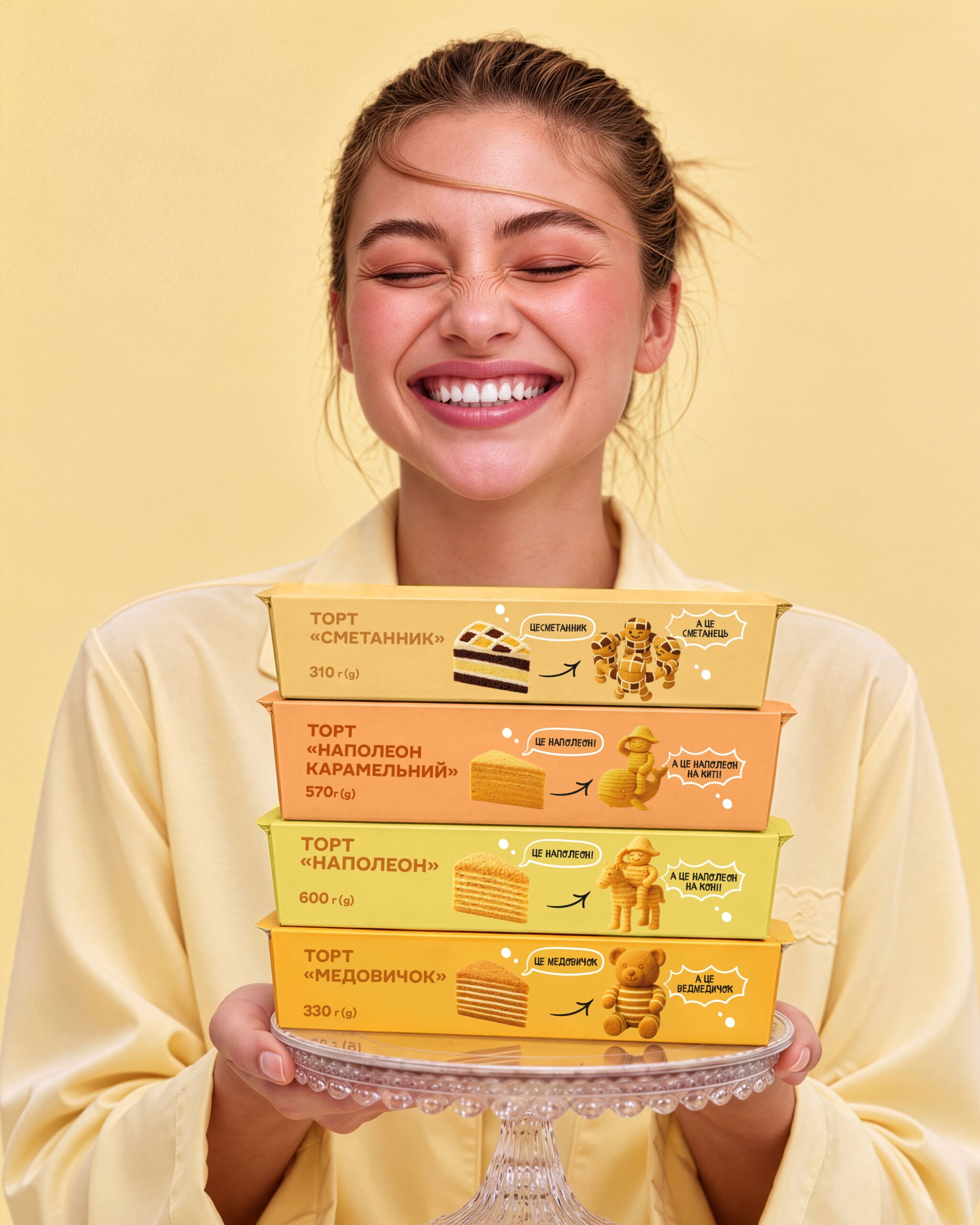
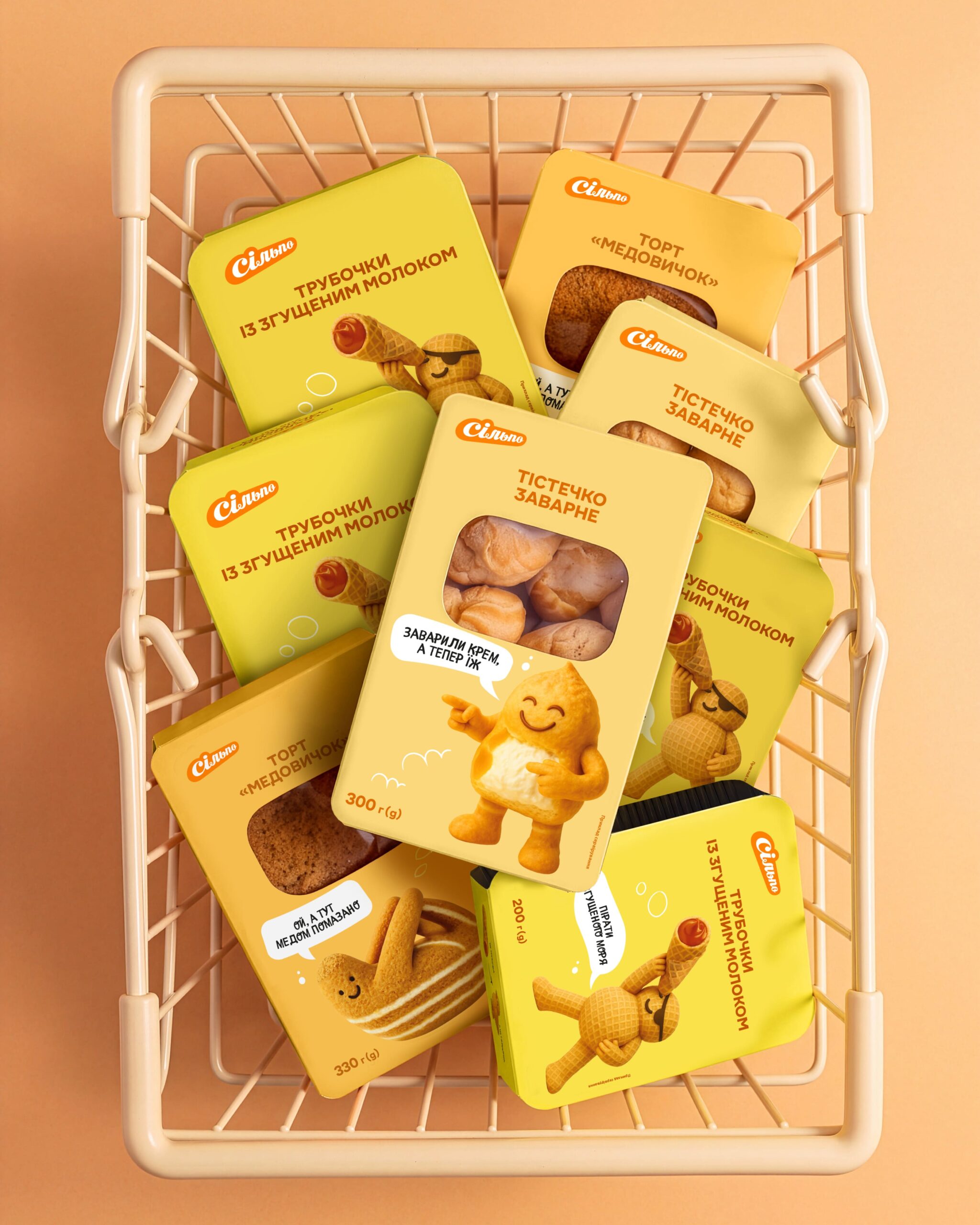
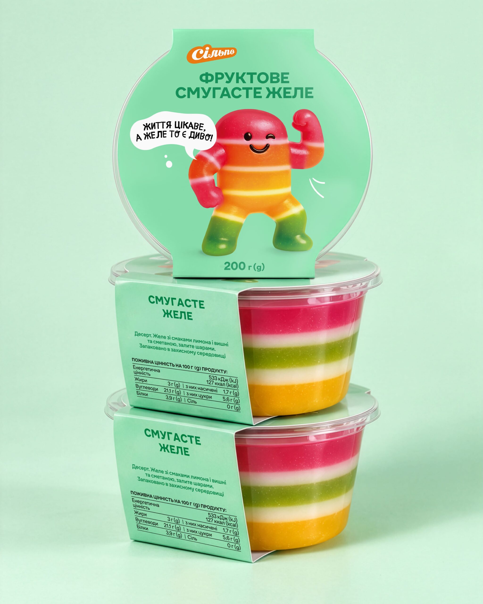
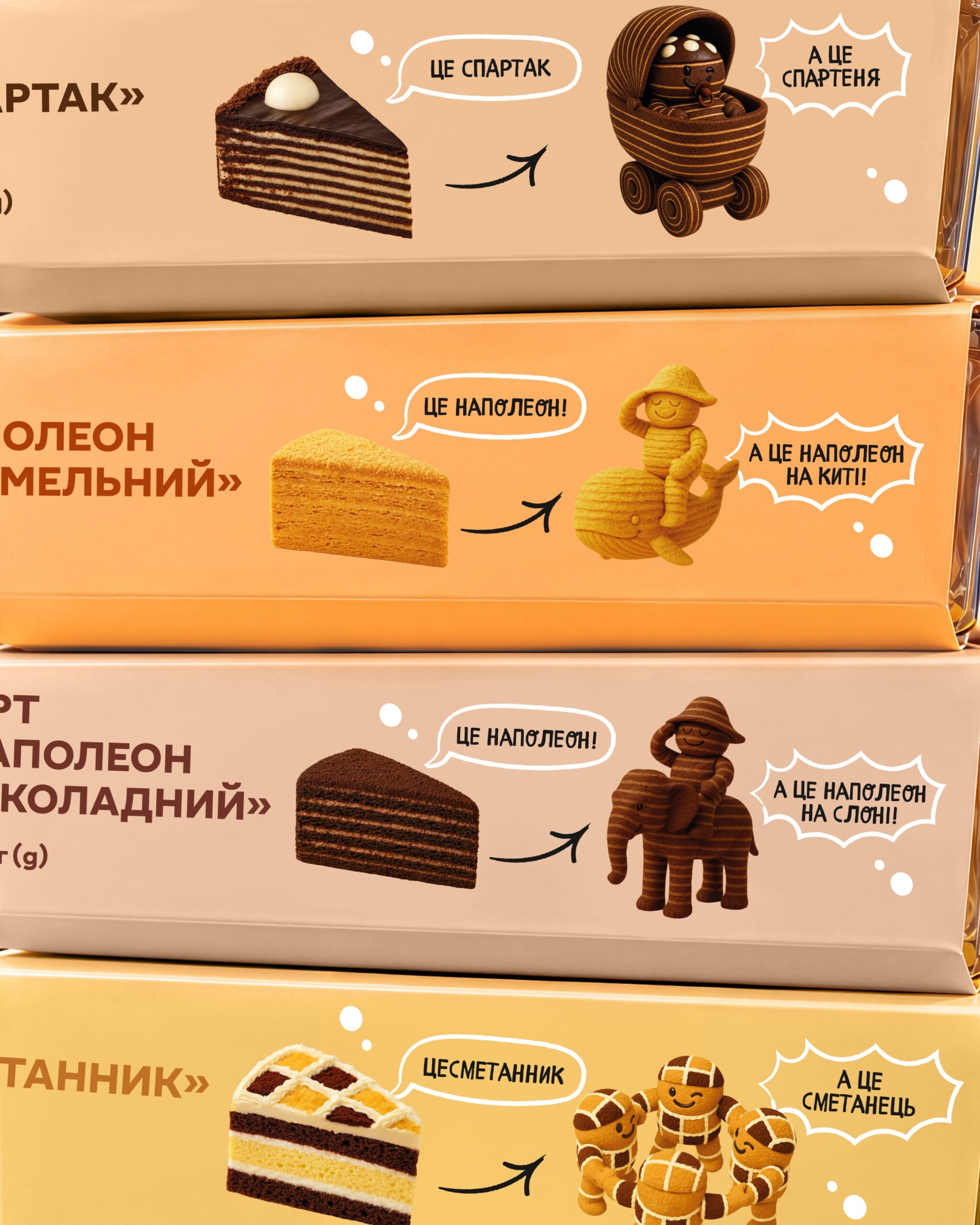
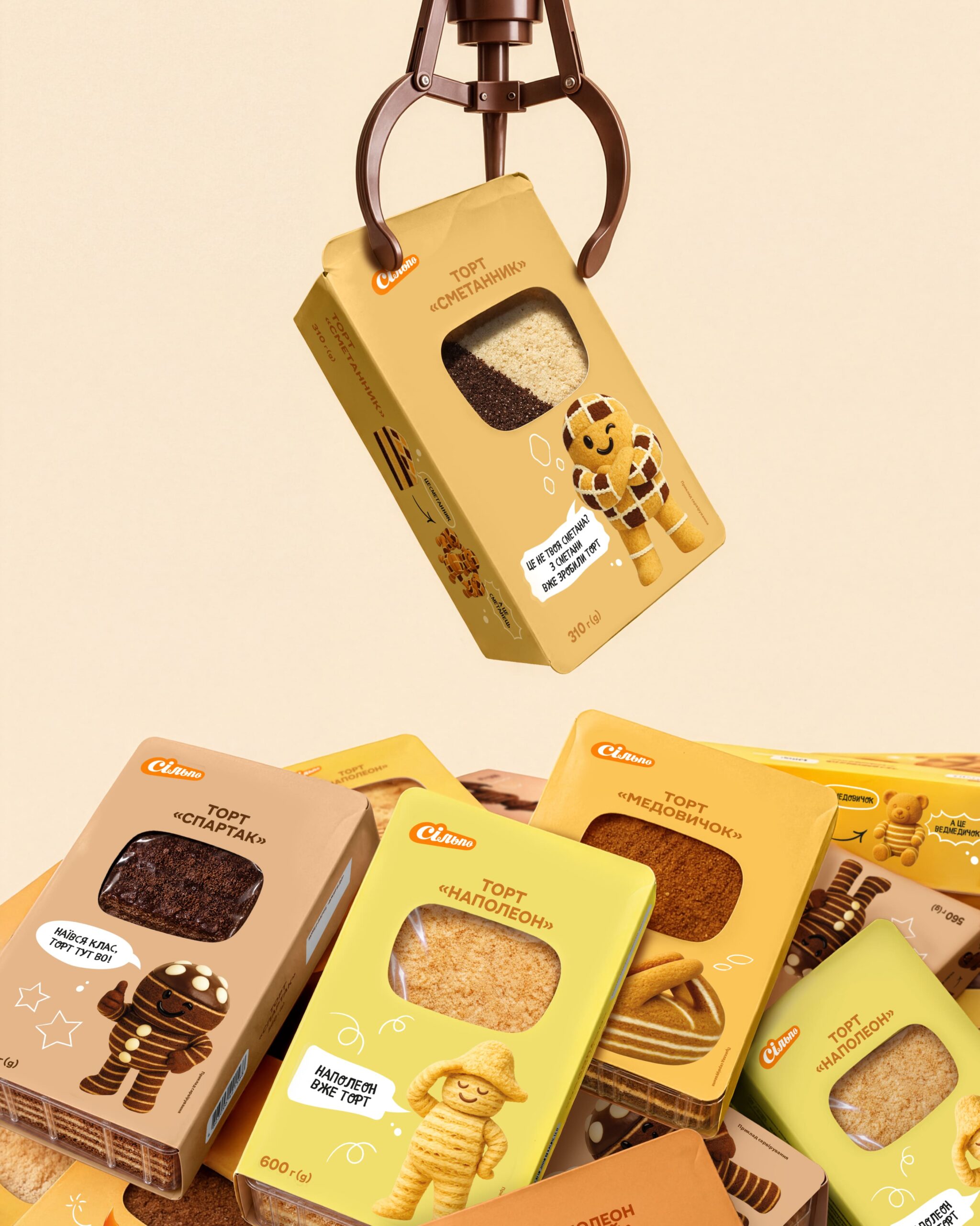
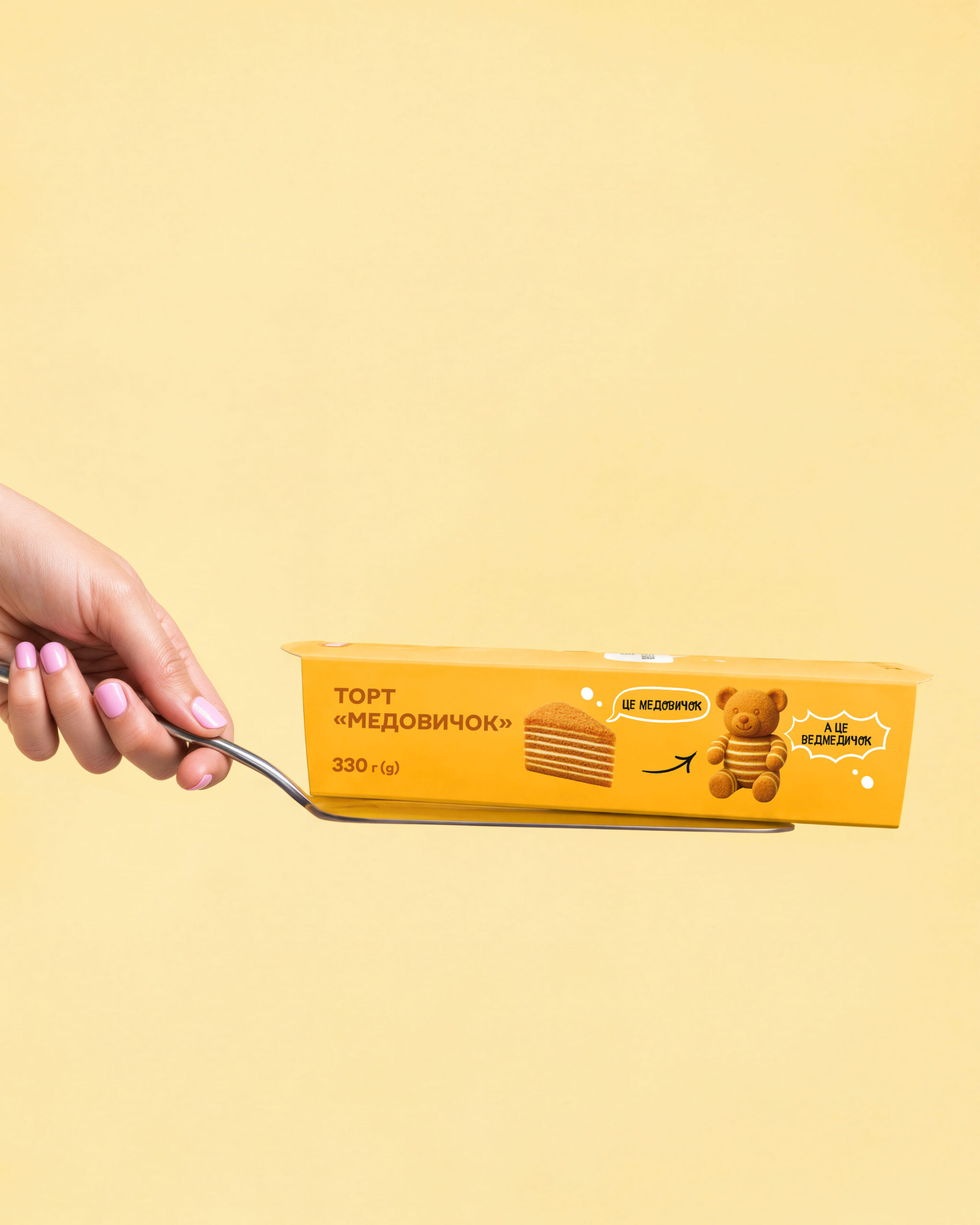
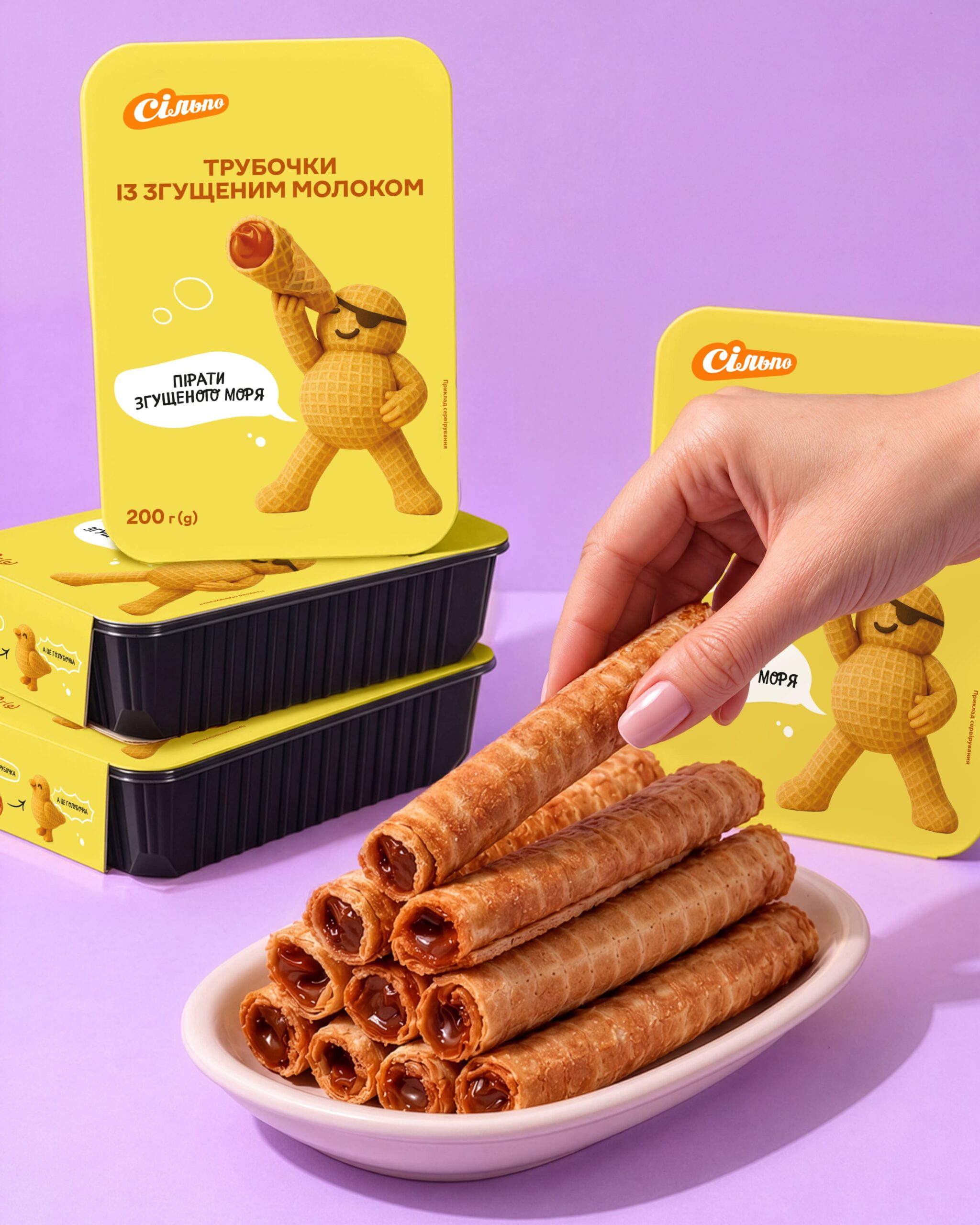
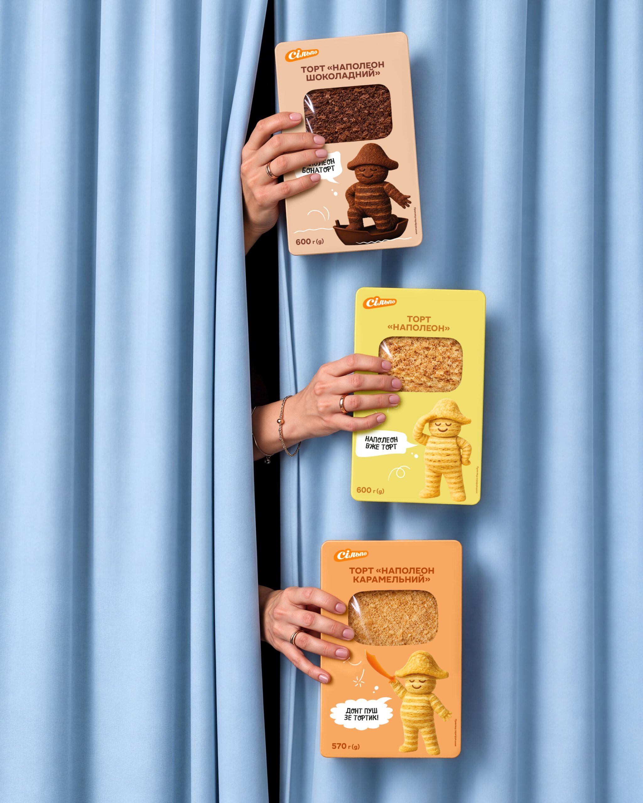
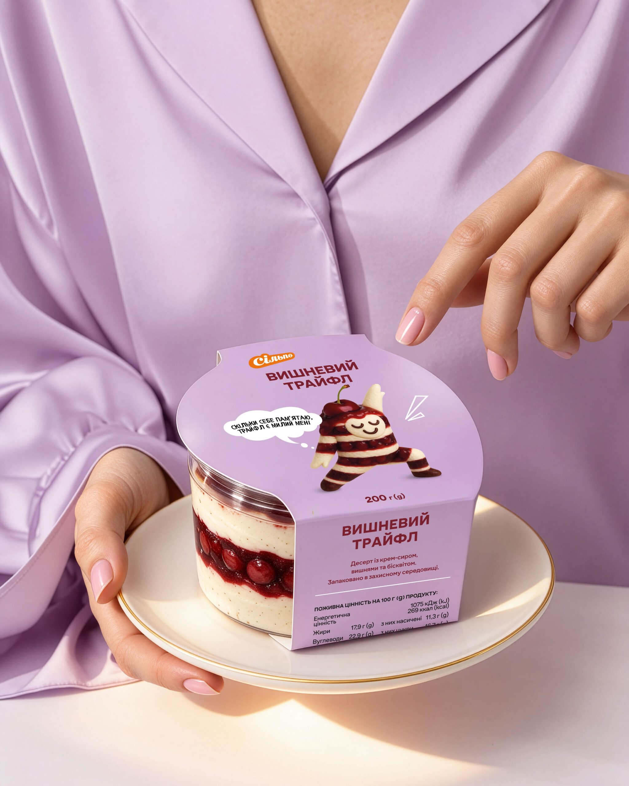
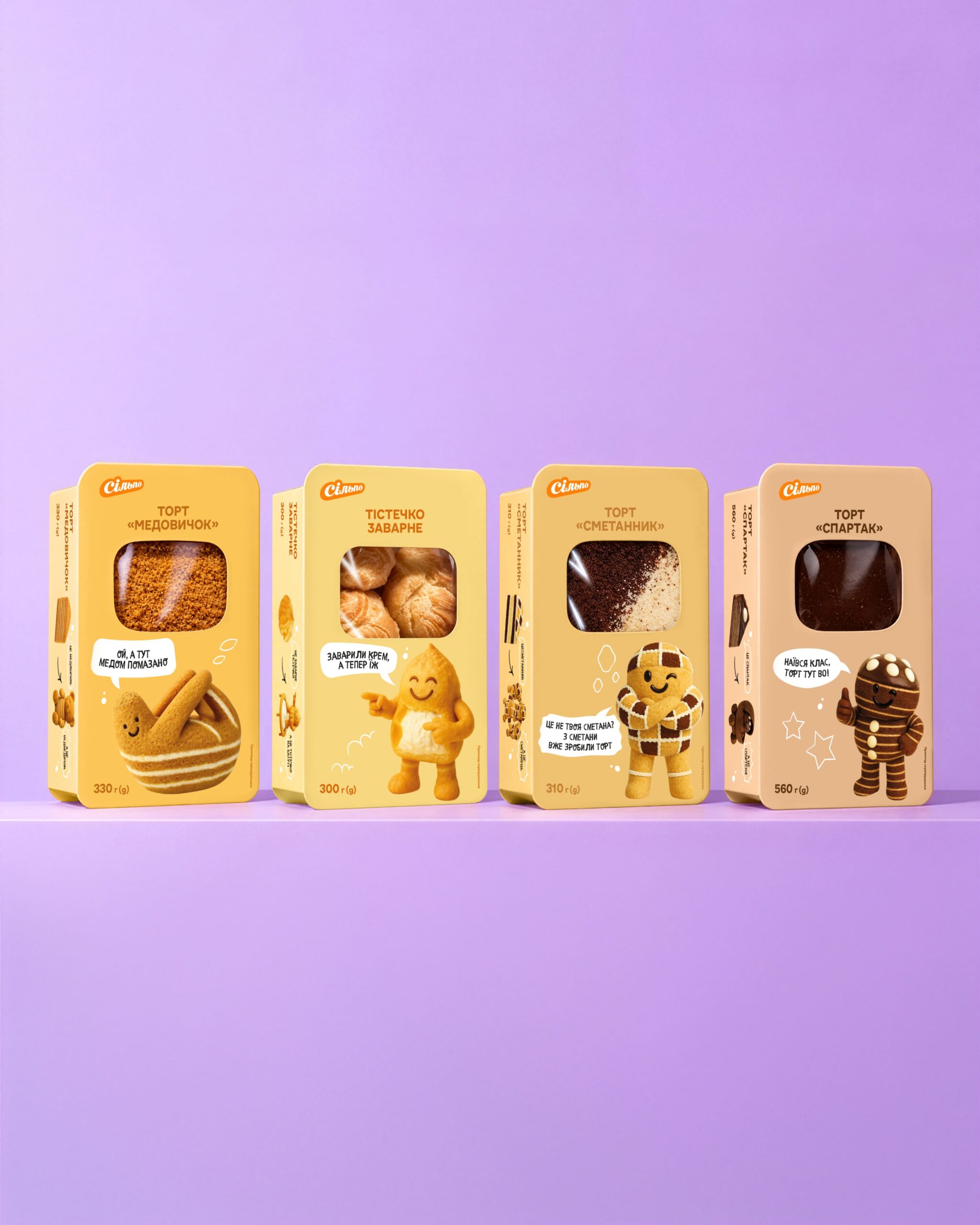
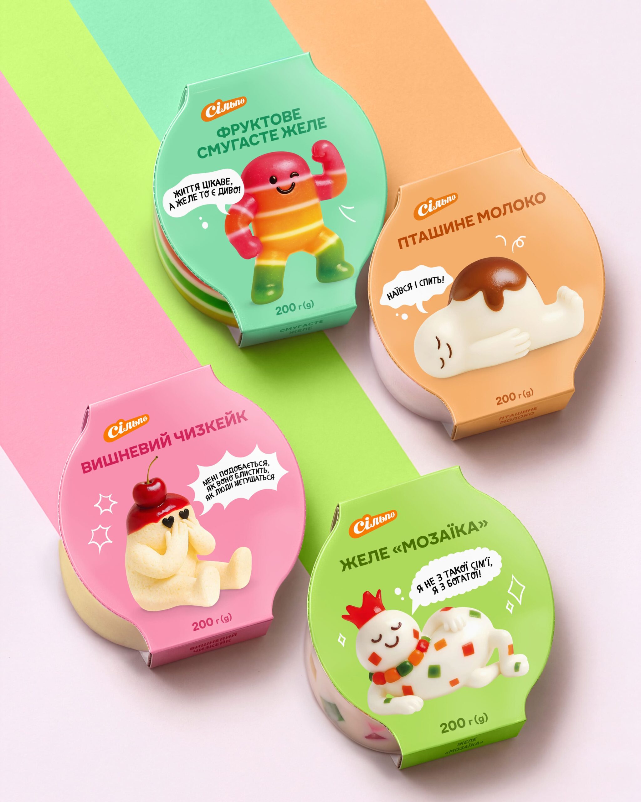
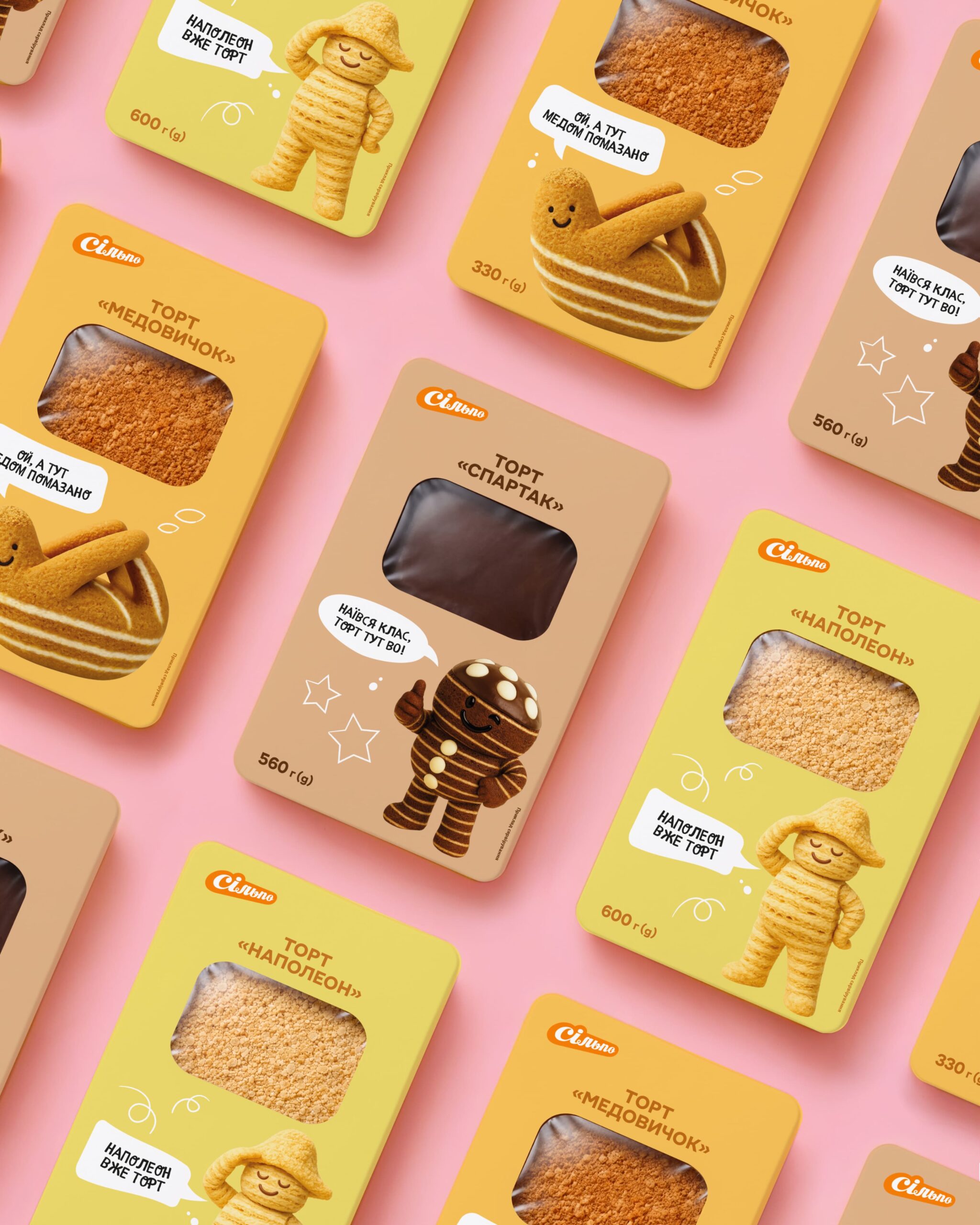
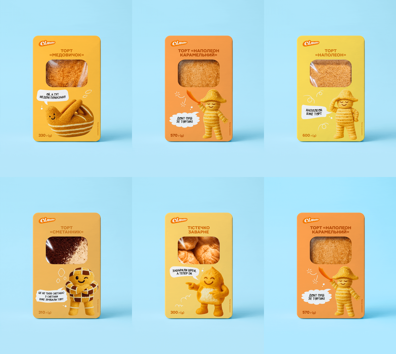
We created a playful packaging concept built around Ukrainian internet culture, familiar humour and wordplay. Each cake became a small character with its own personality, while the illustrations and copy reference locally recognisable memes and cultural moments. Some of the jokes are intentionally subtle — the kind of details that reward shoppers who take a closer look.
The visual system combines warm, dessert-inspired colours, rounded forms, expressive illustrated characters and unexpected copy. Even the side panels become part of the experience, turning the packaging into something to explore rather than simply a container for the product.
For an international audience, the specific references may not always be familiar — but the principle is universal: use humour and cultural context to create an emotional connection at the shelf.
Because Silpo is a brand built around joy, we wanted the cakes to do more than look delicious. We wanted them to make people smile before they even take the first bite.
 lunapanda
 Tridimage
 Analoguecreative
 lettera7
 alchimistestudioParis
 Lana B
 Colossal
 Pivot Studio
 M&A CREATIVE AGENCY
 monther al omari
 Anastasia Cherepanova | xtramez
 Hollóka Grafikai Műhely / Graphic Design Studio
 BOLD branding
 Antonia Skaraki
 Pâmella Lorrany
 Z9BKAdsgn
 Francesco Paternoster
 b1studio.ro
 Chris Creative Works
 Boordon
 Dmitriy Kuzovlev
 Brand Society
 yasharpic